Ulupinar Textile Headquarters Showroom
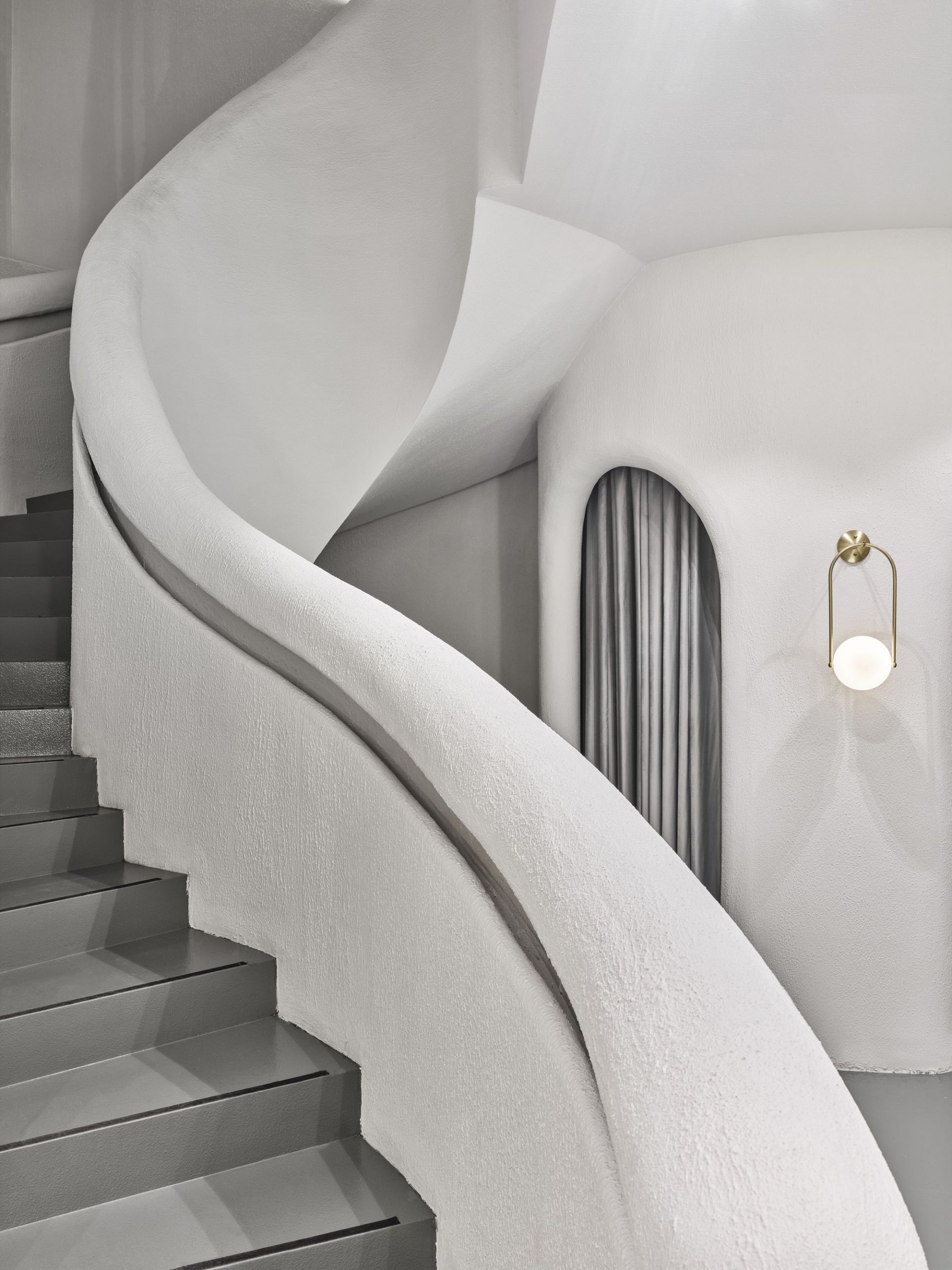
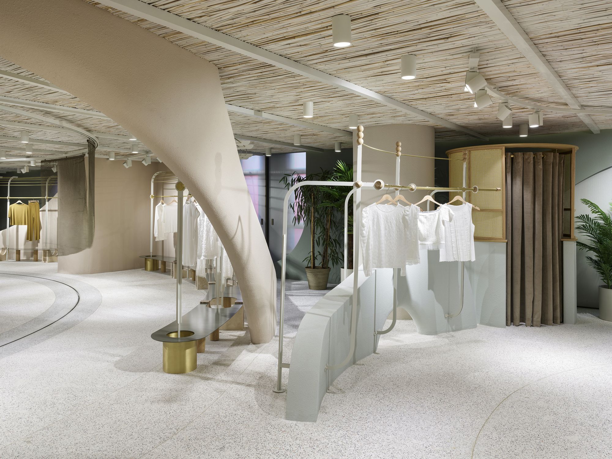
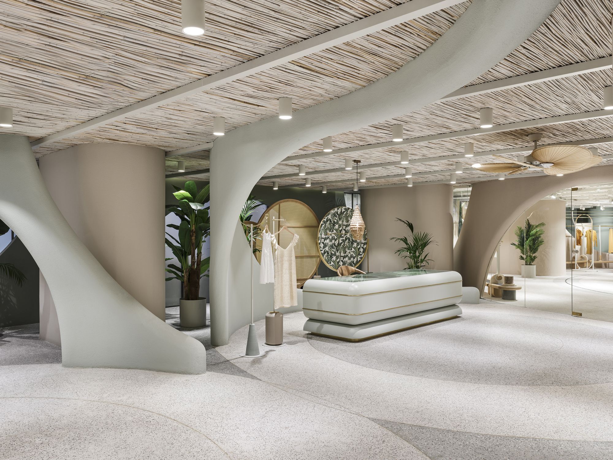
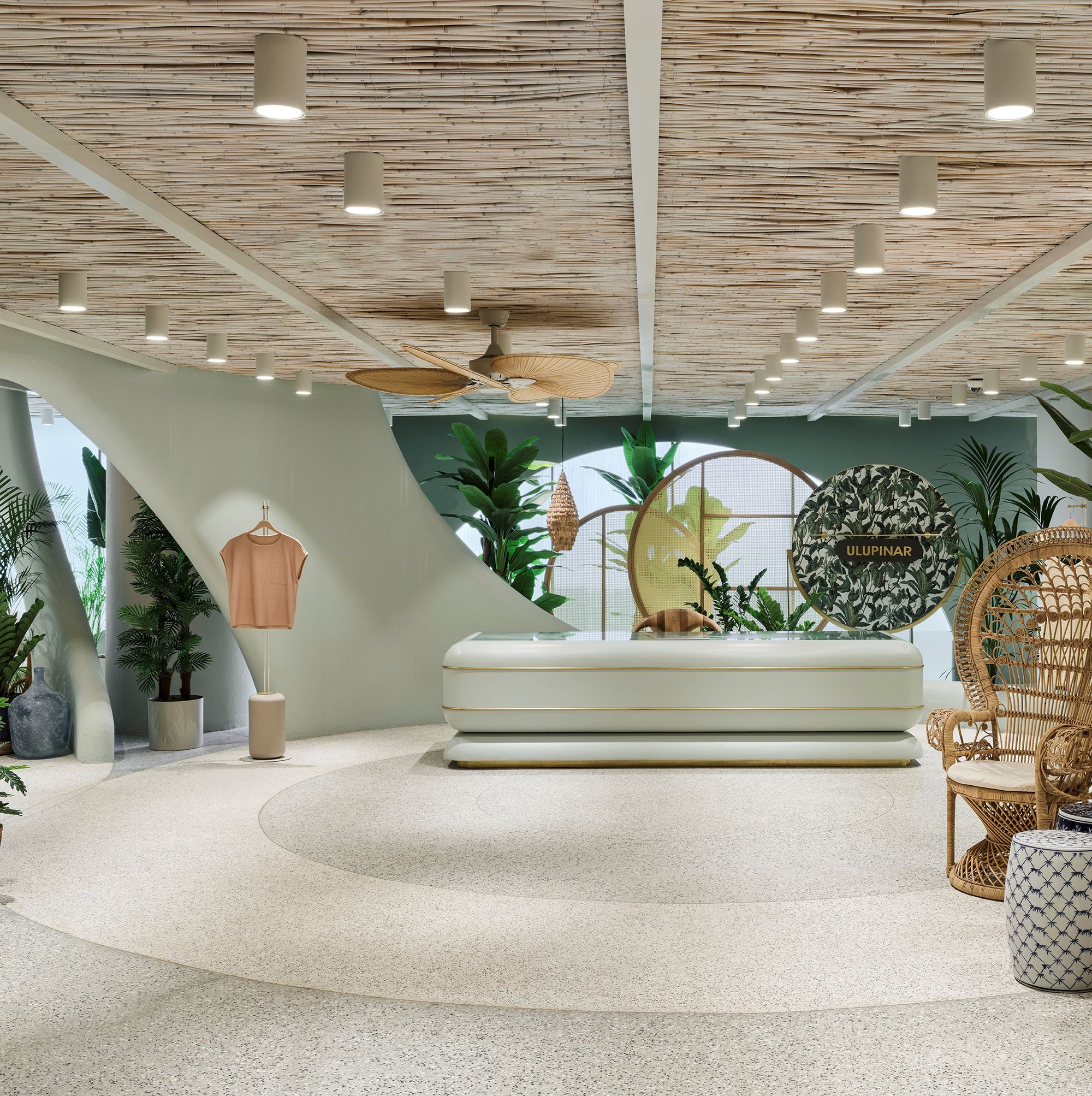
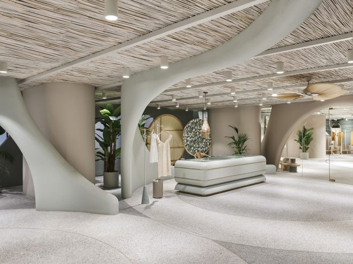
To detach the users from the chaotic city life was intended by enriching the experience with fluid circulation which is created with preferring organic forms in construction elements and the feeling of “serenity” that accompanies. Also, flexible usage of the custom-designed movable furniture modules procures the variable space perception and perspectives in the project, which was designed by Zemberek Design for a well-established textile company, Ulupınar Tekstil.
Photography by © Ibrahim Ozbunar
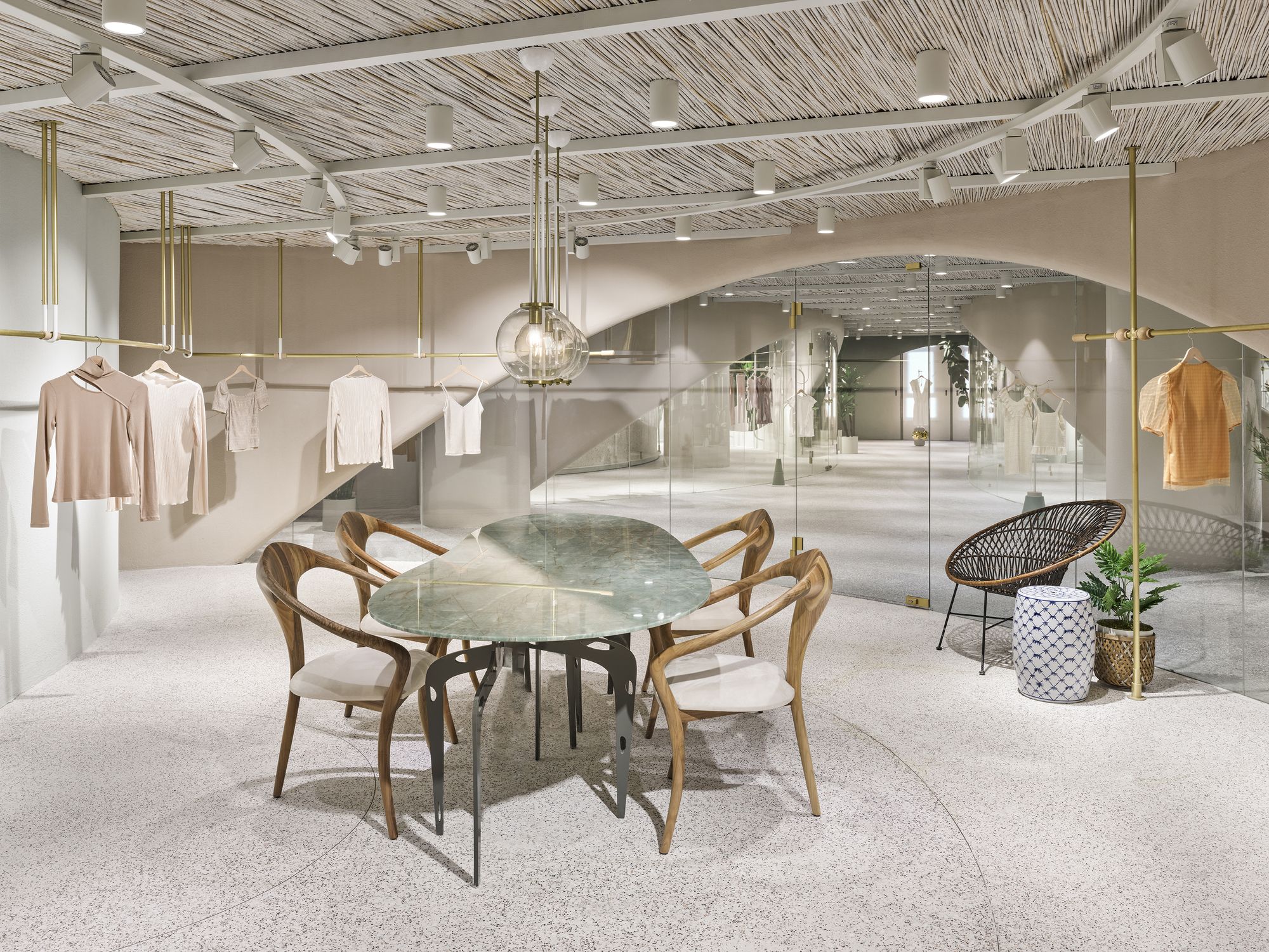
The showroom areas are designed to host fashion designers of retail brands. By focusing on the designers who are the main users, it was aimed to create alternative working setups that would allow visitors to own the space as their office.
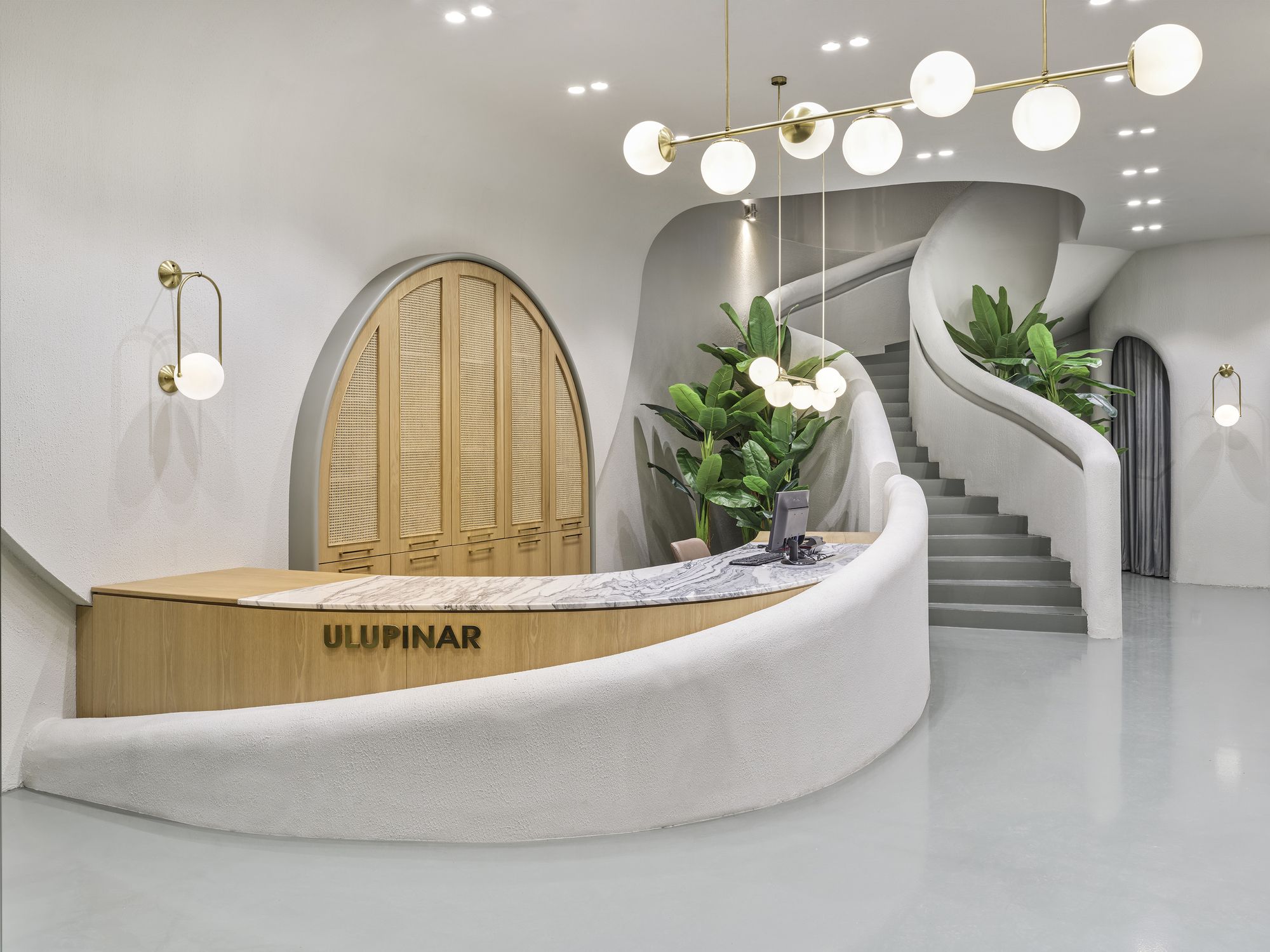
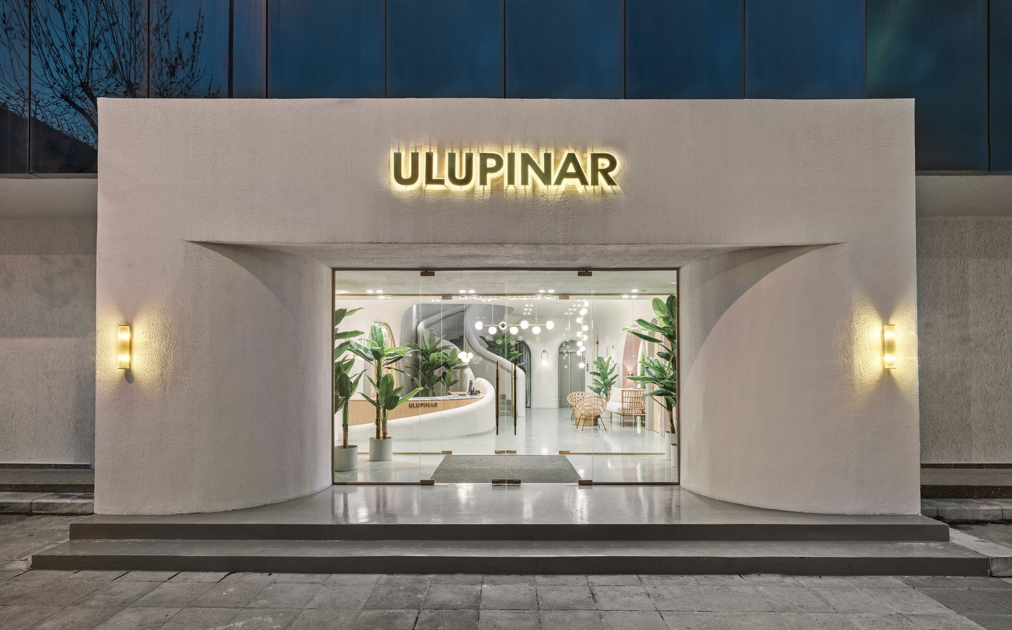
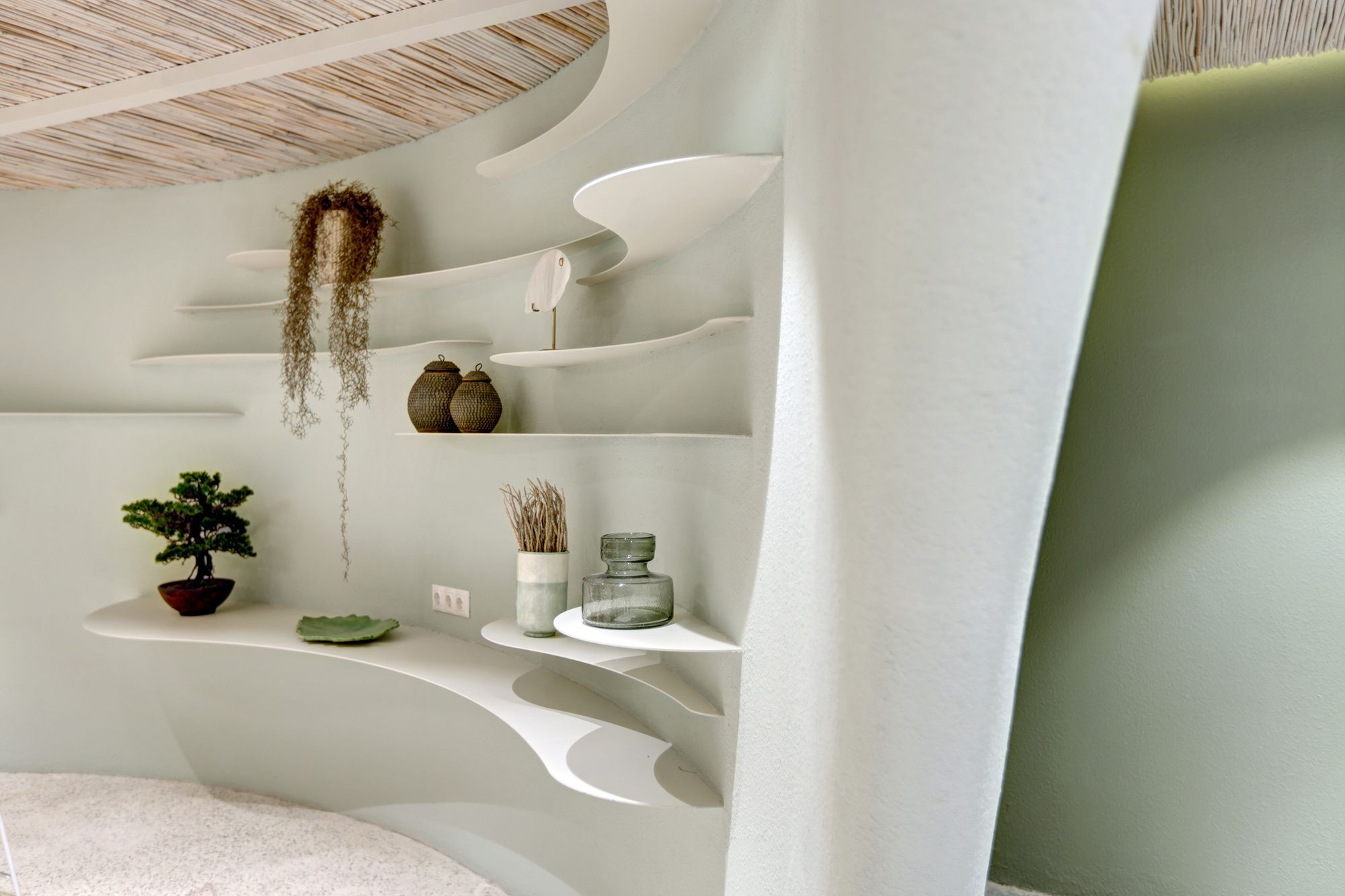
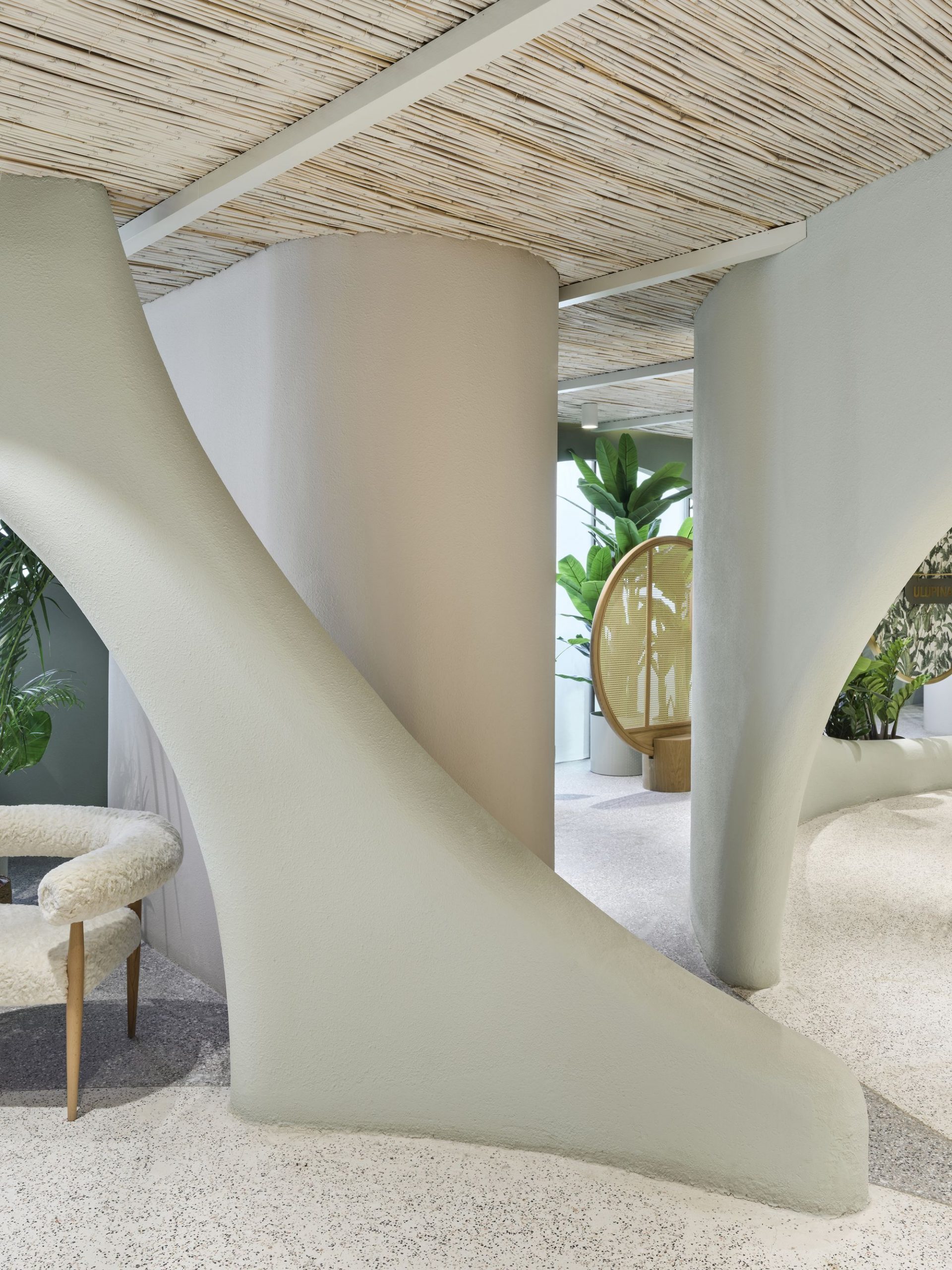
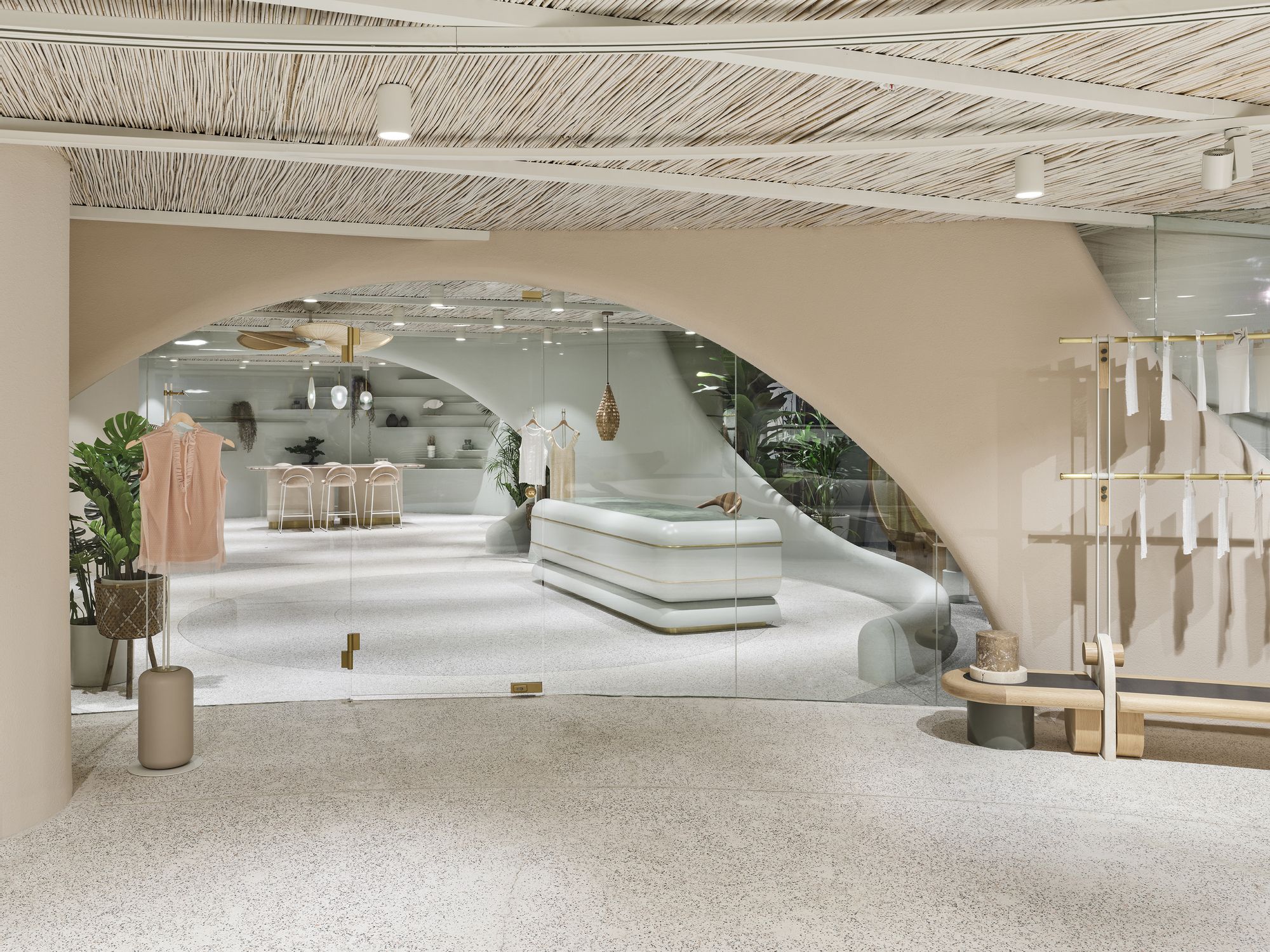
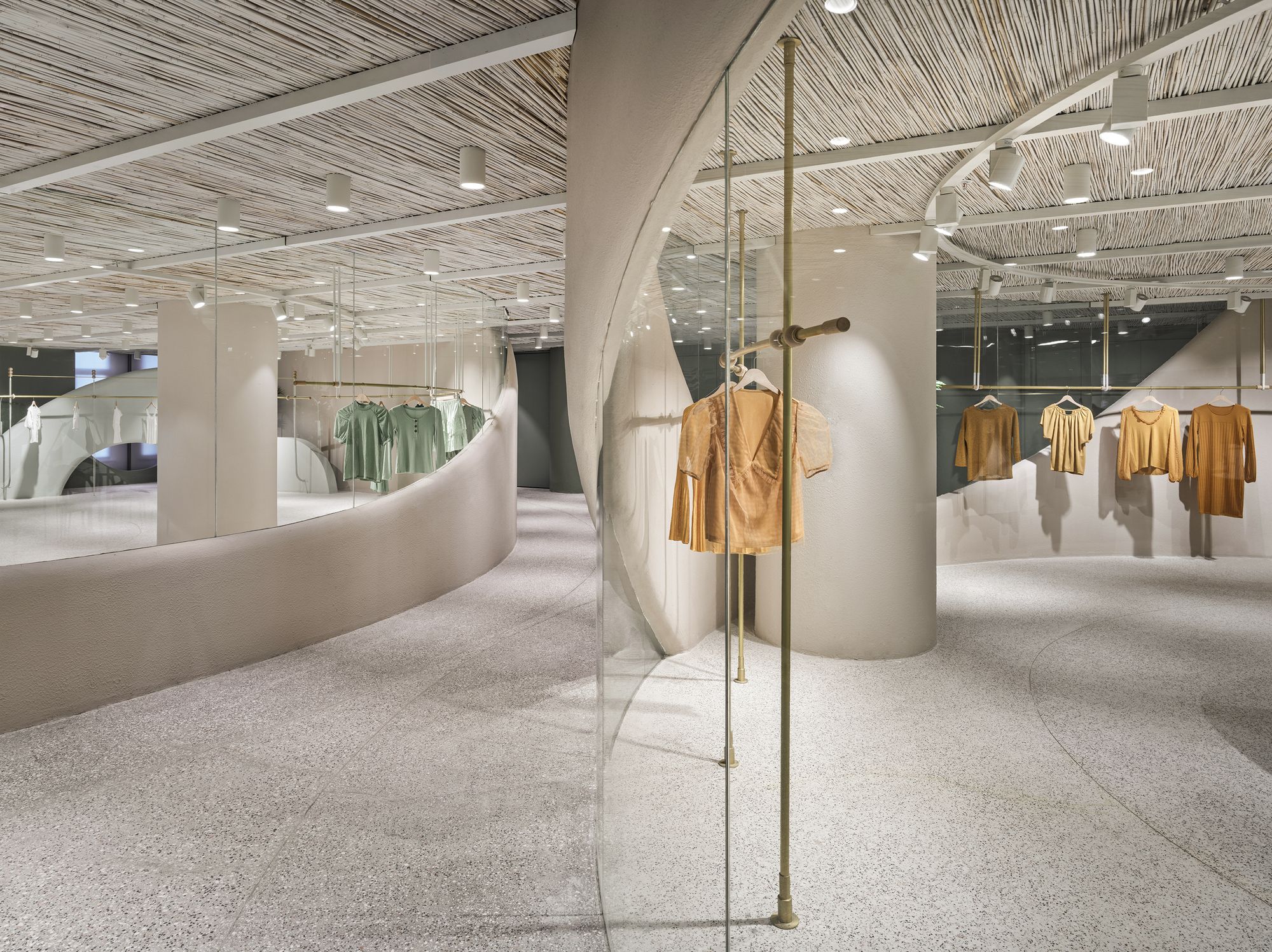
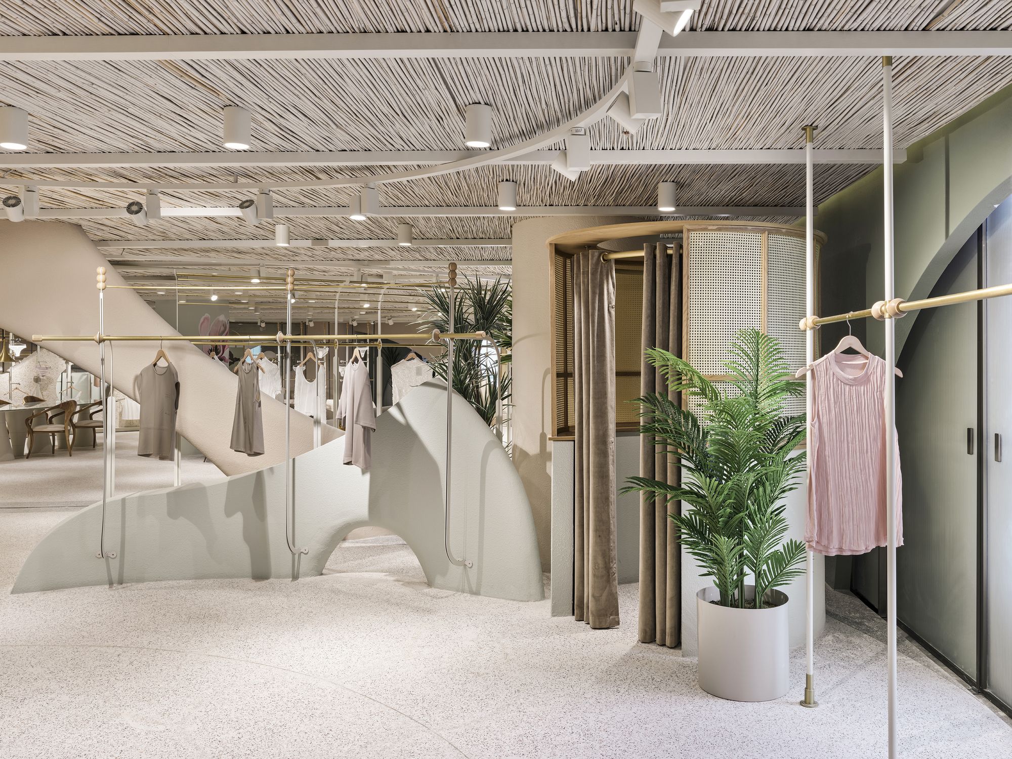
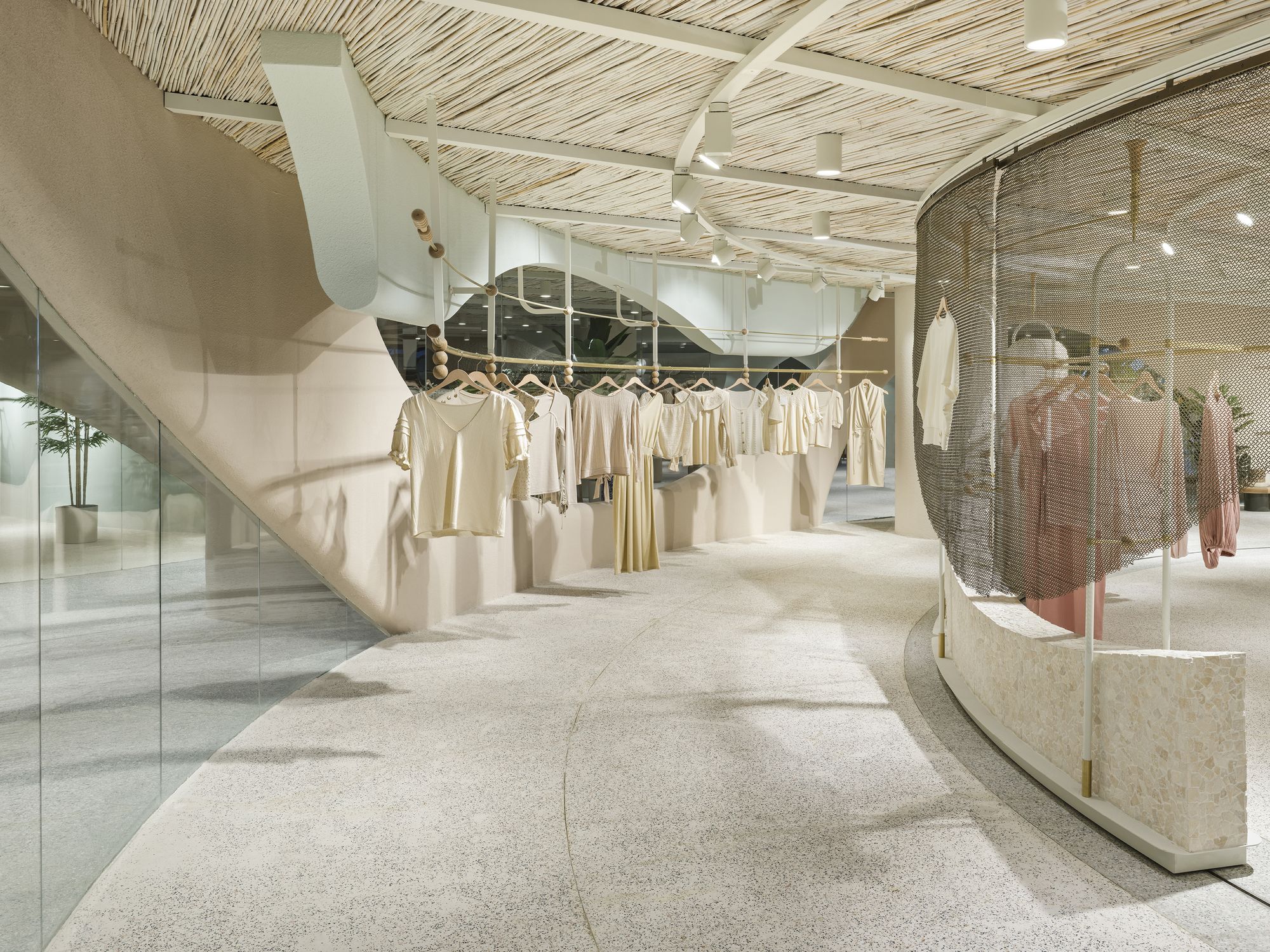
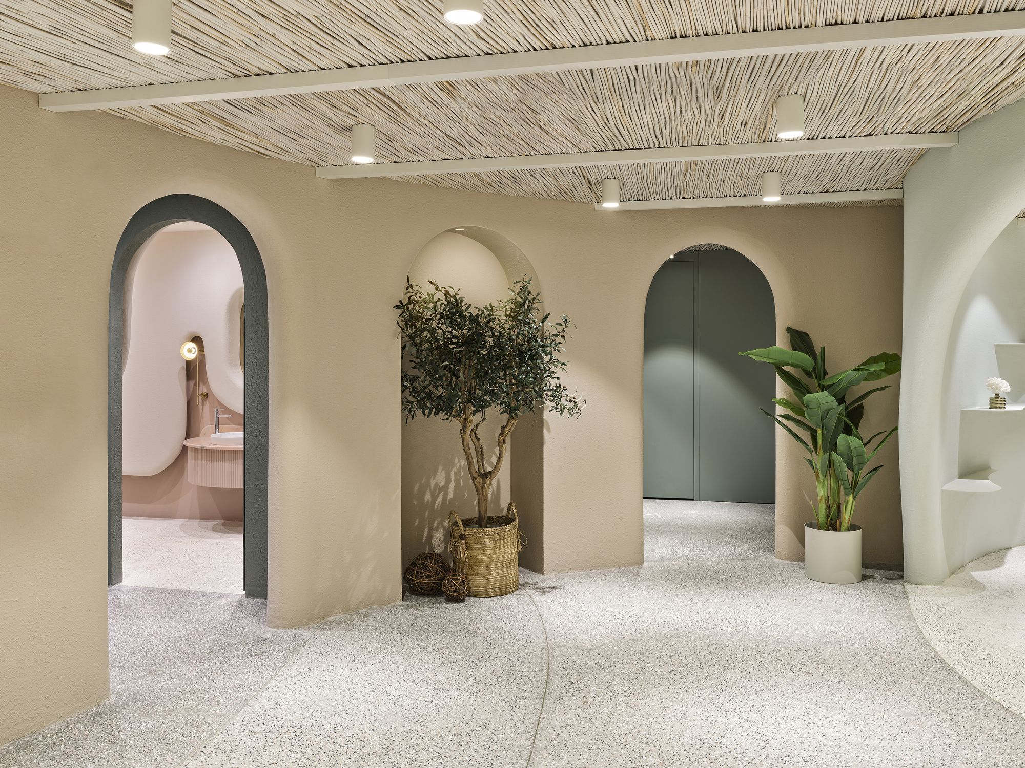
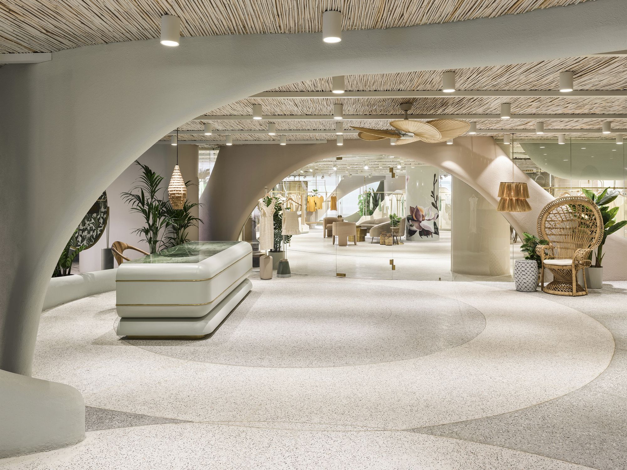
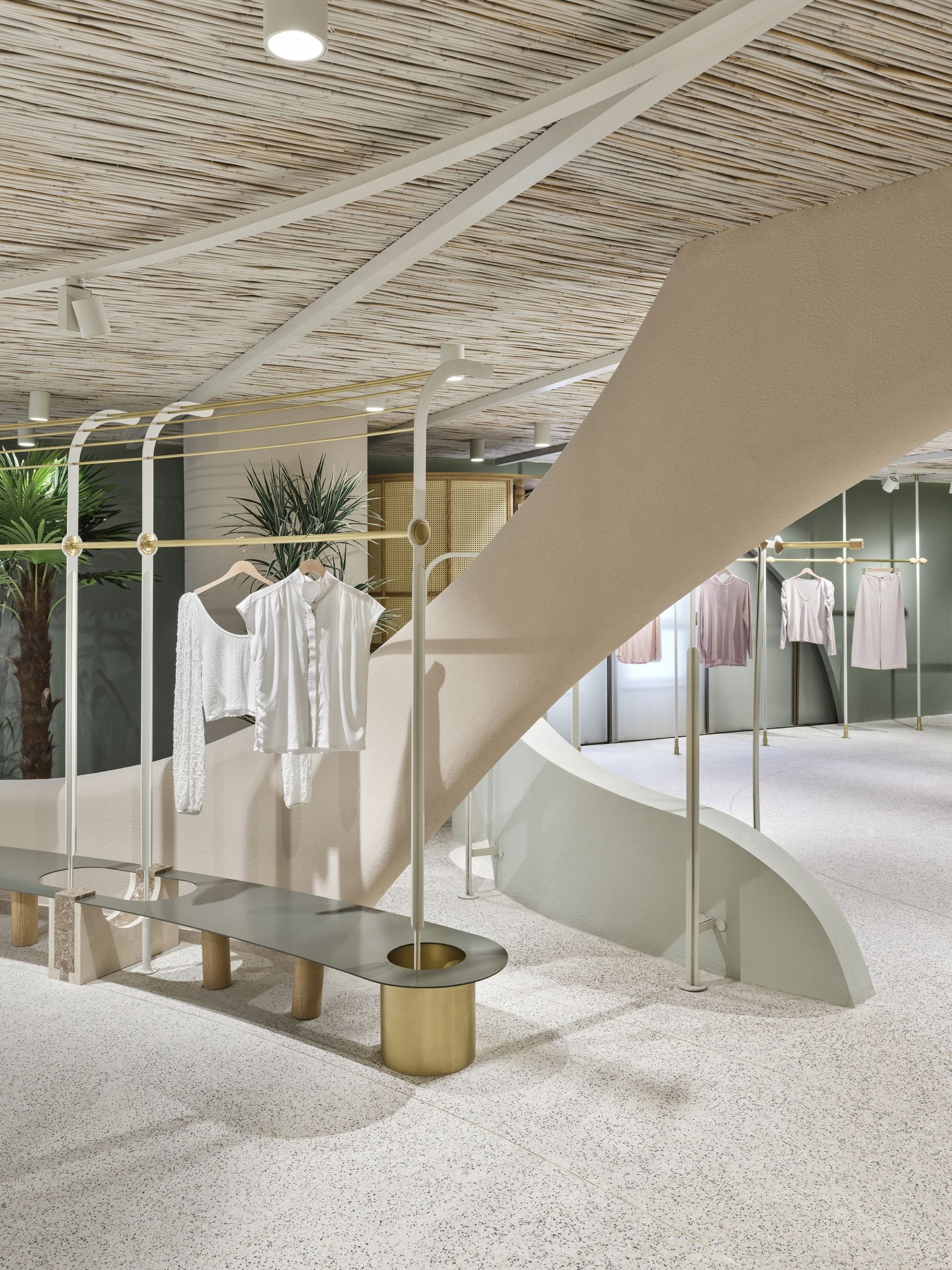
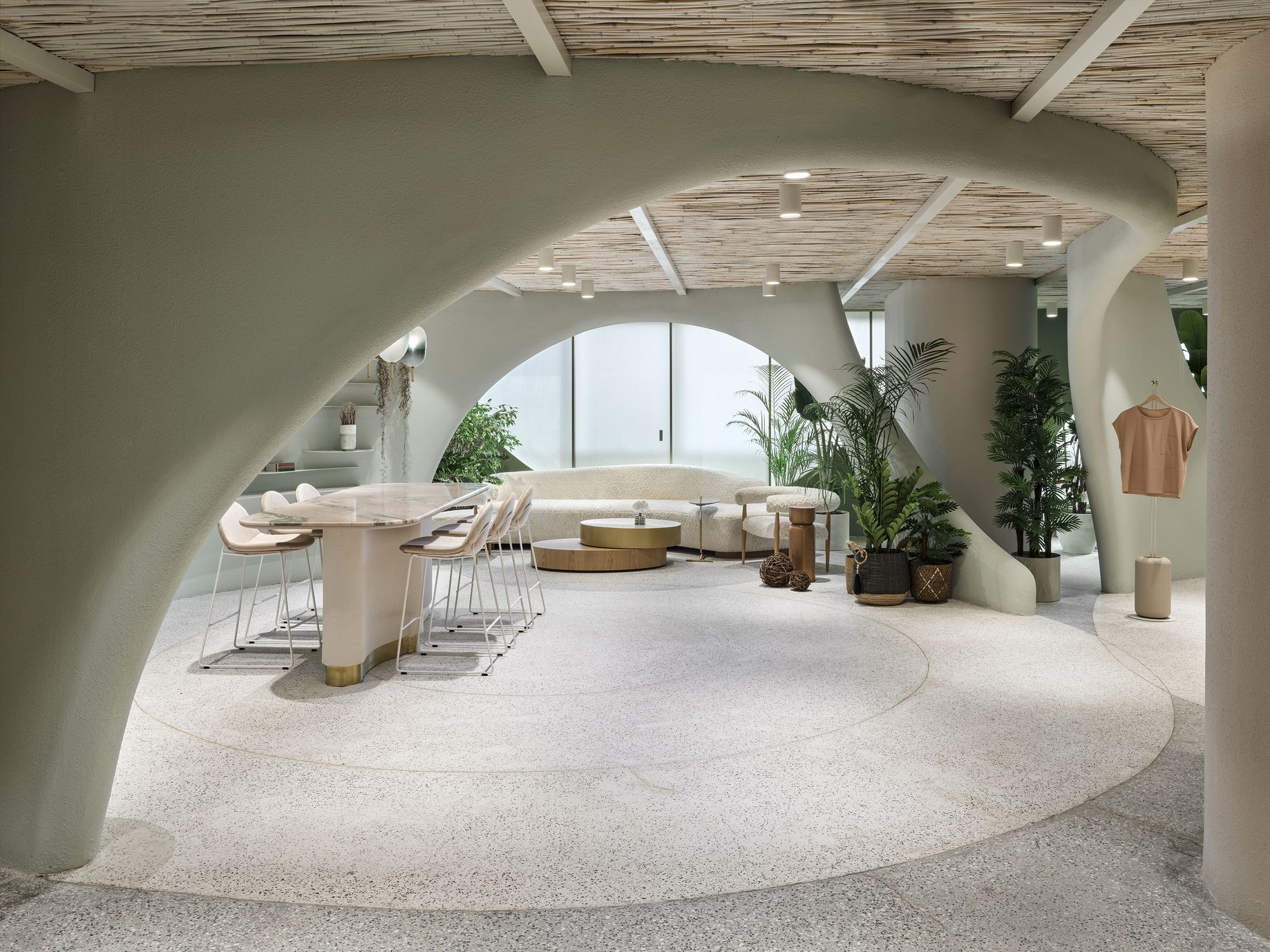
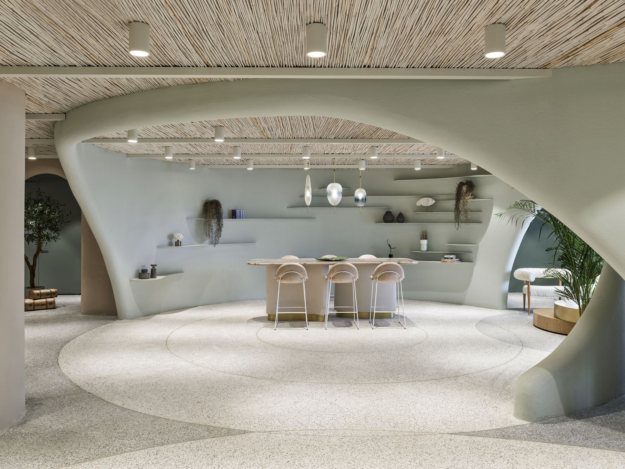
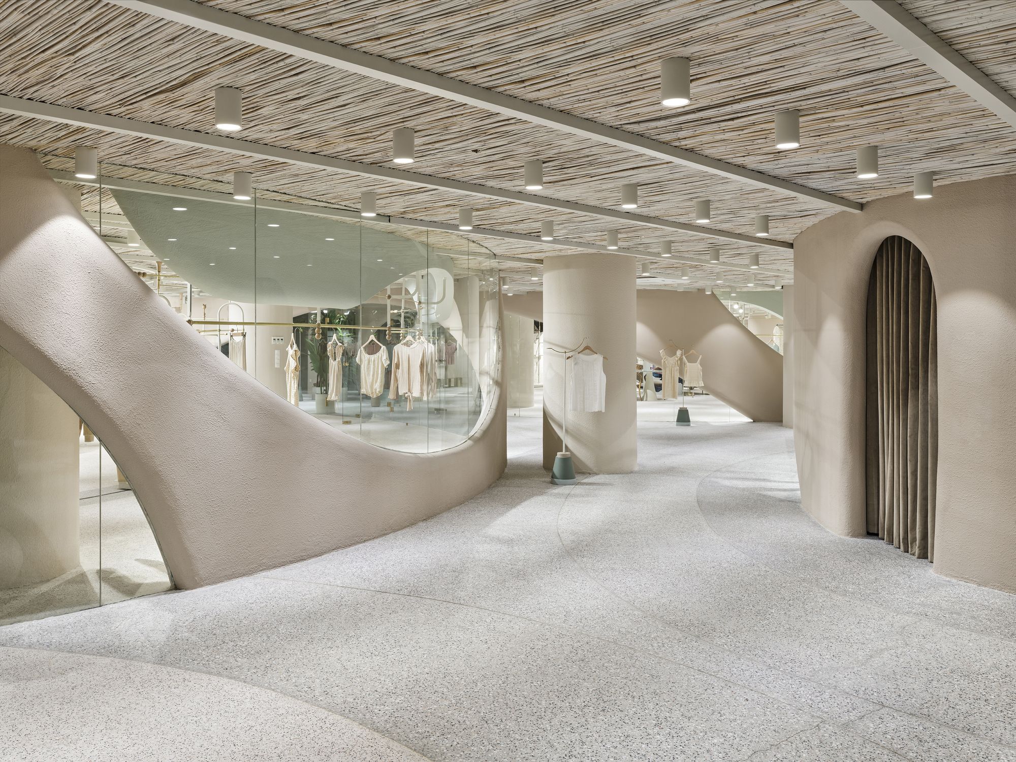
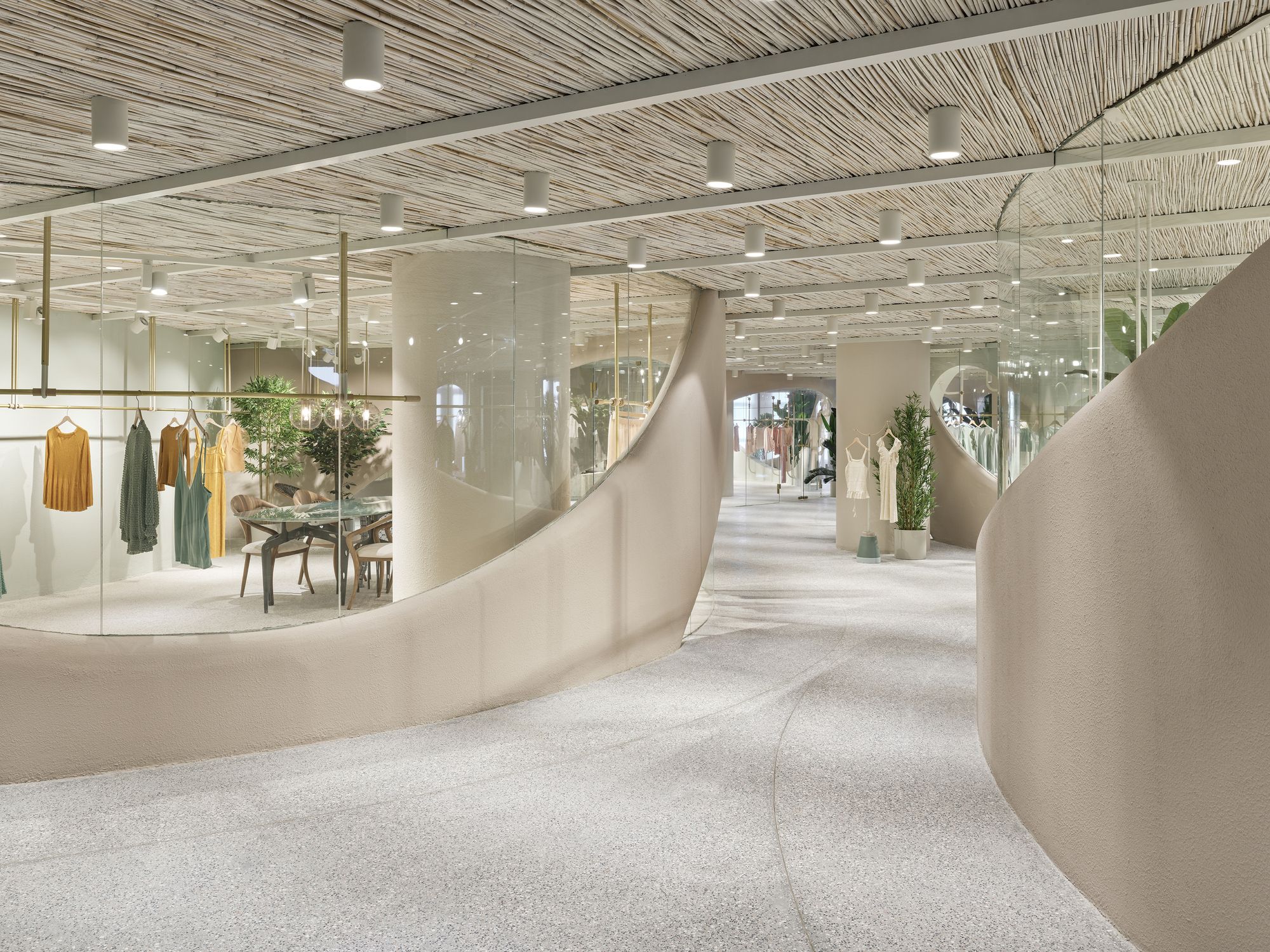
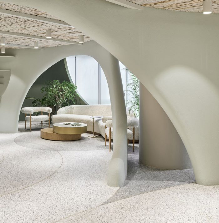
One of the important design criteria was, to procure the feeling of “serenity” inside in every phase of the visitor experience, in contrast to the dense city pattern that the building appertains outside. At the main entrance of the building, a calm and gentle design was preferred, almost as a messenger of the showroom areas. Throughout the building, it was intended to establish a pleasant circulation scenario for the visitors through the curvilinear walls that do not dictate its route but direct it with its natural flow.
Photography by © Ibrahim Ozbunar
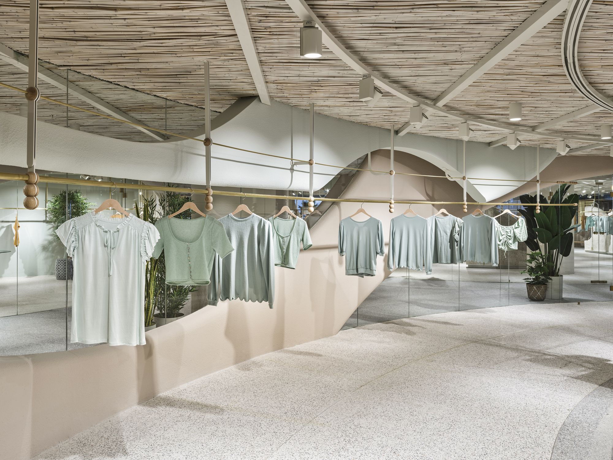
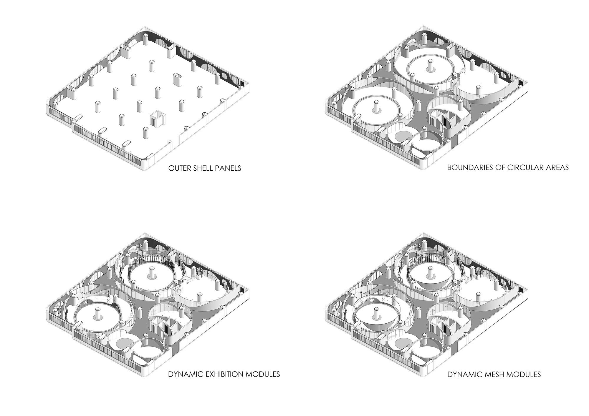
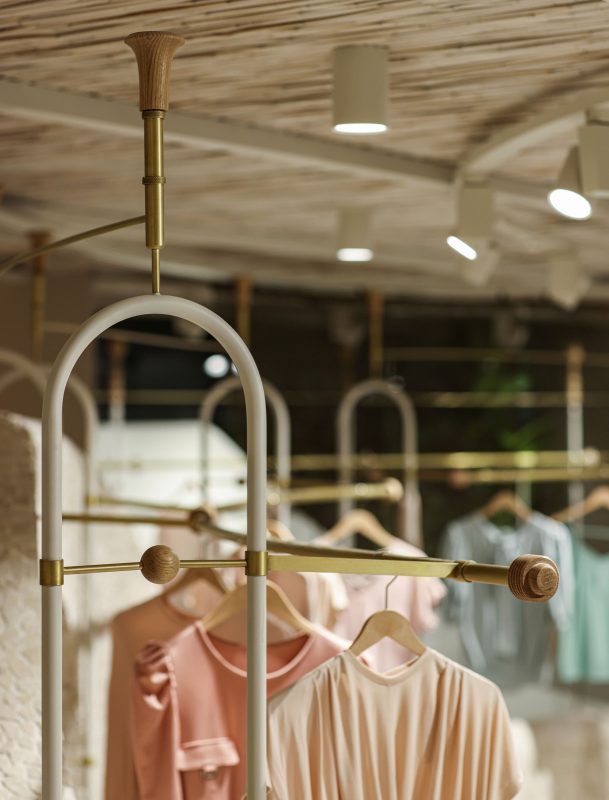
A completely introverted experience set up was provided by creating a shell that excludes the surrounding city pattern with light-permeable panels. This introverted setup is also created with preferring organic forms in construction elements and the “fluidity” of the custom-designed movable furniture modules. Furthermore, concepts such as density and complexity were especially kept out of the design process.
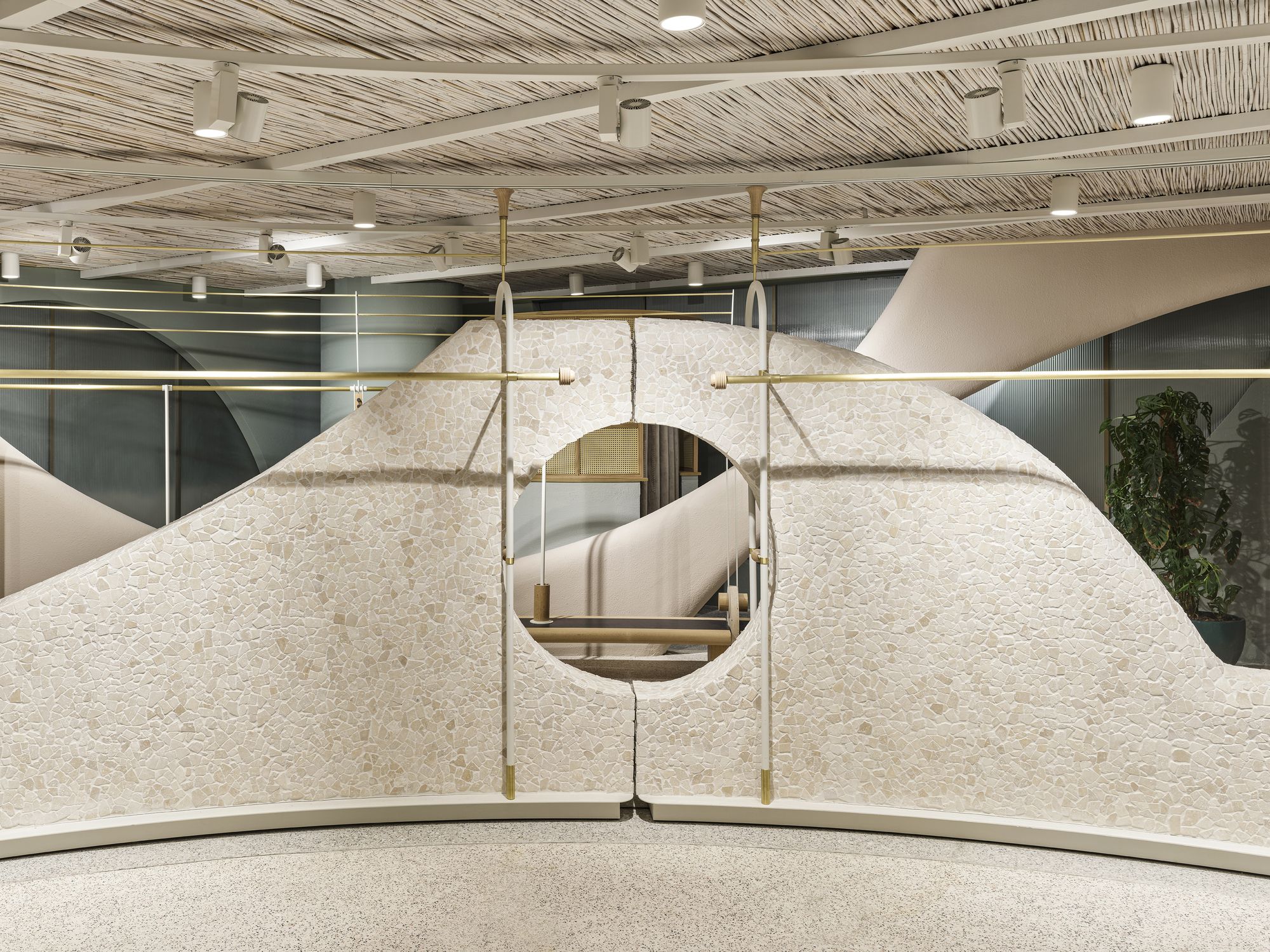
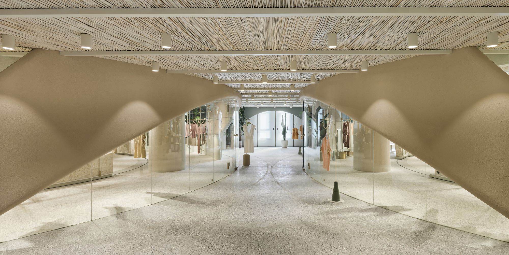
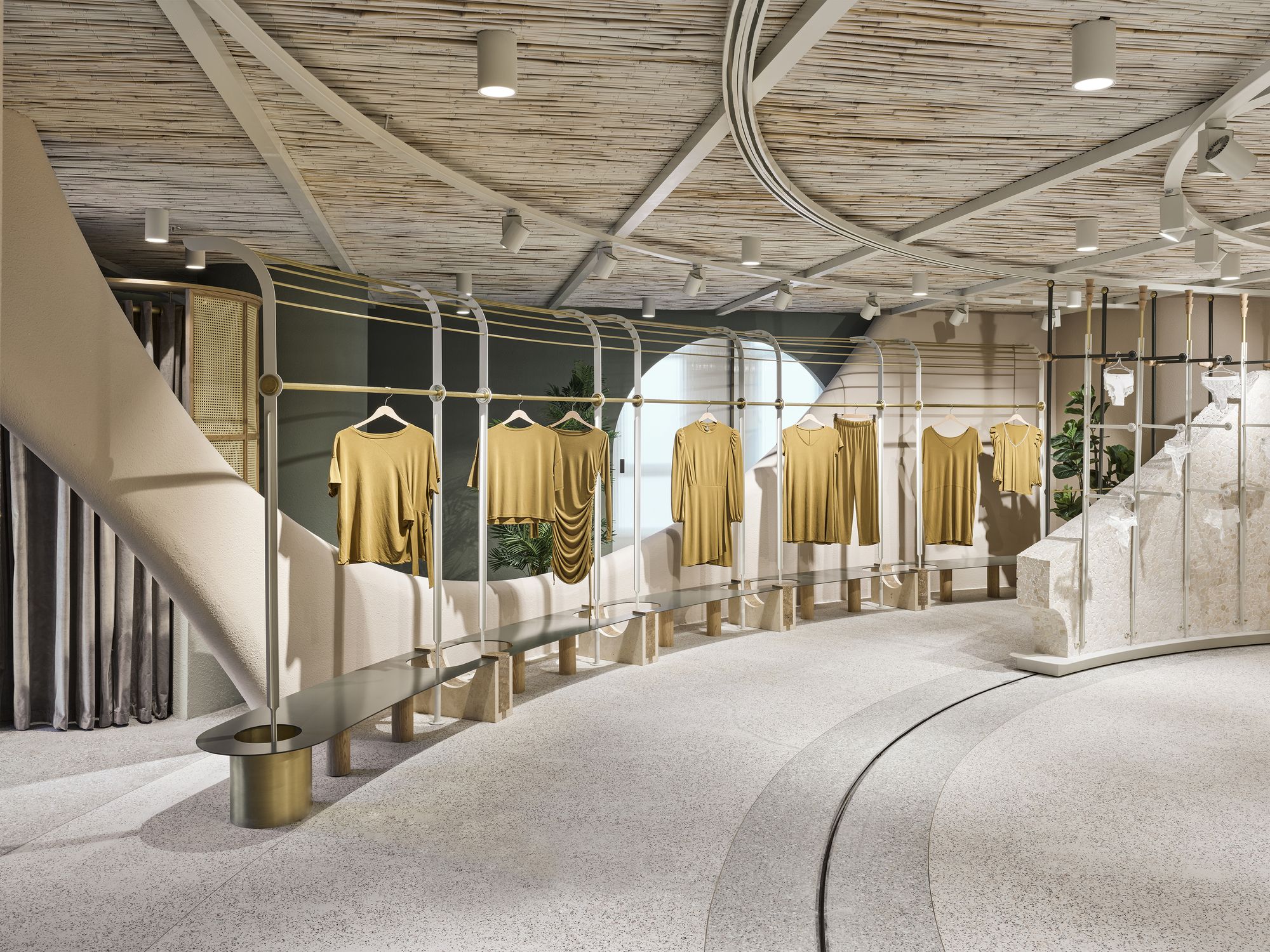
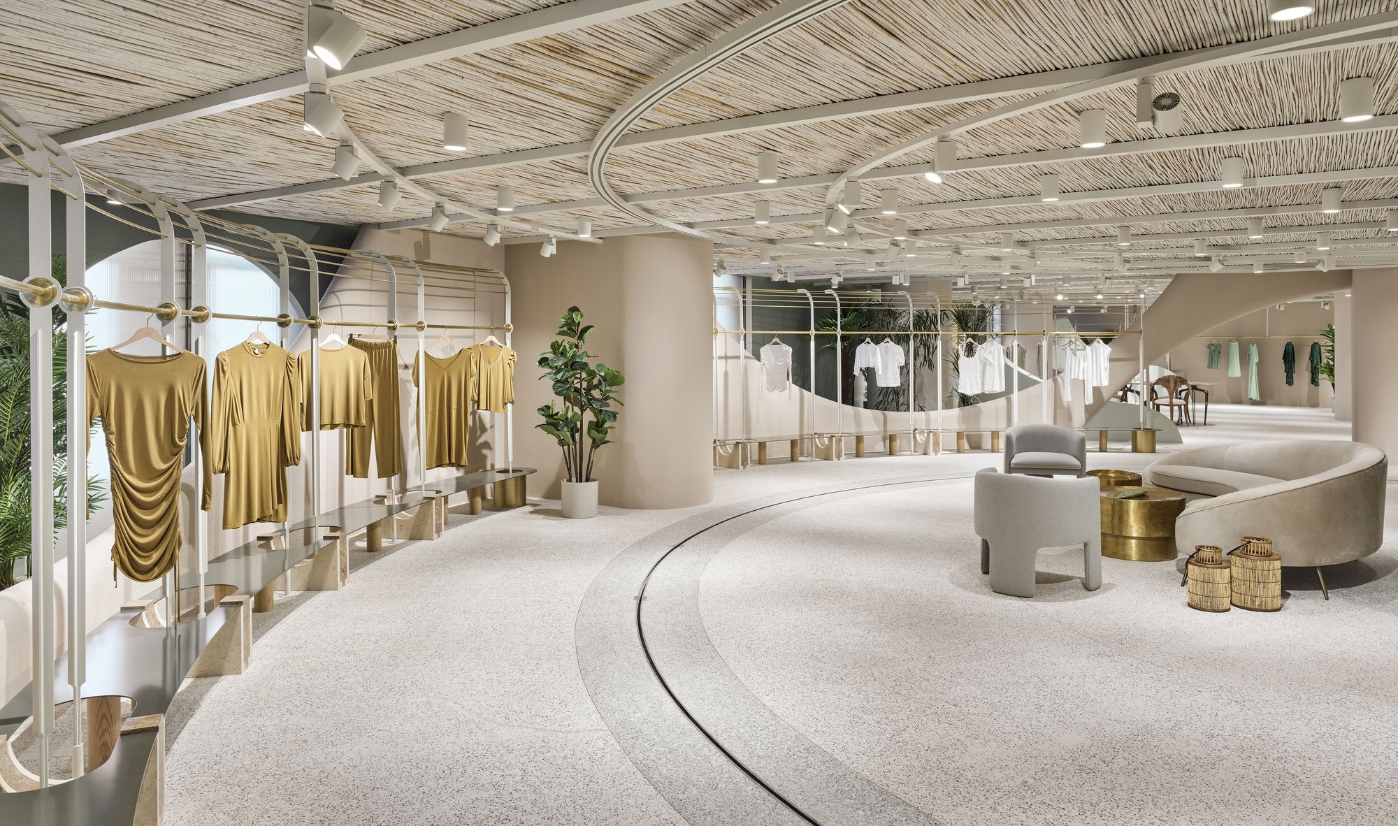
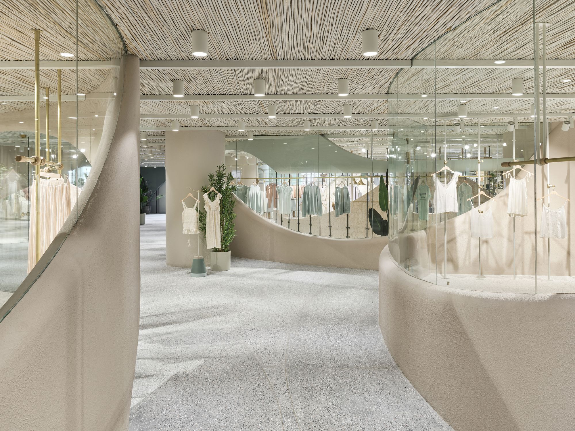
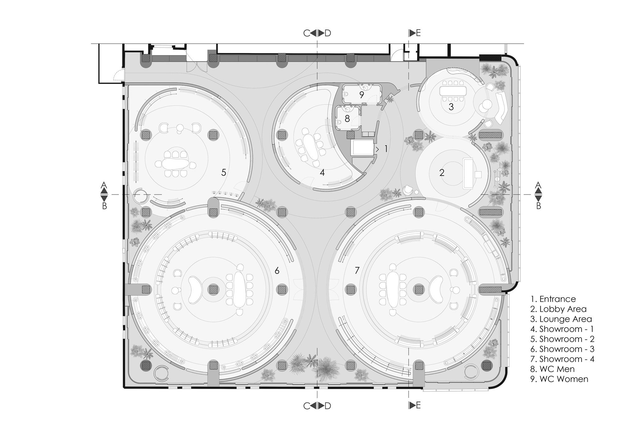
The journey of the users in four main showrooms has been designed as a holistic and as well as partitioned flow. While these sections are separated from each other by circular plans that are defined in different sizes according to product varieties and quantity, the boundaries of the circular areas are connected to each other by walls that rise and fall in harmony with curvilinear lines completed with transparent surfaces.
Photography by © Ibrahim Ozbunar
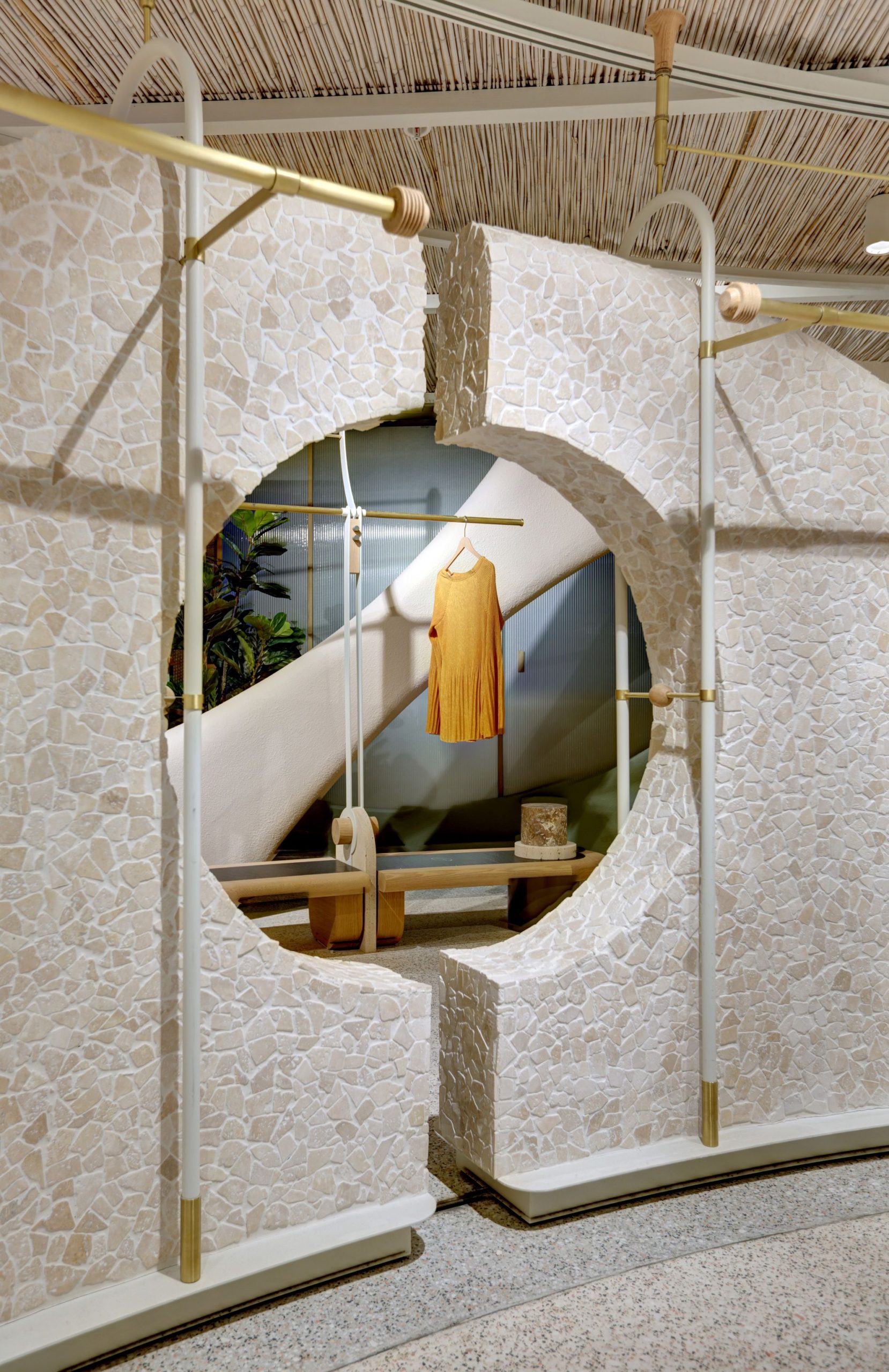
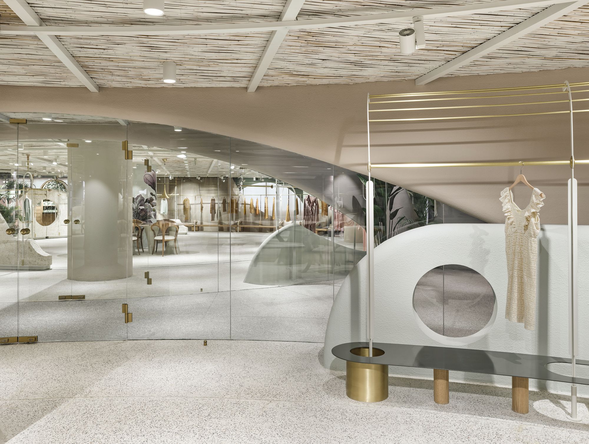
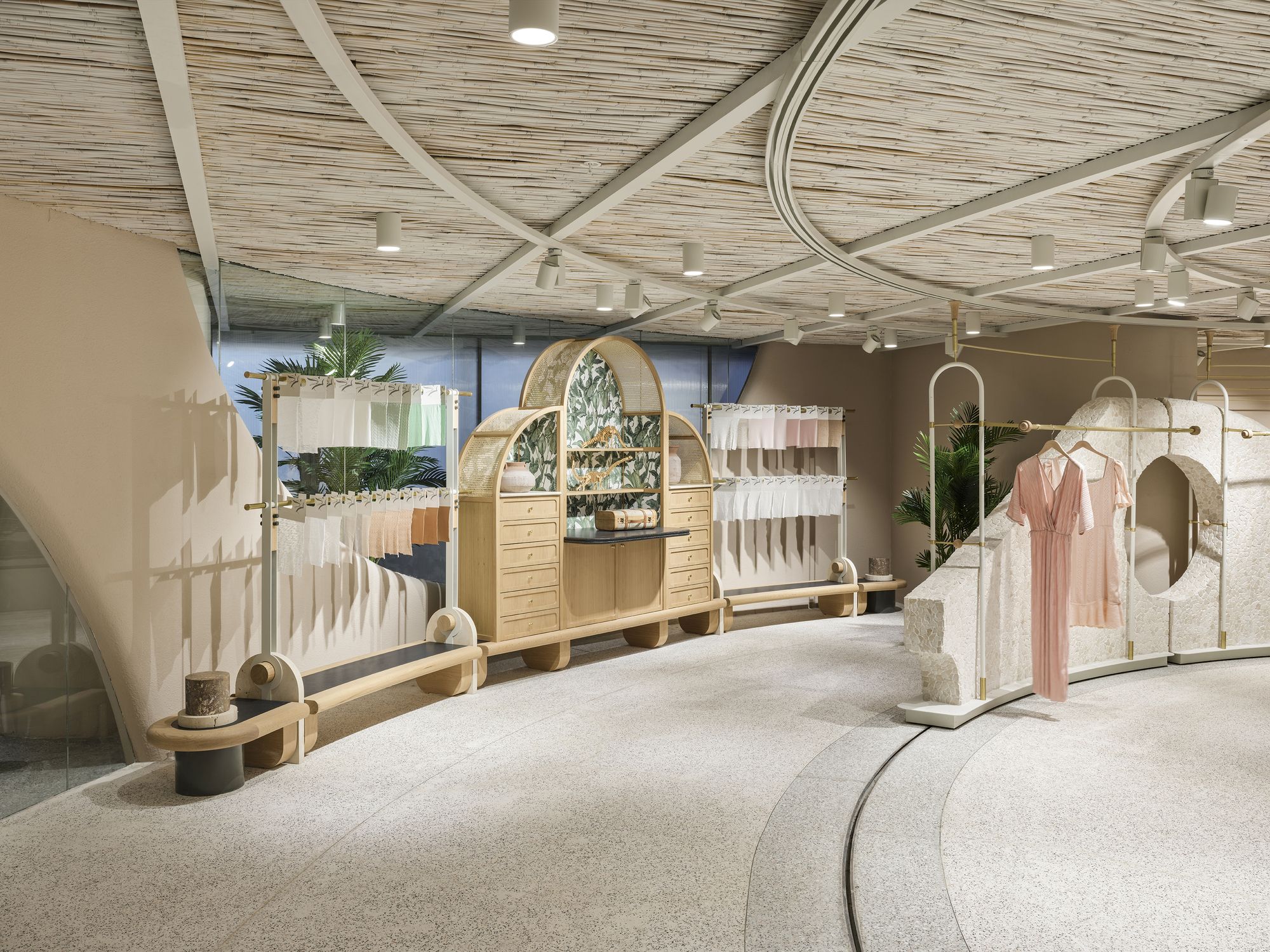
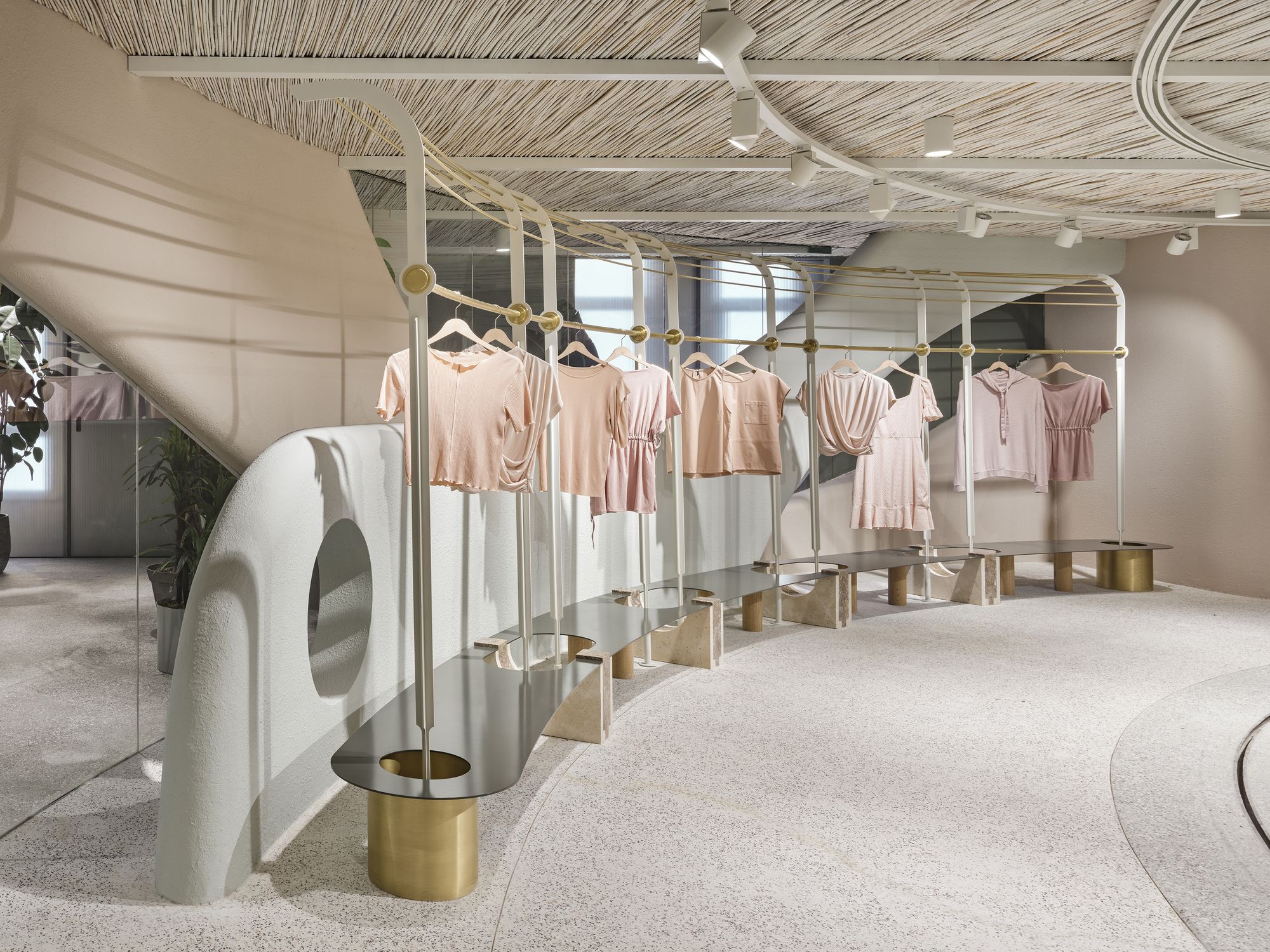
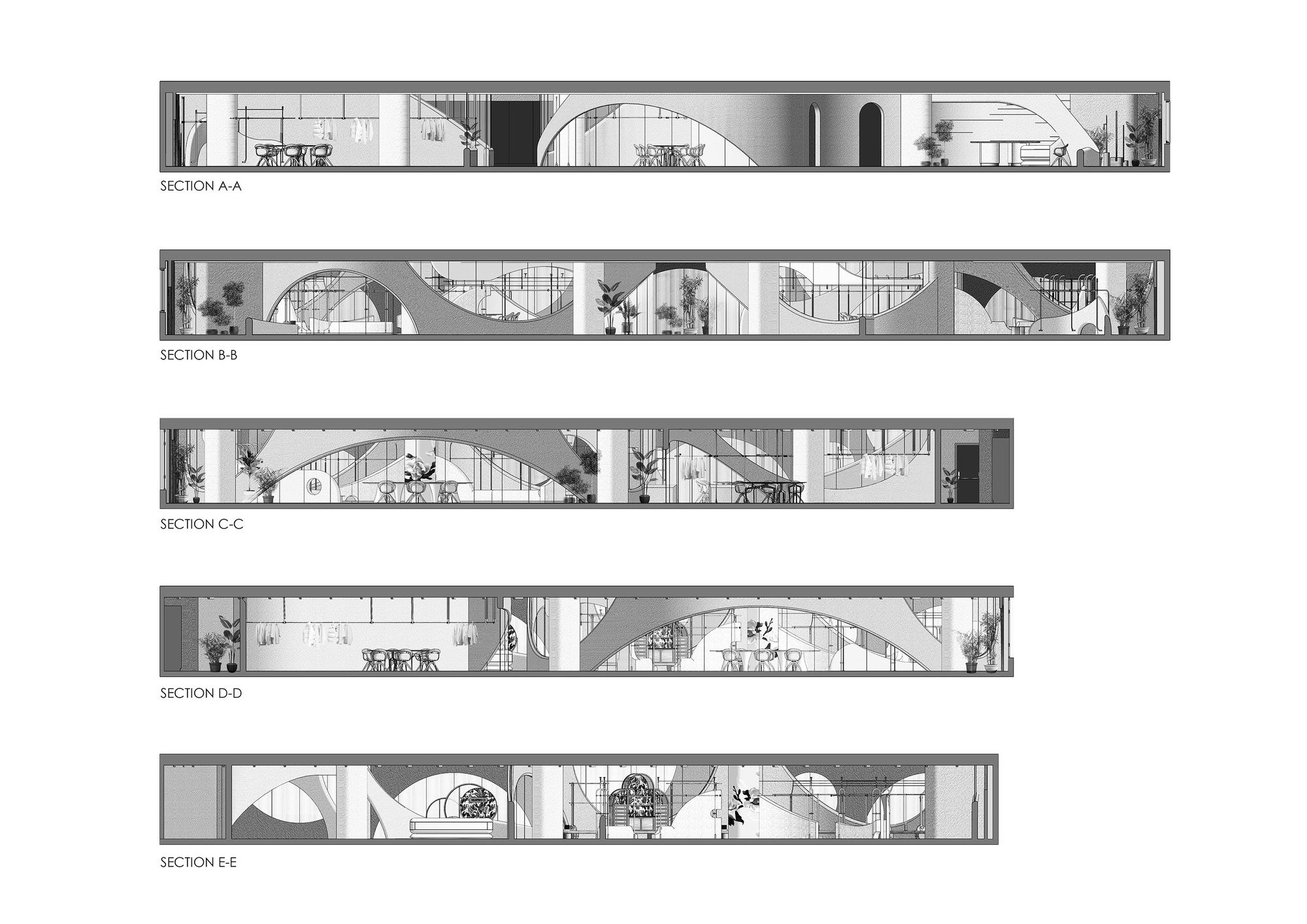
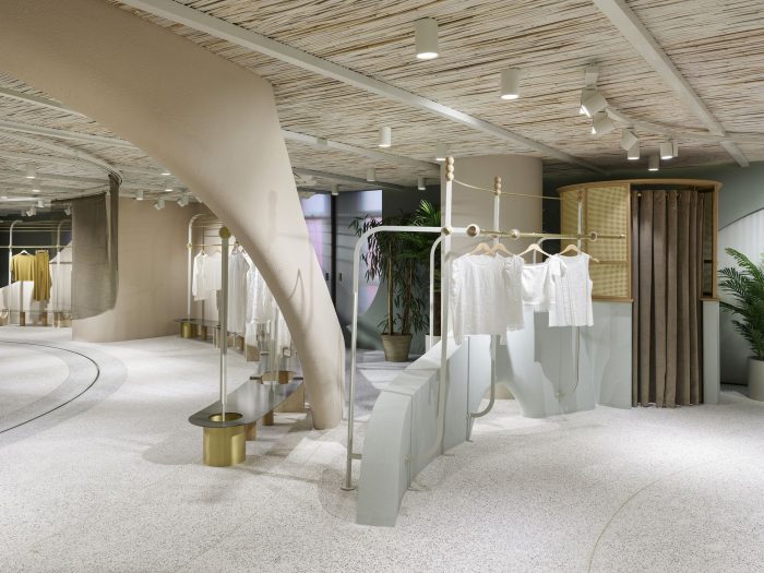
Main showrooms are designed with interlocking double layered circular schemes that keep the visitor in the center. The outer layer is created with fixed structural elements and exhibition elements integrated into them and the inner layer is defined by exhibition modules moving on a circular track on the floor. The intertwined connection formed by the circular layers with each other and with the outer shell enables coincidental perspectives.
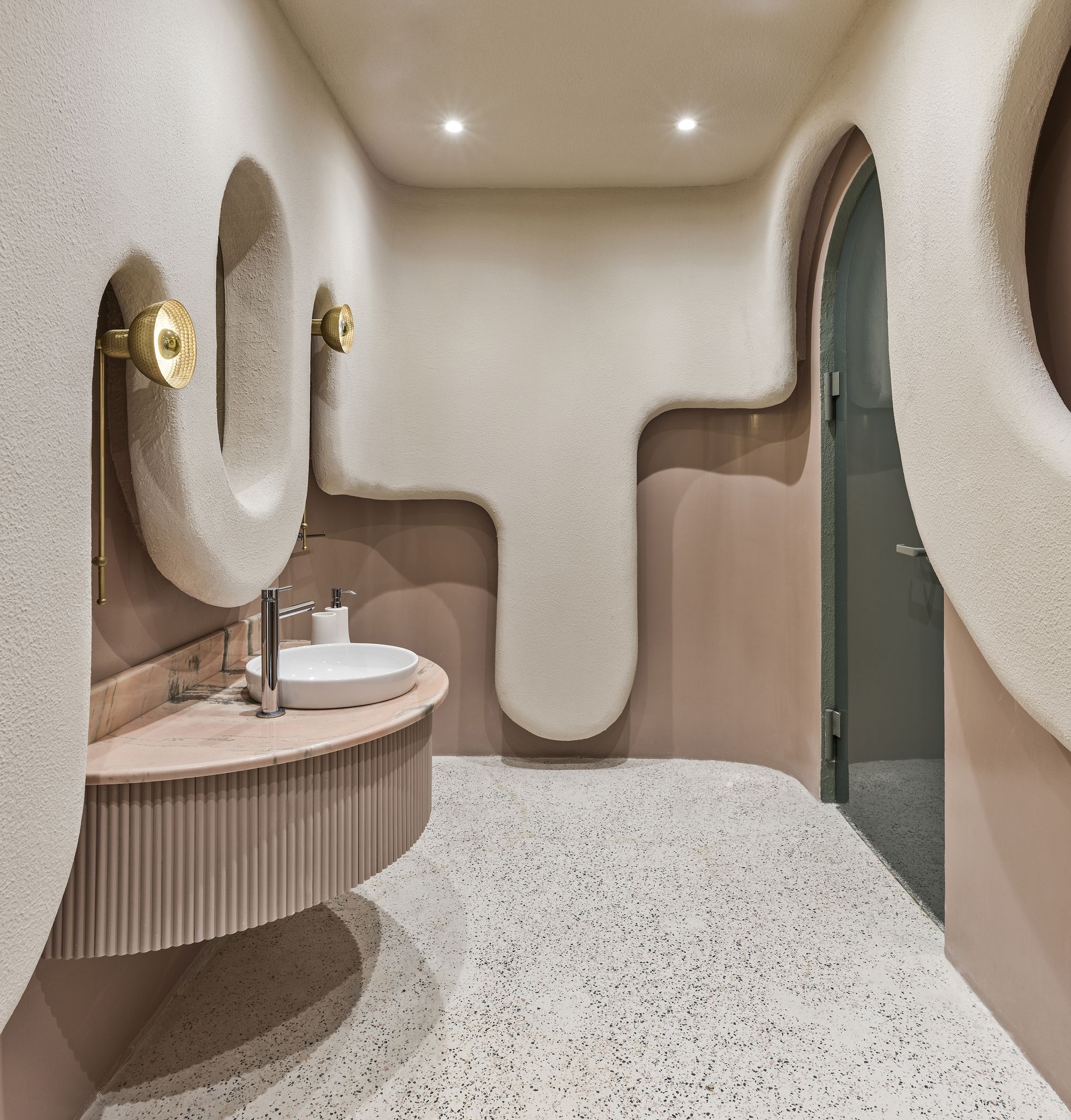
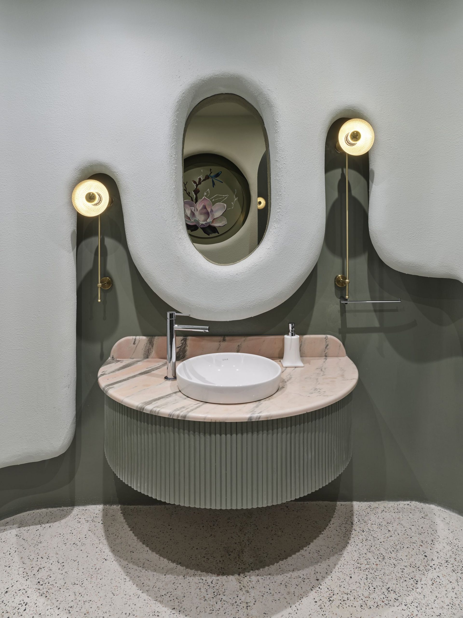
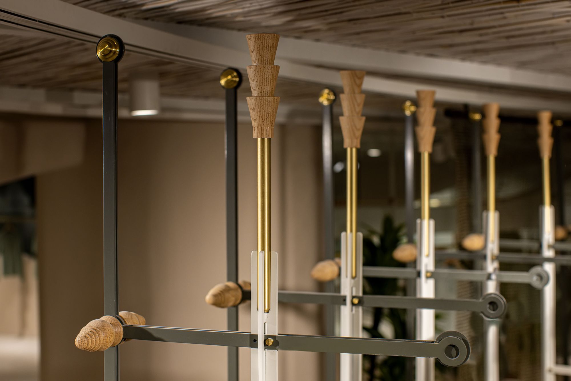
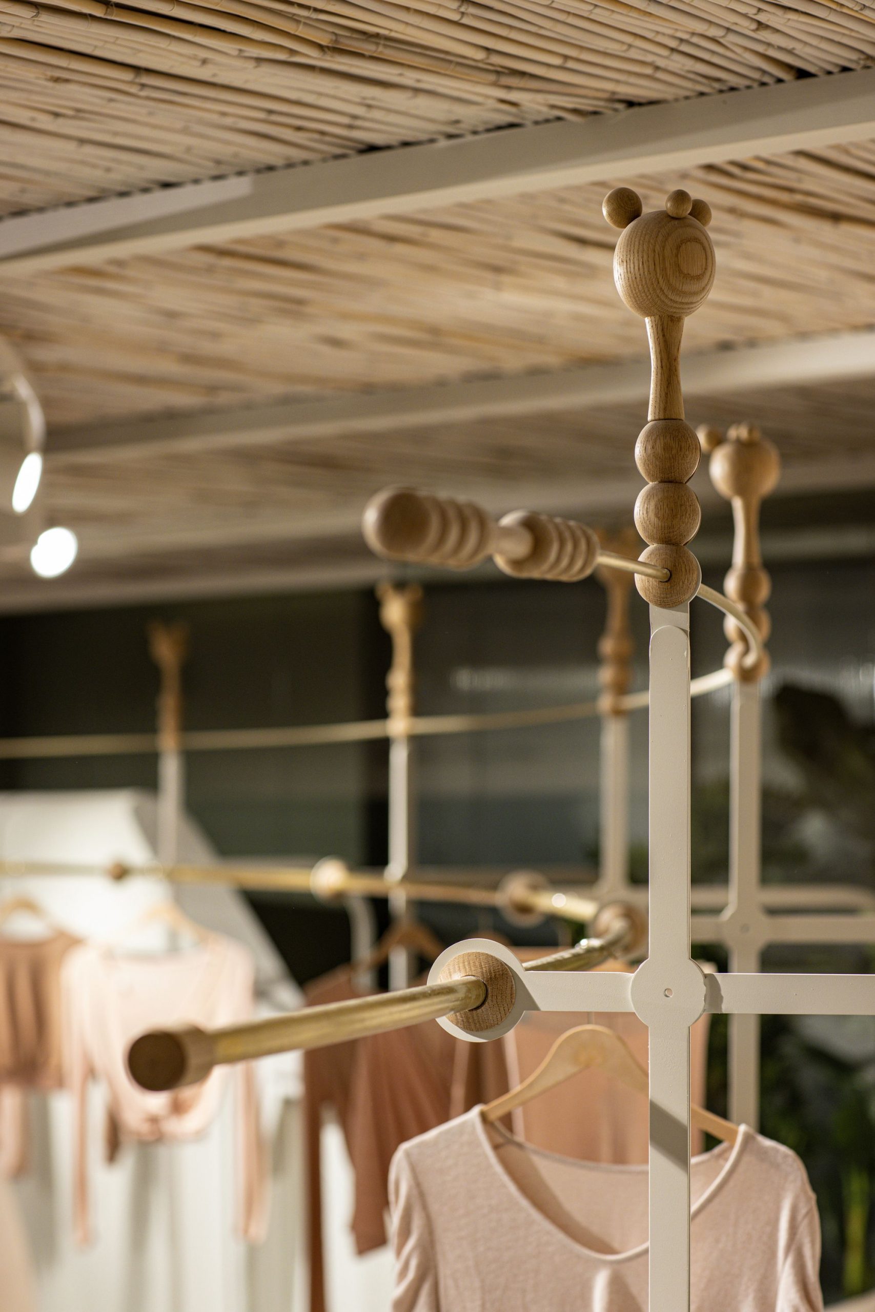
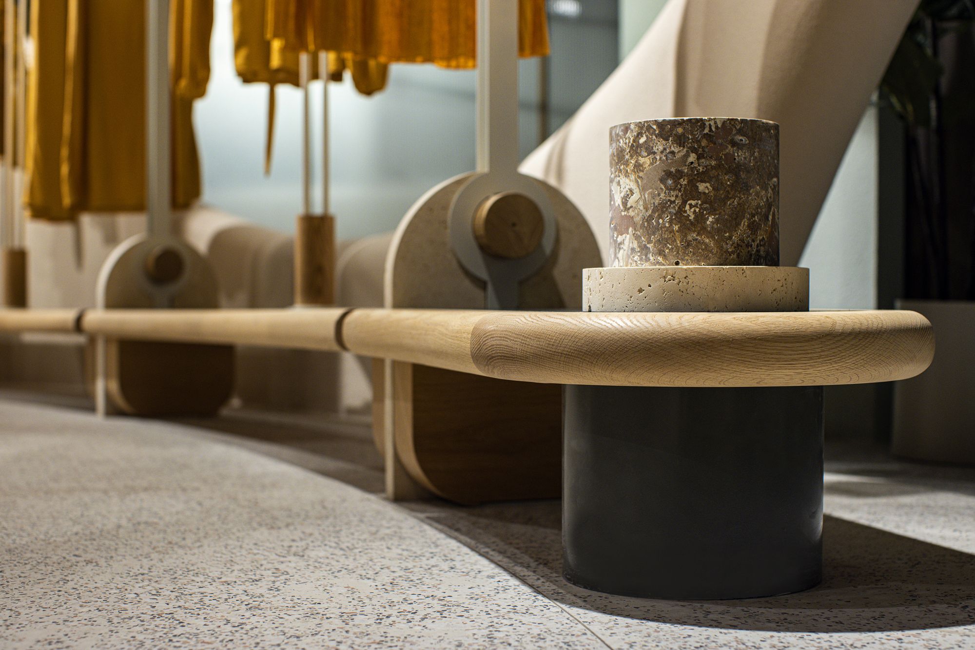
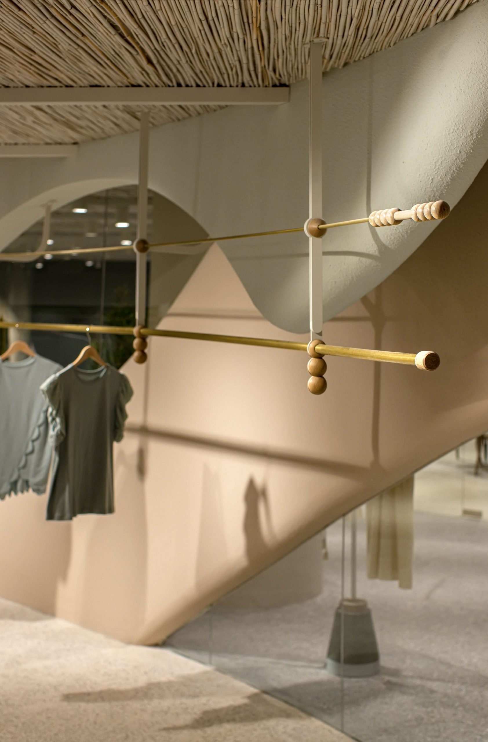
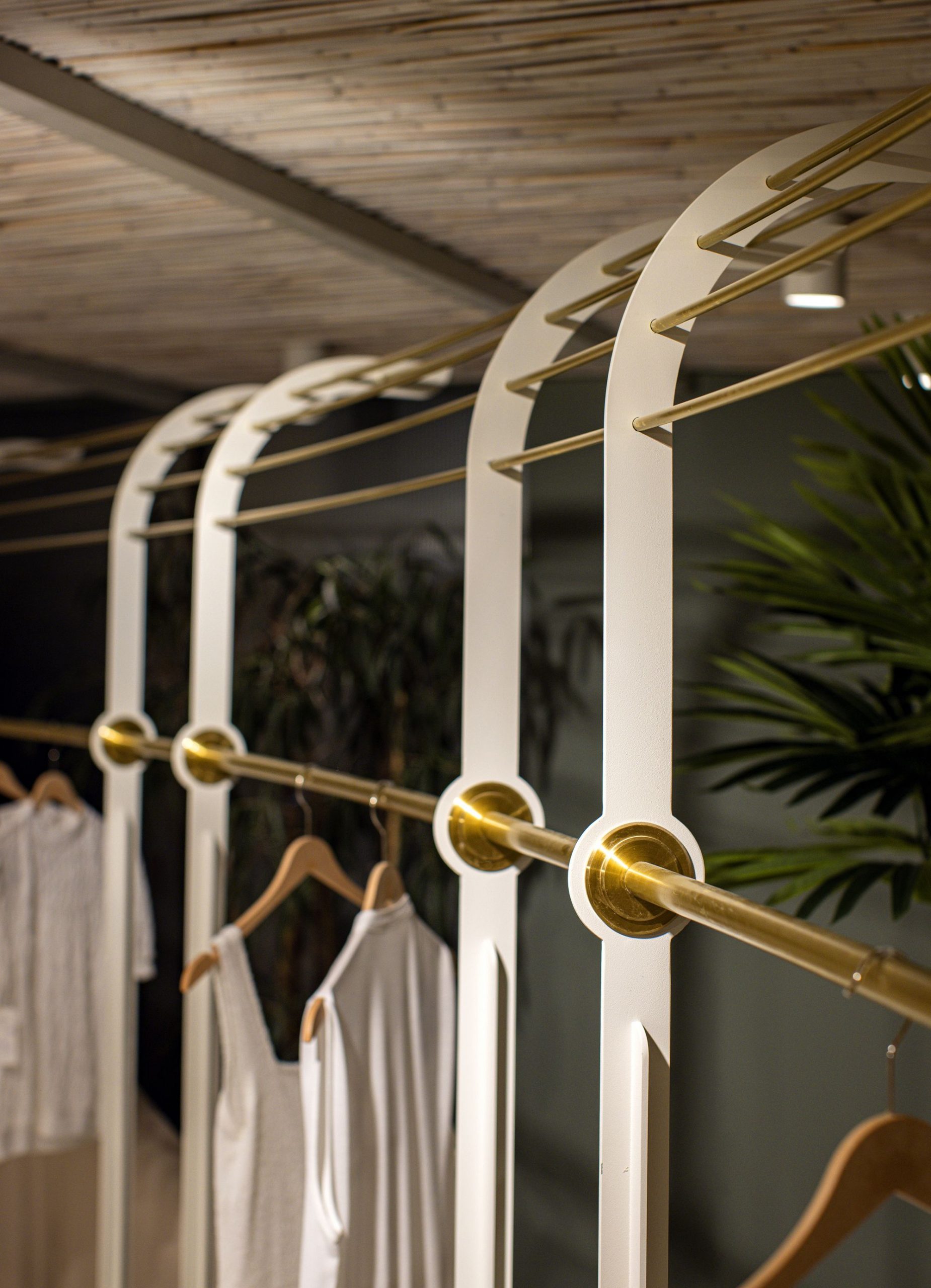
The design language and material decisions are developed to reflect the plain and elegant language unity felt in the company’s product range. Integrity has been achieved with “simplicity” which is one of the principles of the company and the concept of “lightness” of their products, with the curvilinear surfaces that divide the space into sections and the neutral tones selected in the color palette. Handcrafted custom details designed and the materials such as brass, marble, and wood are chosen for exhibition modules diversified as a symbol of the richness and care of the products that are on display.
Photography by © Ibrahim Ozbunar
Project Info:
Architects: Zemberek Design
Location: İstanbul, Turkey
Area: 1070 m²
Project Year: 2021
Photographs: Ibrahim Ozbunar
Manufacturers: Jotun
