Utrecht Library
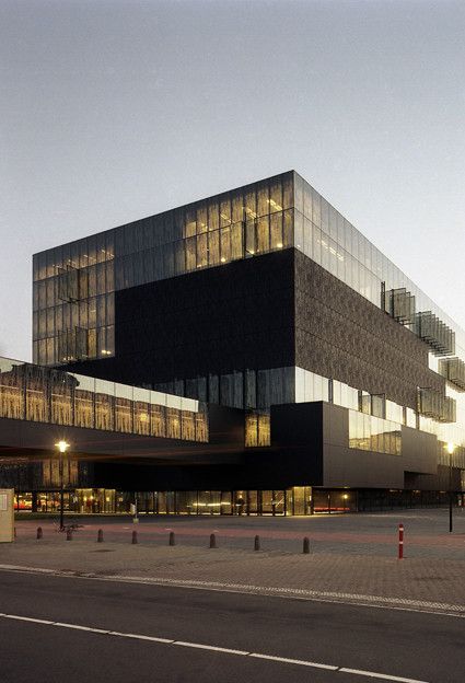
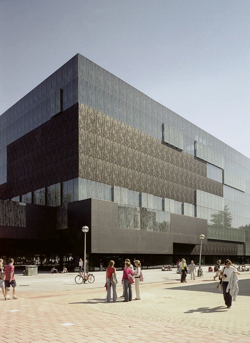
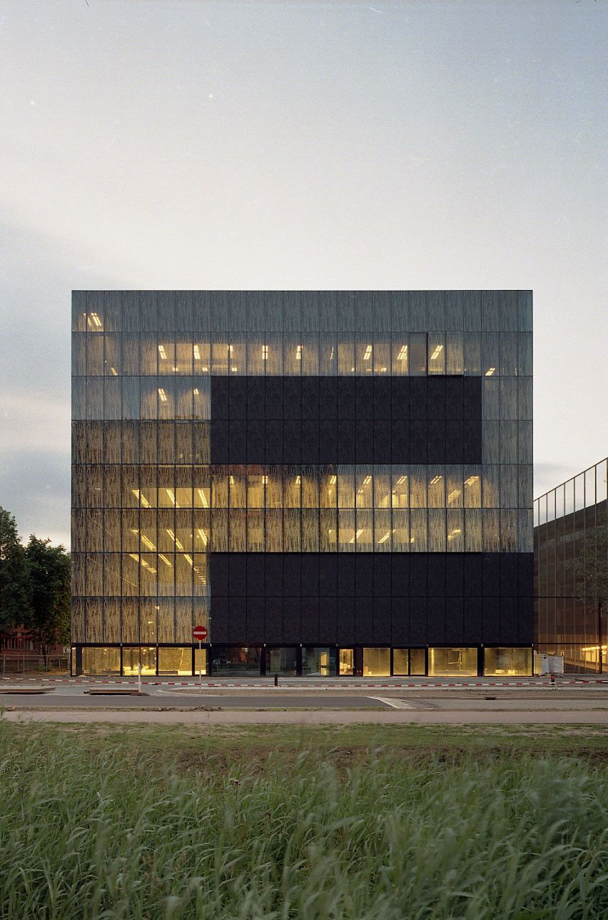
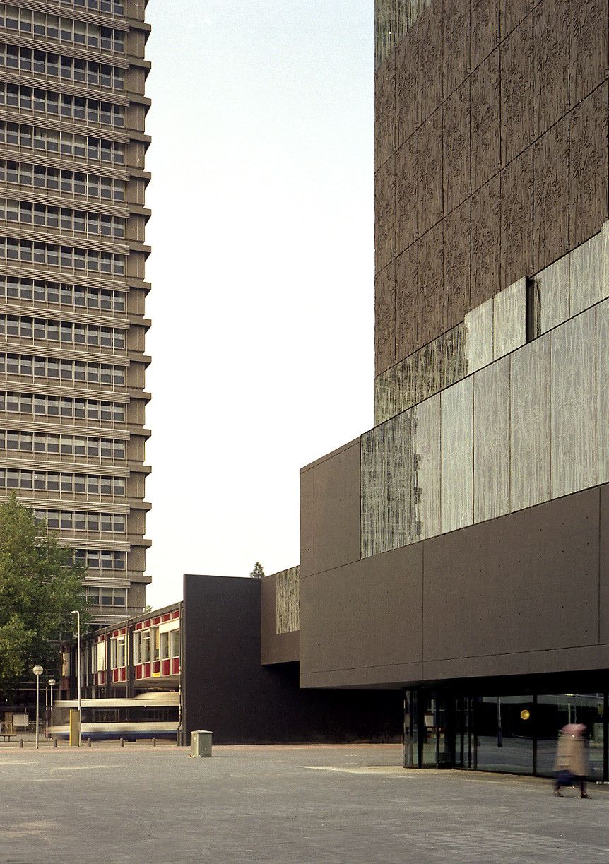
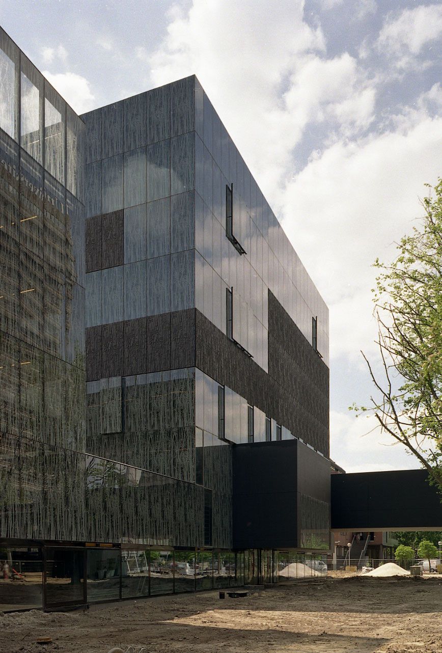
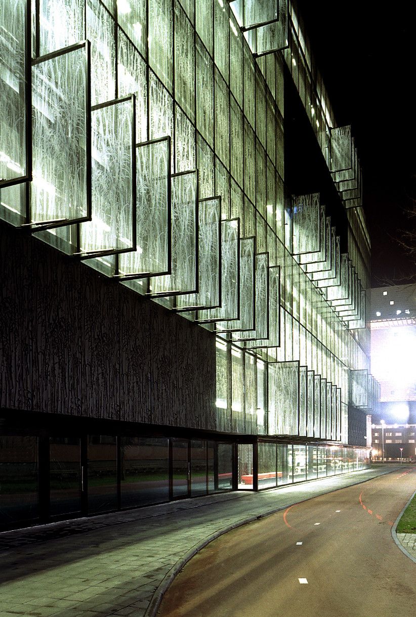
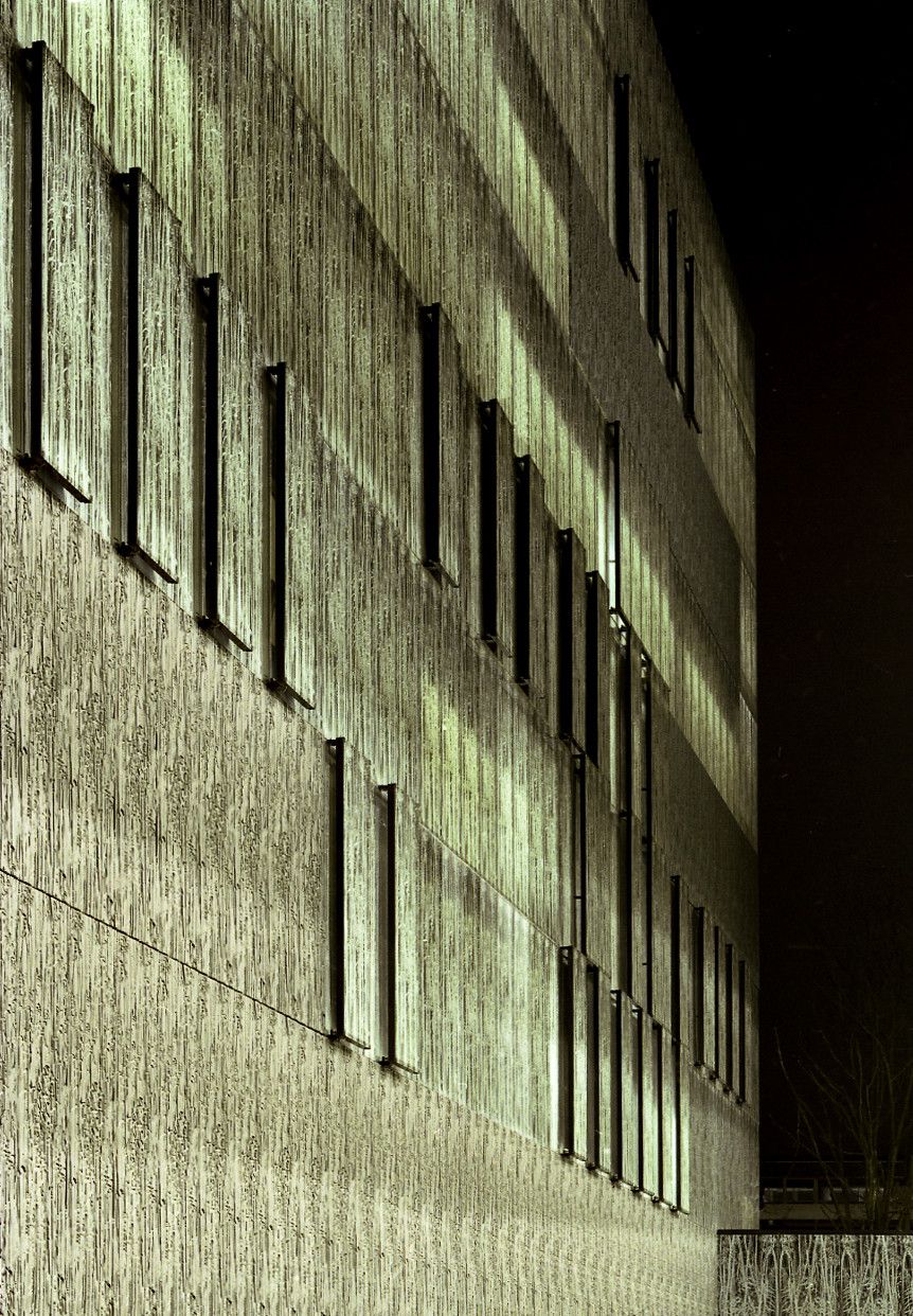
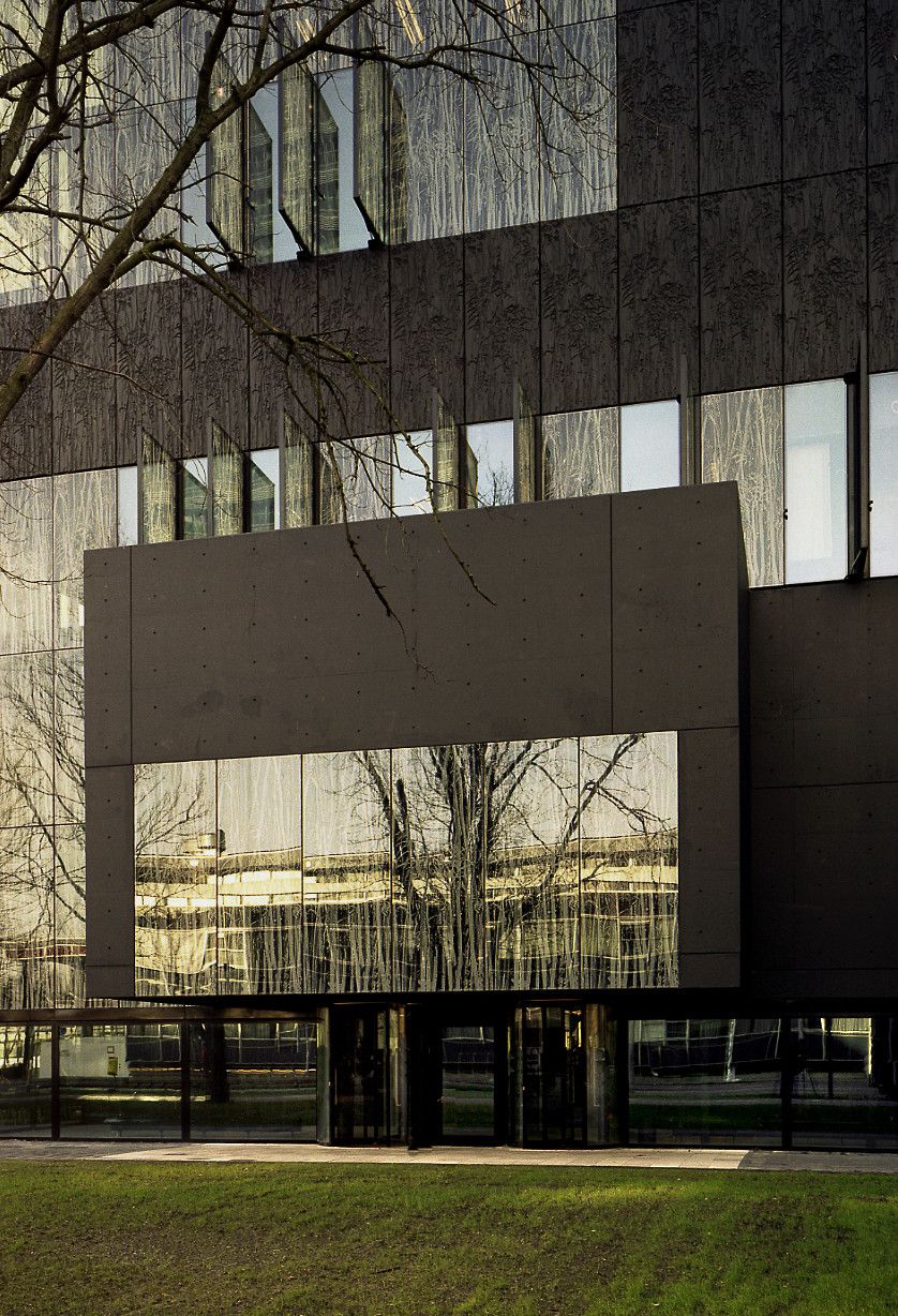
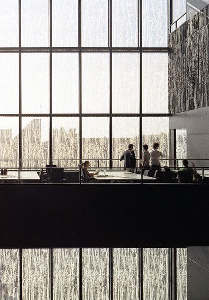
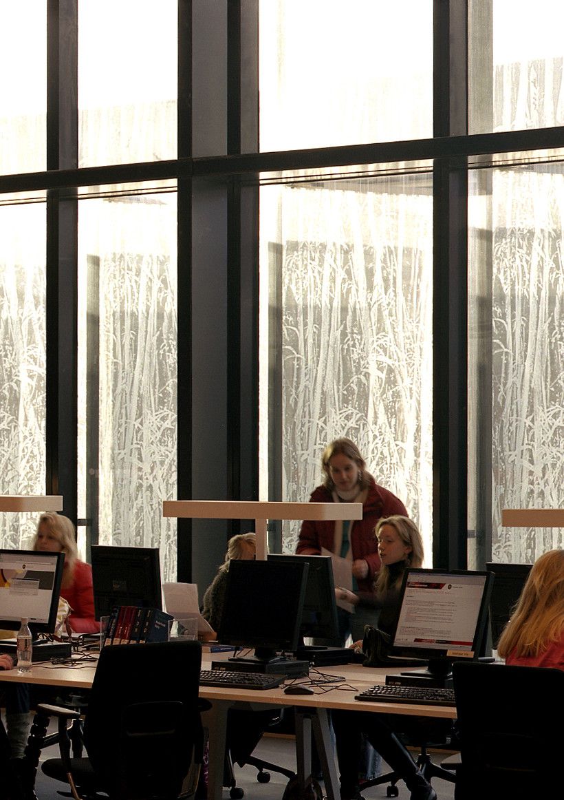
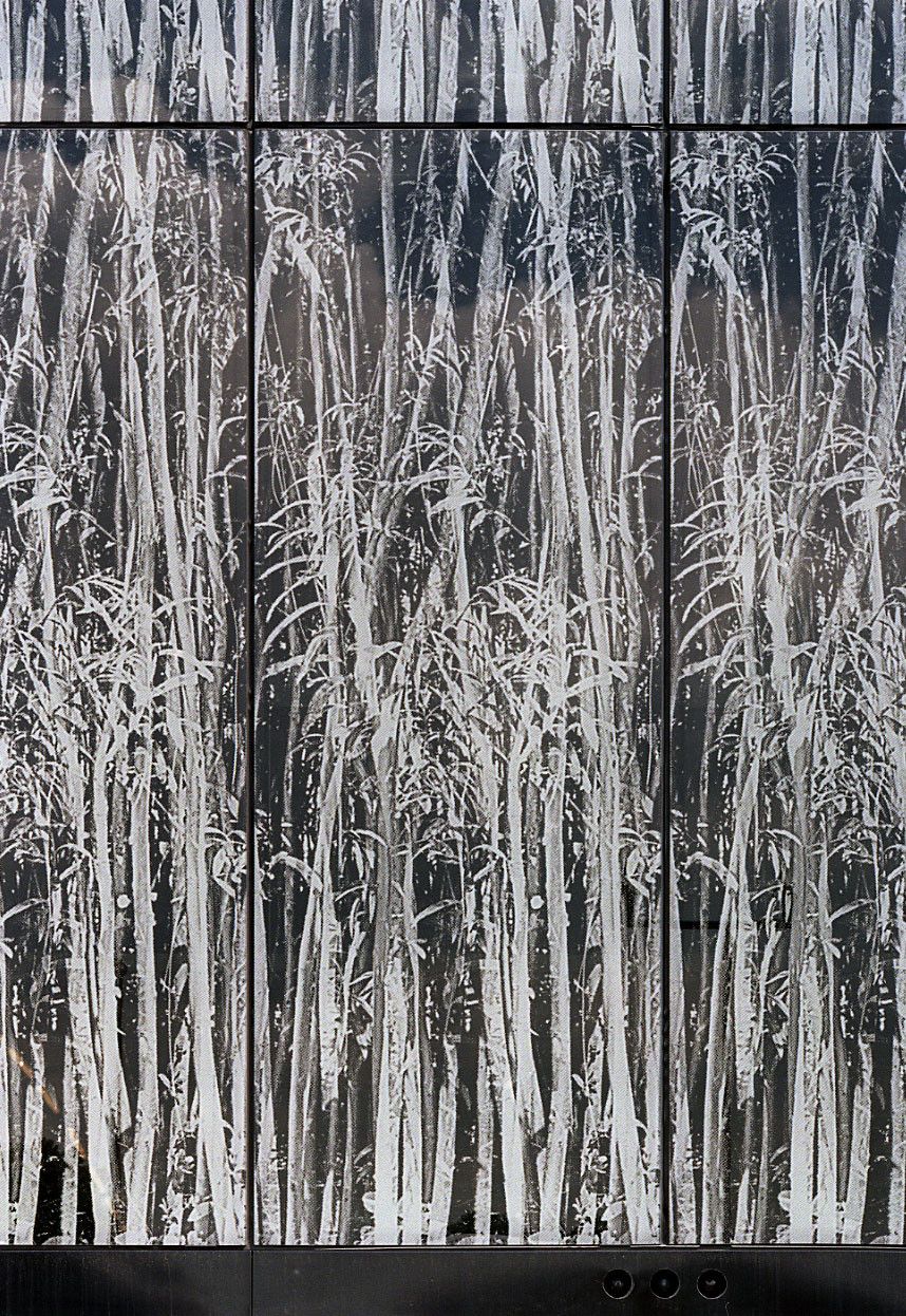
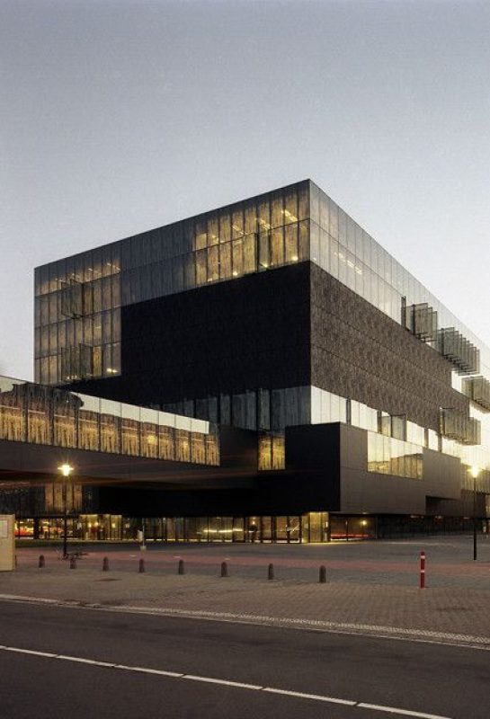
The library appears in this context as a solid composition of volumes, which show on the facade a play of alternating transparent and opaque panels. They are blurred by a repeated texture, printed on the glass and carved in relief on the black concrete panels.
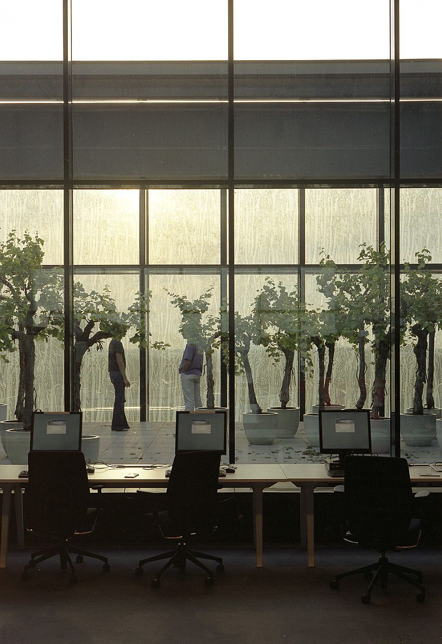
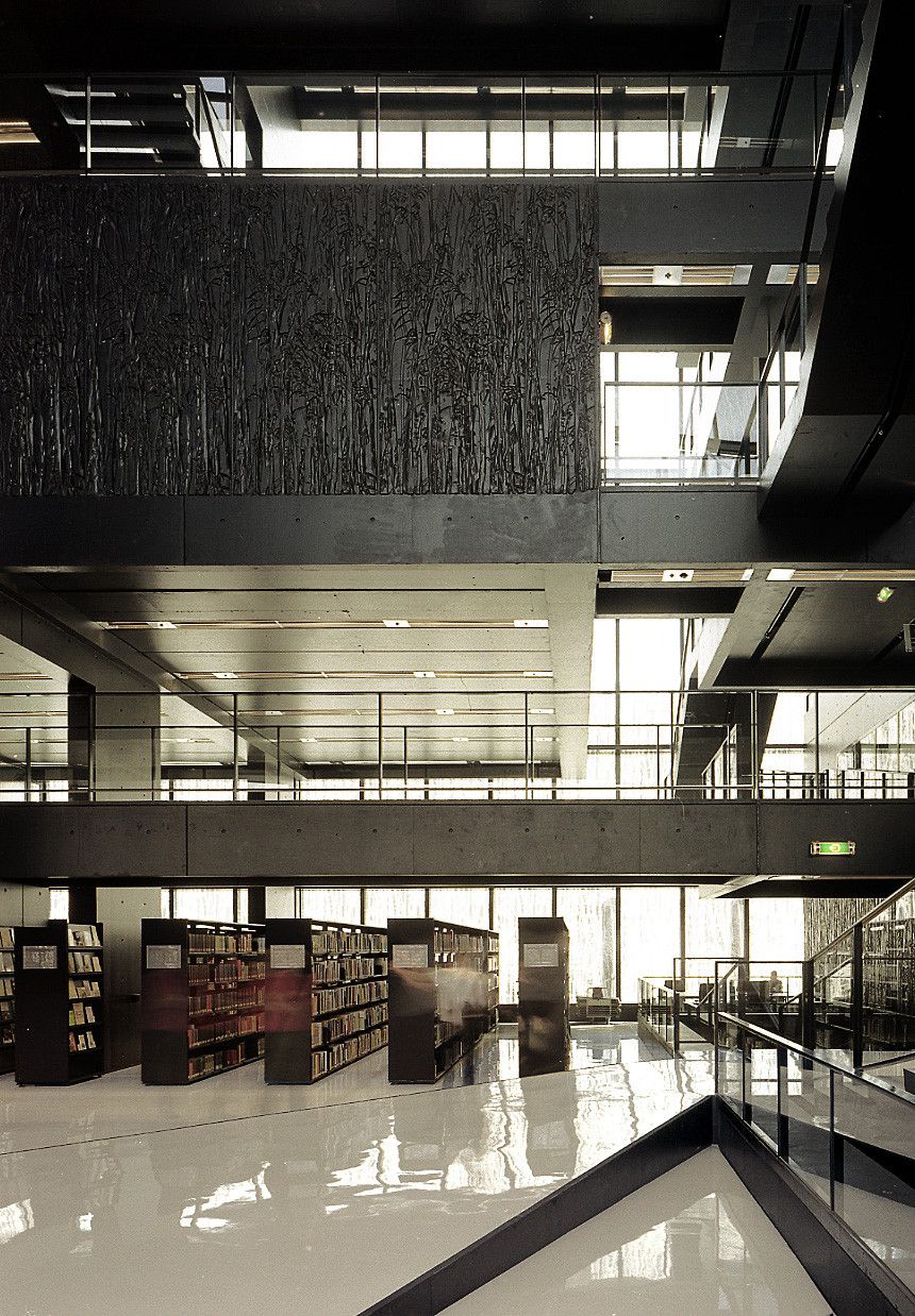
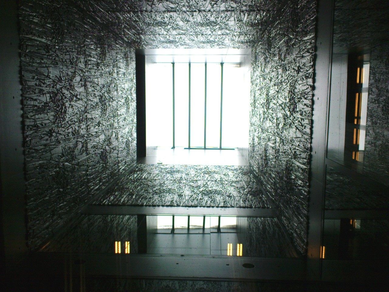
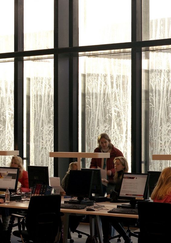
The texture is a pattern of jungle trees, which add some vertical movement to the facade composition. Some of the glazed panels are doubled, and slightly shift off the façade line, making it three-dimensional and contributing to regulate the sunlight. Their opening is automatically controlled in relation to the sun exposure, but they can also be opened manually.
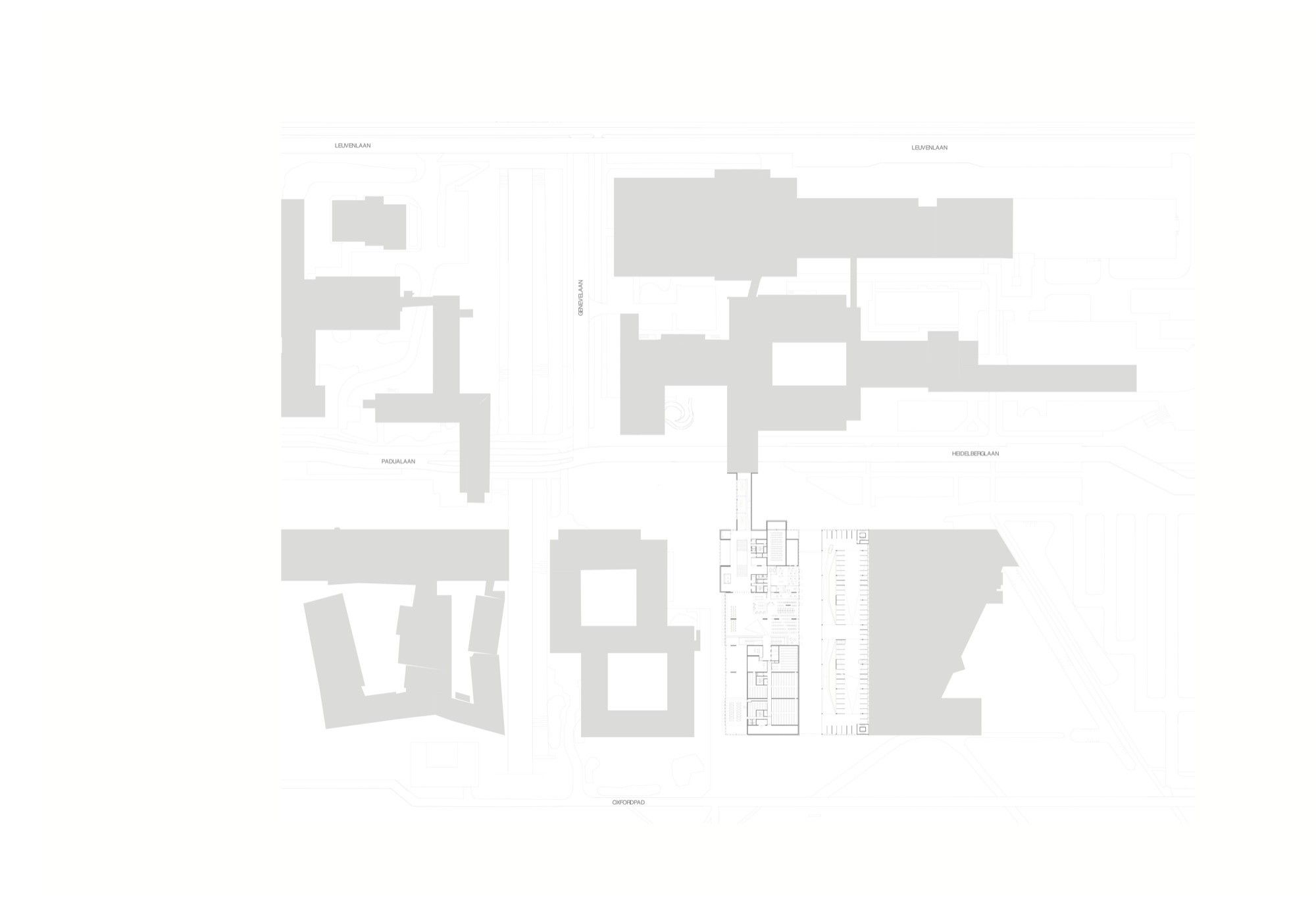
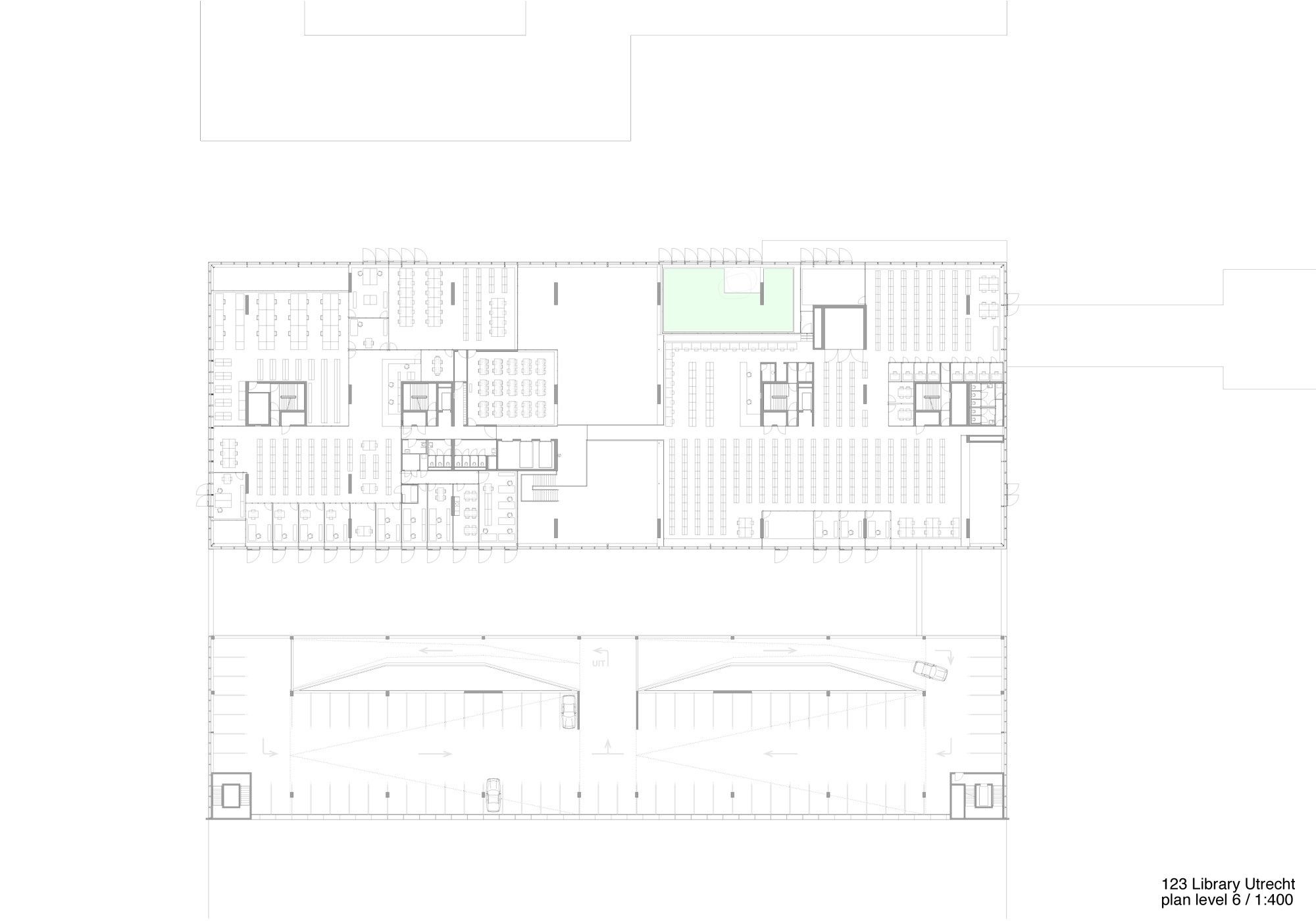
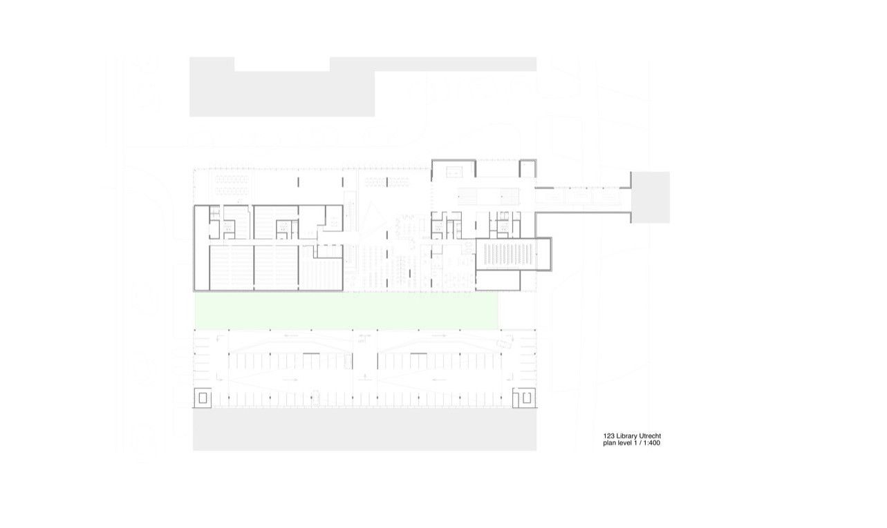
A suspended bridge links the library with the tower beside, while the side volume of the parking is connected to the main block by the basement. The courtyard garden designed by West 8 separates the parking from the library block. All of these volumes have the same texture on the facade panels so that they are clearly part of the complex. The whole building is massive and rather dark, although the alternation, the texture and the shifting of the panels make it light and dynamic, with a special effect in night views.
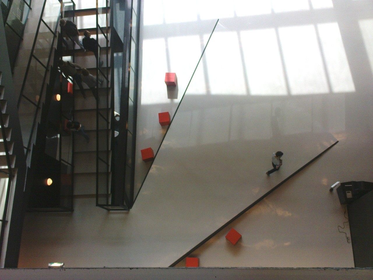
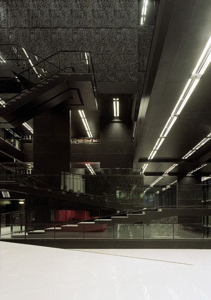
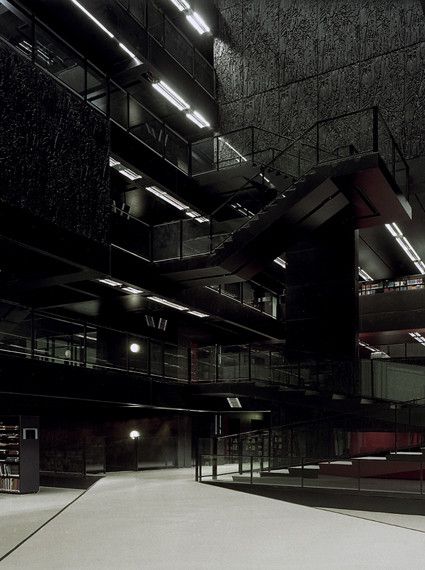
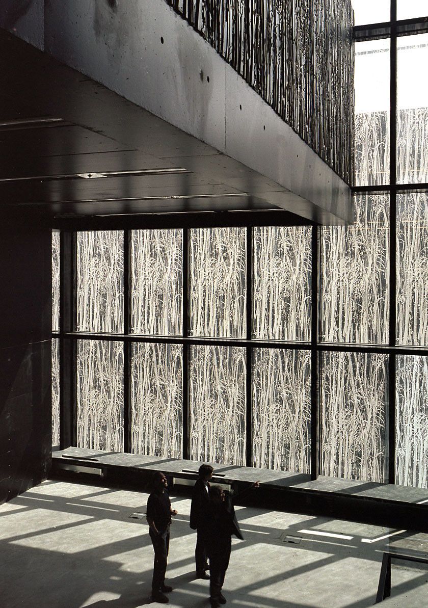
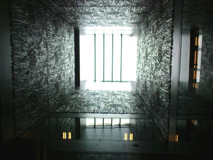
The main entrance brings us to a gallery, and from there to a large staircase. The contrast between the white reflecting floor and the dark concrete panels is accompanying through the library space; once reached the first level, the atrium opens up into a full height, where different volumes stick in and out with the same wall texture. The composition of the façade becomes clear and understandable, as every outer solid wall turns into a spatial volume on the inside. The glass panels frame the full height spaces, closing it vertically at the façade line.
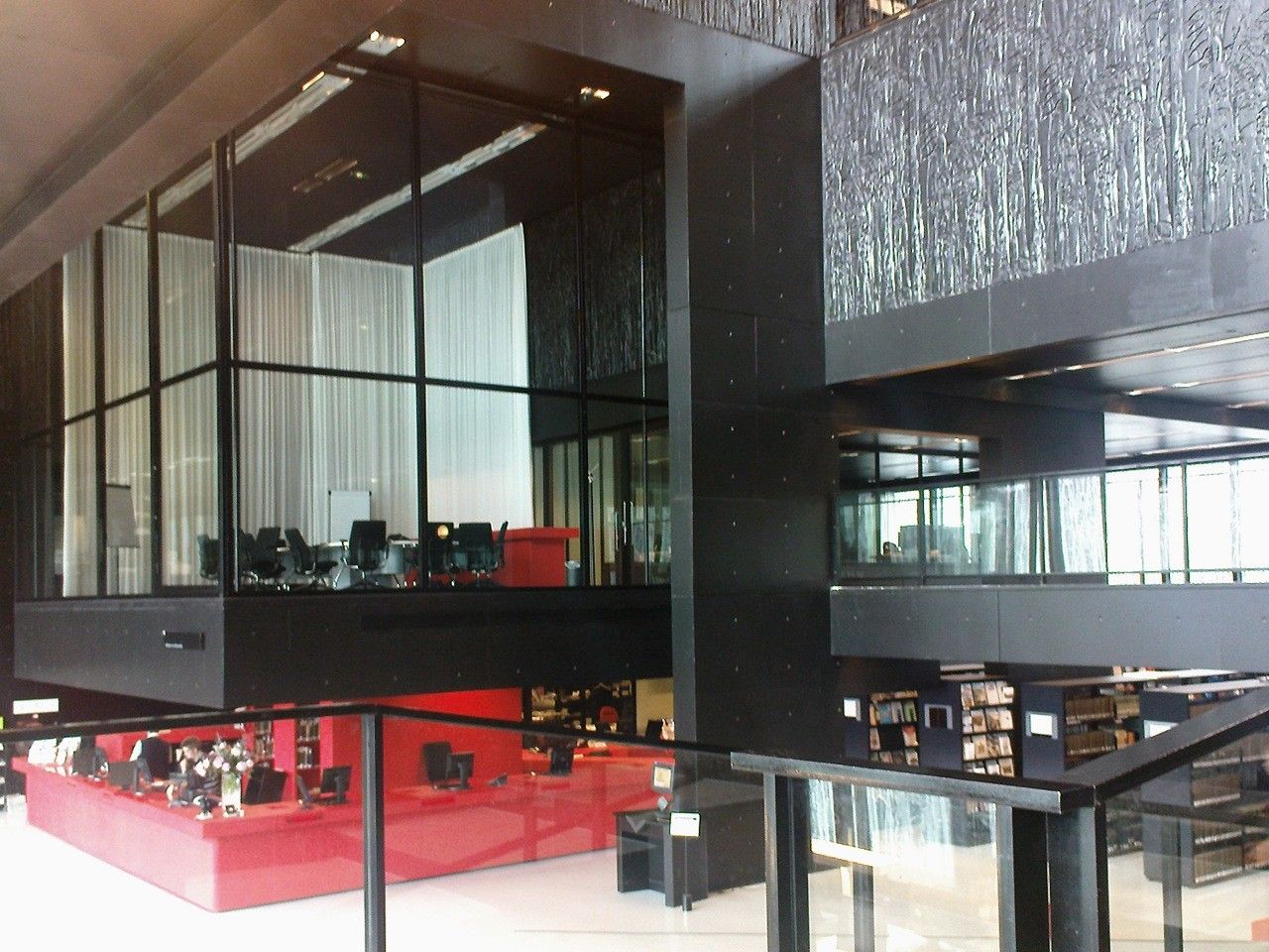
These interior volumes house the various lecture rooms, desks, bookshelves, and archives, on different levels, now as an open terrace, now as enclosed rooms with balconies and openings. Particularly effective is the meeting room above the reception area, cantilevered and completely glazed towards the atrium. The touch of red on some fixed furniture enrich the chromatic scale of the interior and catches the attention on the important spots.
Walking on the distribution stairs and bridges – the open core of the library – we enjoy the space and atmosphere, its openness and its silence. Particular attention has been in fact given to the acoustics and the lighting: the relieved texture helps to absorb the sound, while the same texture printed on glass regulates the sunlight on the lecture desks. It is a building that allows students and visitors to feel in an open and interactive space while concentrating on the private reading.
Project Info
Architects: Wiel Arets Architects
Location: Utrecht, Netherlands
Client: University Utrecht
Acoustic Advisor: Adviesbureau Peutz & Associates bv
Area: 36250.0 sqm
Year: 2004
Type: Library
Photographs: Jan Bitter & Andrea Giannotti
