Vanke Pavilion Expo Milan
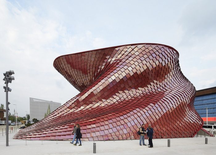
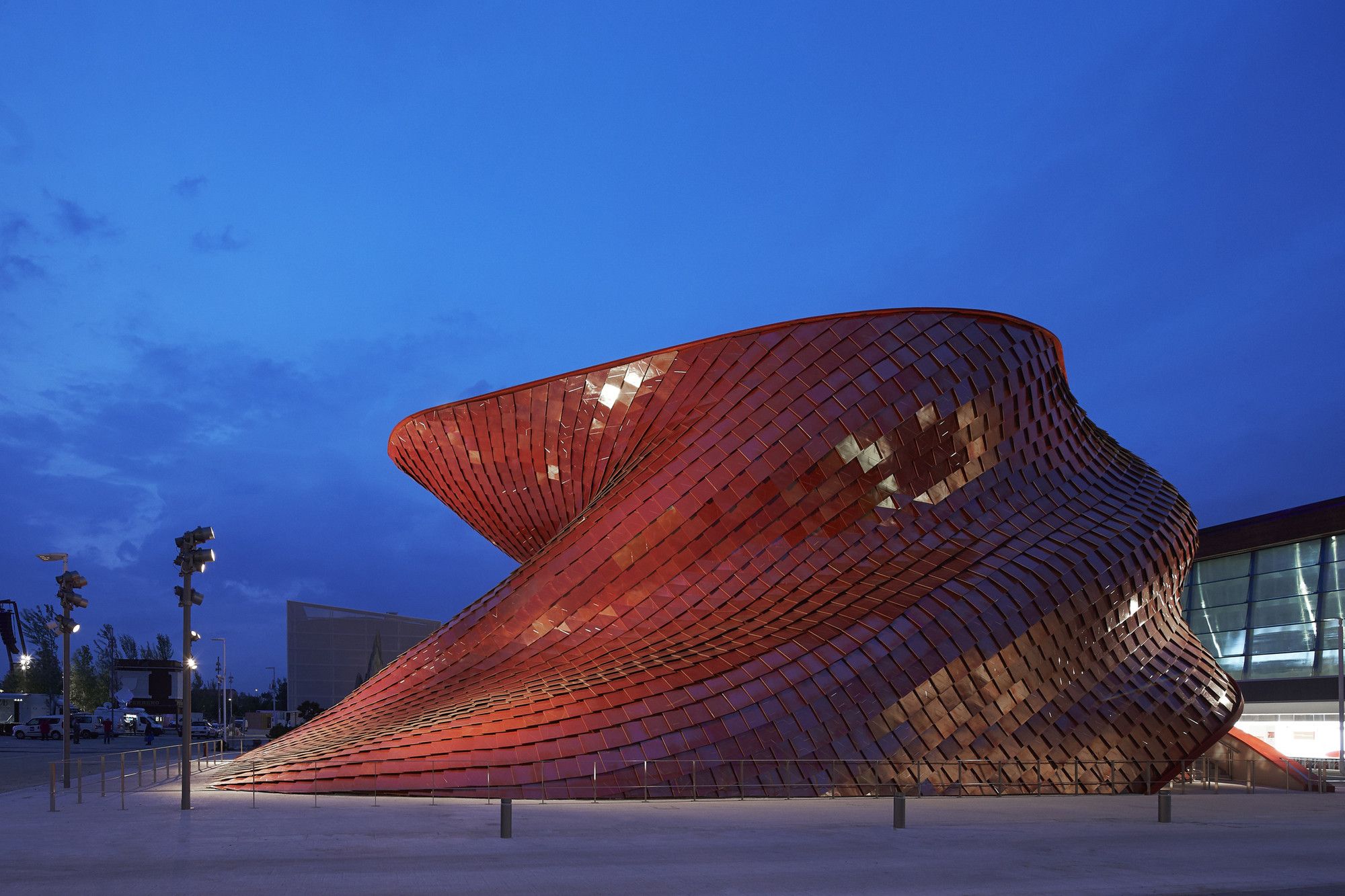
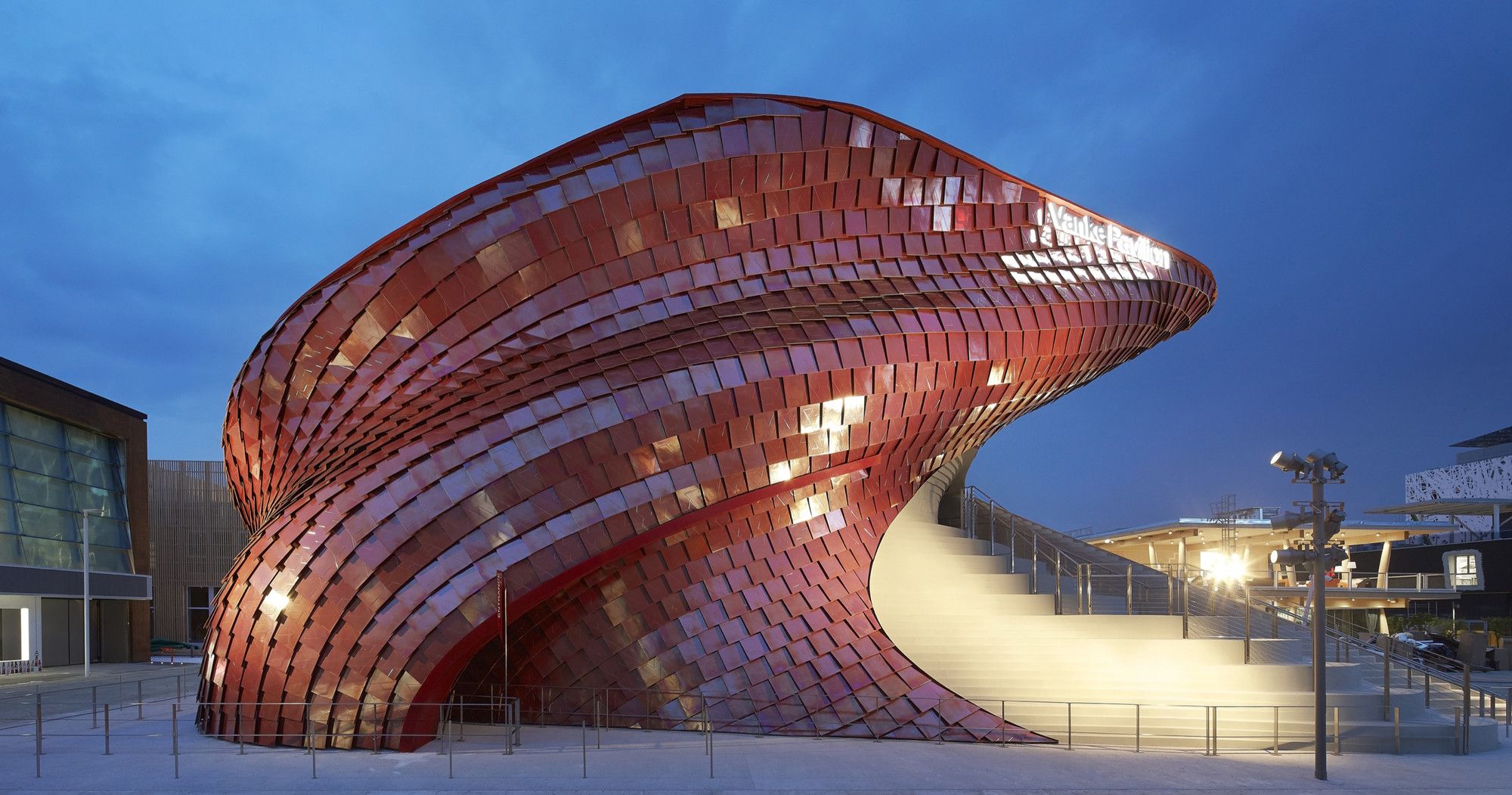
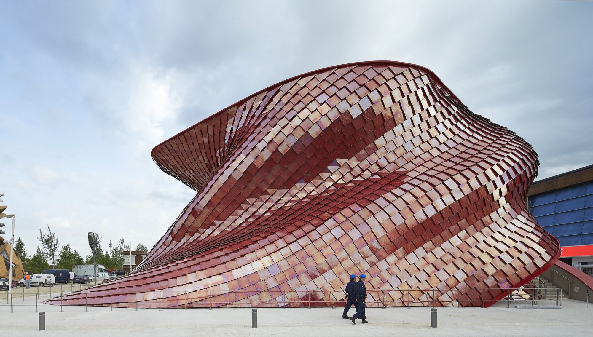
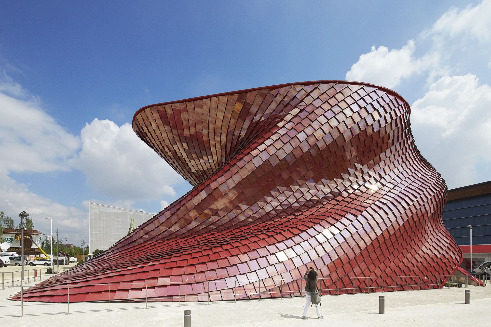
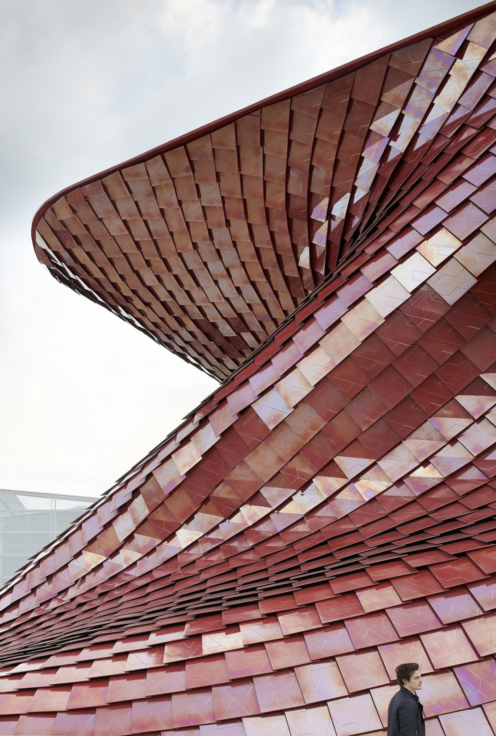
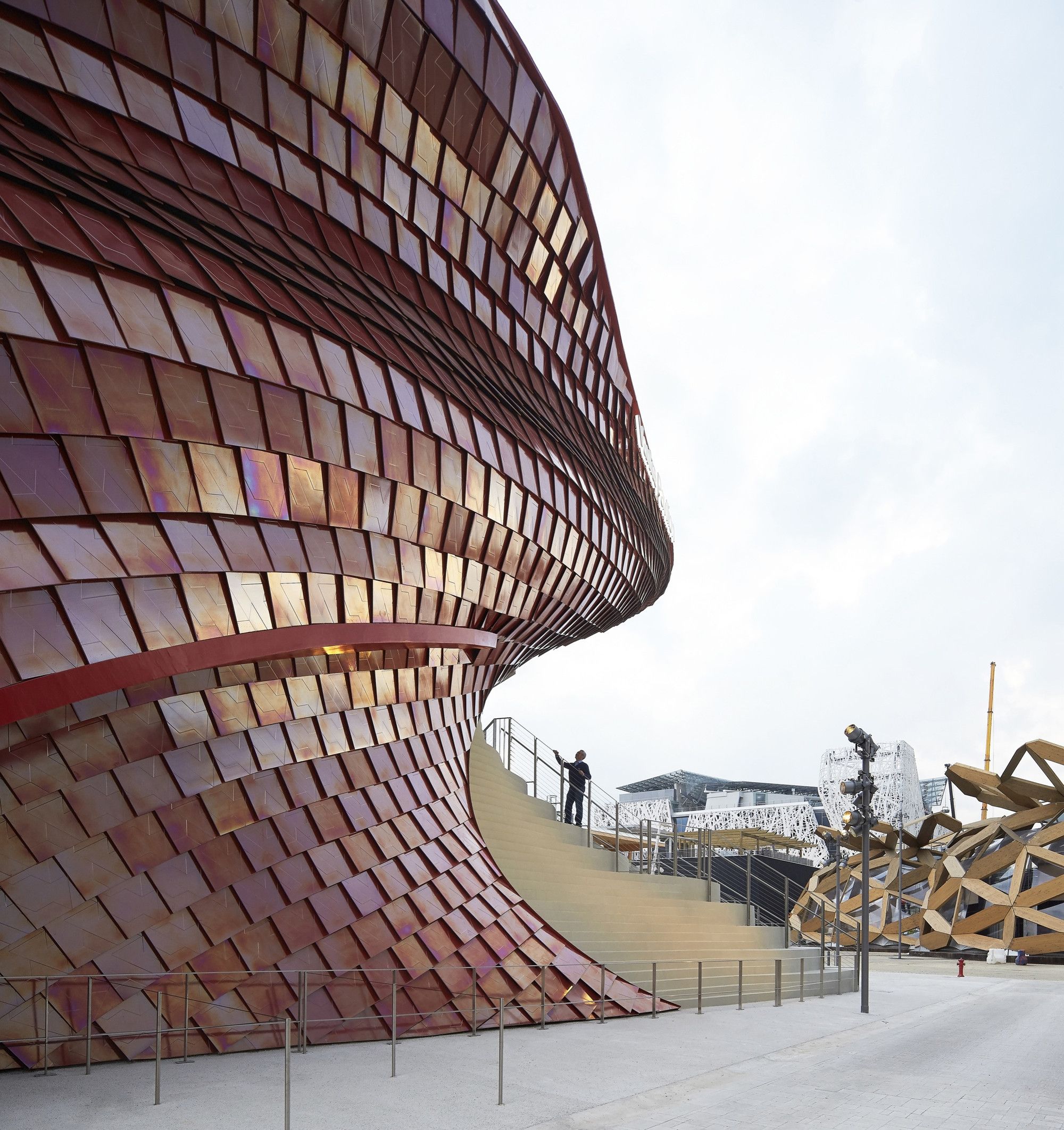
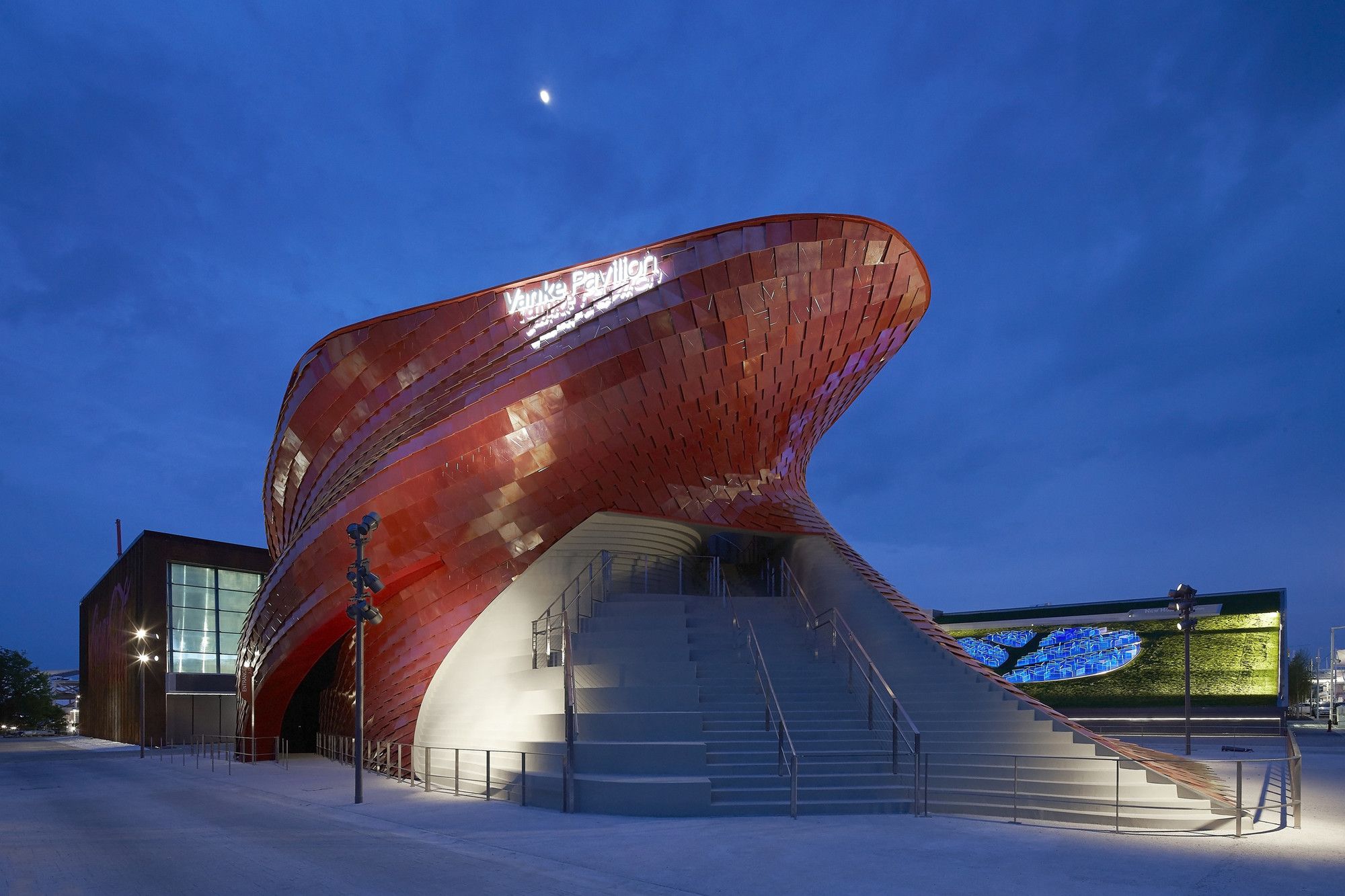
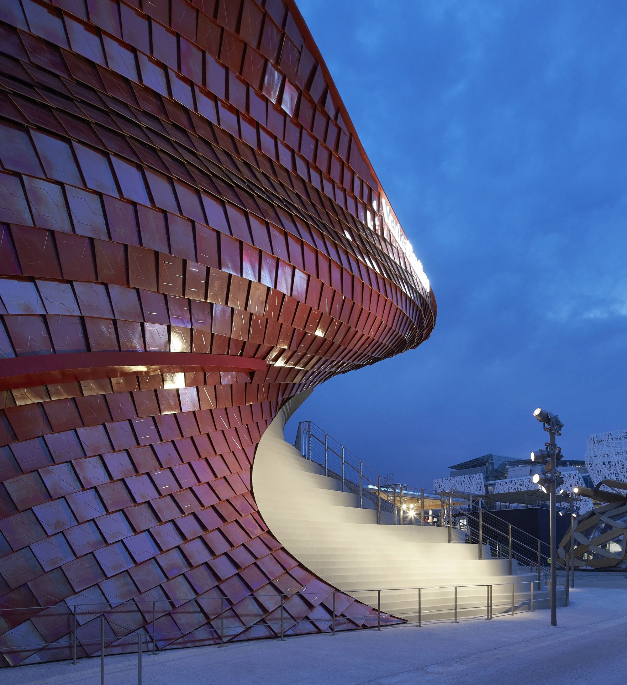
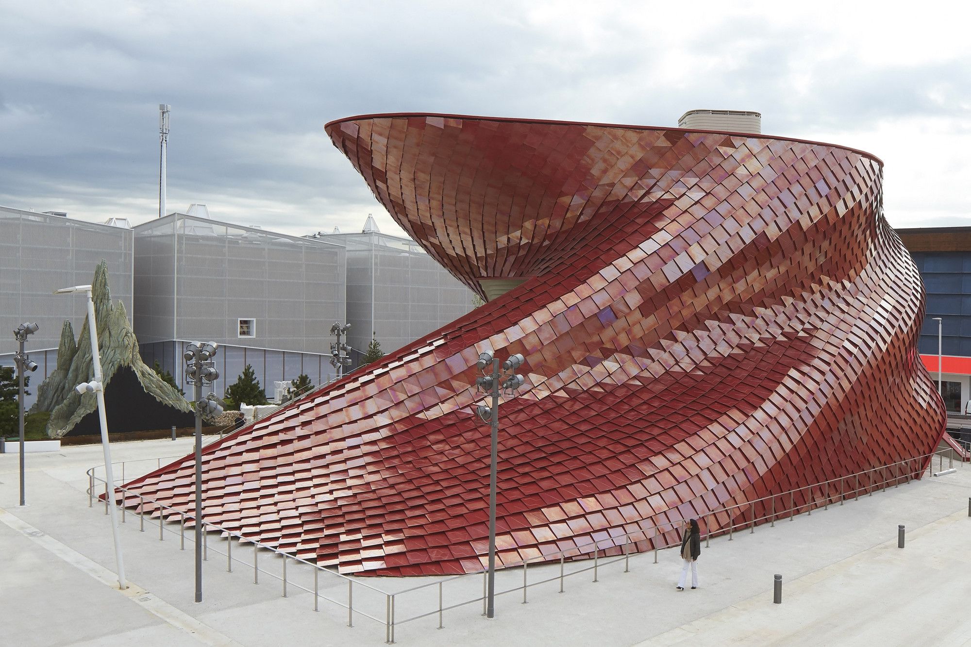
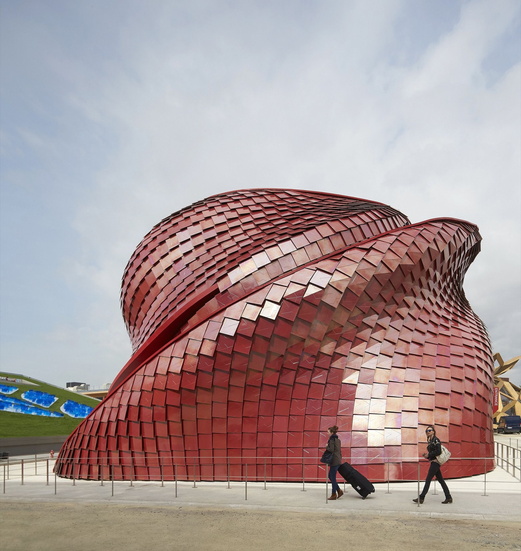
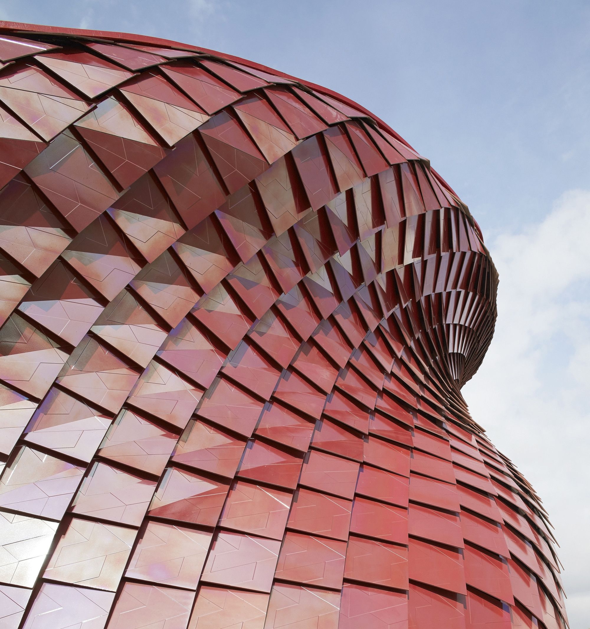
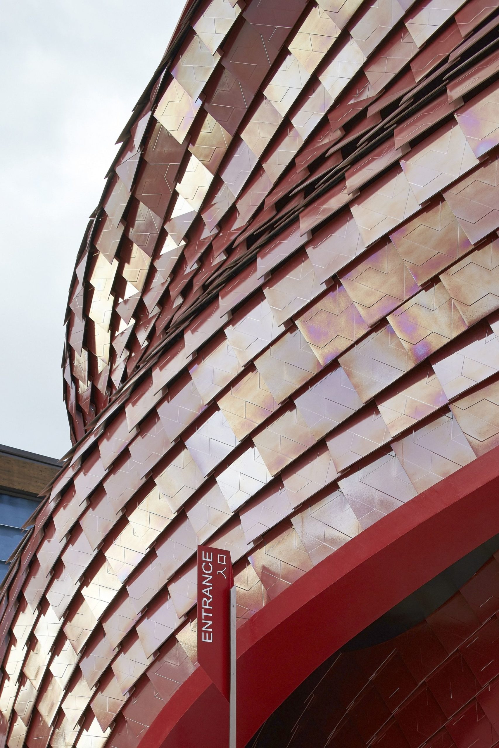
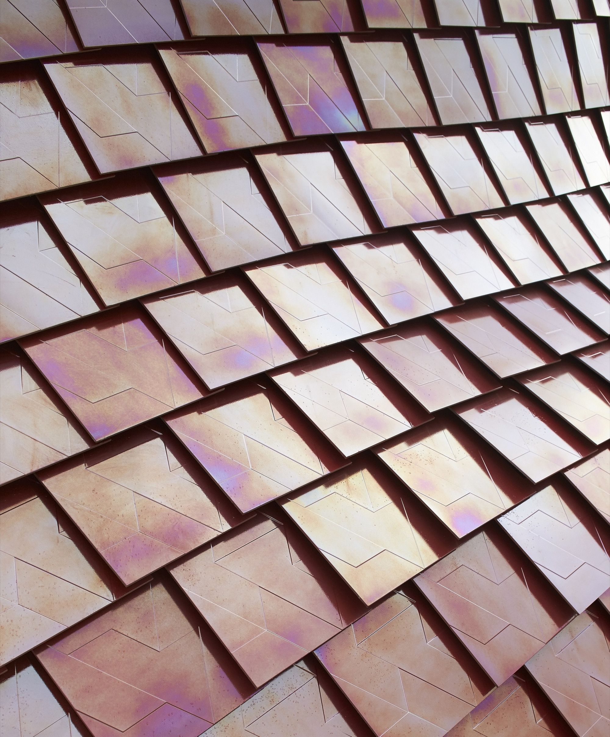
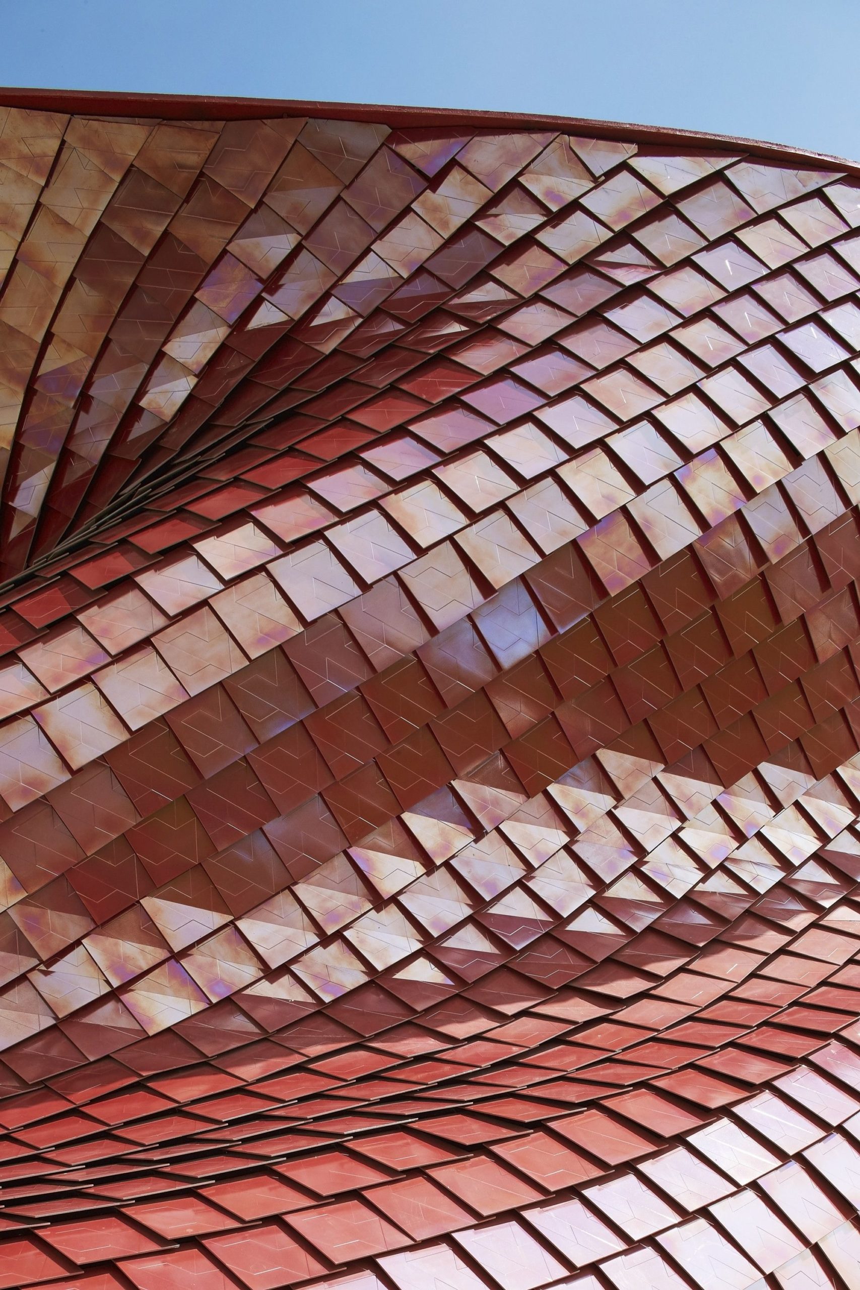
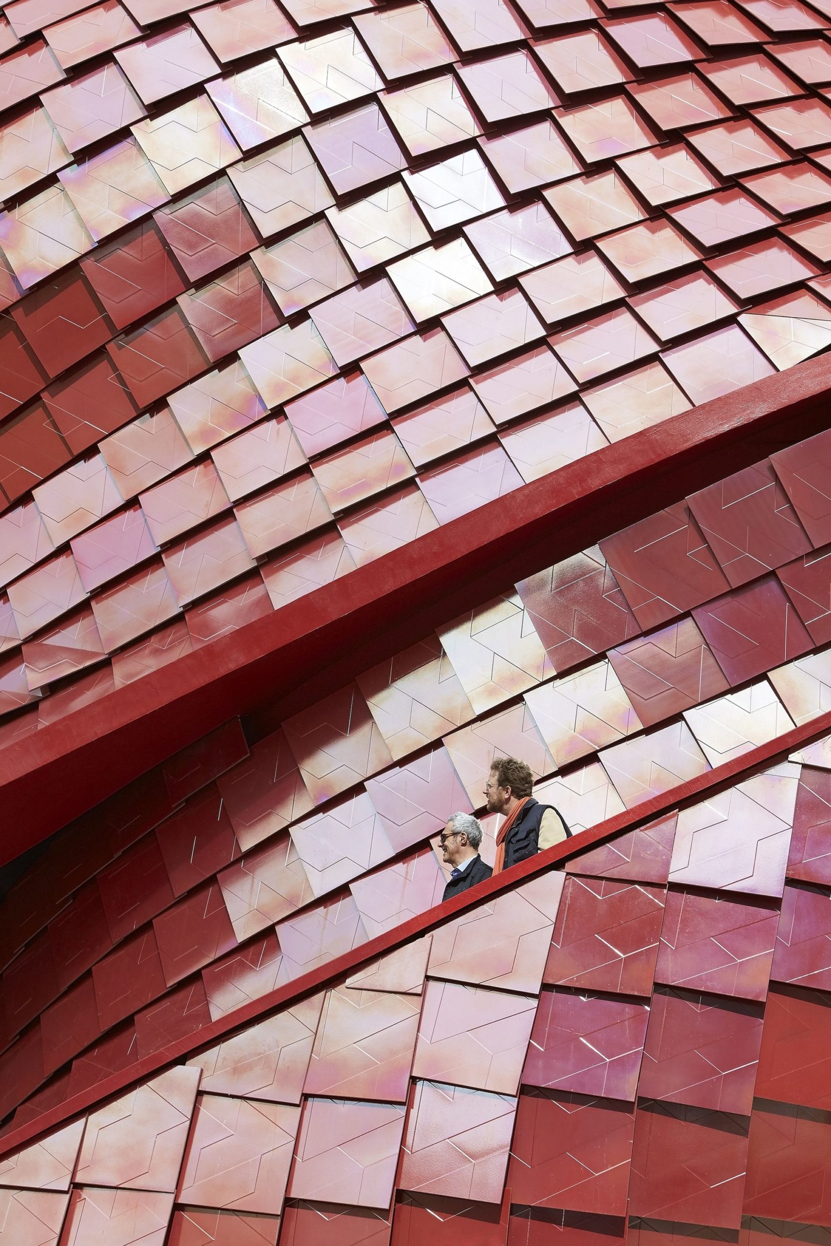
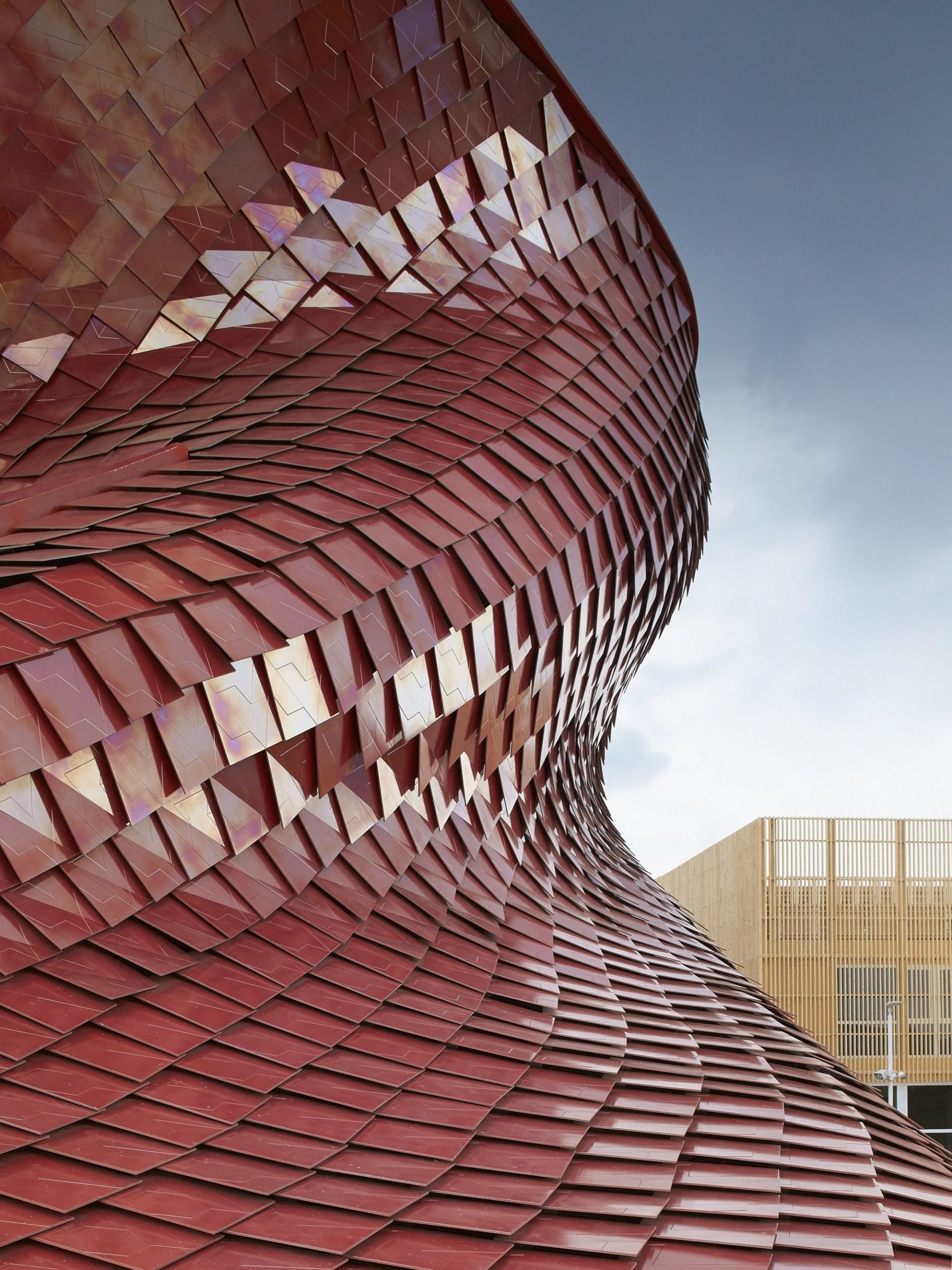
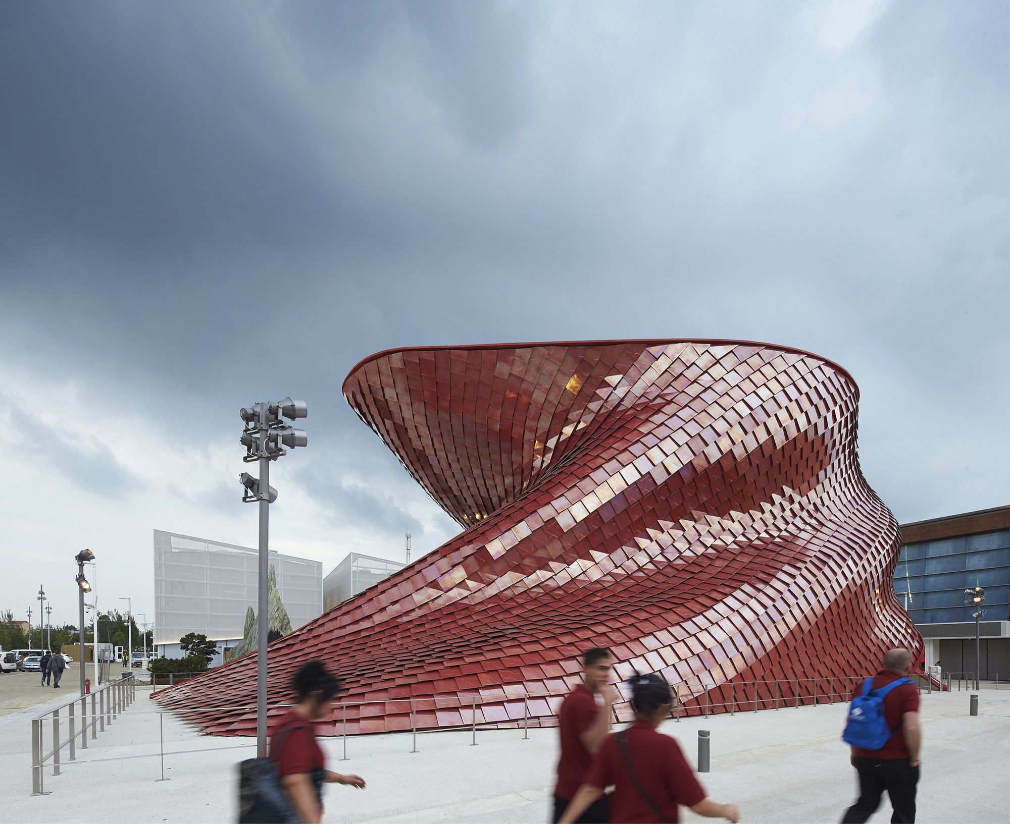
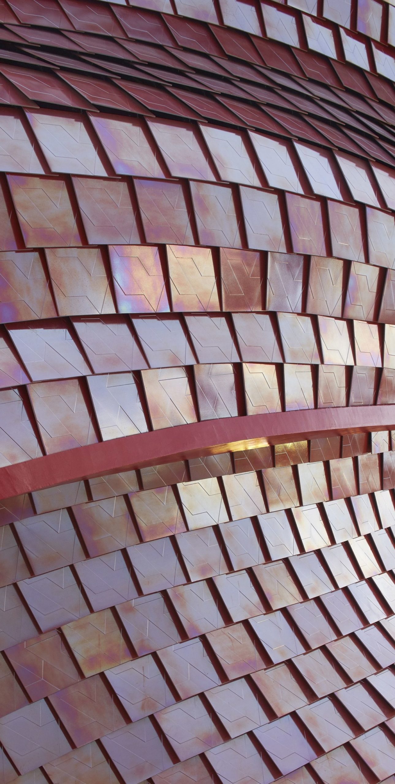
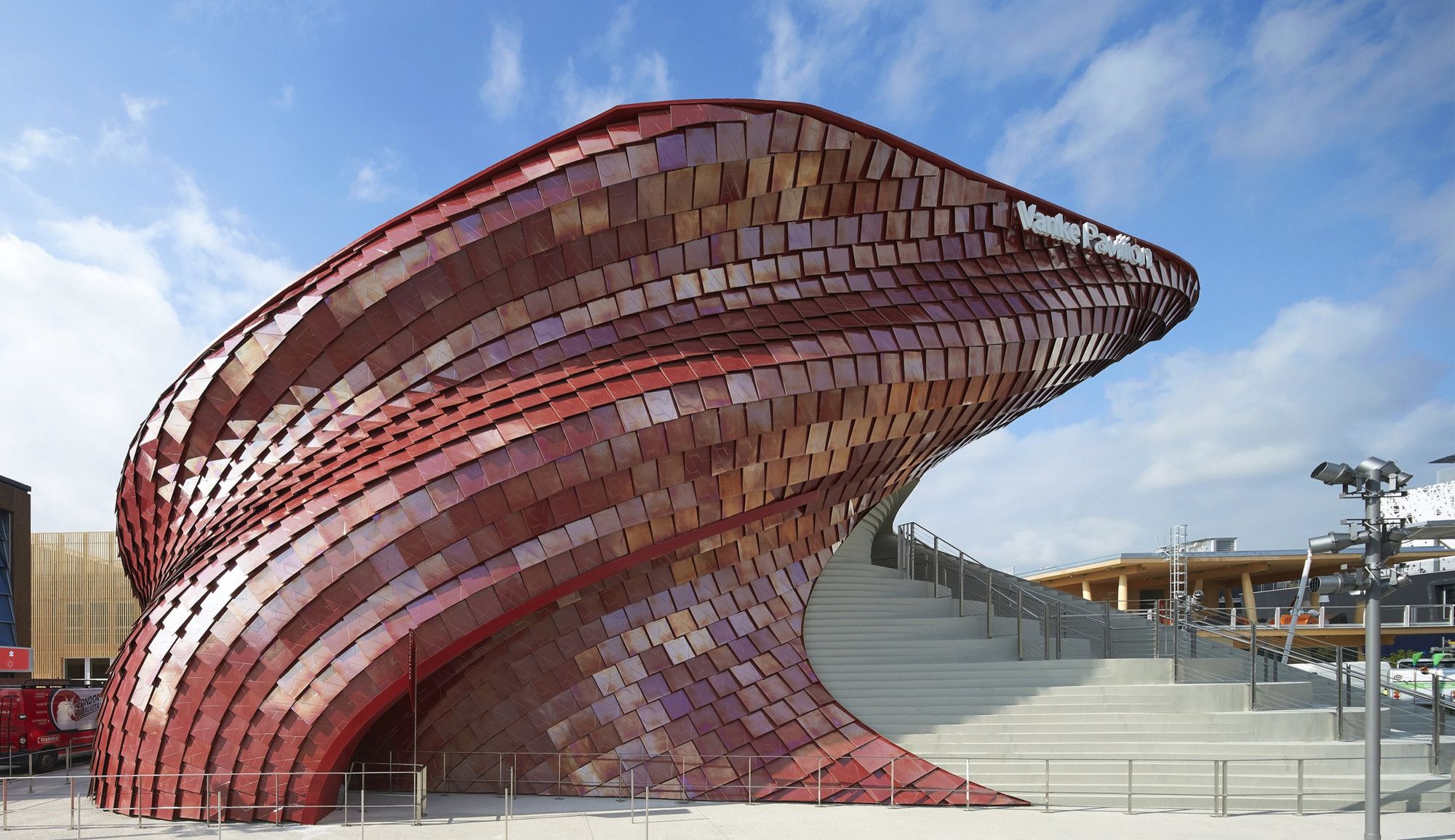
Daniel Libeskind’s pavillion for the Milan expo of 2015 is well underway, with its construction nearing completion. One could characterize it by its sinuous, plastic shape, and its scale-like façade. The vanke pavilion will serve as the chinese pavilion on the expo, and naturally, it’s rowdy visual presence follows from that.
But let’s be honest here. First impressions are what they are, and Libeskind’s pavilion seems like an attempt at architectural showmanship more than anything else.
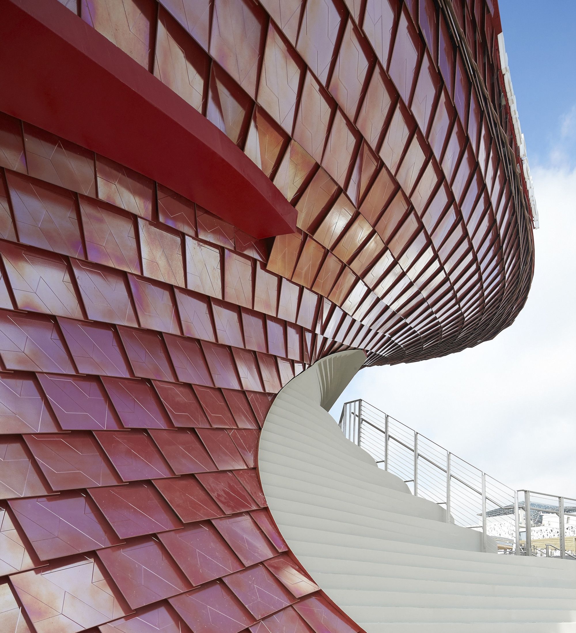
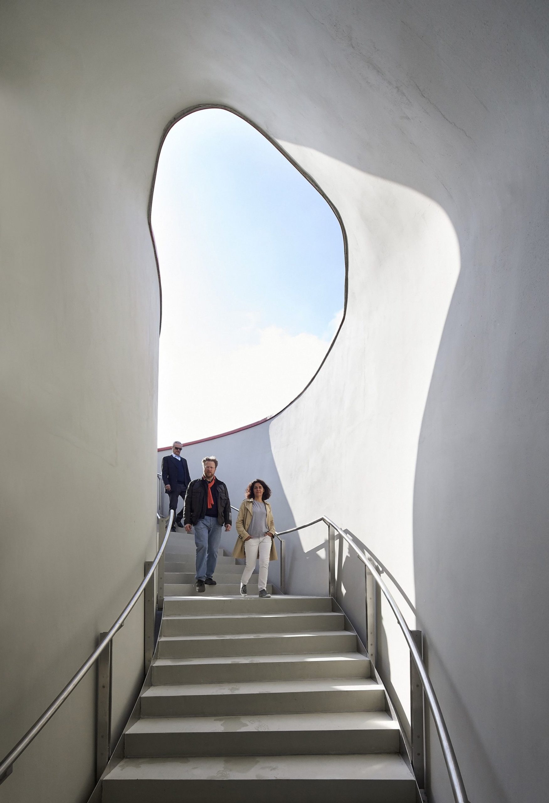
Sure, it’s shape makes it so that people can climb the building through a set of stairs, and enter it under a folder on it’s façade. And sure, the ascent to the terrace is one of it’s finer points (and one of the most clear references to China, the drawings on the stairs). But one can’t help but to feel bored, desensitized towards this building – it’s architectural vocabulary runs out on itself. It is as if, by virtue of its “peculiarity”, “sculptural prowess”, “innovative plasticity” and its “breakthrough designing” it held nothing of its own in terms of identity. The structural shape was intended to become a sculptural figure that welcomed China’s vast cultural impact, from the periods of the renaissance, contemporary art as well as Confucius and Lao Tzu. The exterior of the skin portrays a scaly nature that entirely wraps the structure. There is also access to the roof and terraces through an external stair that allows visitors to experience the view of other nearby expo pavilions.
It screams, it yells, it’s a call for attention; but it ends up being like a whisper in a rowdy crowd – nearly impossible to hear straight. All throughout the nineties and early two thousand’s, architect’s tried to expand the vocabulary of architectural expression by way of the “ideology” of deconstruction and the acknowledgment of the shape in itself. Buildings came (and still come, as it seems) in all shapes and forms, as if that was all they were – shapes. The Vanke pavilion is like a sloppy, white old man trying to be a gangster rapper in 2015 – he is not gangster, he can’t rap, and gangster rap is dead. I’ll put it another way: it’s an outdated and tasteless architectural gesture, with little substance and integrity.
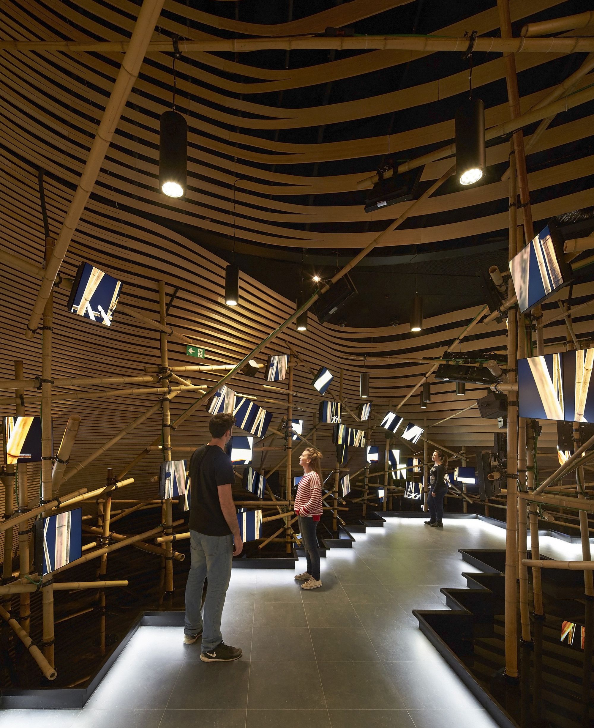
Vanke chairman, Wang Shi talks about intention of the pavilion, stating, “to express our idea of urbanization and community through the experience of food. Indeed, food is one of the most effective ways to understand a culture: the ritual of eating and talking together is important in every community because by eating together it is possible to get to know each other better. Vanke is an ‘urban developer,’ and our mission is to create better communities to offer a better life to our customers.”
It looks like it’s greatest ambition is, above all to be noticed, while failing miserably in the effort. The building even lacks the scale (or “bigness”, as some would say) that might make such an attempt work. Like a pastiche of the work of the Starchitects of the recent past. In this sense, it does a disservice to the people of China as it’s representative pavilion.
The renders are really good, though. Looks like someone discovered Grasshopper.
photography by: Hufton+Crow
photography by: Hufton+Crow
photography by: Hufton+Crow
photography by: Hufton+Crow
photography by: Hufton+Crow
photography by: Hufton+Crow
photography by: Hufton+Crow
photography by: Hufton+Crow
photography by: Hufton+Crowphotography by: Hufton+Crow
photography by: Hufton+Crow
photography by: Hufton+Crow
photography by: Hufton+Crow
photography by: Hufton+Crow
photography by: Hufton+Crow
photography by: Hufton+Crow
photography by: Hufton+Crow
photography by: Hufton+Crow
photography by: Hufton+Crow
photography by: Hufton+Crow
photography by: Hufton+Crow
photography by: Hufton+Crow
photography by: Hufton+Crow
photography by: Hufton+Crow
photography by: Hufton+Crow
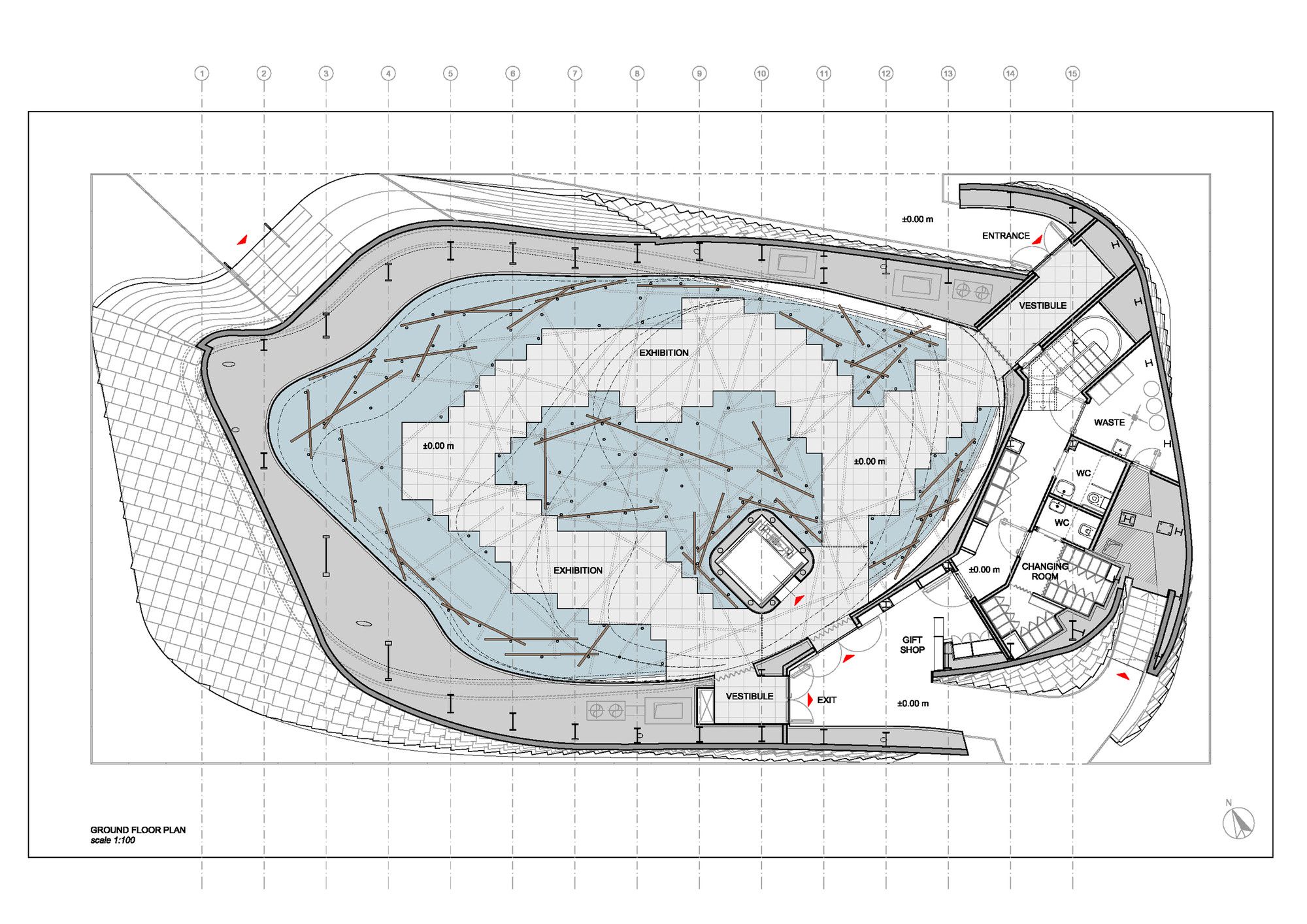
Ground Floor Plan
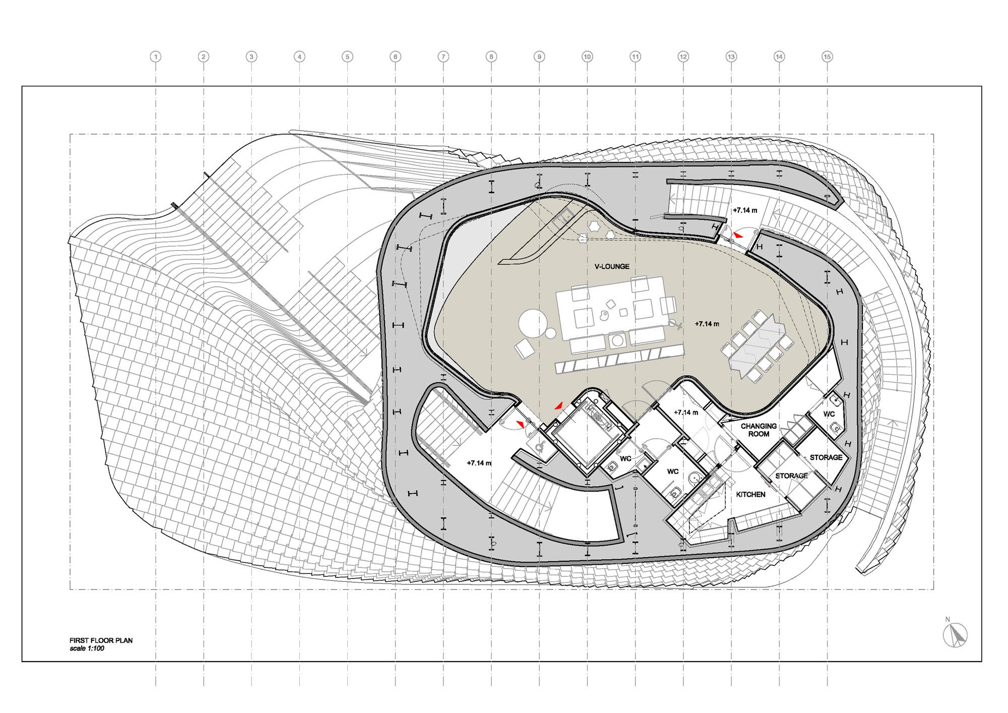
First Floor Plan
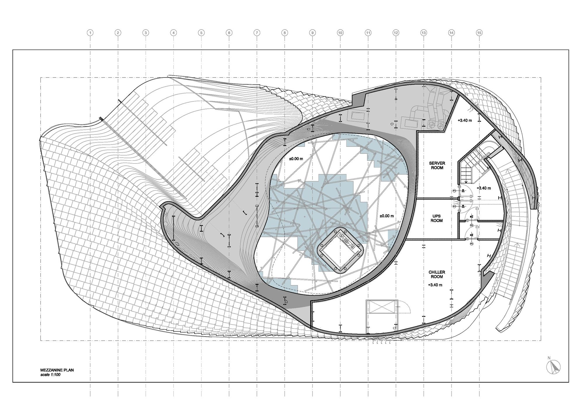
Mezzanine Floor Plan
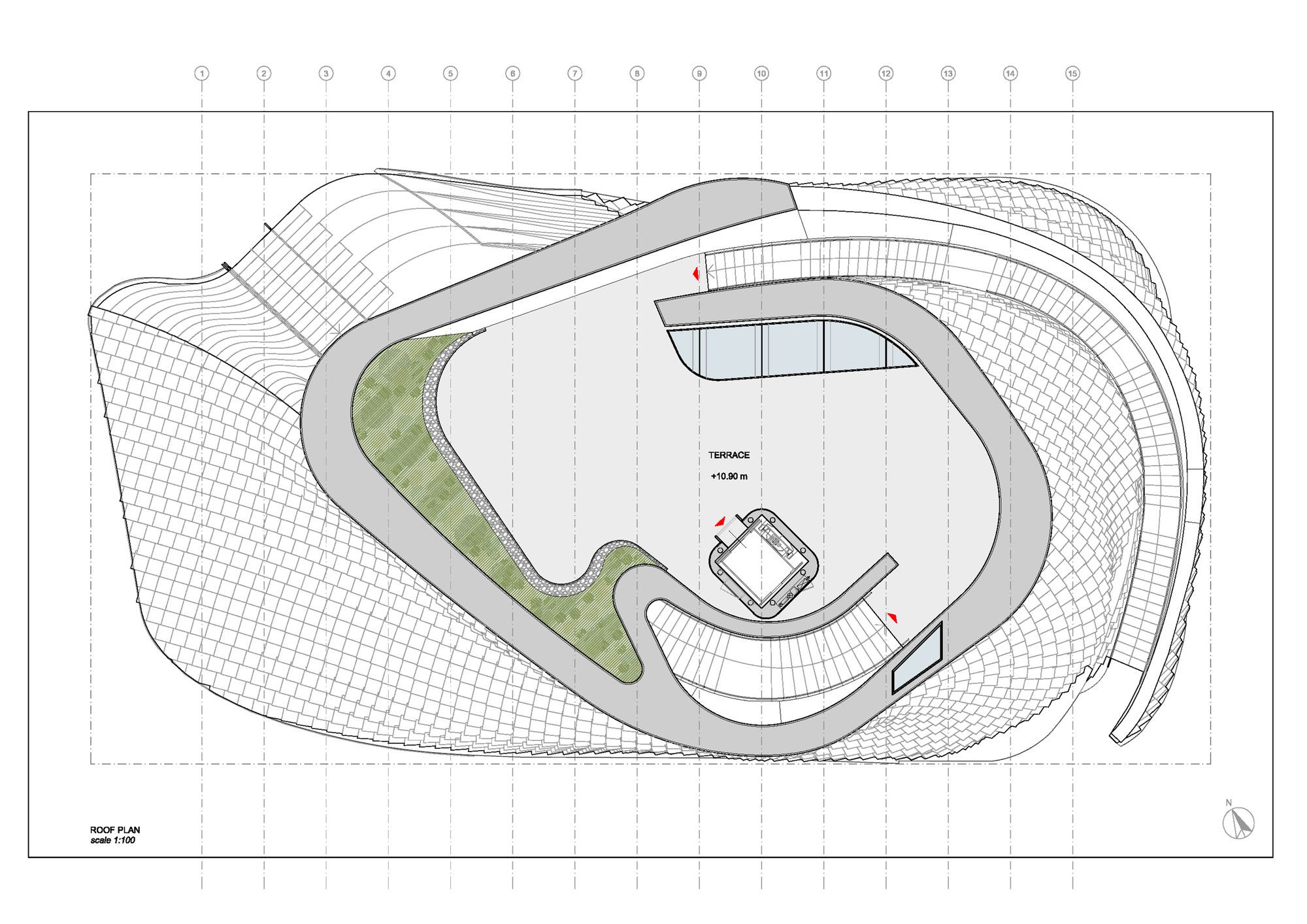
Roof Plan
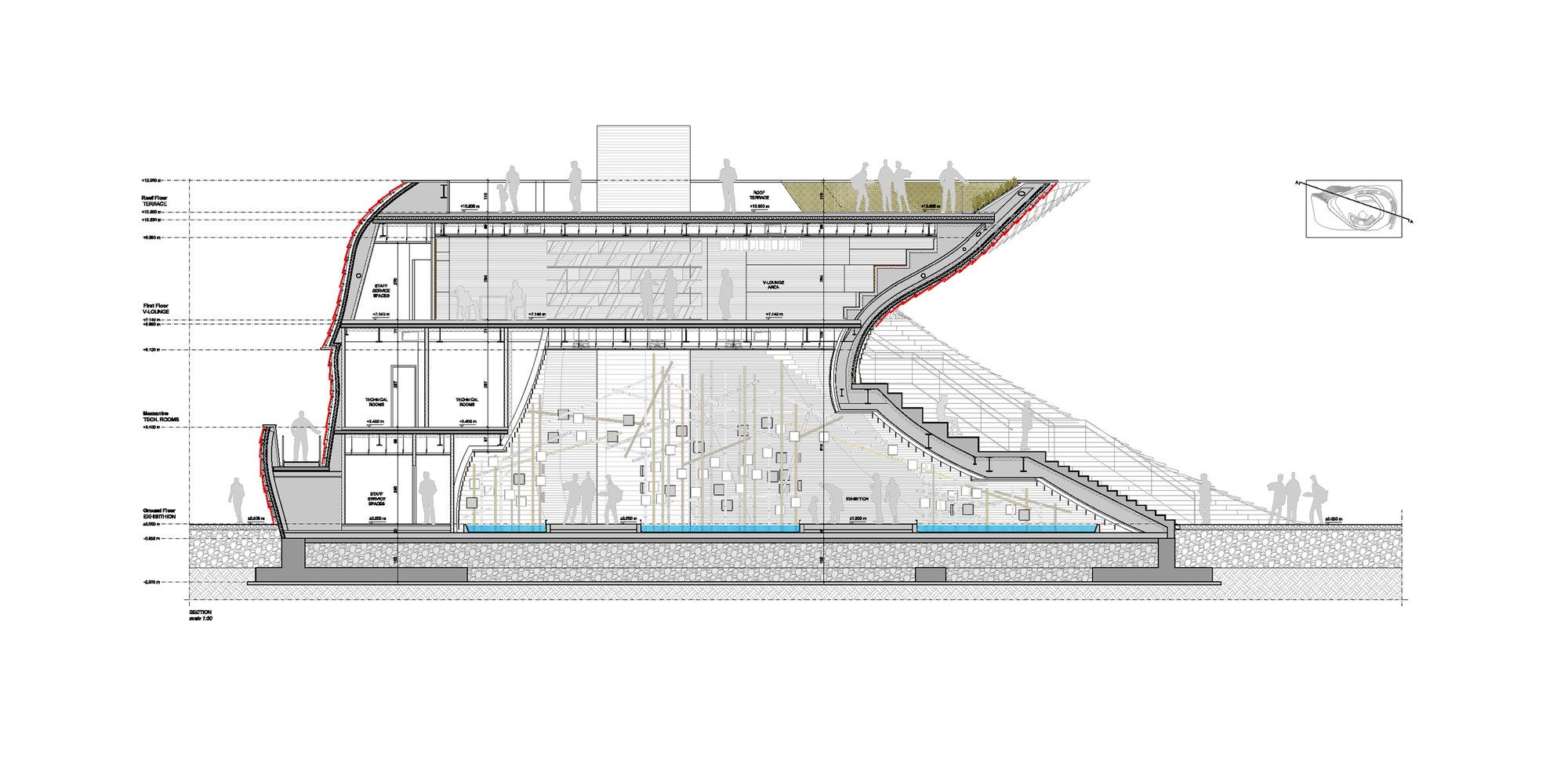
Section
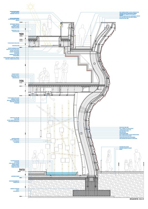
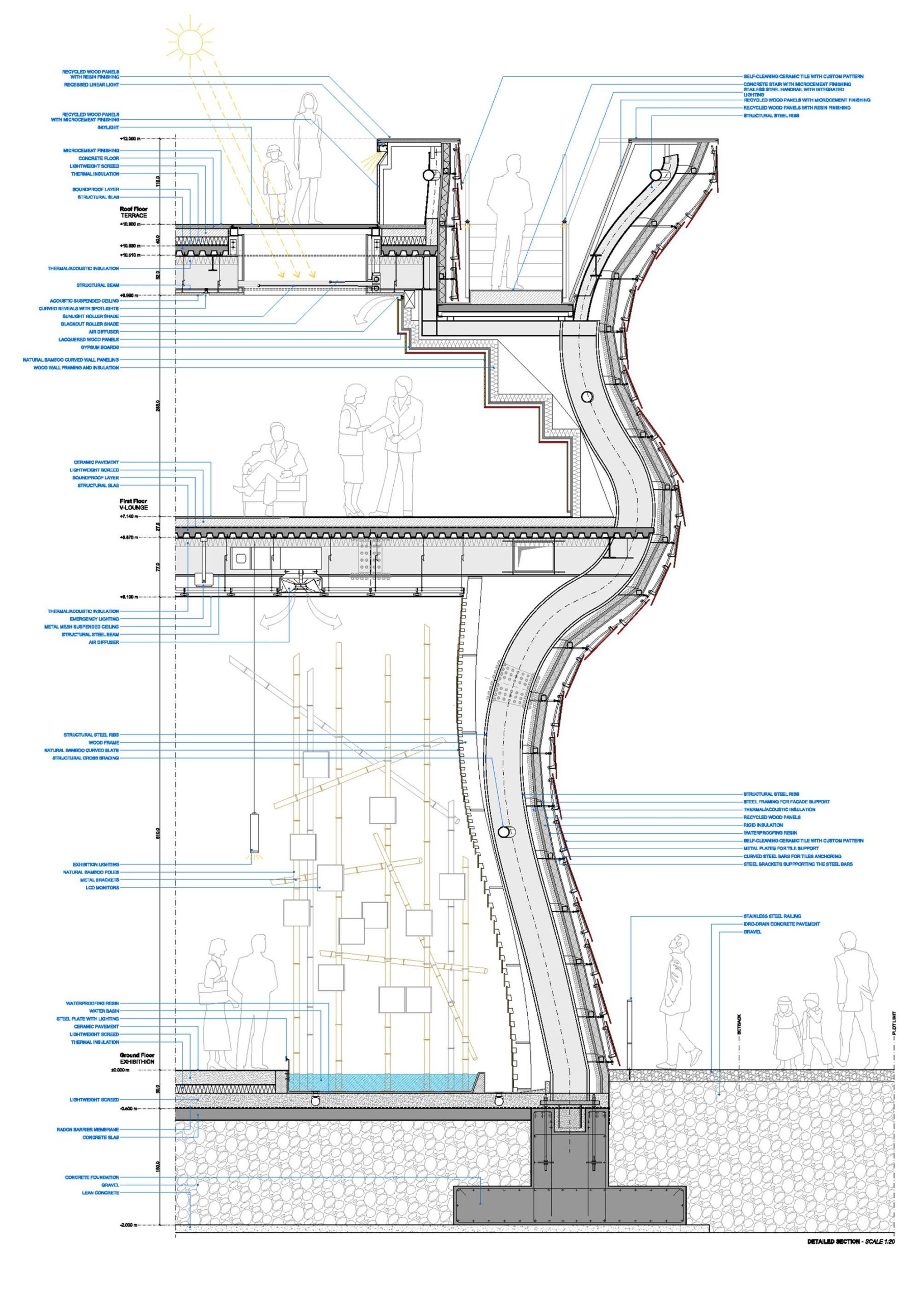
Detail Section
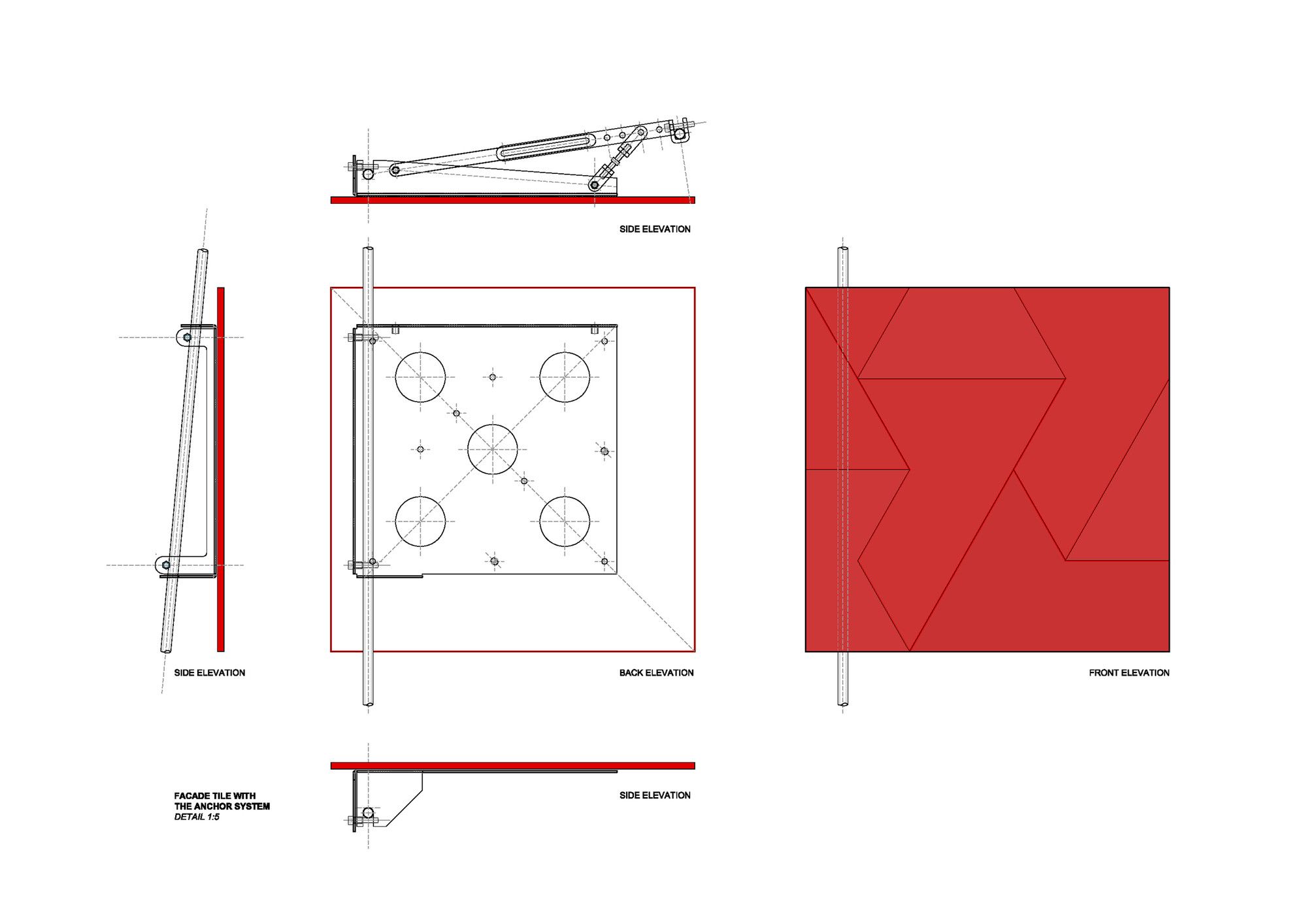
Detail
By: Daniel Anthony Fraga


