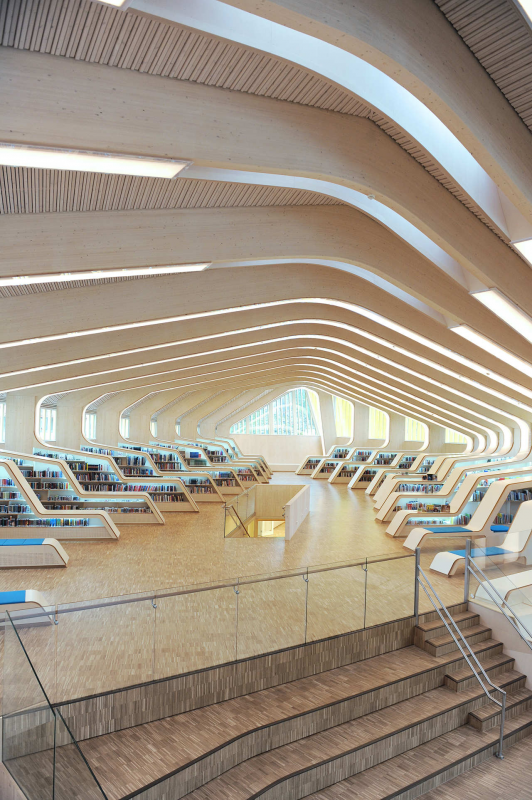
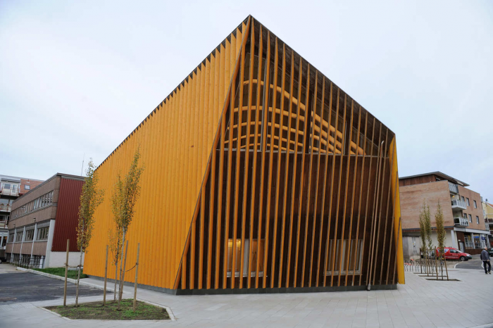
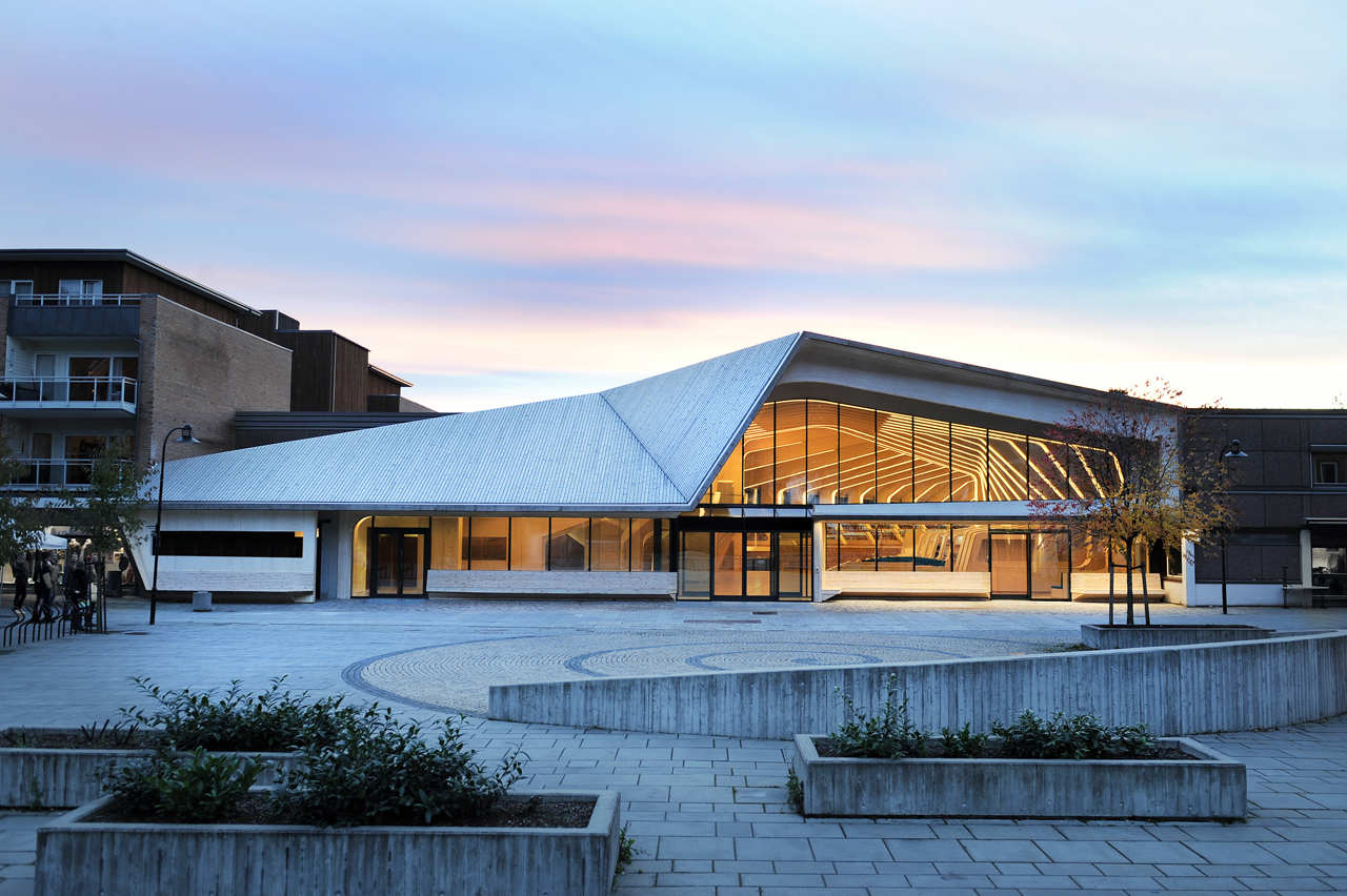
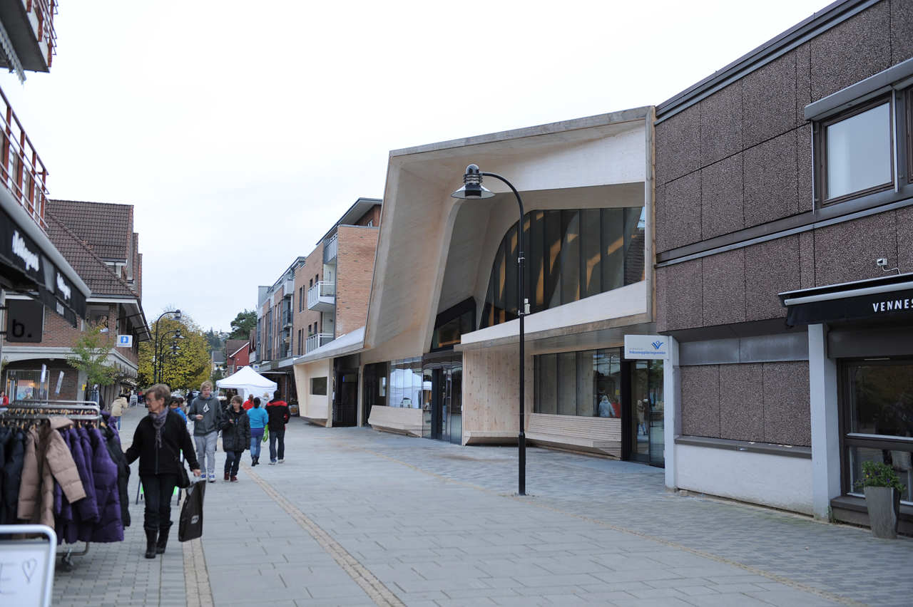
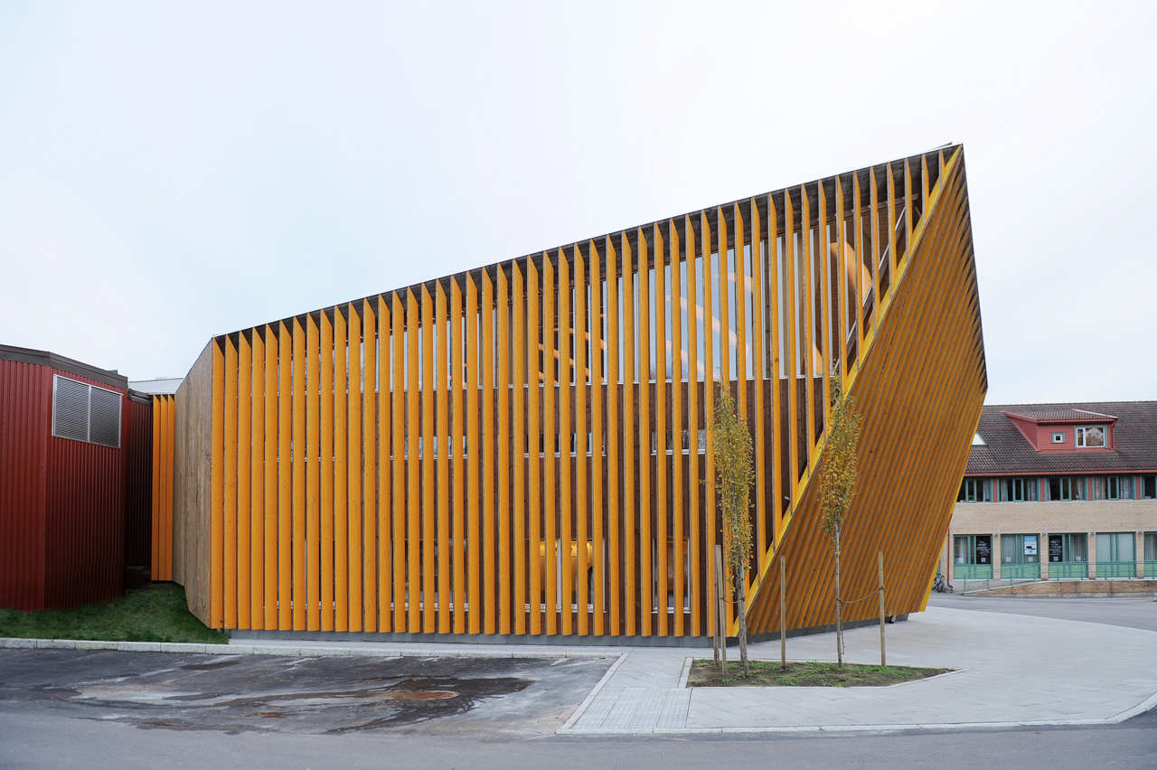
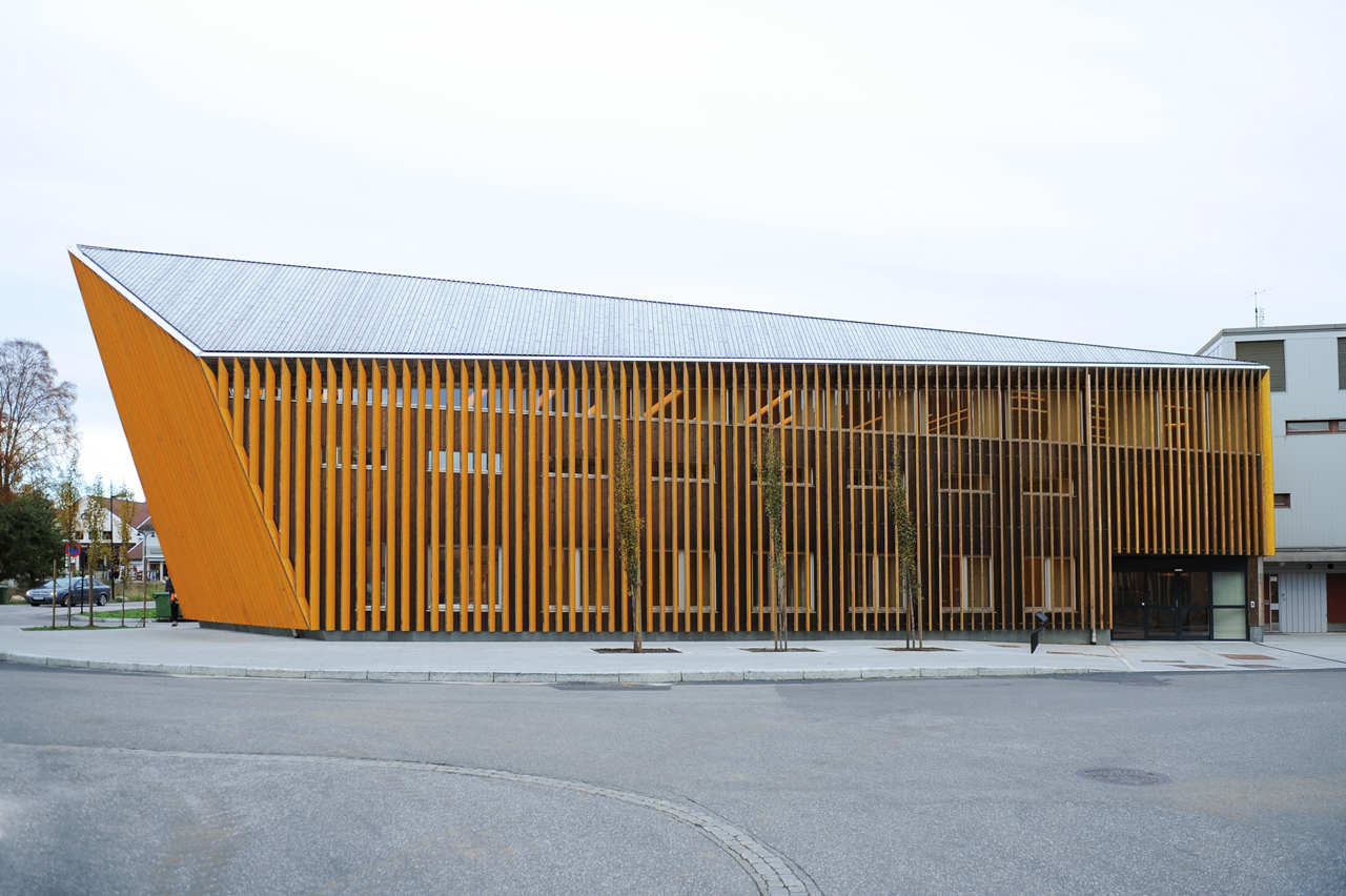
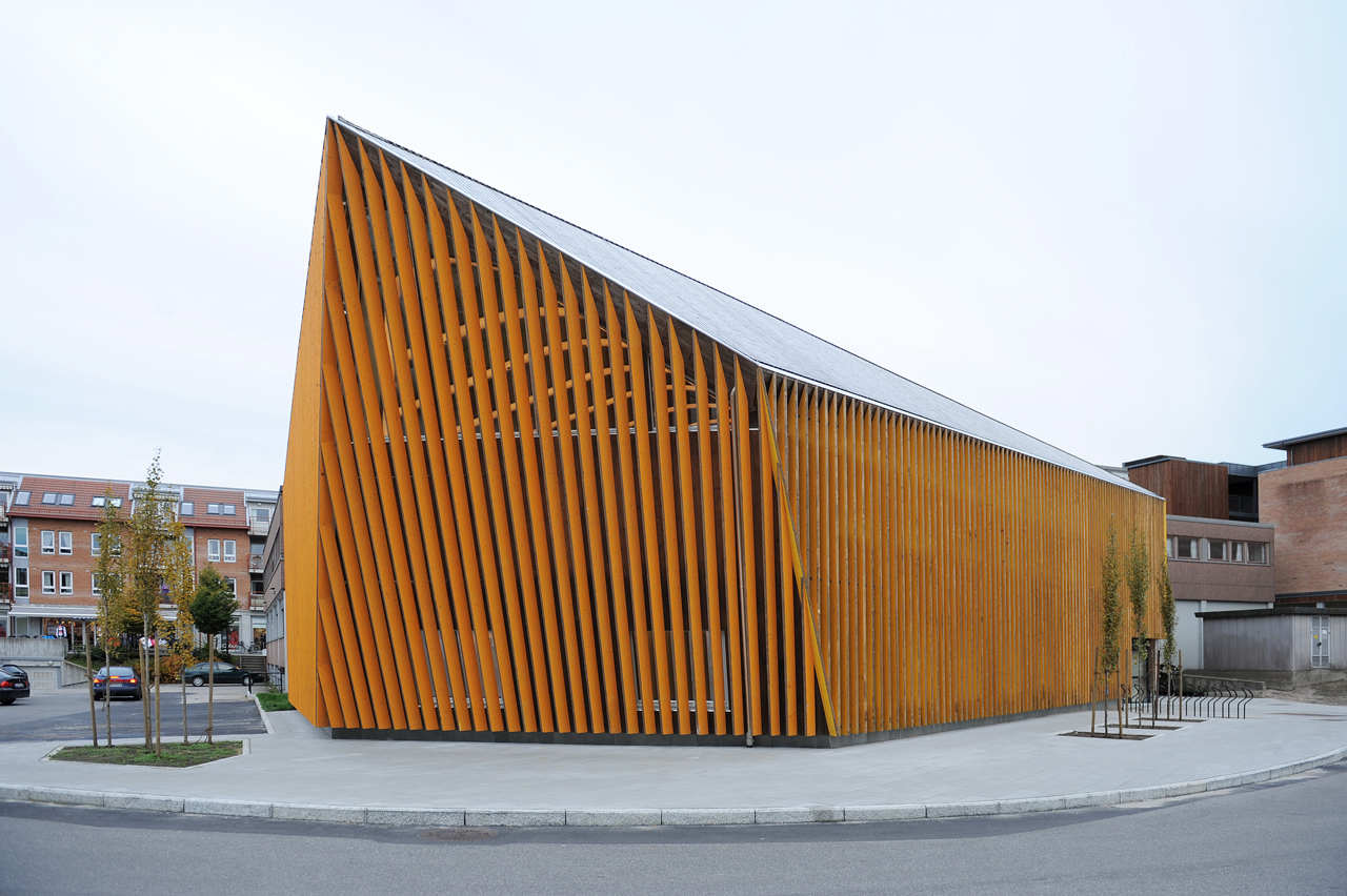
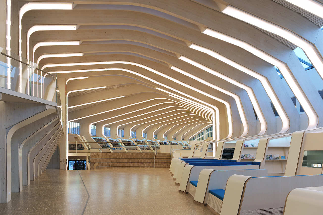
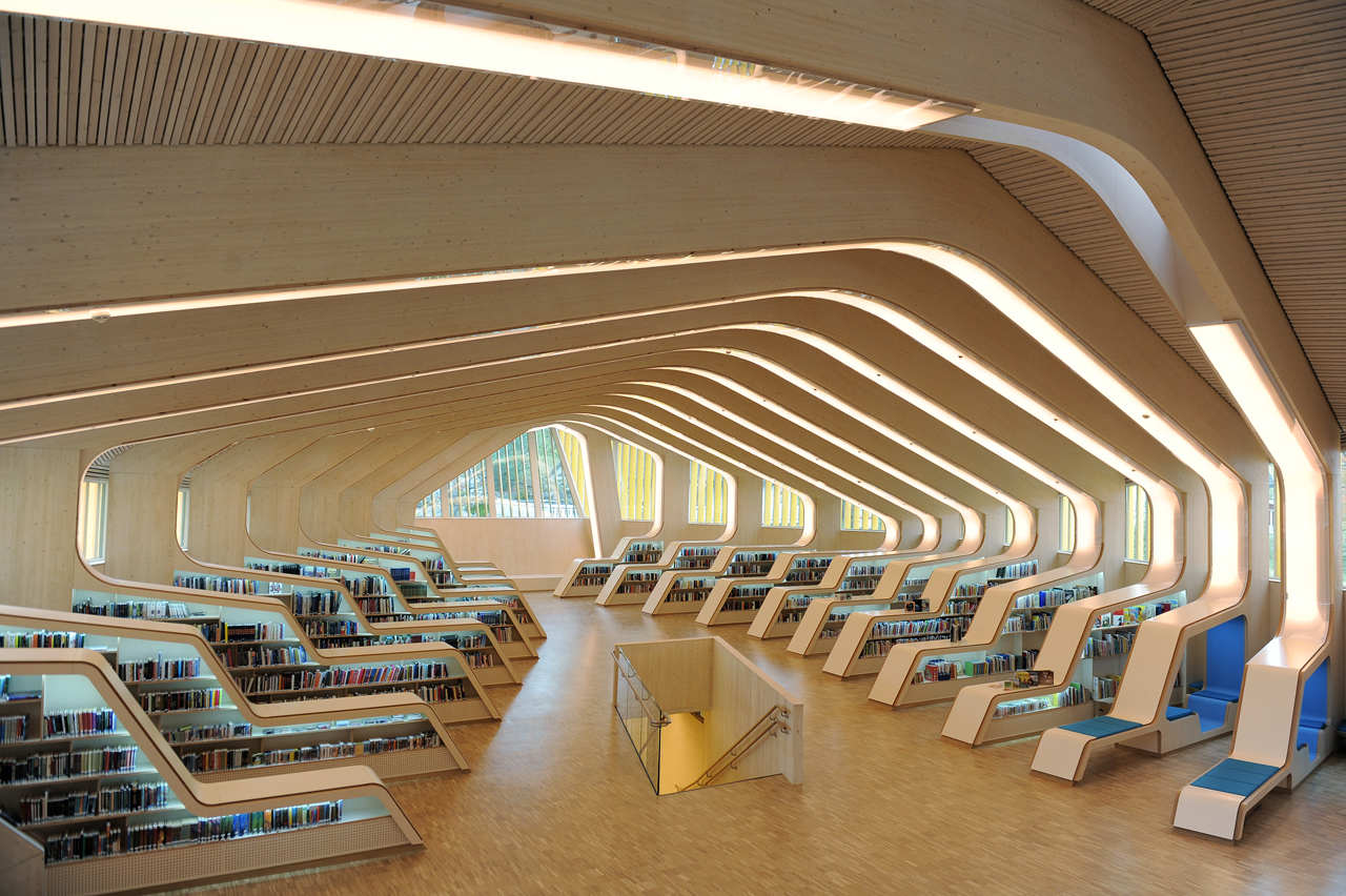
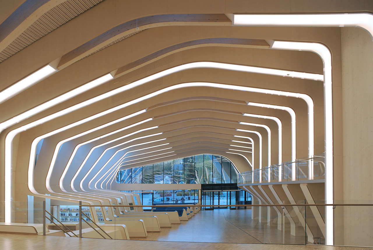
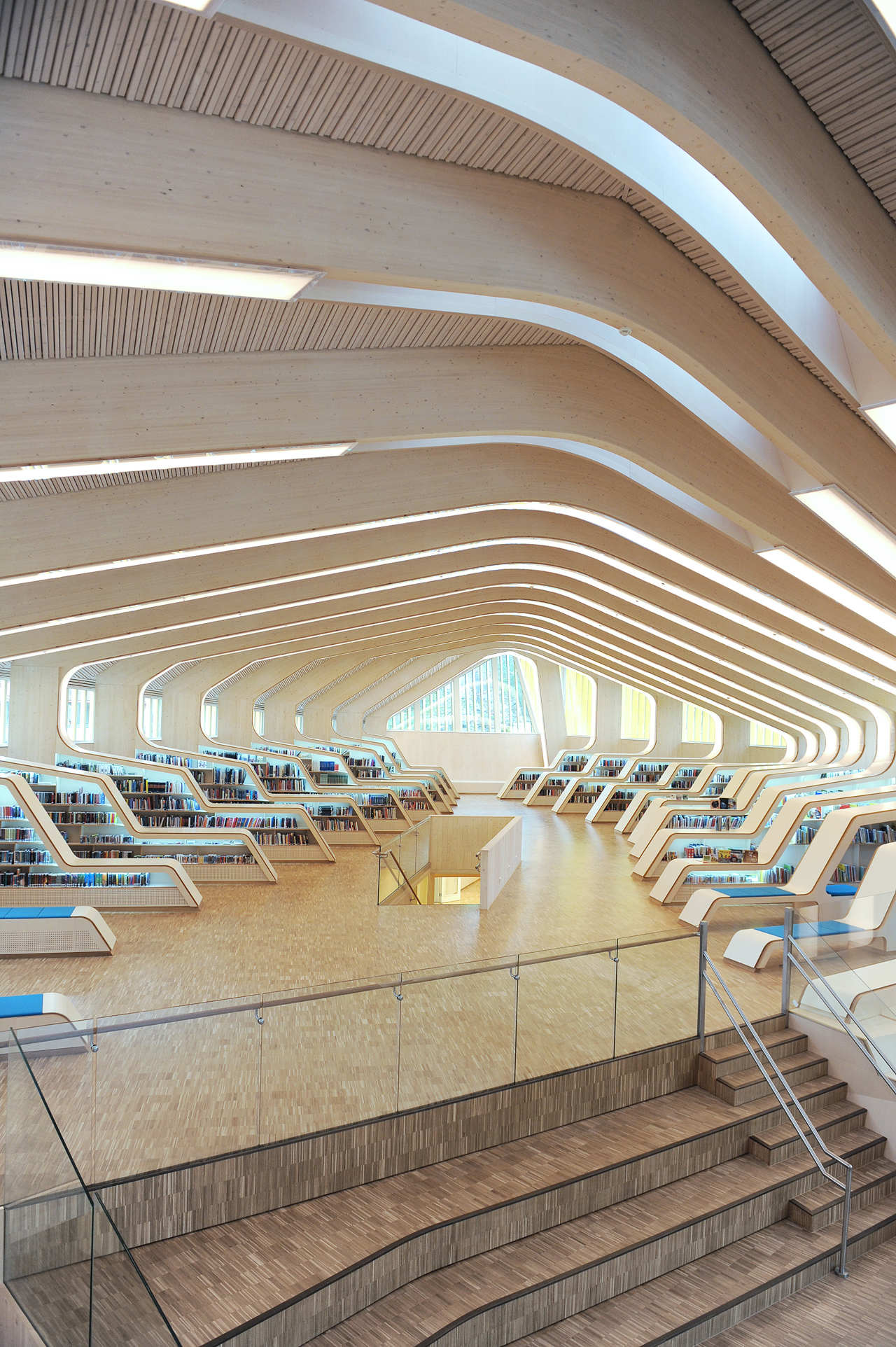
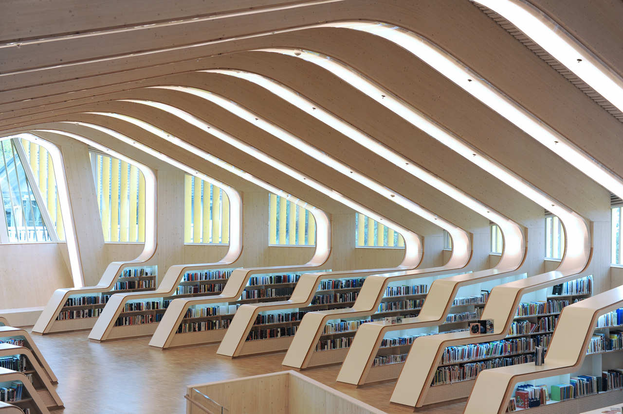
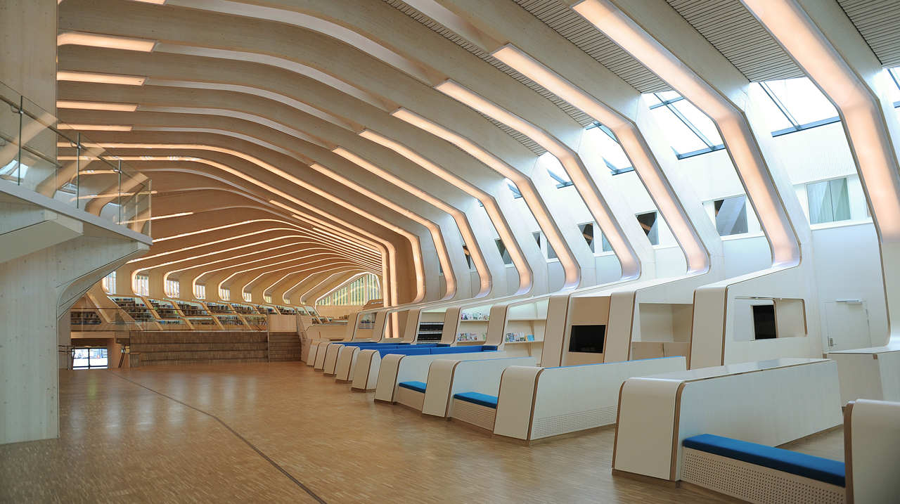
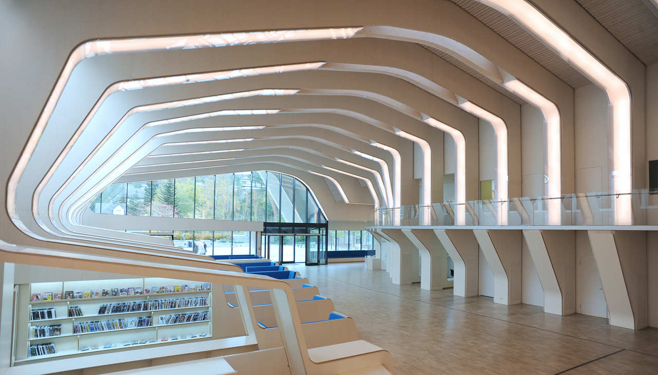
Made of 27 ribs of prefabricated glue-laminated timber elements and CNC-cut plywood boards are the basic components of this library, the Norwegian architects Helen & Hard bring a sophisticated elegance to this public library in Norway. The Gaudiesque style of timber beams and columns gradually shift shape according to technical and programmatic demands achieving a strong spatial identity well deserved for the cultural center. The library structural elements create a dynamic aesthetic identity for the project to meet the client’s original intent to mark the city’s cultural center. More details come from the architects after the jump. The new library in Vennesla comprises a library, a cafe, meeting places, and administrative areas, and links an existing community house and learning center together. Supporting the idea of an inviting public space, all main public functions have been gathered into one generous space allowing the structure combined with furniture and multiple spatial interfaces to be visible in the interior and from the exterior. An integrated passage brings the city life into and through the building. Furthermore, the brief called for the new building to be open and easily accessible from the main city square, knitting together the existing urban fabric. This was achieved using a large glass facade and urban loggia providing a protected outdoor seating area.
 In this project, we developed a rib concept to create useable hybrid structures that combine a timber construction with all technical devices and the interior.
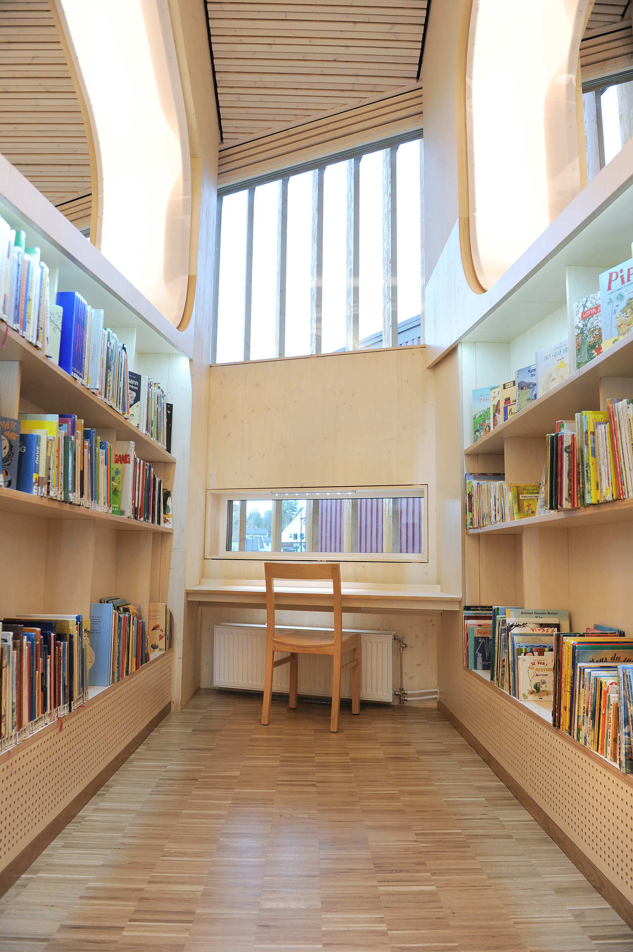
The whole library consists of 27 ribs made of prefabricated glue-laminated timber elements and CNC-cut plywood boards. These ribs inform the geometry of the roof, as well as the undulating orientation of the generous open space, with personal study zones nestled along the perimeter. Each rib consists of a glue-laminated timber beam and column, acoustic absorbents which contain the air conditioning ducts, bent glass panes that serve as lighting covers and signs, and integrated reading niches and shelves.
 The gradually shifting shapes of the ribs are generated by adapting to the two adjacent buildings and also through the spatial quality and functional demands for the different compartments of the library. Each end façade has been shaped according to the specific requirements of the site. At the main entrance, the rib forms the loggia which spans the width of the entire square. Against south/west the building traces the natural site lines and the building folds down towards the street according to the interior plan and height requirements. On this side, the façade is fitted with fixed vertical sun shading. This shading also gathers the building into one volume, which clearly appears between the two neighboring buildings. A main intention has also been to reduce the energy need for all three buildings through the infill concept and the use of high standard energy-saving solutions in all new parts. The library is a ‘low-energy’ building, defined as class ‘A’ in the Norwegian energy-use definition system. We aimed to maximize the use of wood in the building. In total, over 450 m3 of glulam wood have been used for the construction alone. All ribs, inner and outer walls, elevator shaft, slabs, and partially roof, are made in glulam wood. All glulam is exposed on one or both sides. A symbiosis of structure, technical infrastructure, furniture, and interior in one architectonic element creates a strong spatial identity that meets the client’s original intent to mark the city’s cultural center.
PHOTOGRAPHY BY © Emile Ashley
PHOTOGRAPHY BY © Emile Ashley
PHOTOGRAPHY BY © Emile Ashley
PHOTOGRAPHY BY © Emile Ashley
PHOTOGRAPHY BY © Emile Ashley
PHOTOGRAPHY BY © Emile Ashley
PHOTOGRAPHY BY © Emile Ashley
PHOTOGRAPHY BY © Emile Ashley
PHOTOGRAPHY BY © Emile Ashley
PHOTOGRAPHY BY © Emile Ashley
PHOTOGRAPHY BY © Emile Ashley
PHOTOGRAPHY BY © Emile Ashley
PHOTOGRAPHY BY © Emile Ashley
PHOTOGRAPHY BY © Emile Ashley
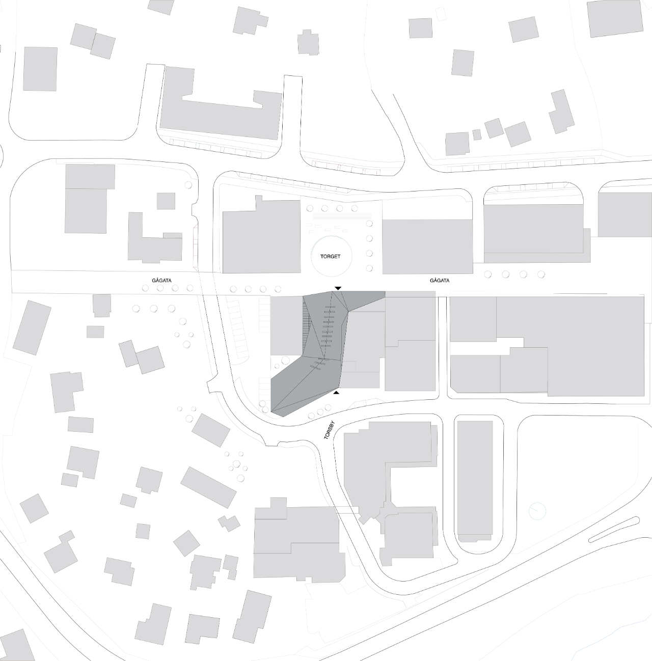
site plan
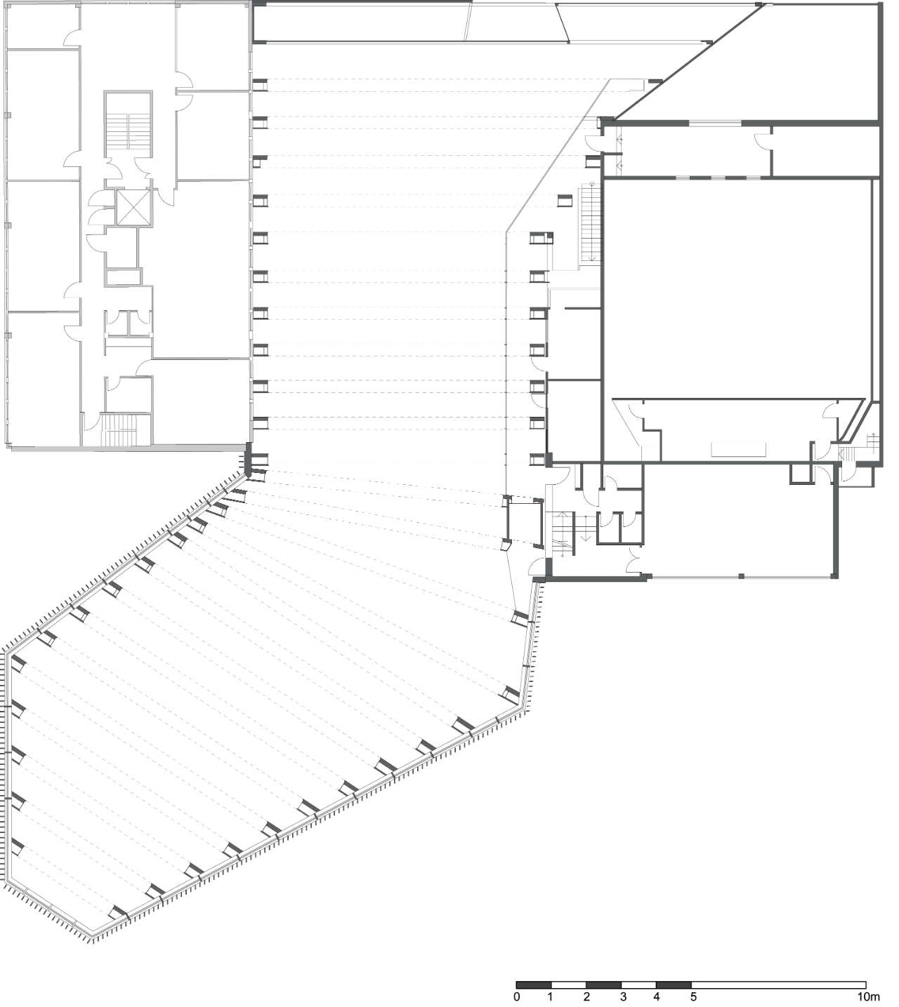
mezzanine plan
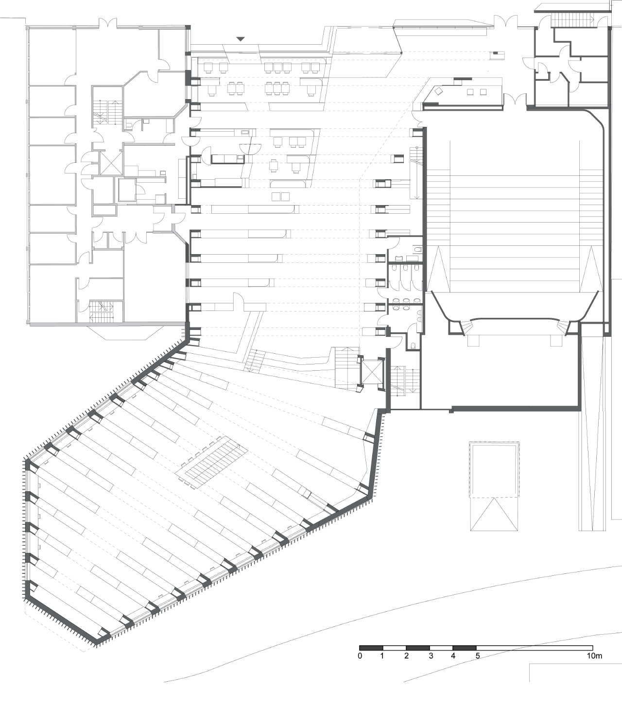
ground floor plan
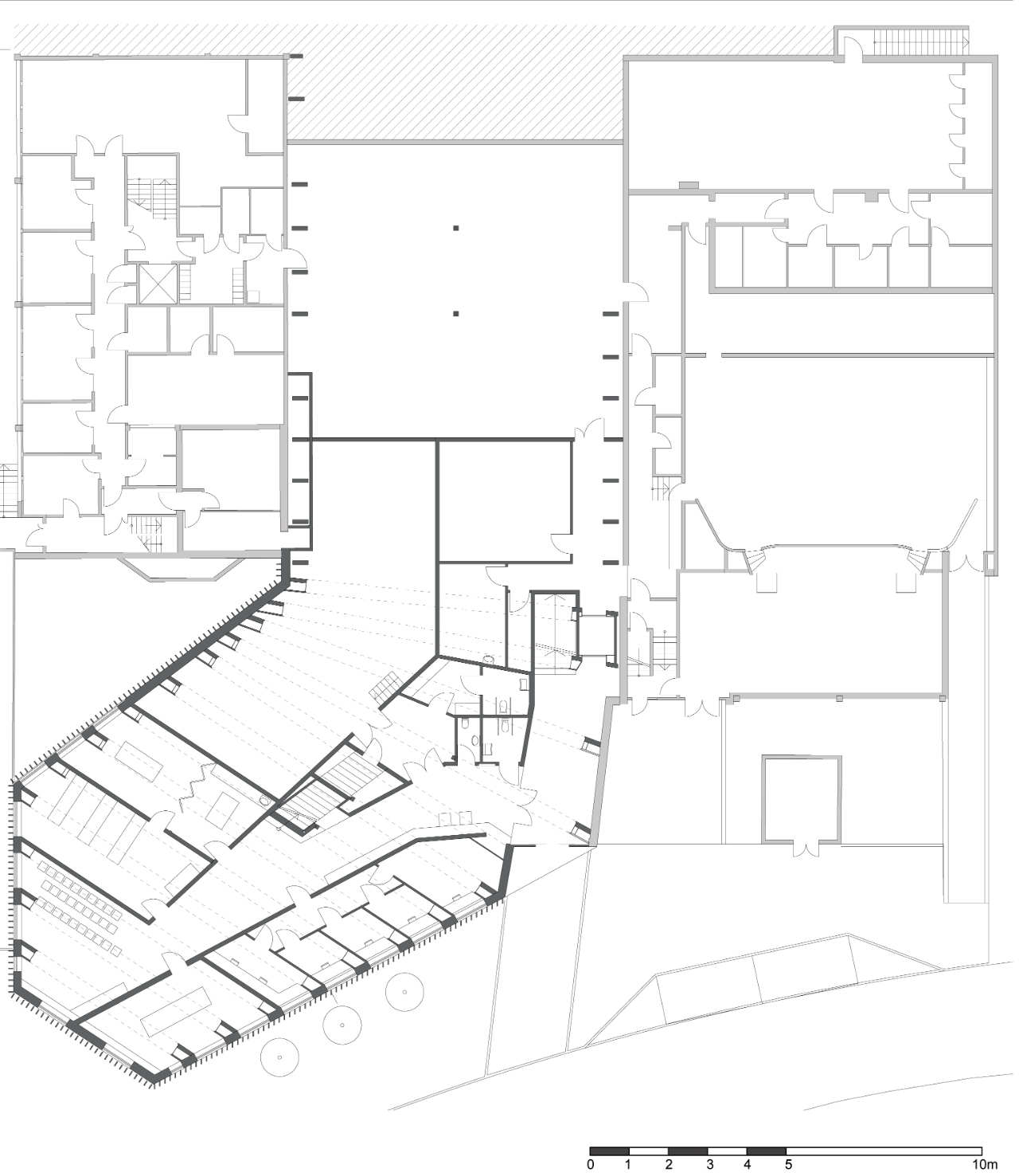
cellar plan
Courtesy of Helen & Hard – Photographs: Emile Ashley


