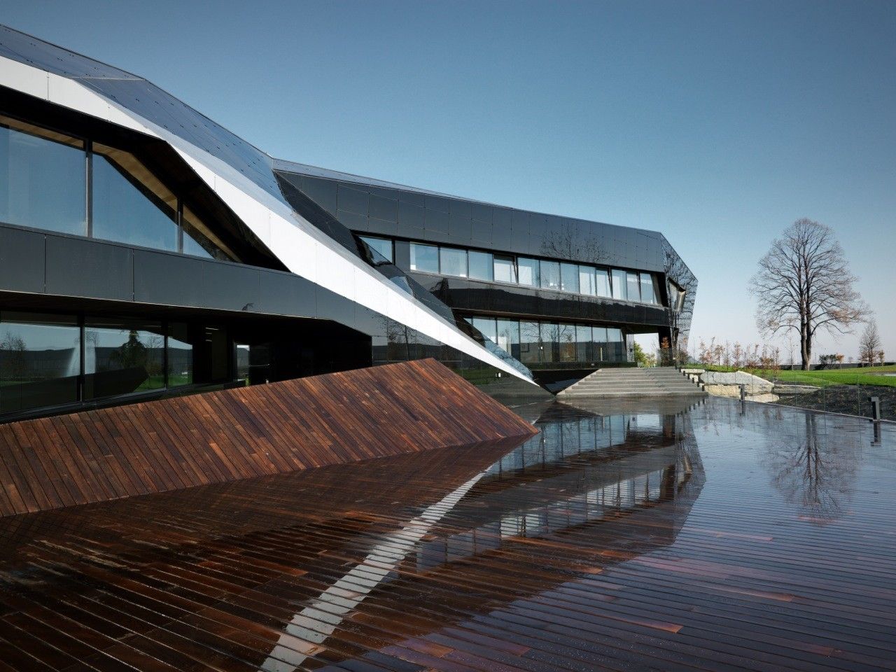
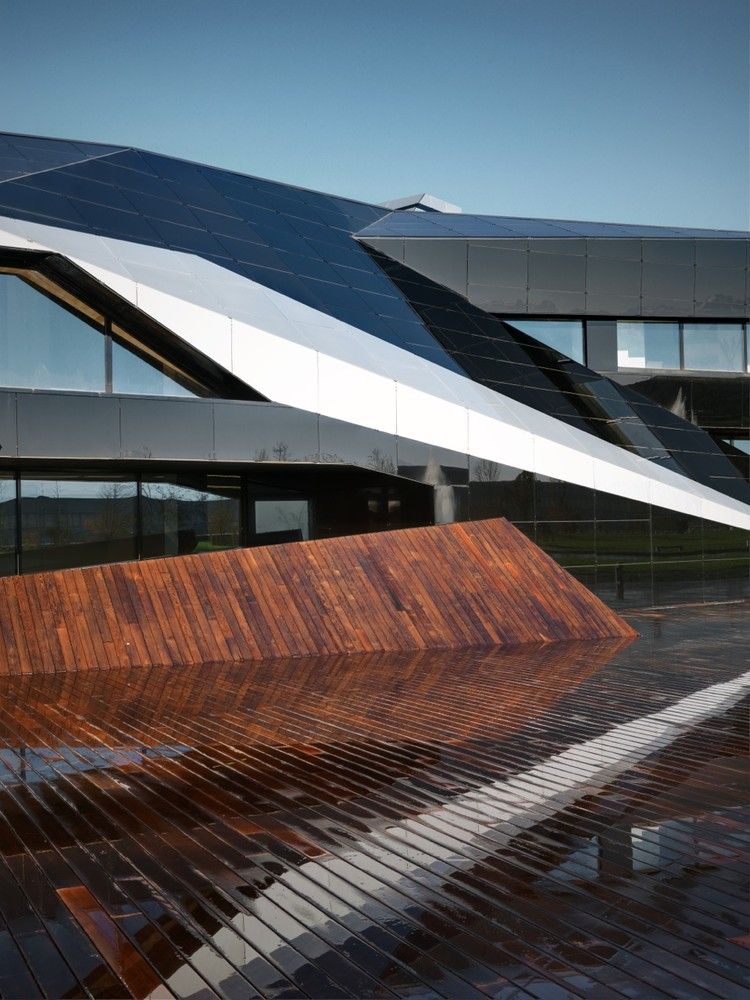
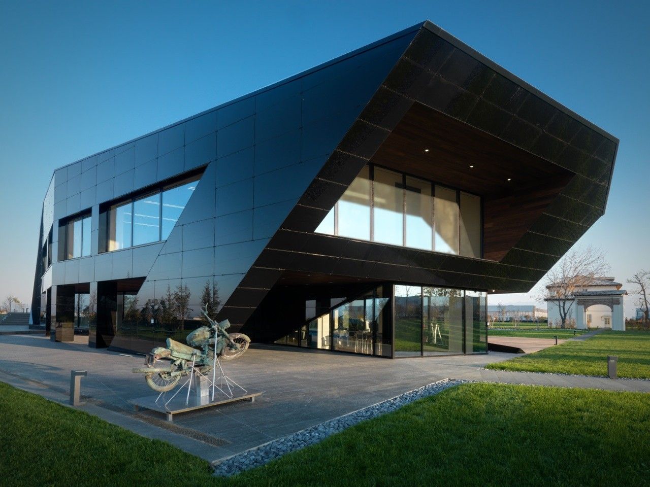
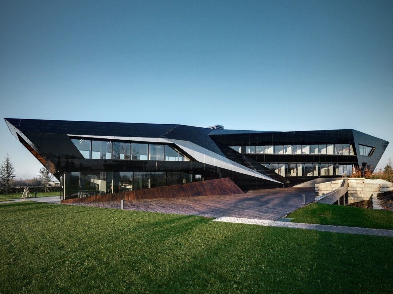
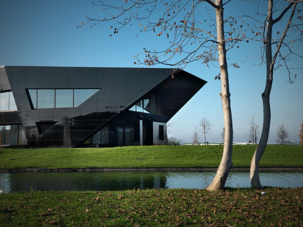
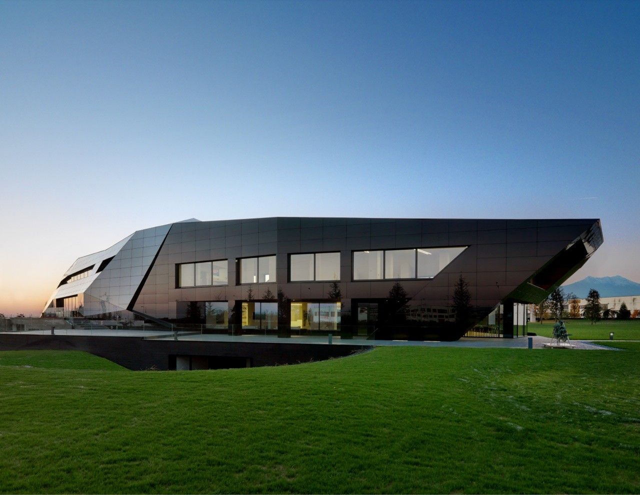
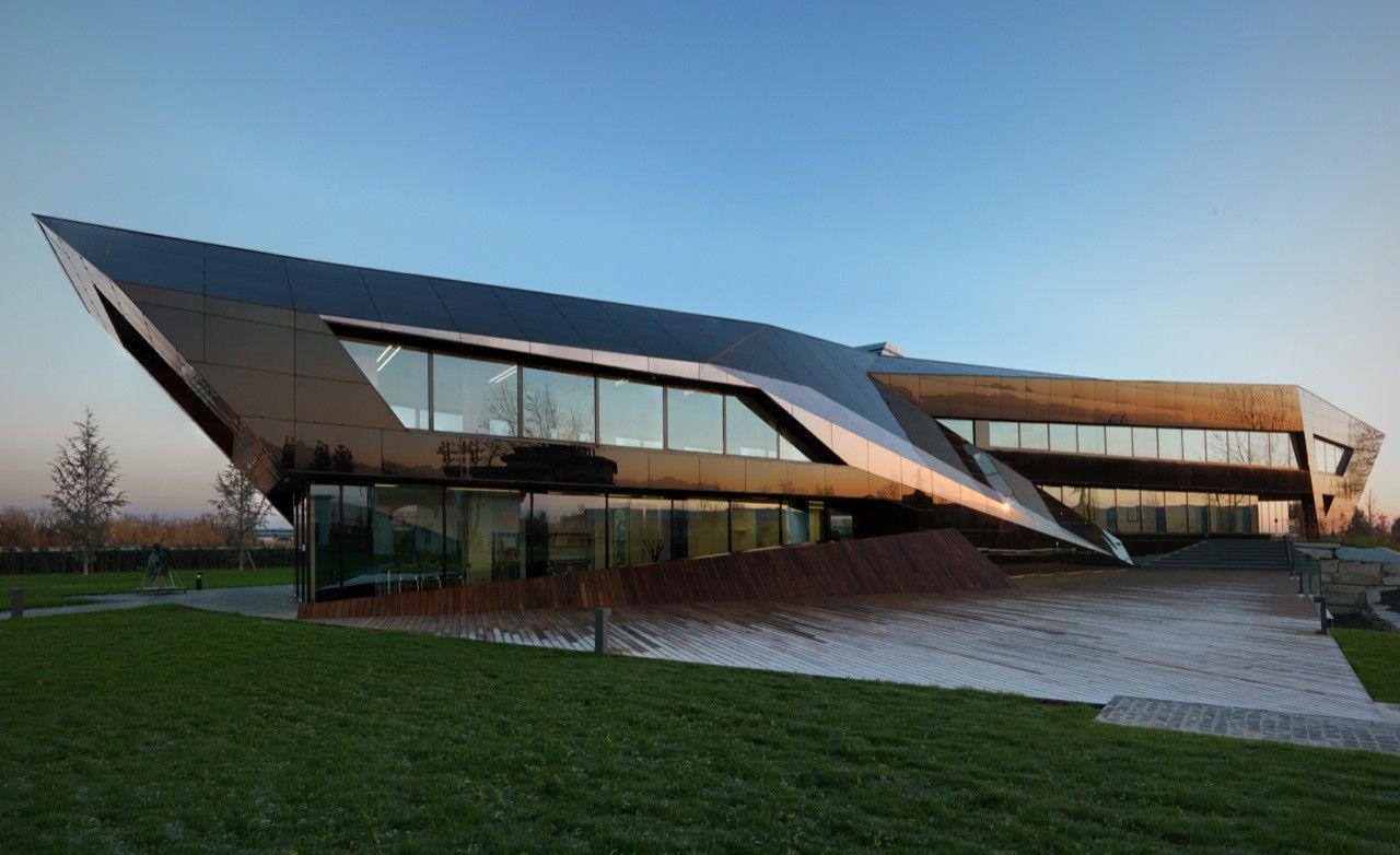
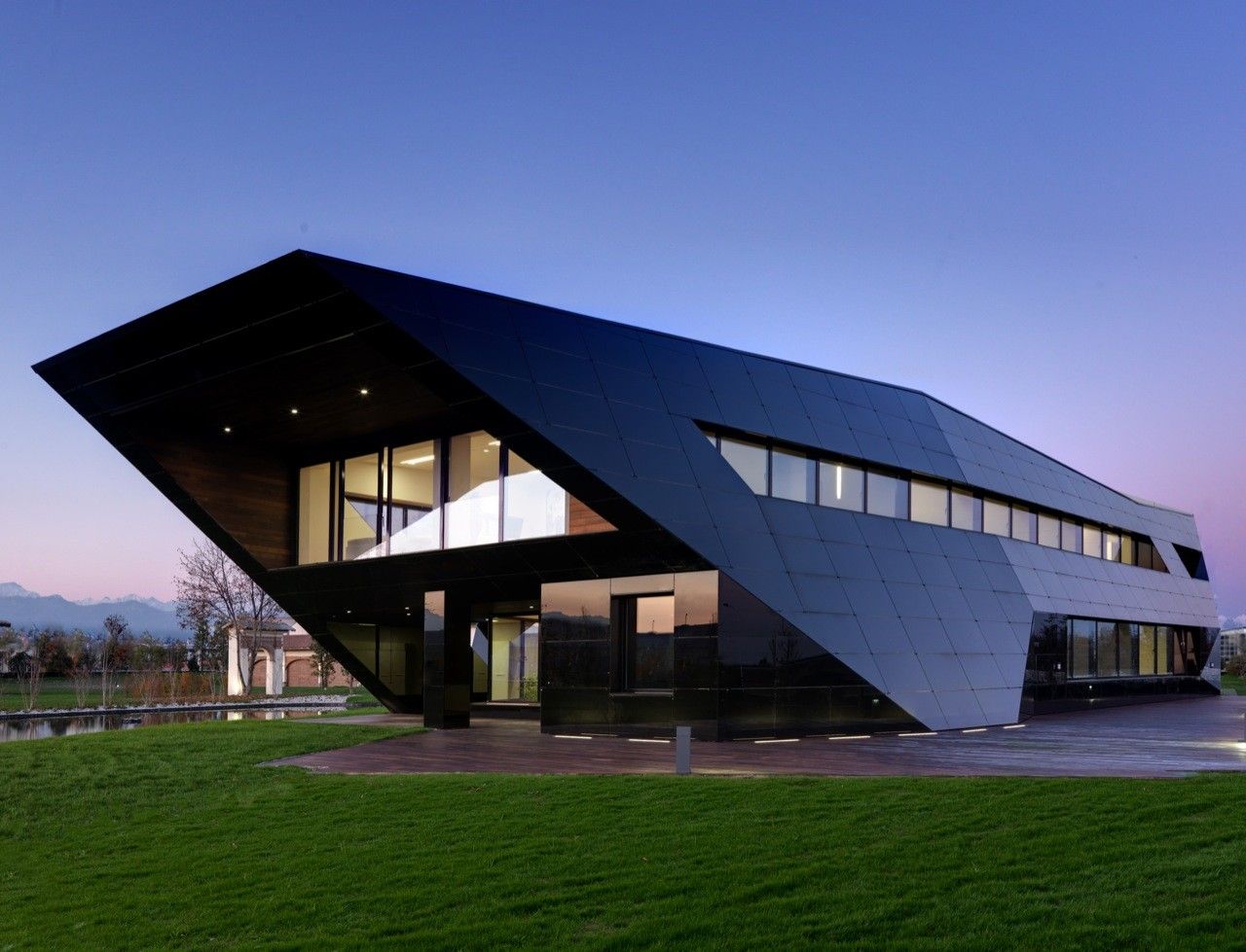
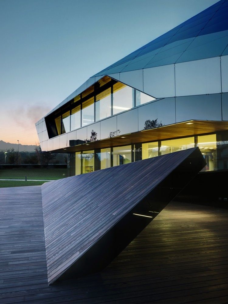
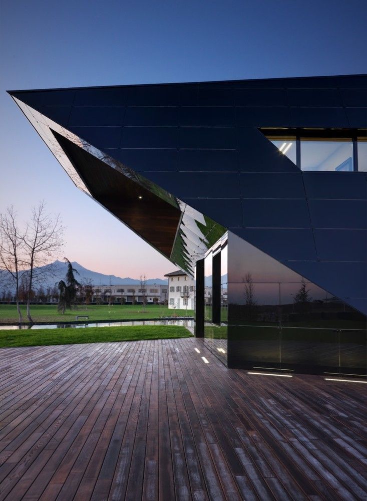
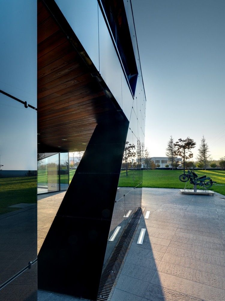
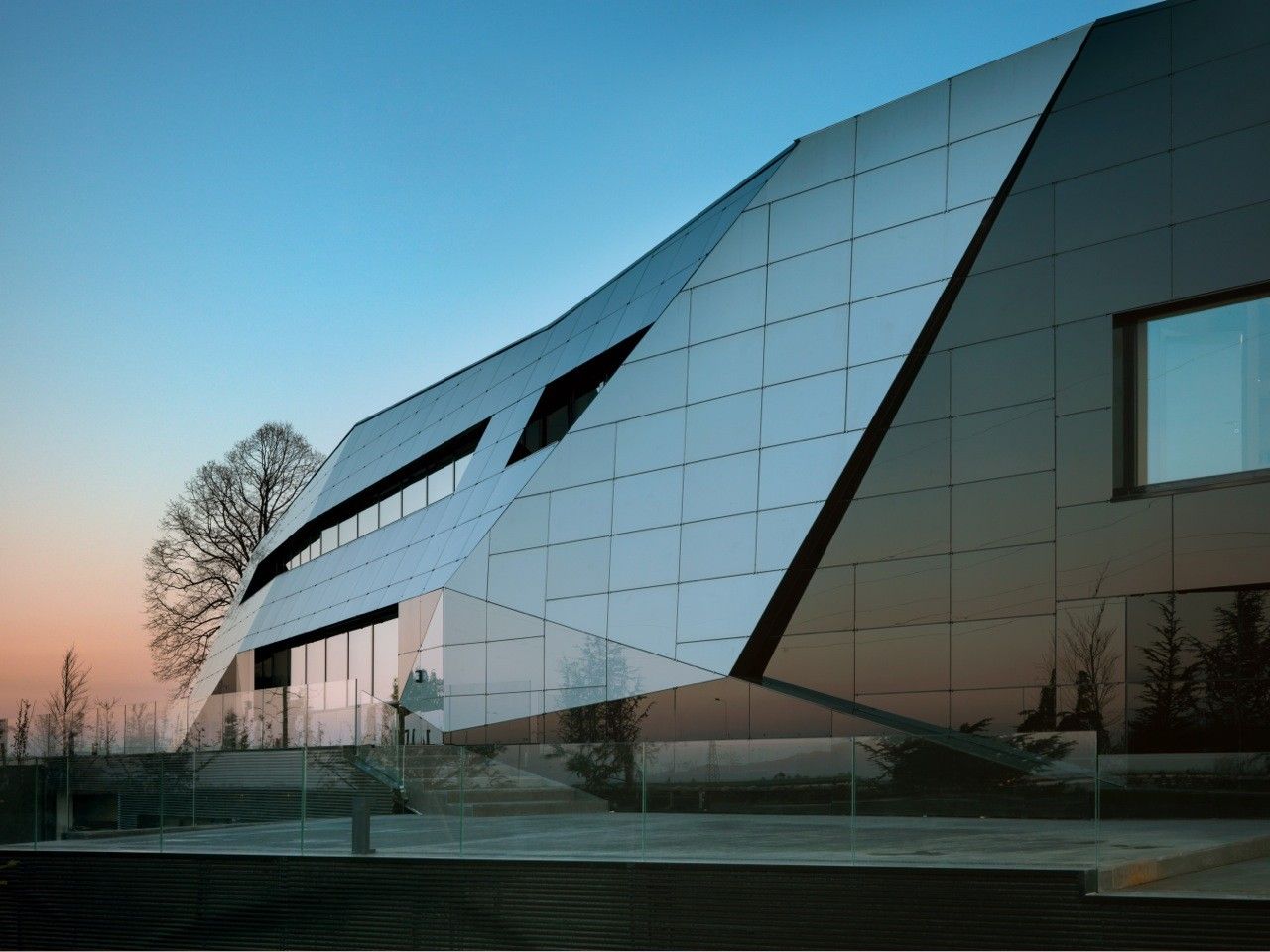
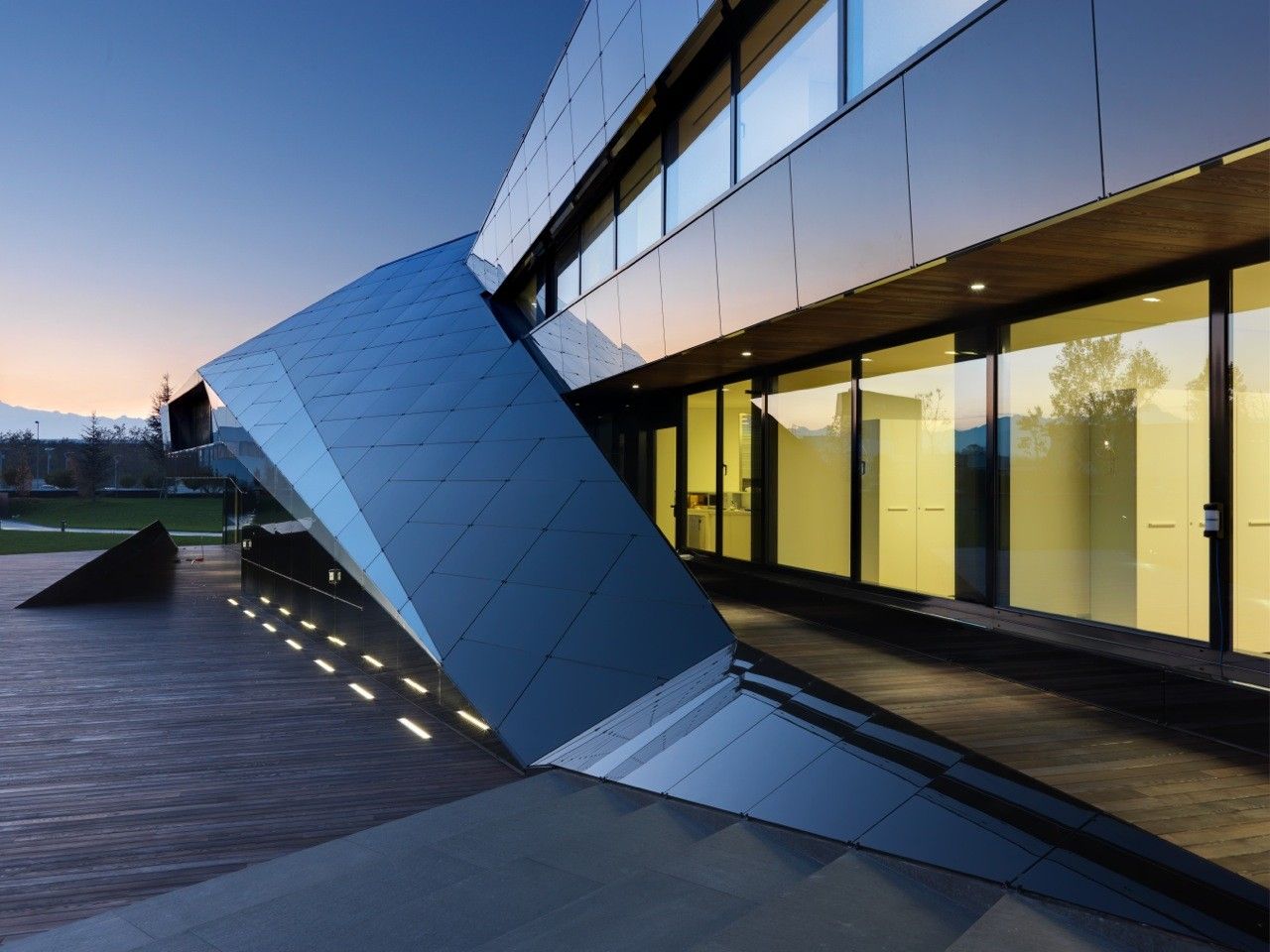
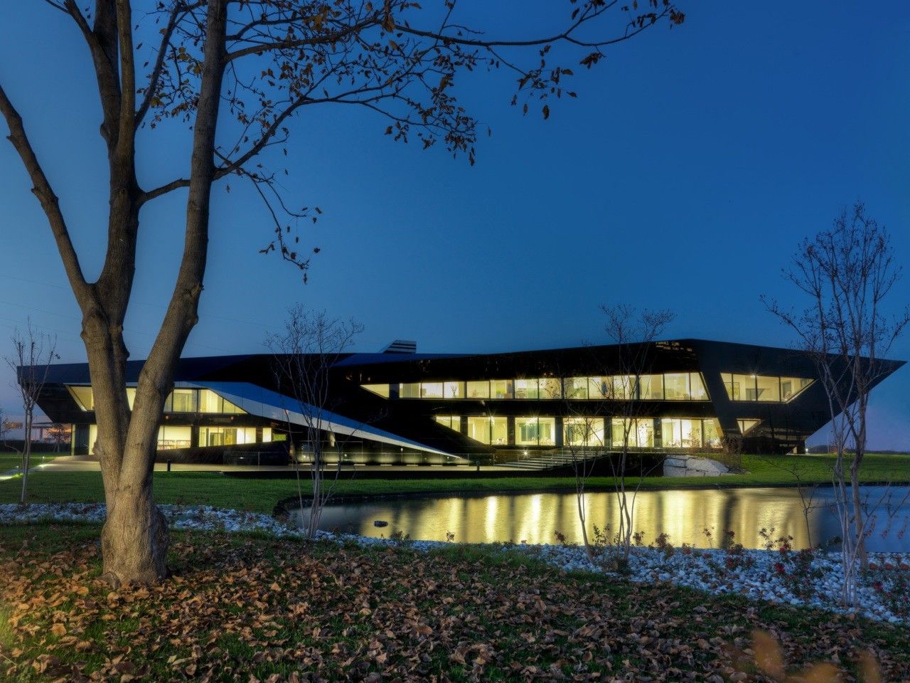
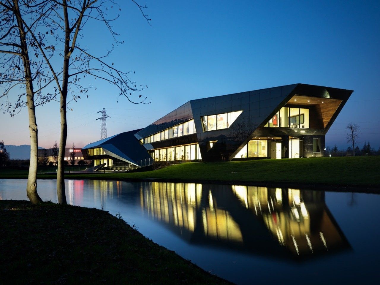
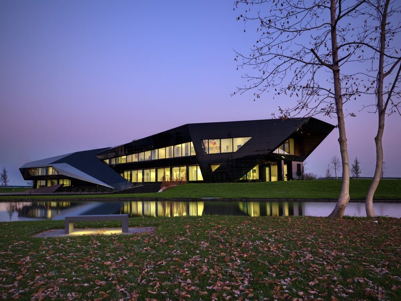
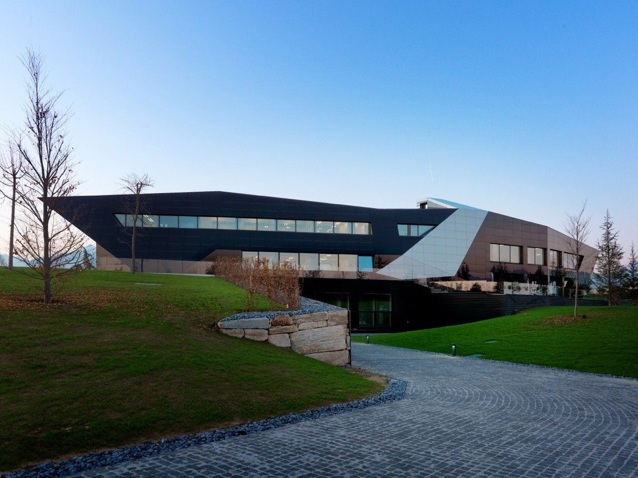
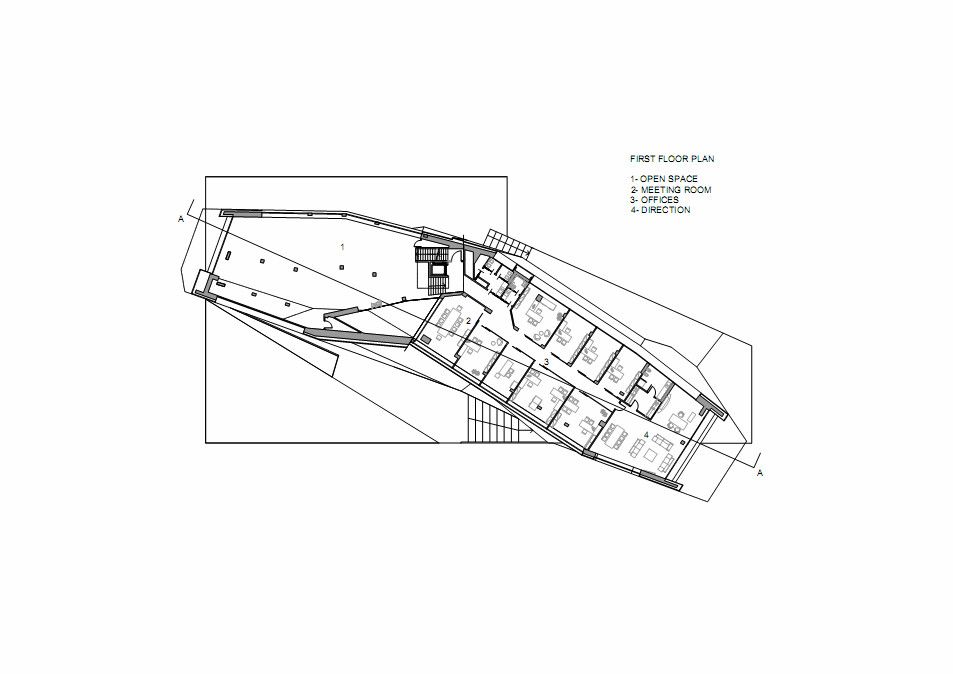
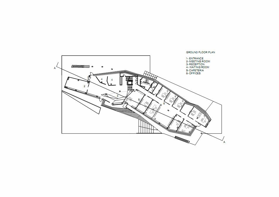
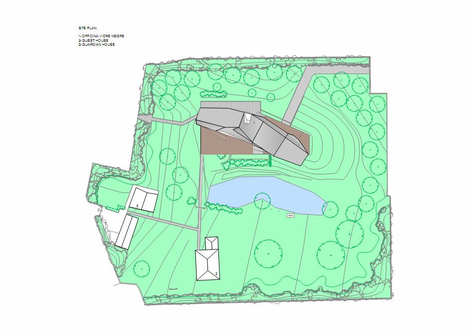
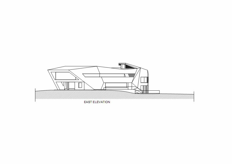
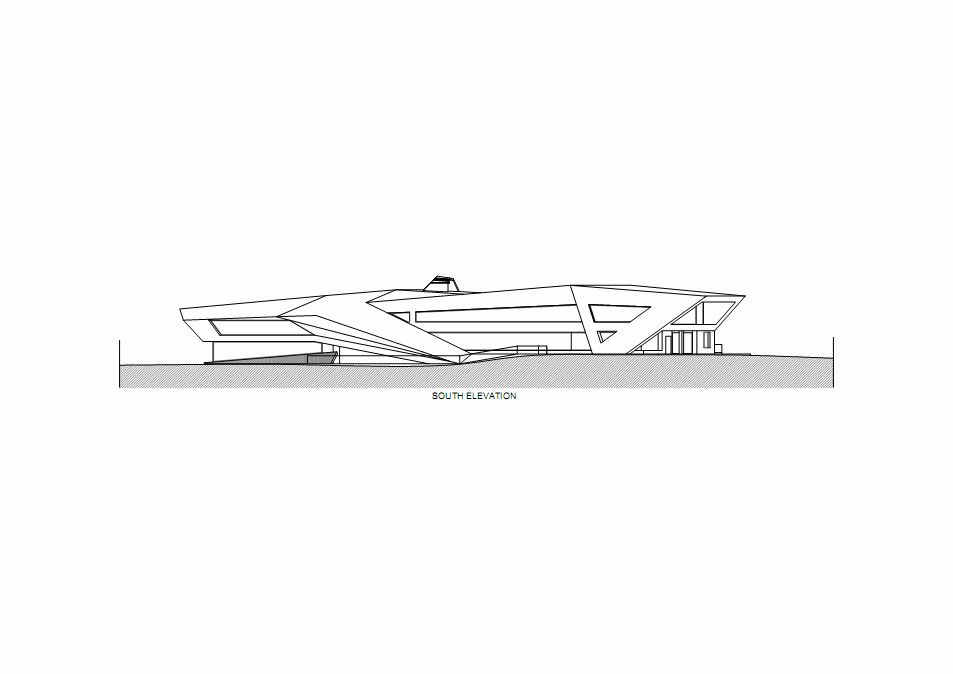
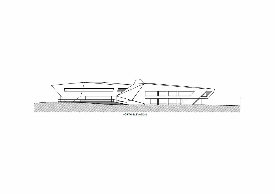
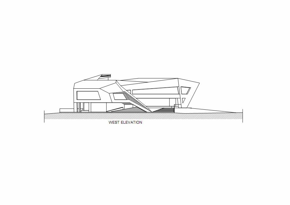
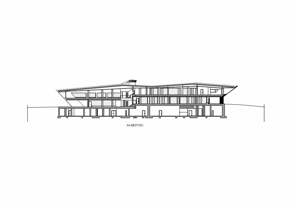
Designed by Damilano Studio Architects, Oficina Vidre Negre, for those not fluent in Catalan, means Black Glass Office, which very accurately describes the architecture of this building. The idea that is strongly observed within and around the structure is a reflection, making glass an easy choice of material for the façade. Reflection is one of those words that can be applied to a range of topics and interpretations. In this case, the smooth glass cladding of the prism hopes to reflect the surrounding park environment onto the building, which is also emphasized through its shape inspired by the landscape
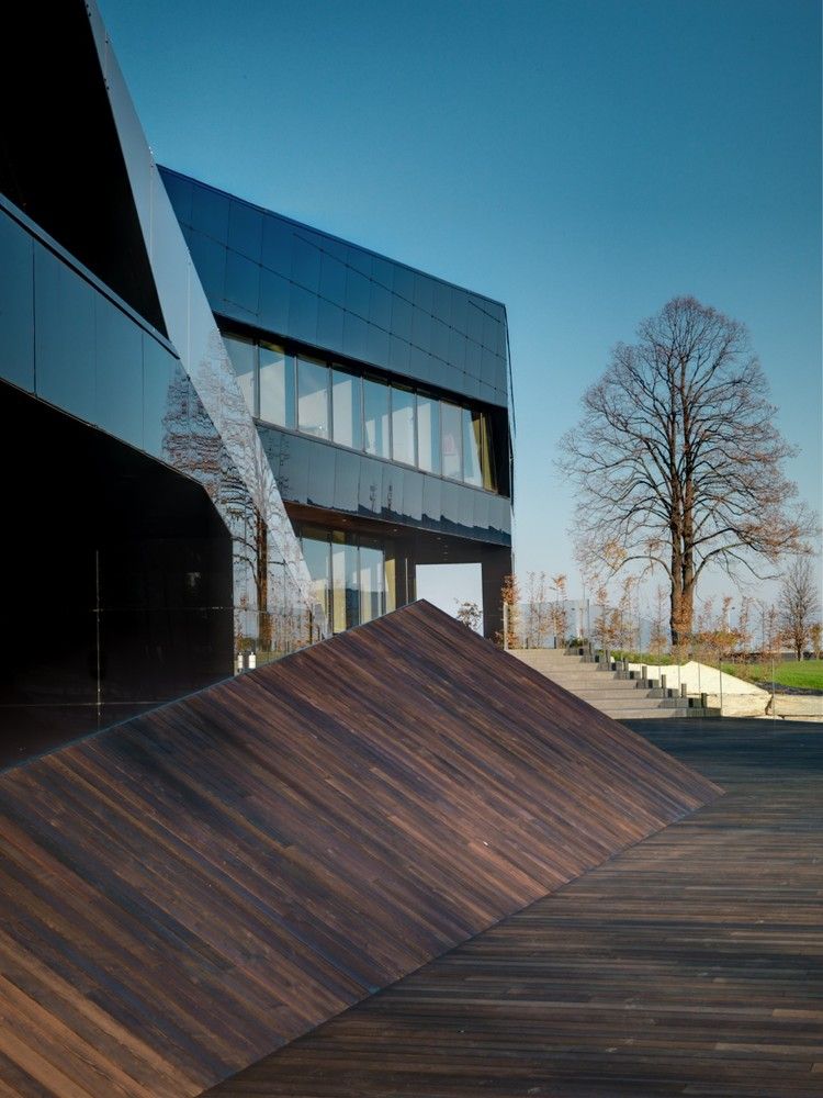
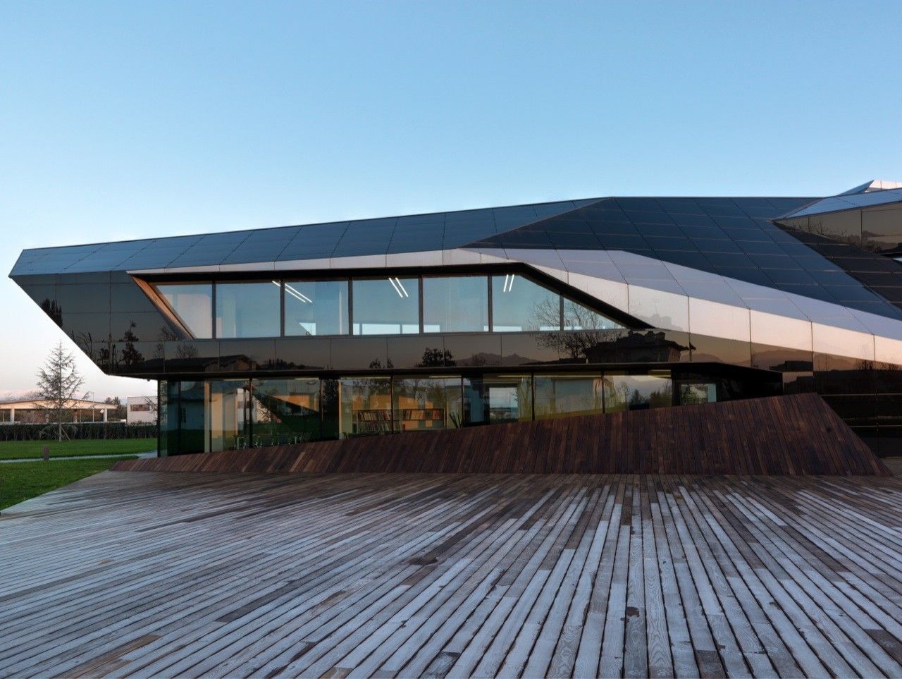
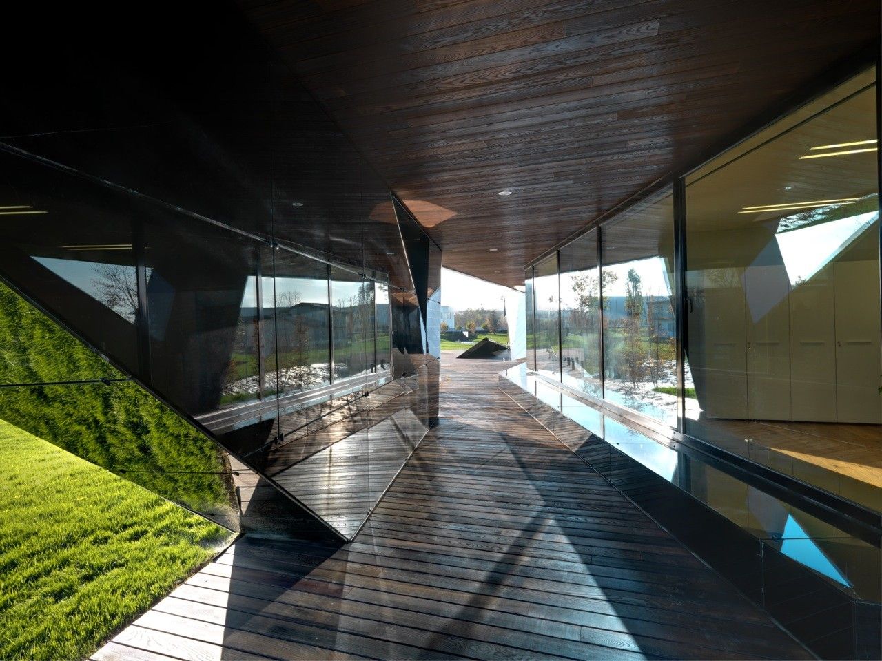
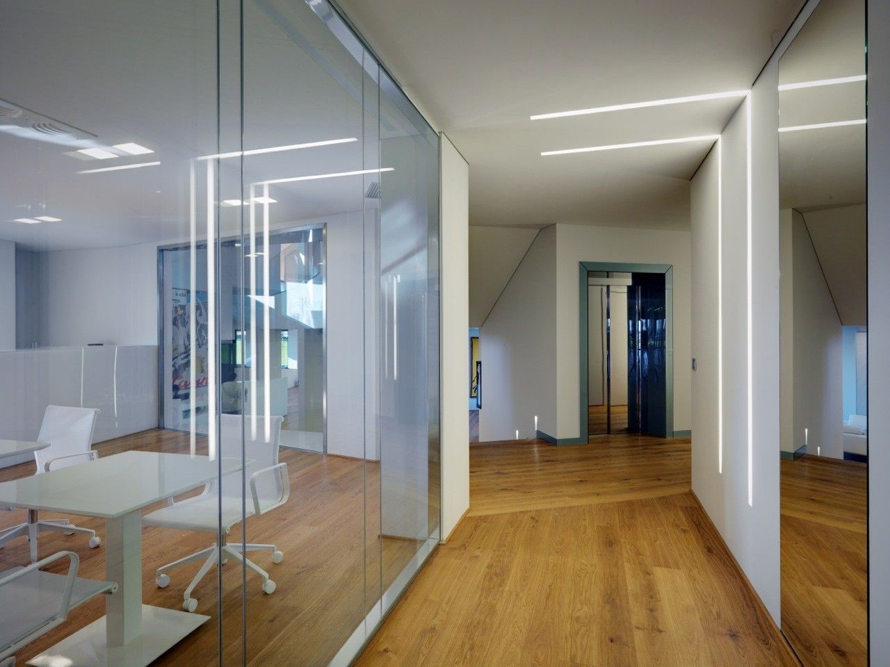
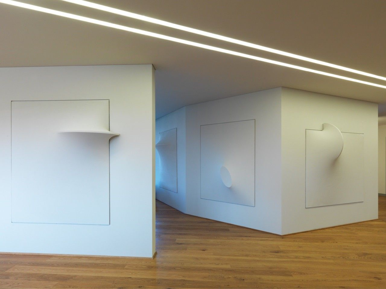
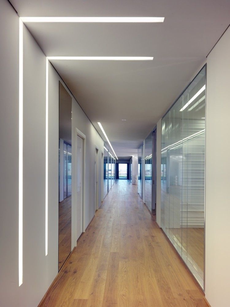
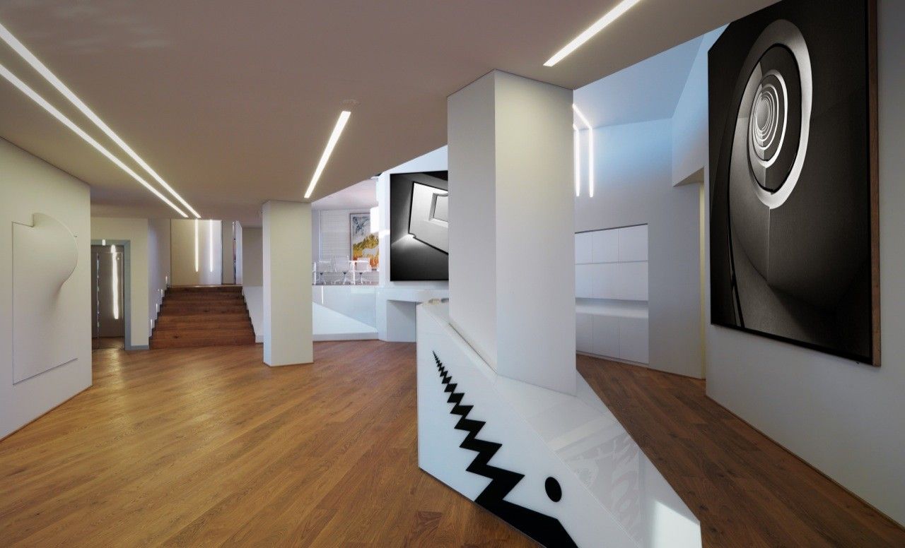
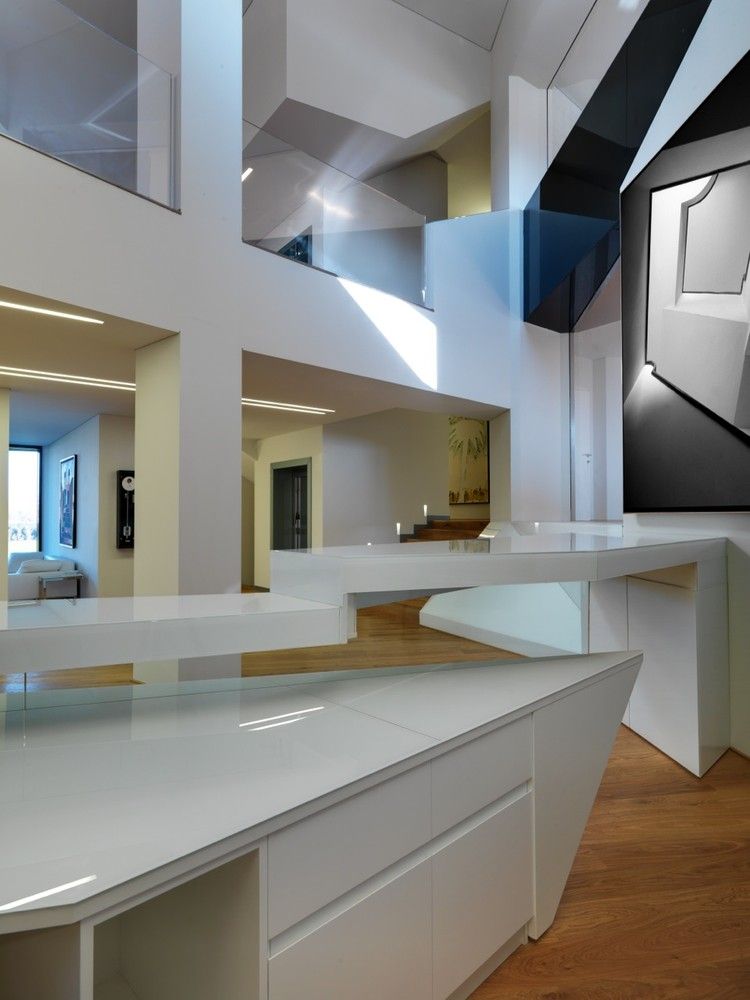
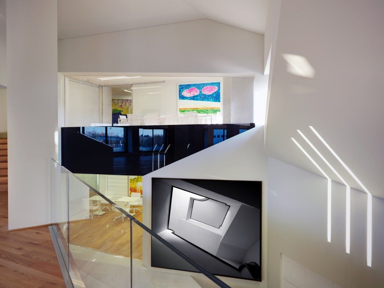
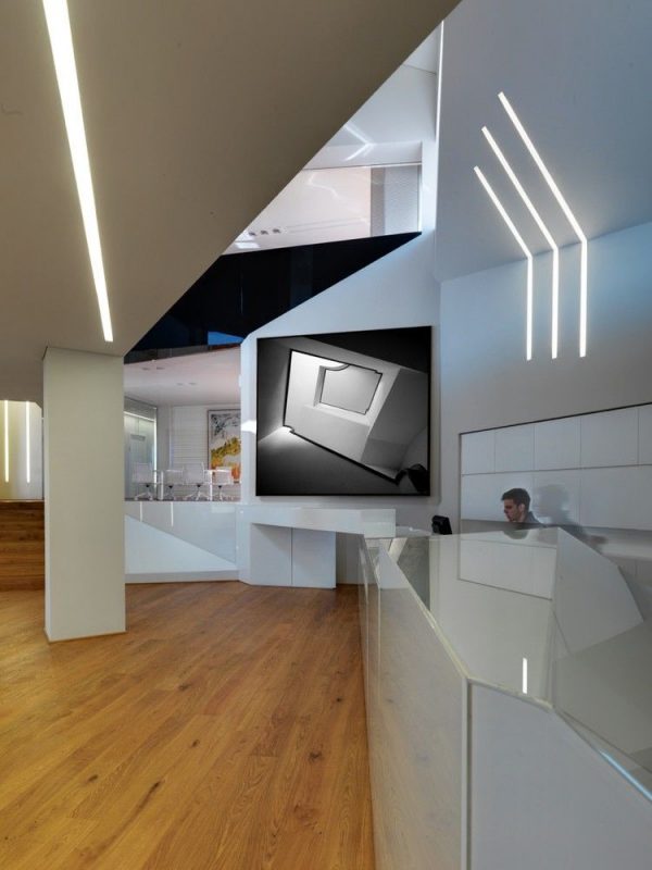
The building strives to become a part of its environment, attempting to blur the line between nature and structure. The dynamic geometric prism draws on sculpturesque qualities allowing it to remain functional while still intriguing to look at, creating a mountain within the park. By using glass handrails on the exterior and wooden oak flooring throughout the entire structure, the only distinction between outside and inside is the door separating the two as the ground flows seamlessly through the building.
This structure is also a nice example of how to integrate sustainable technologies and environmental building systems within architecture without tarnishing the integrity of the initial design. The building runs along the east-west axis, allowing the most natural light to enter the building during the day, and enhancing the daylight by painting the interior white. Mixed among the glass exterior panels are voltaic panels to harness energy for the occupants to use during the day.
For what it’s worth, it would be interesting to see this building with the façade treated differently. I don’t mind the glass panels, which creates an interesting effect, but the fact that they are perfectly rectangular, except for the cuts made to fit the angles of the building, they do little to promote those gestures. By keeping the windows and entrances perpendicular to the ground, it emphasizes the rectangular nature of the building, hinting that the exterior is only a skin, most of which is only used for shading. No doubt Damilano Studio thought about this while designing the Oficina Vidre Negre, but it still leaves me to wonder how the building would have appeared if the panels were made in respect to the angles of the structure instead of adding a grid to a more abstract geometric prism.
Project Info:
Architects: Damilano Studio Architects
Location: Piedmont, Italy
Leading Architect: Arch. Duilio Damilano
Client: Porta Rossa s.p.a.
Area: 6960.0 m2
Photographs: Andrea Martiradonna
Manufacturers: SIMES
Project Name: VIDRE NEGRE OFICINA
