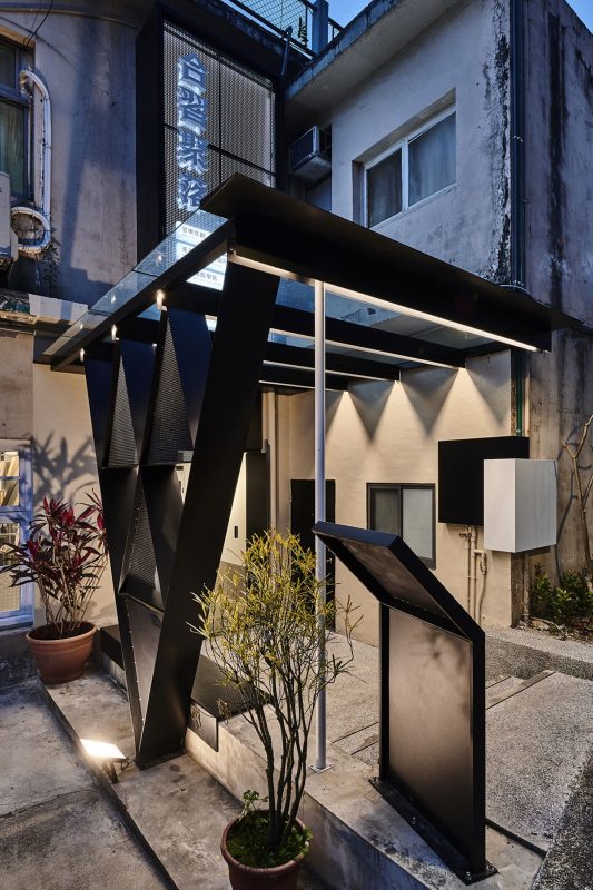
Ward with V dots is to reinvigorate the space of an old hospital and assist the vulnerable teenagers to regrow.
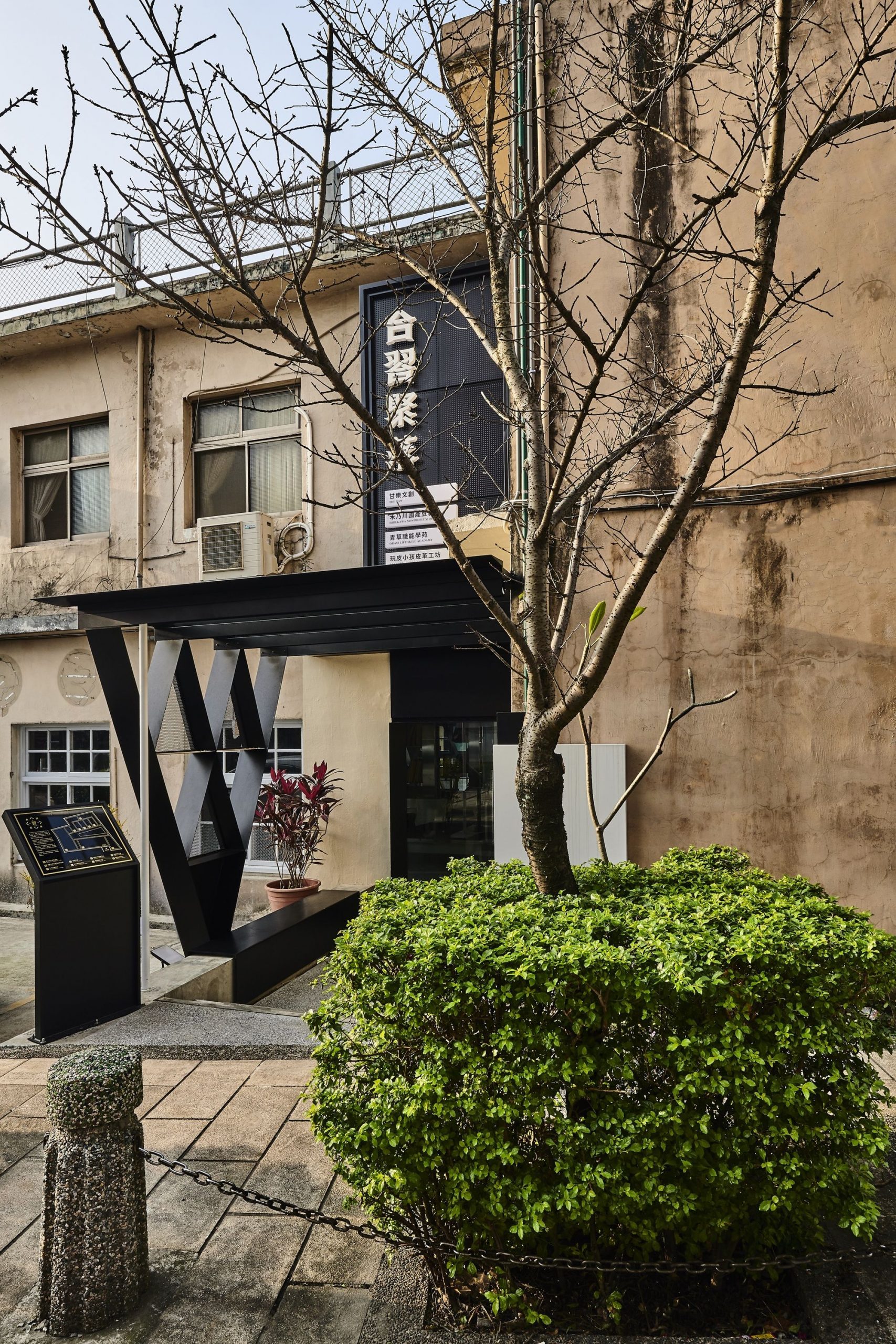
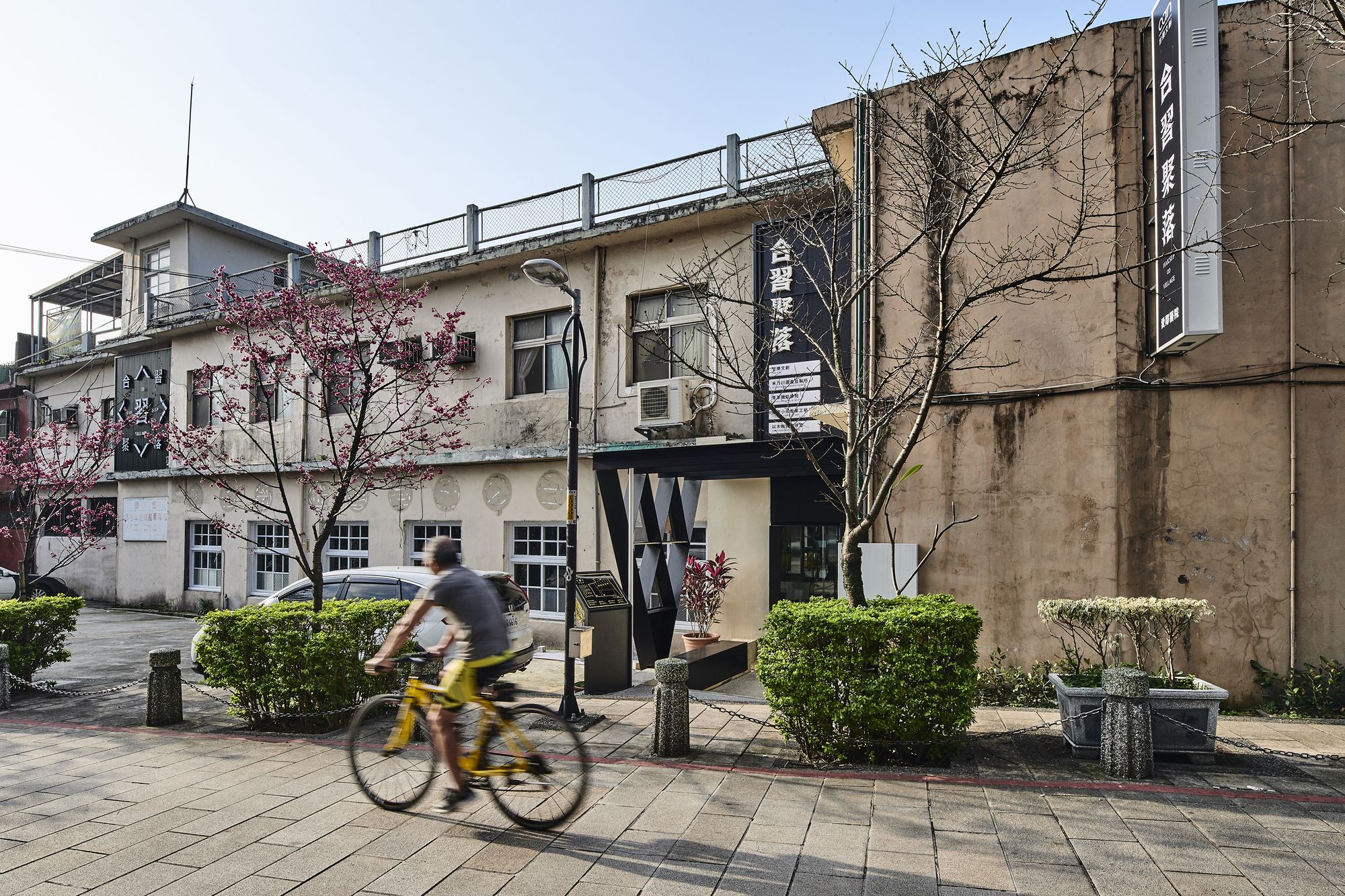
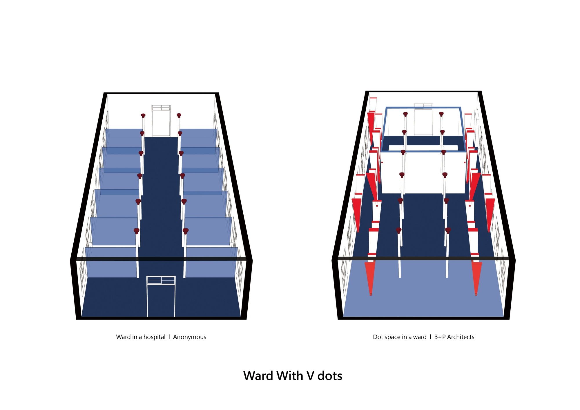
This old hospital with 70 years of history is now the important rejuvenating base for the old residents in Sanxia and it will become the life skills training venue for local vulnerable and highly attention-required students in the future. Meanwhile, it will also be a place for factory tours and as the internship store. The strategy for its space development is based on how to connect the future applications and the framework of the building. B+P Architects tried to show our respect to the old but reborn space to make it with new leaves on an old tree so the features of the original wardrooms are kept and maximized.
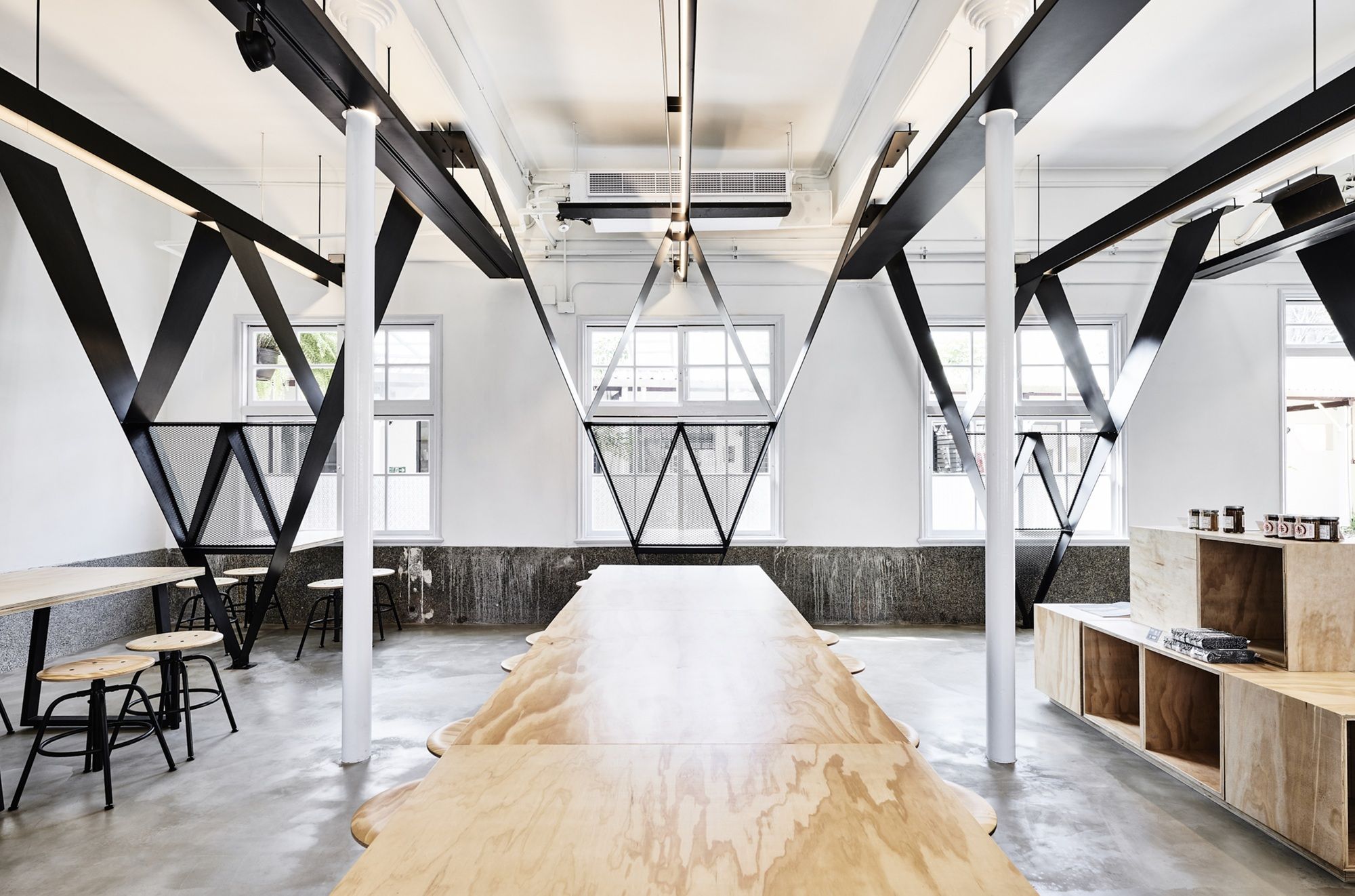
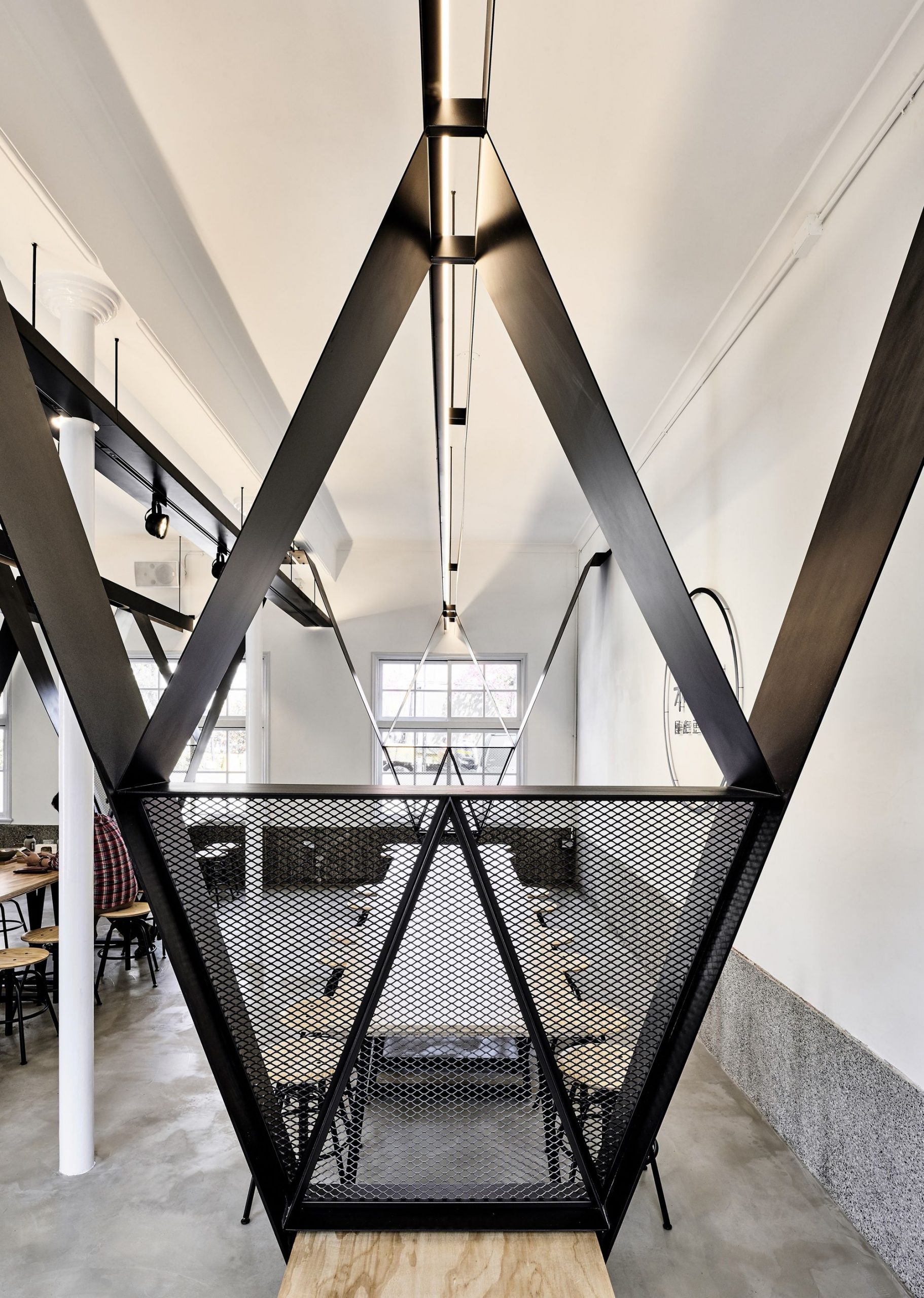
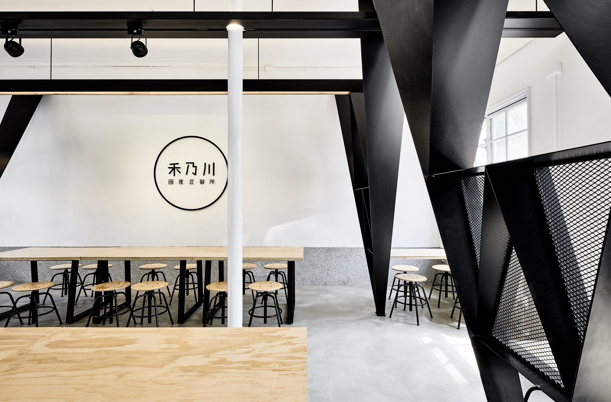
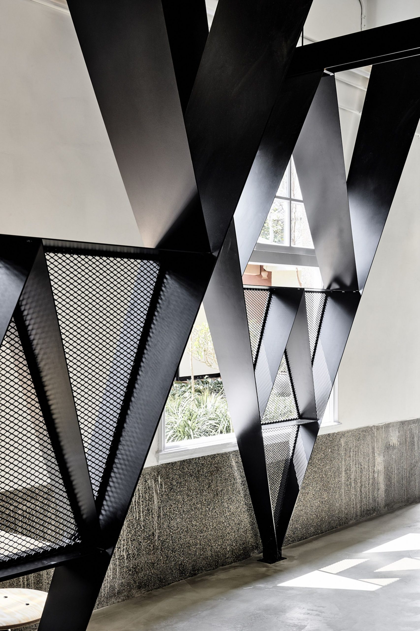
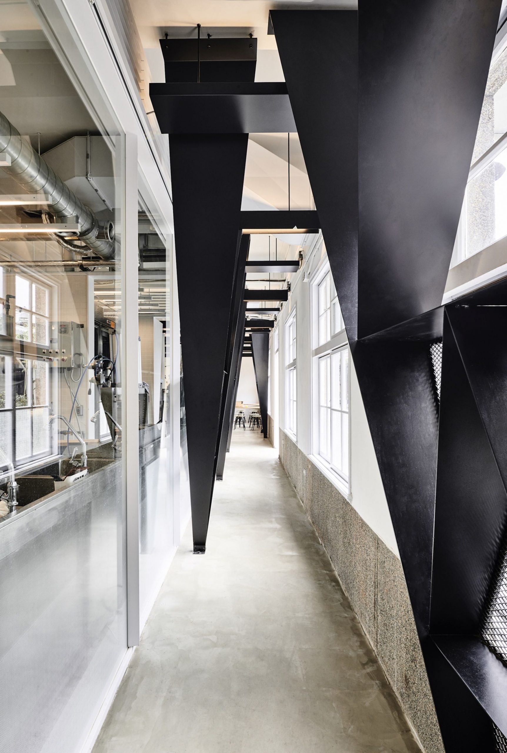
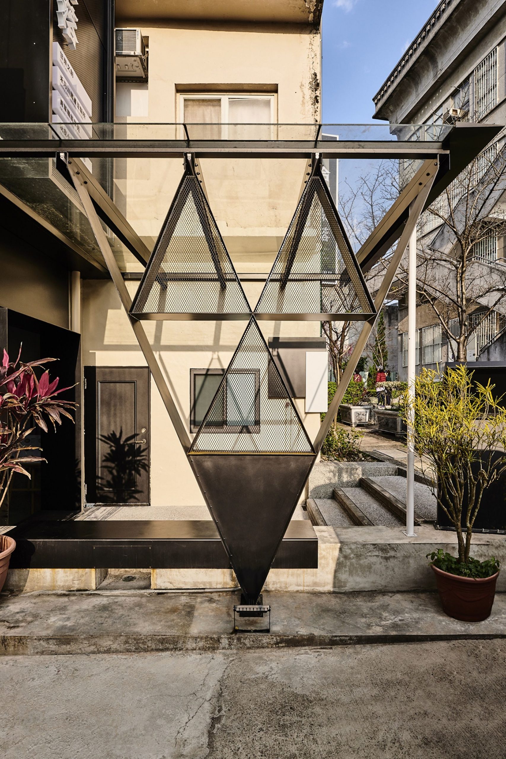
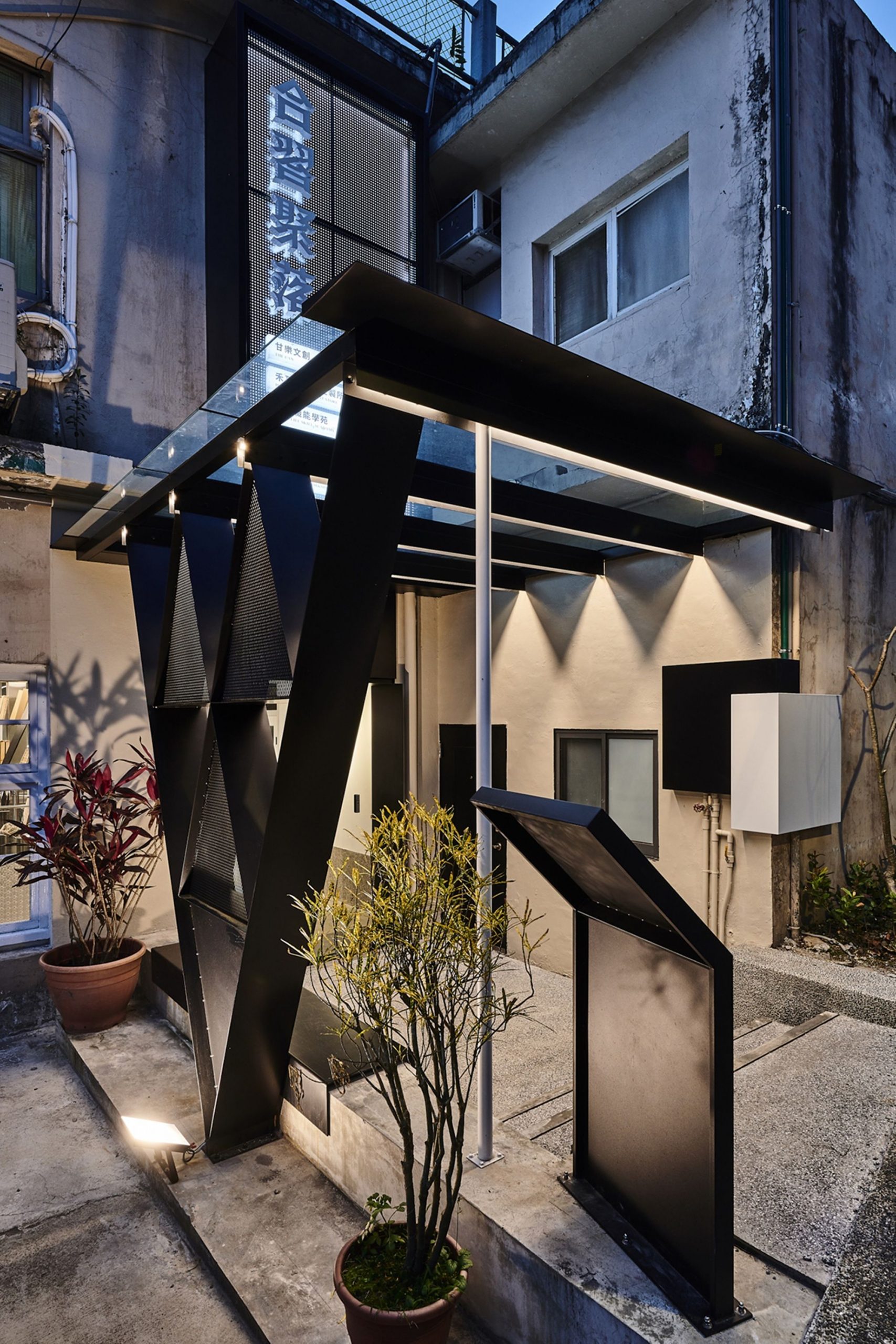
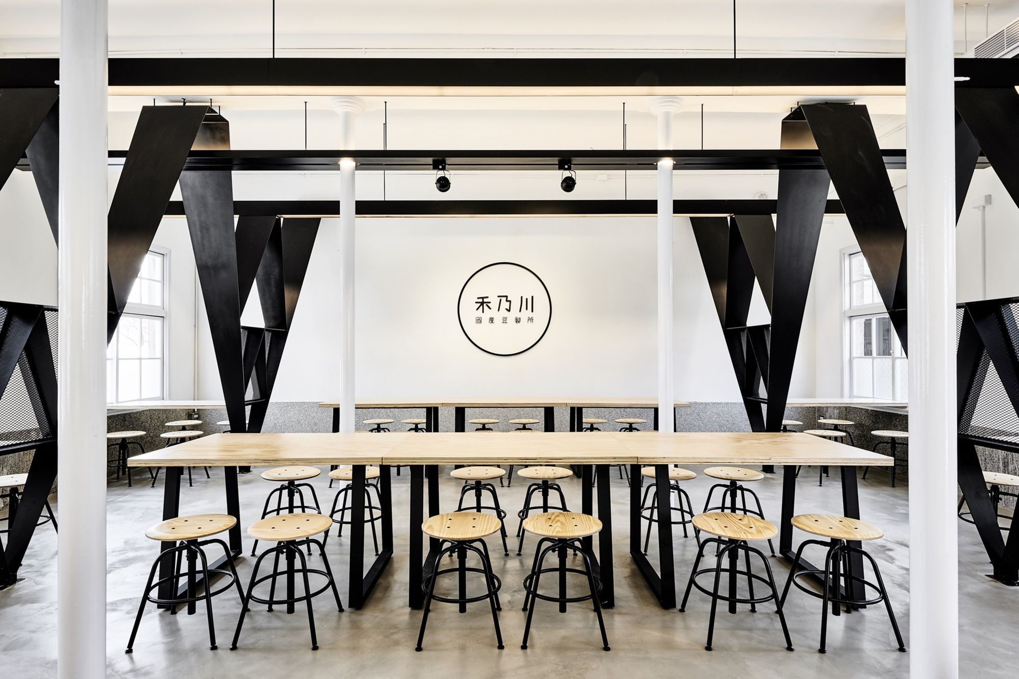
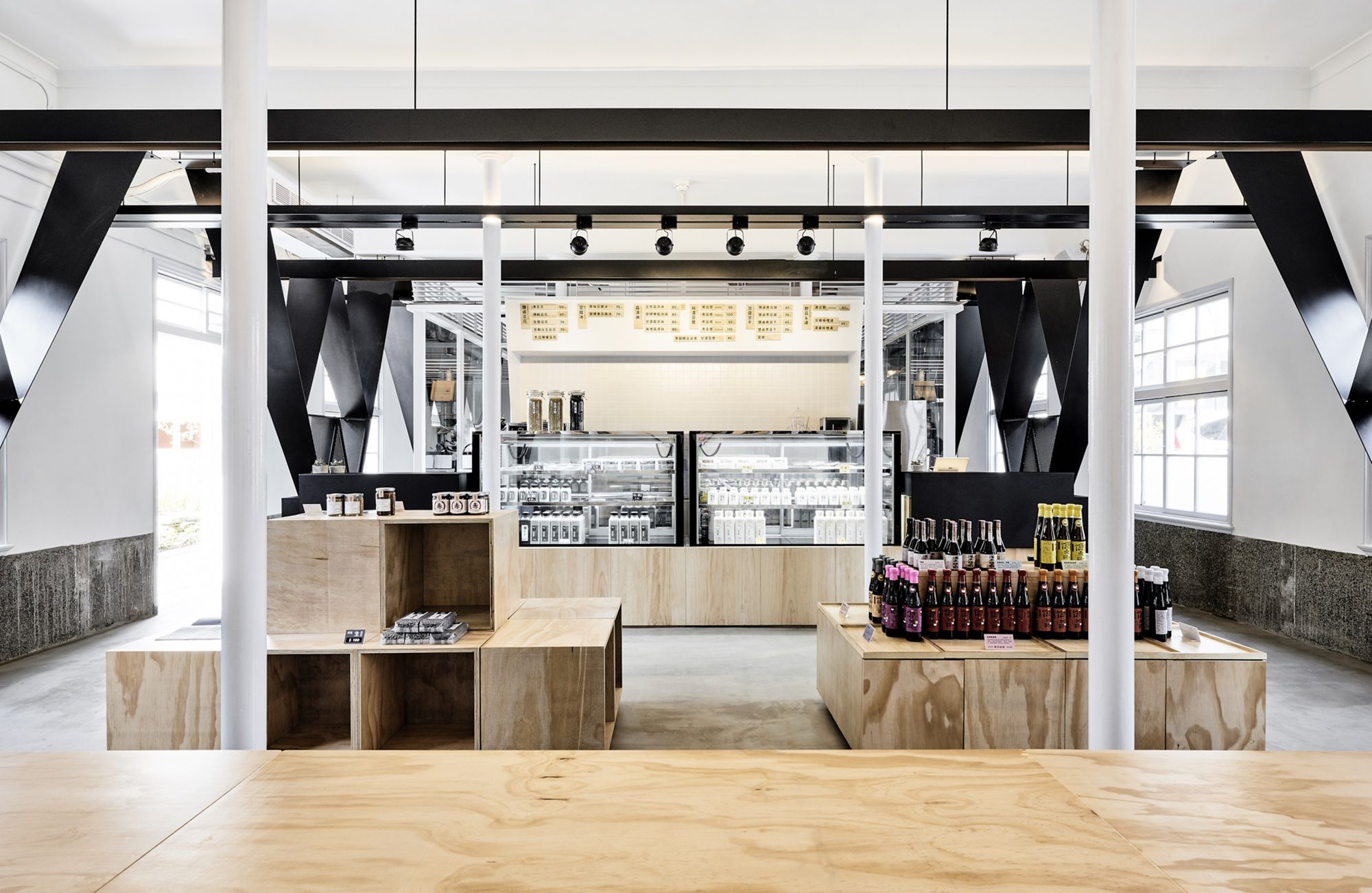
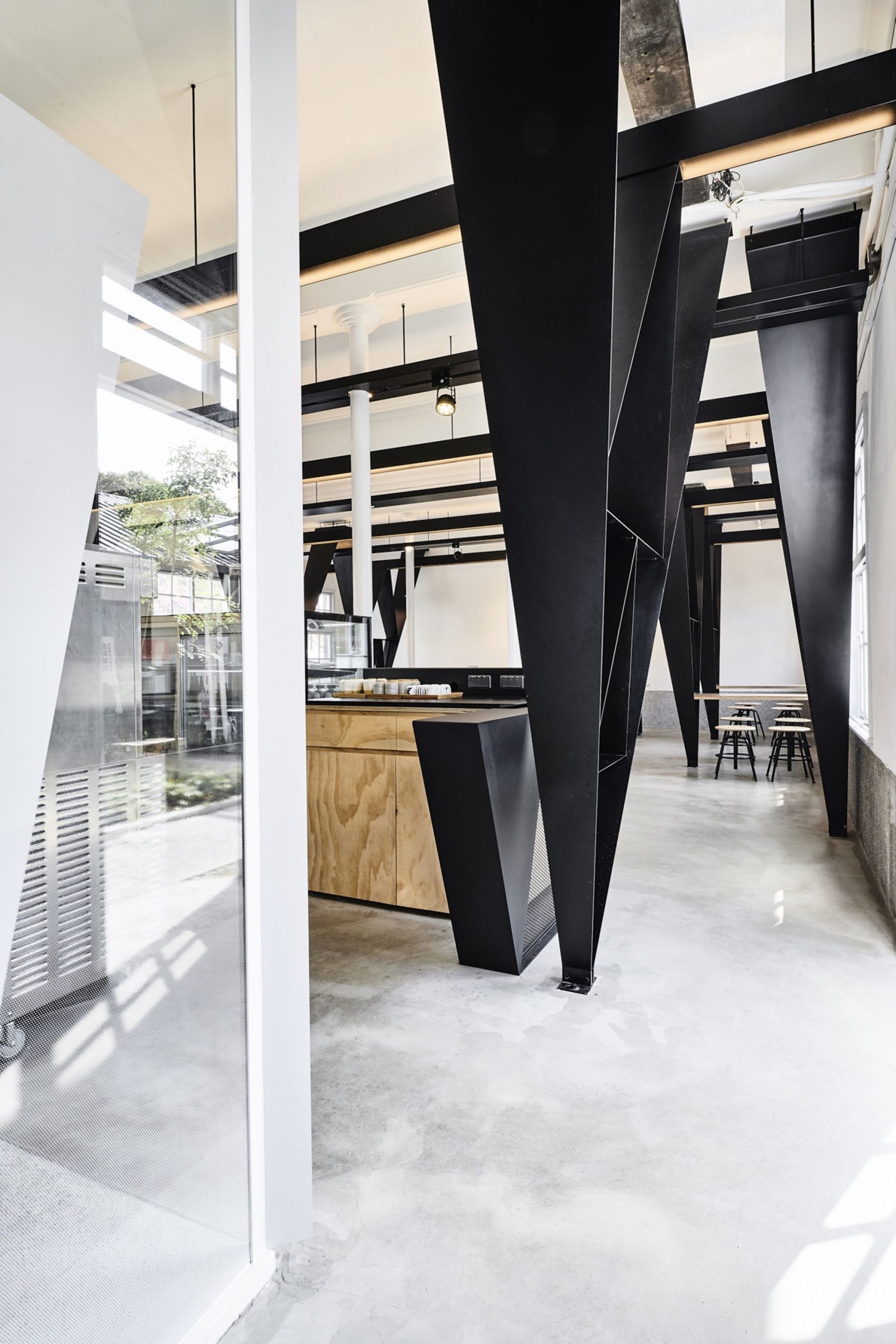
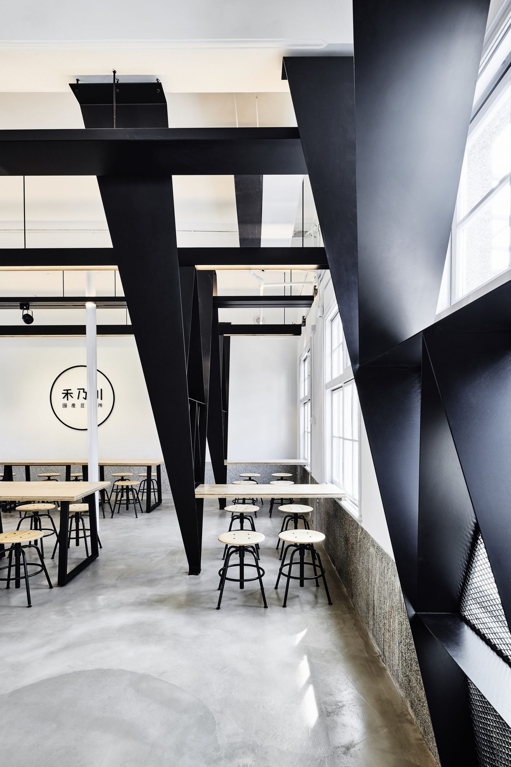
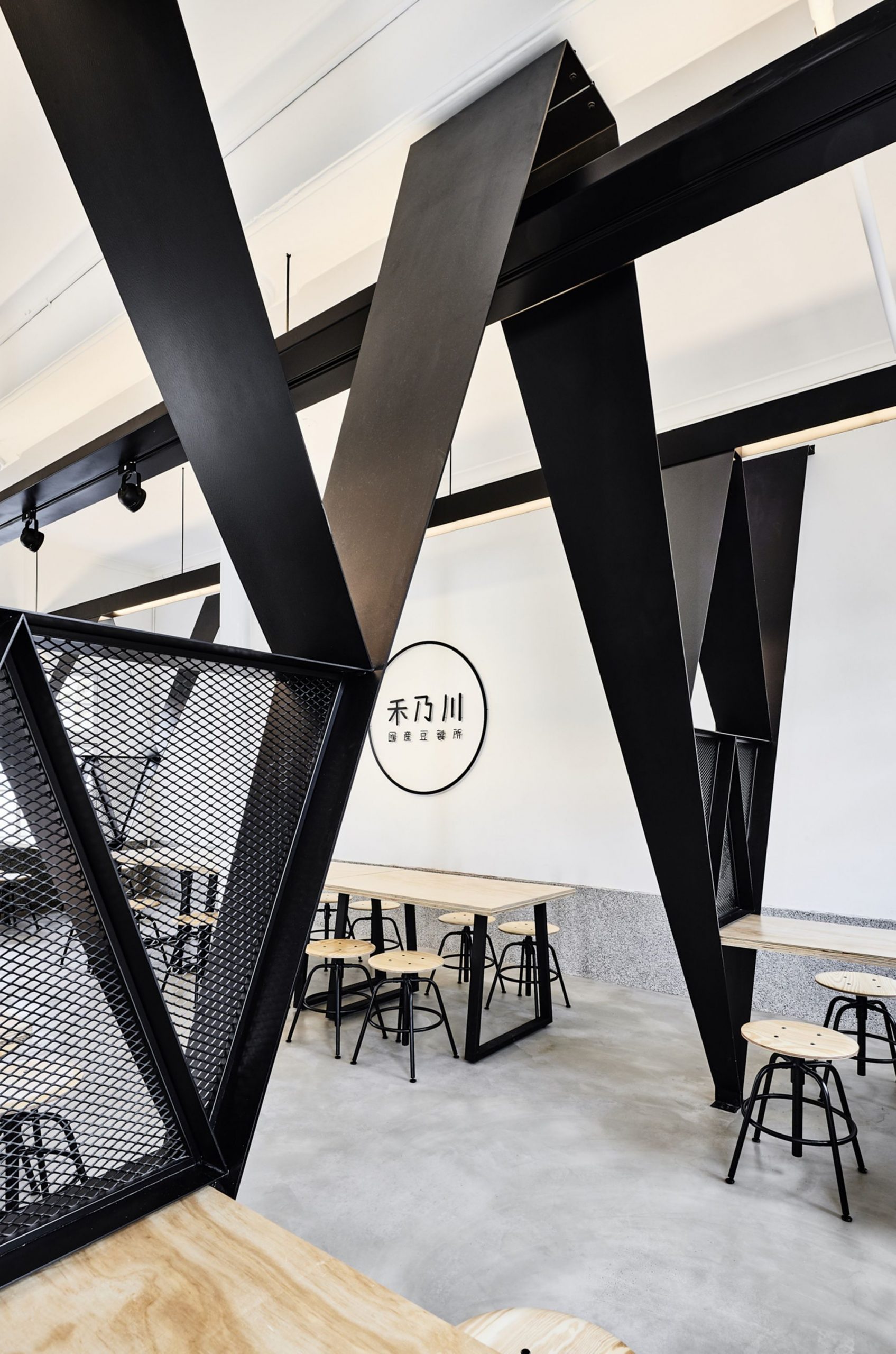
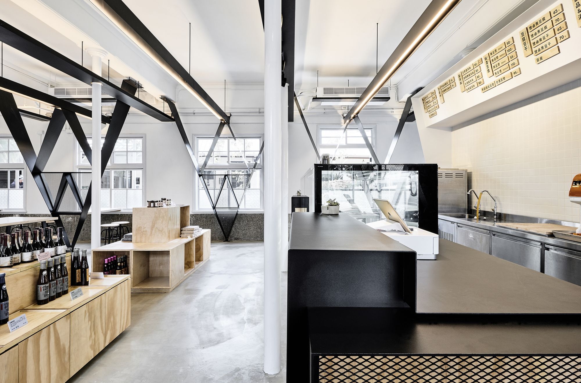
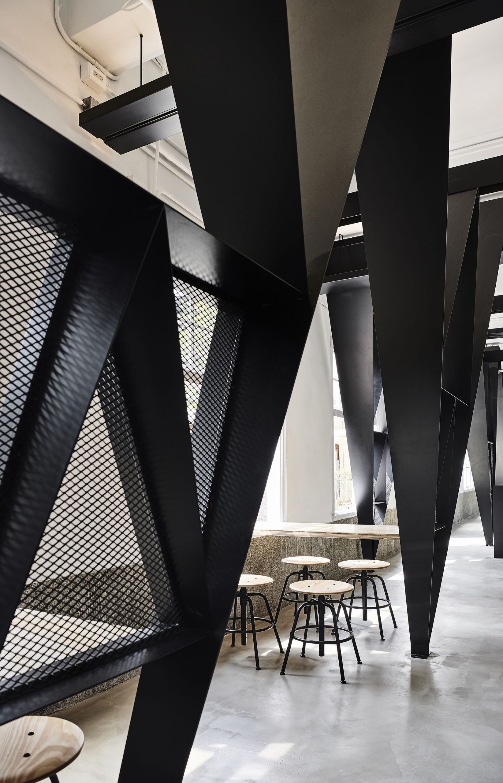
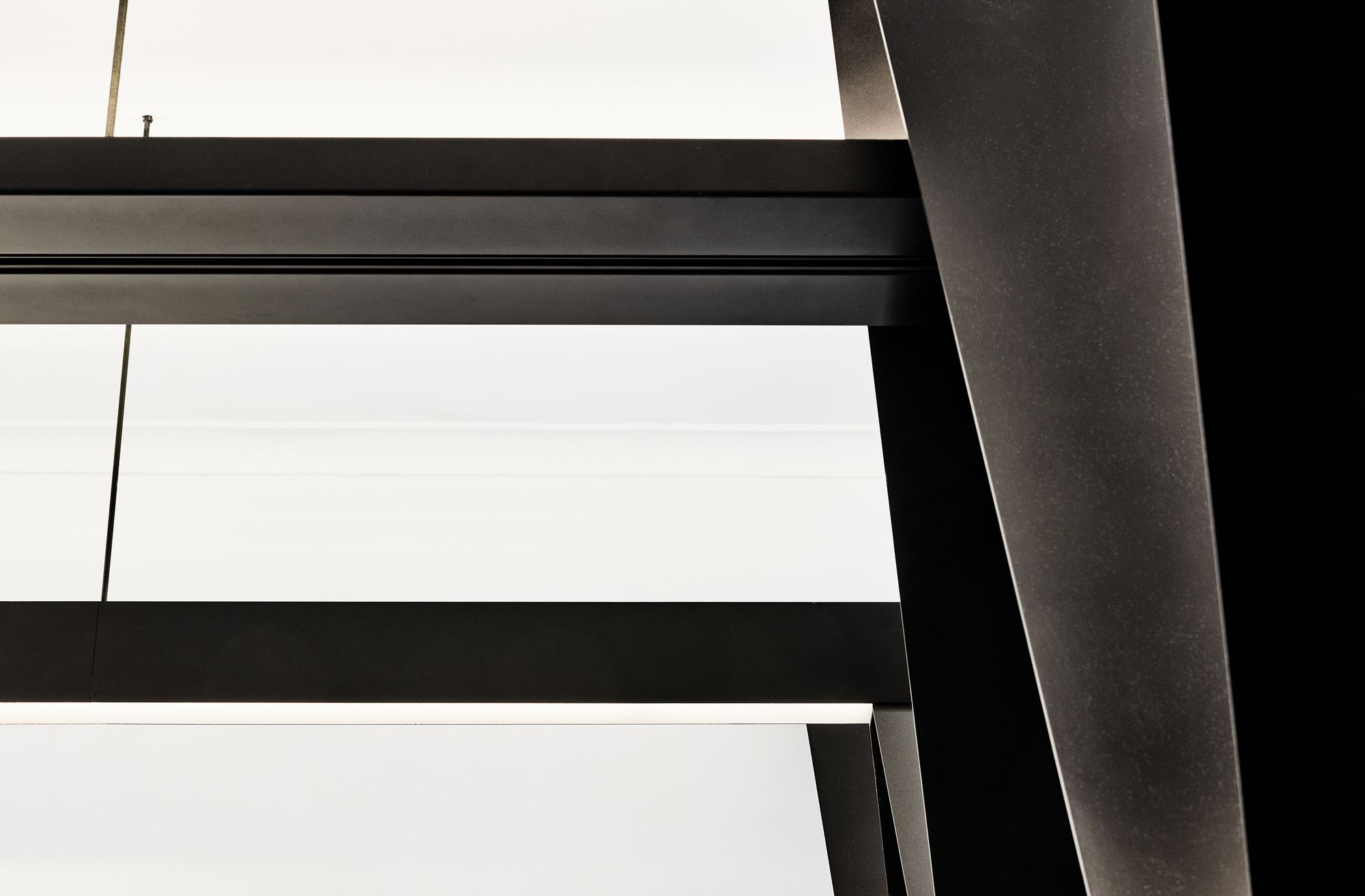
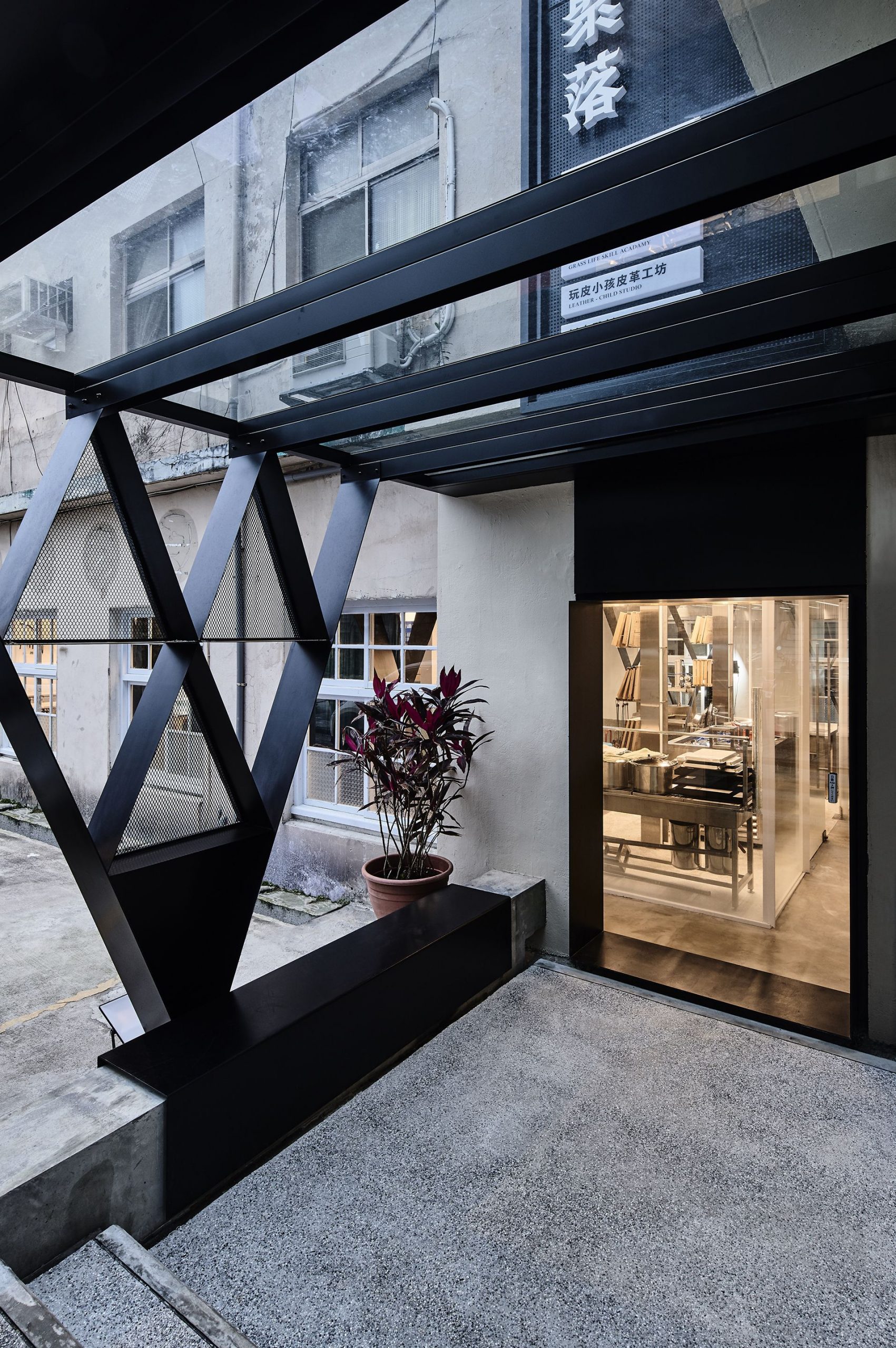
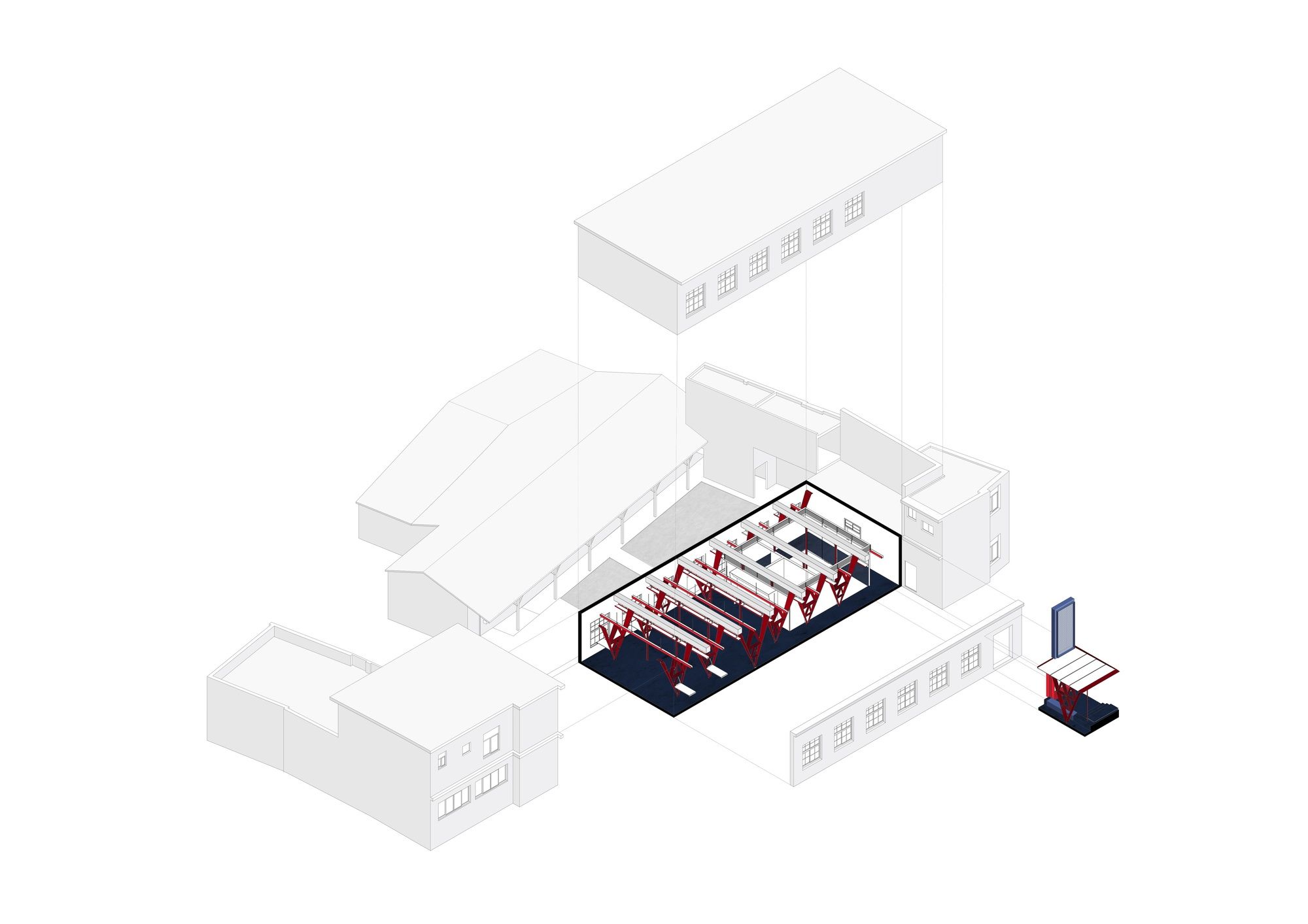
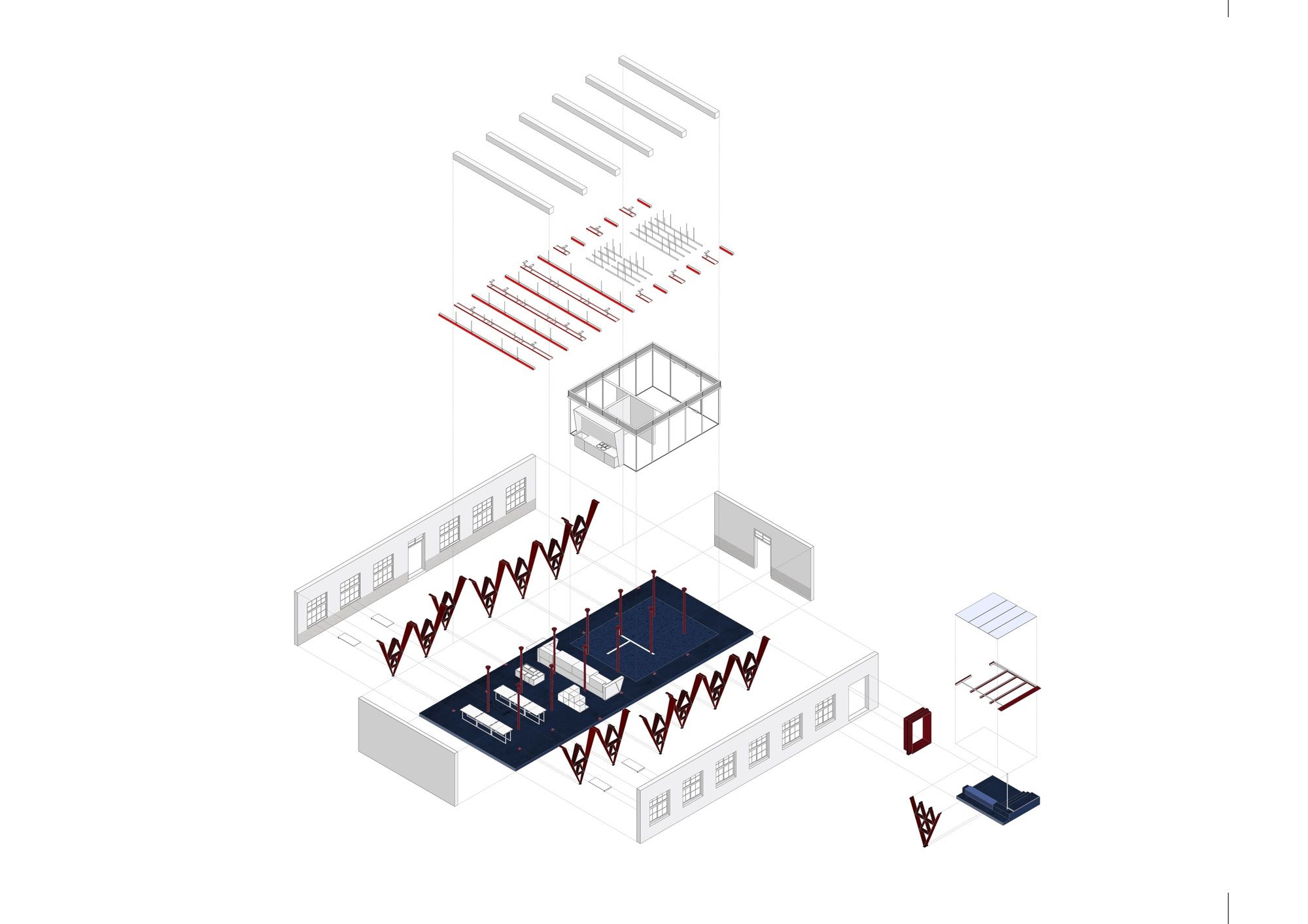
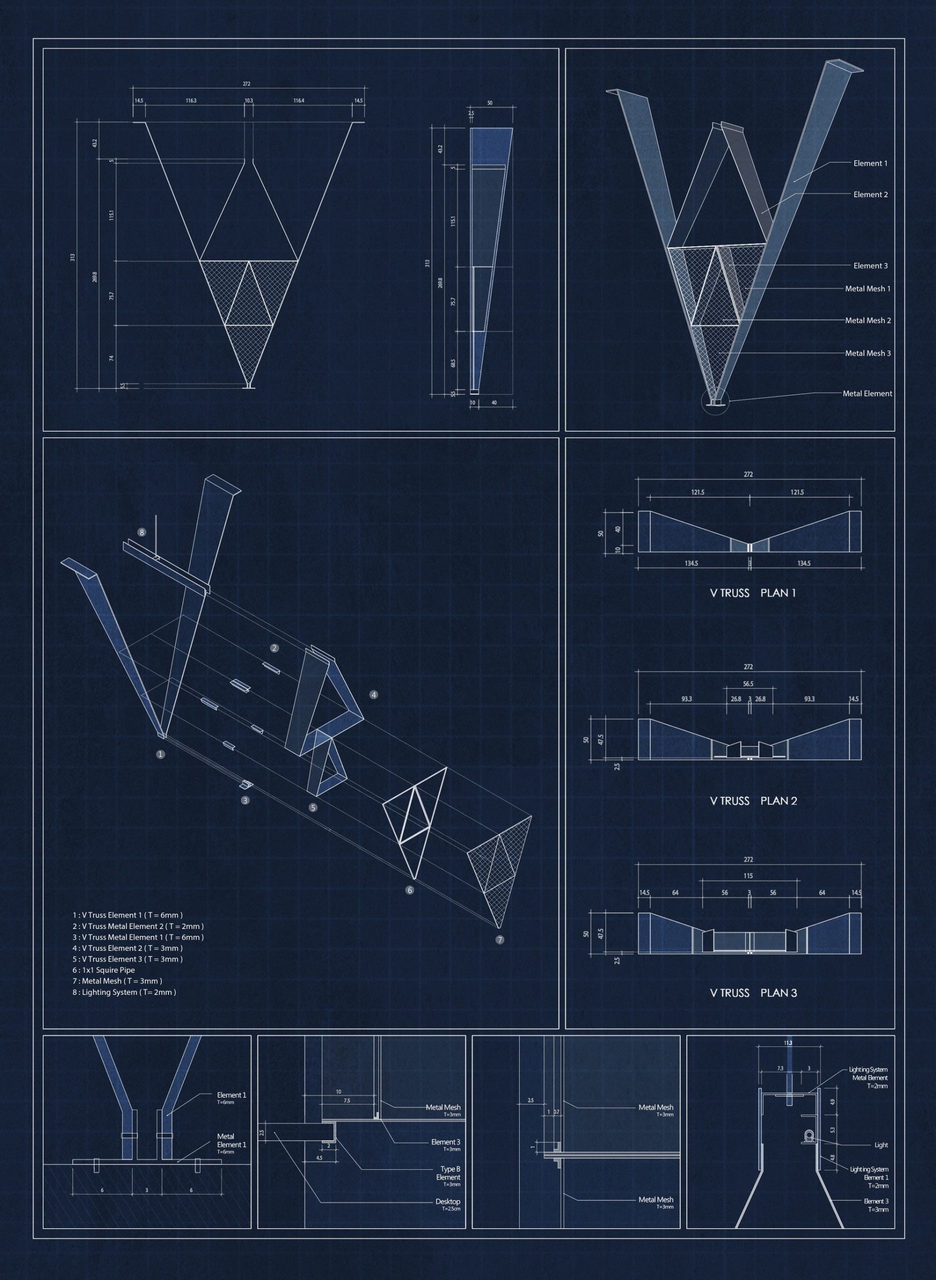
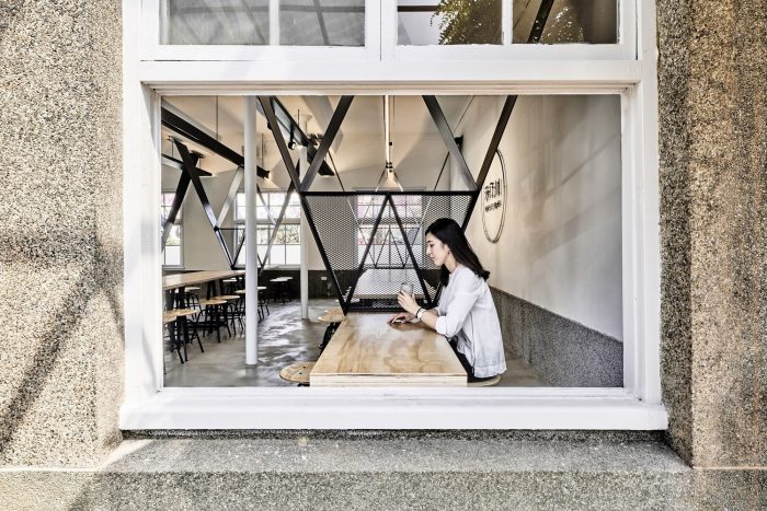
The original columns of the wardrooms were also the support of the framework now. Columns are just like the lining points of the space. The original ward room columns arrayed to form a trend and a dimension to the application of the space was well defined and became the important flow of an old space. The design was embedded with a new structural system, V dots, to reflect the lining points of the primary structure. It’s the structure, it’s the partition, it’s the inner window, it’s the furniture, it’s the exhibition booth and light fixture. The newly defined space will bring new systems in and expand for new lives to transform the hospital wardrooms to be the charity shops. The central walkway of the wardrooms now become the central service station and production rooms to take care everyone surrounded.
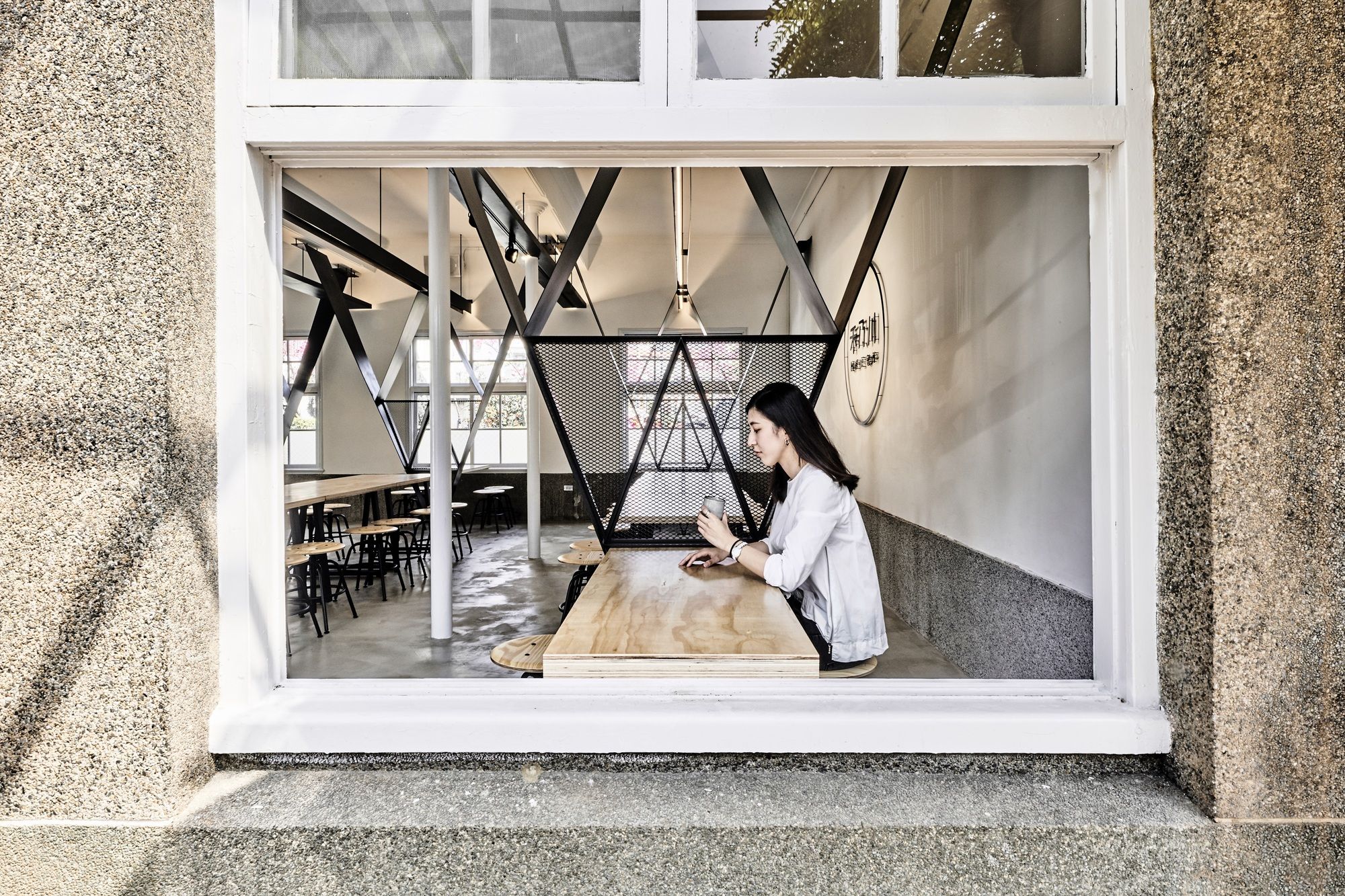
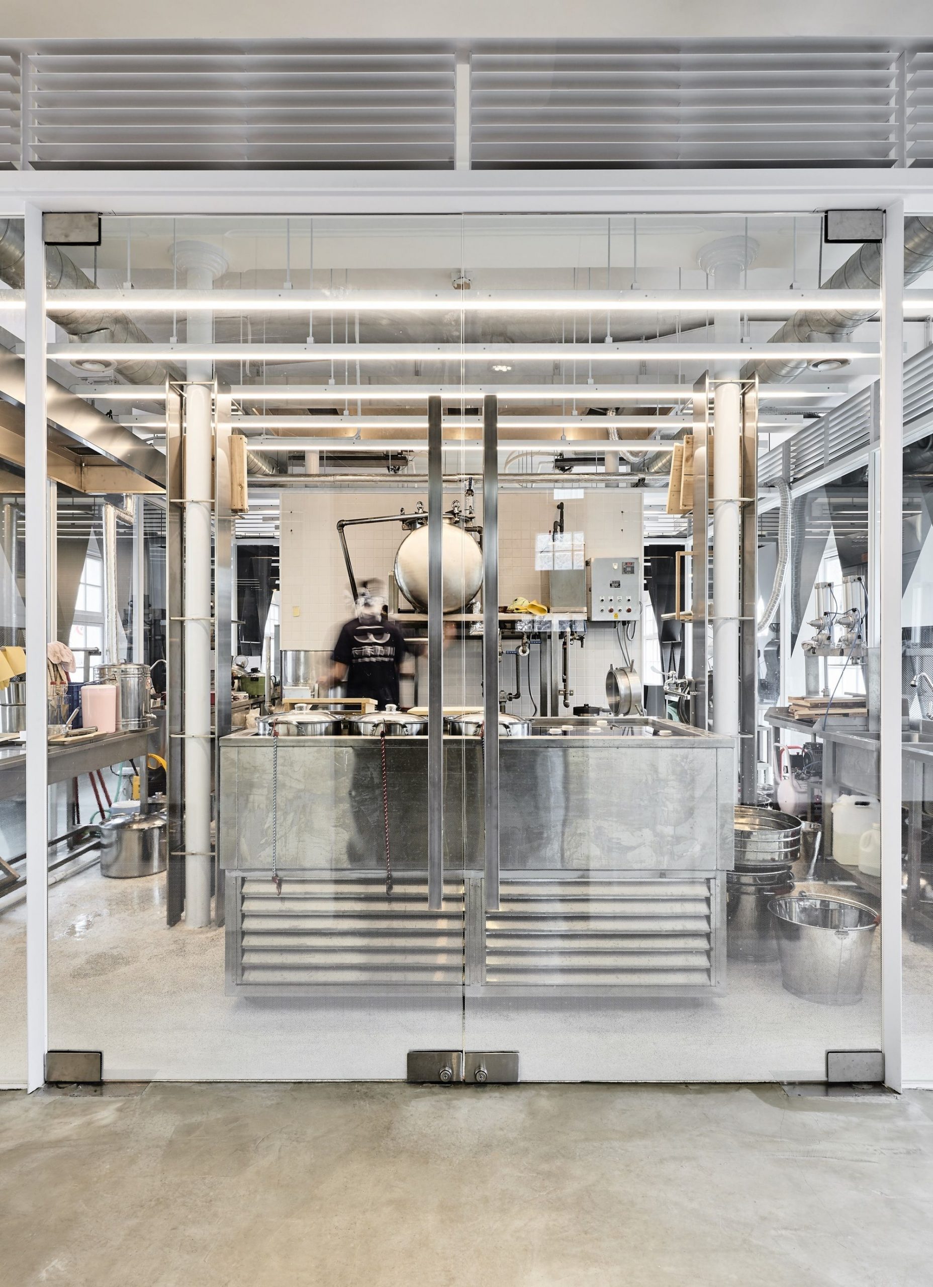
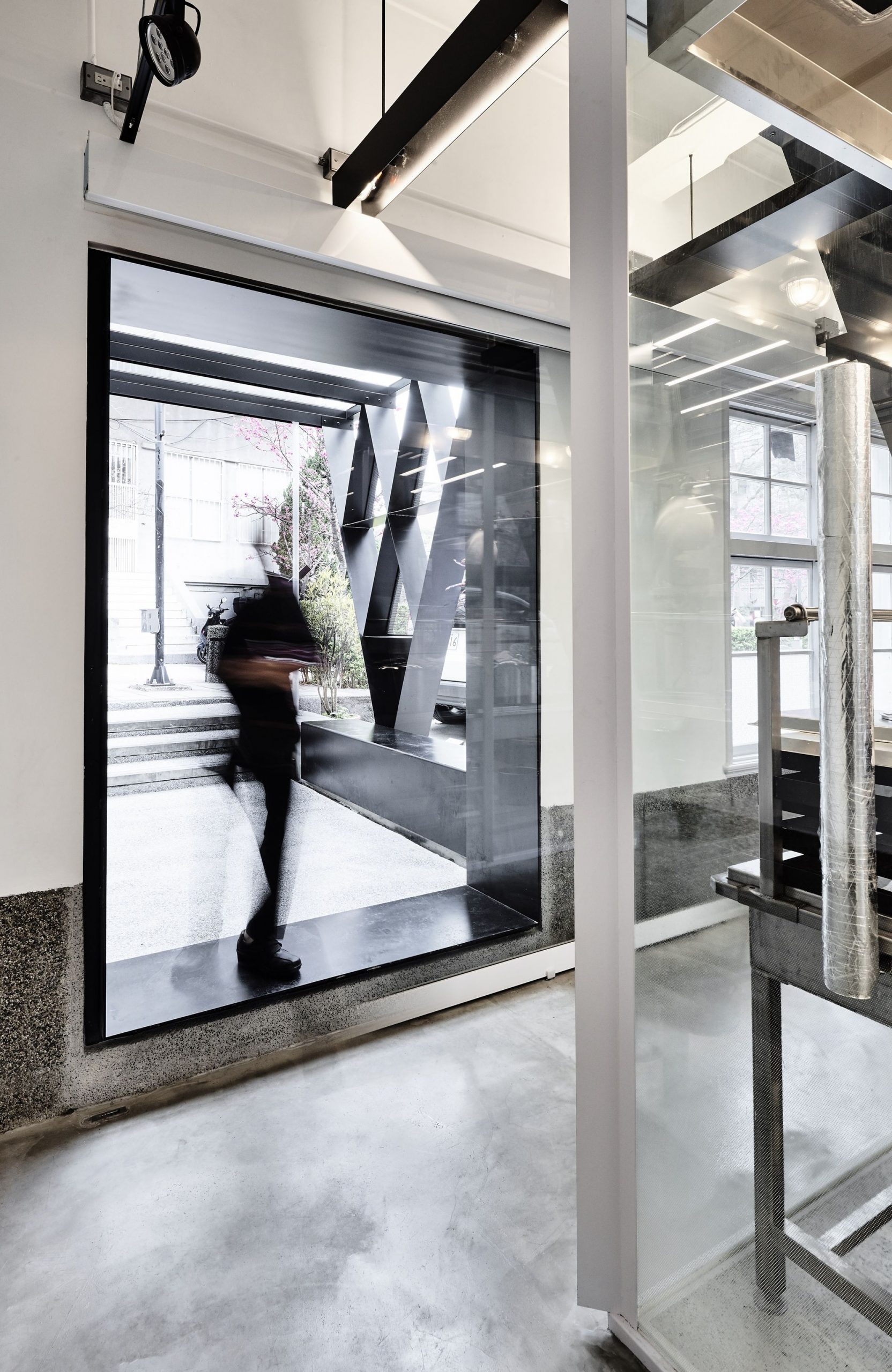
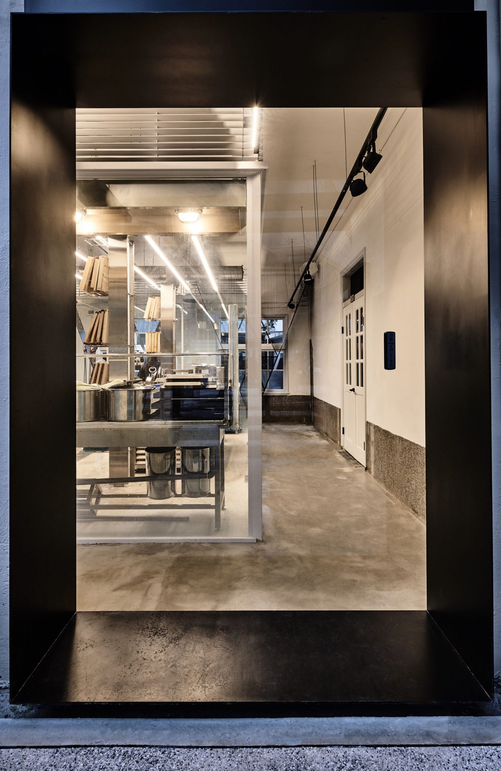
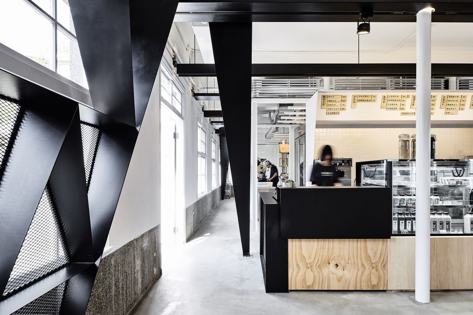
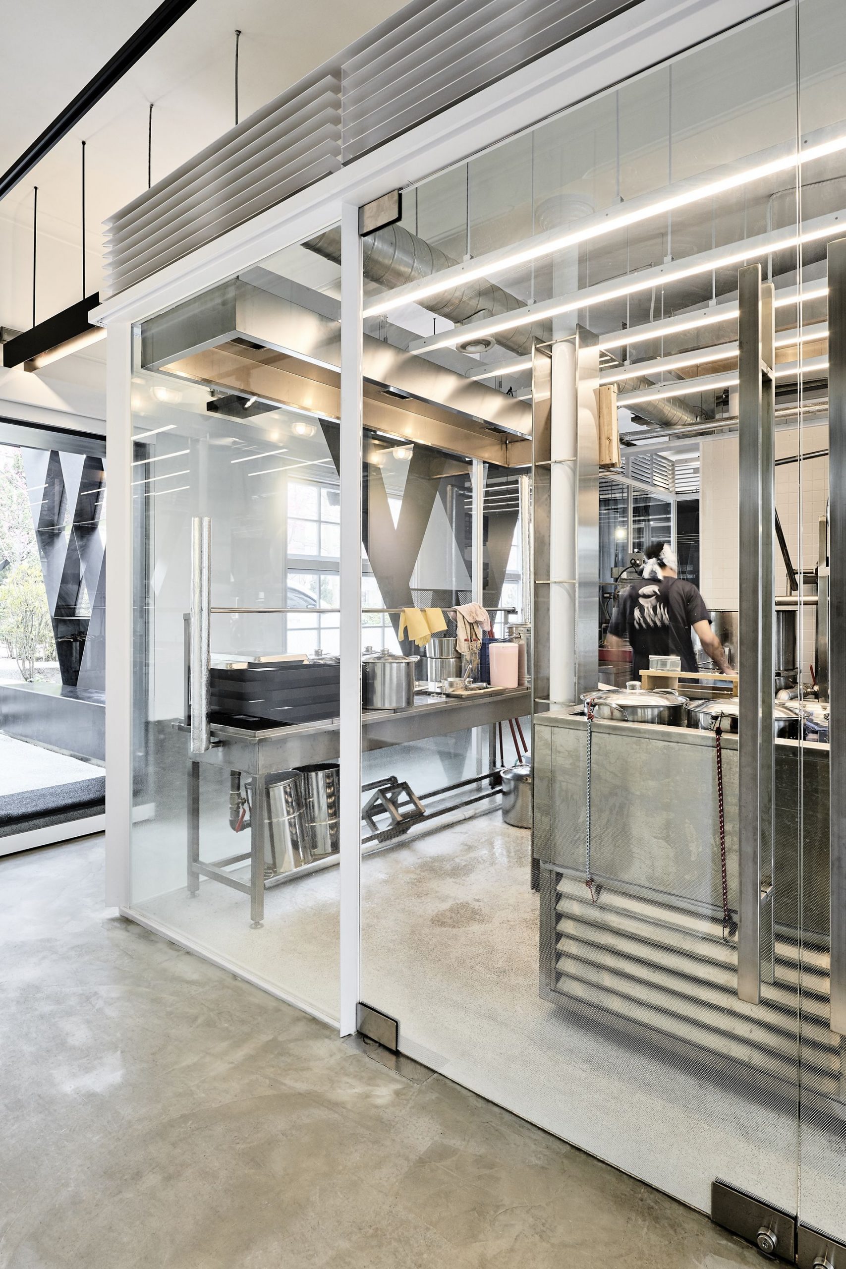
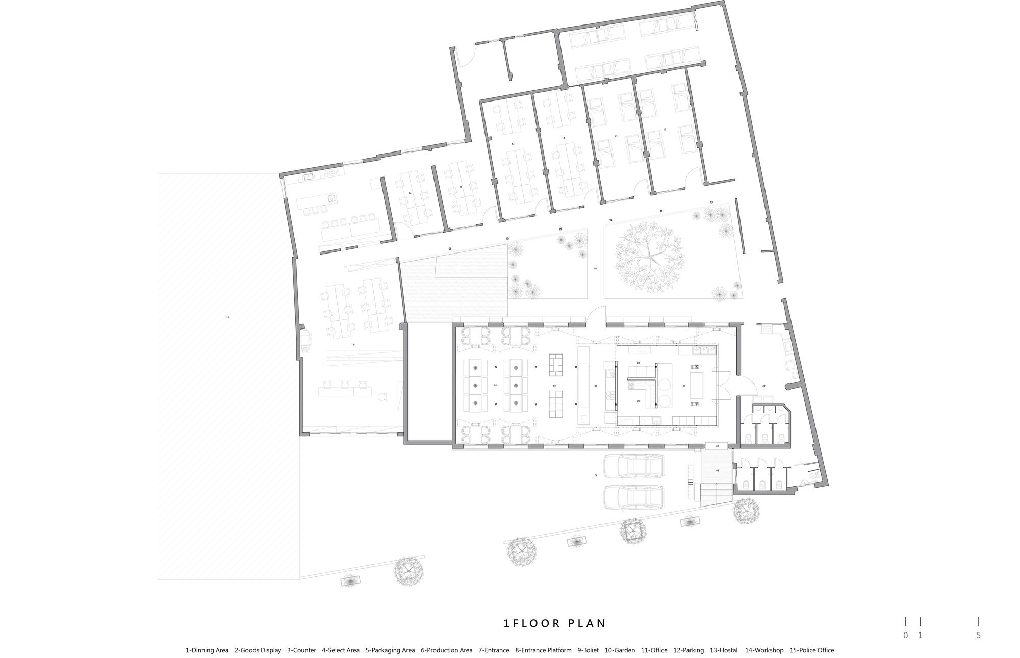
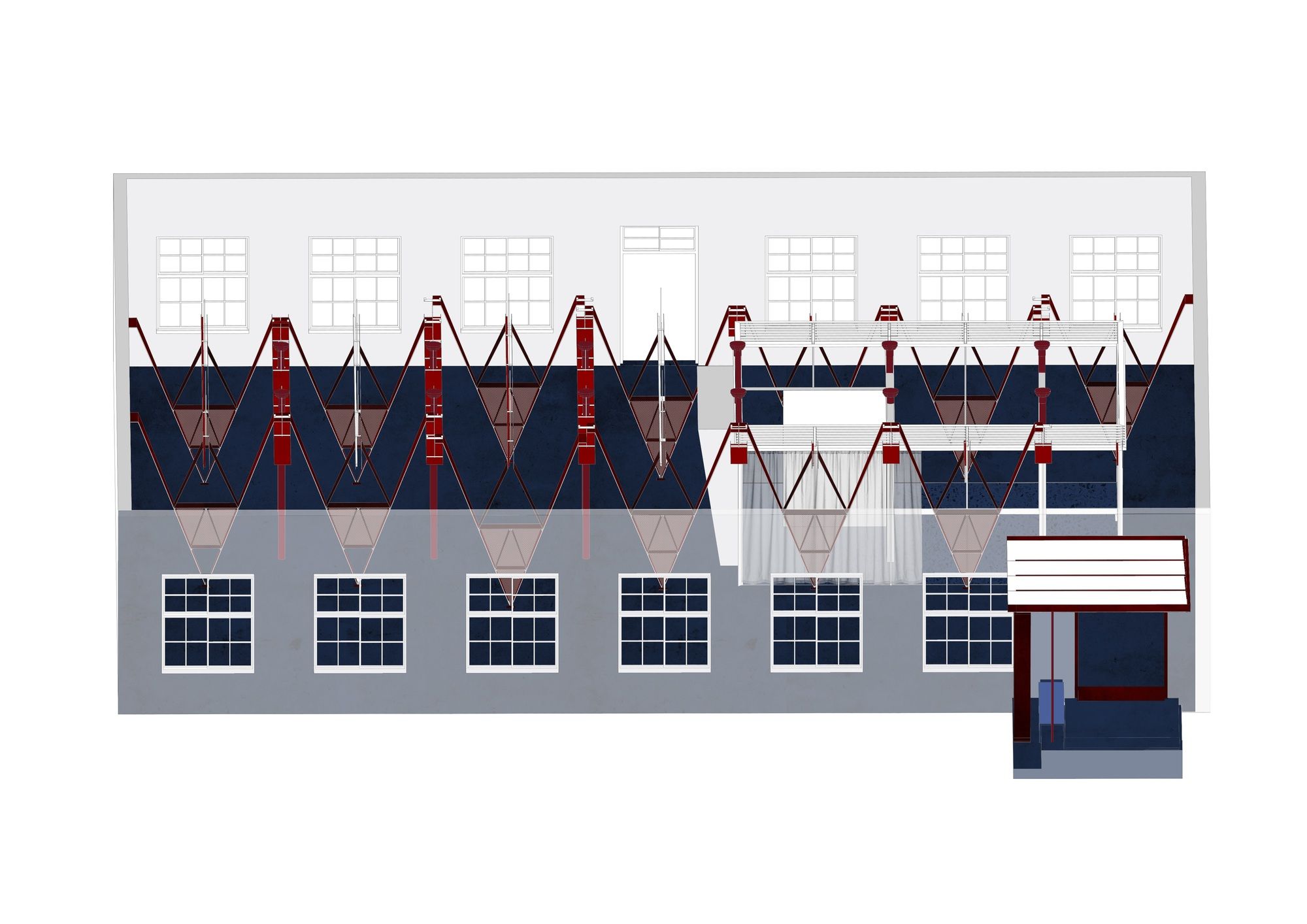
The features of the wardroom space were kept through the white box and black V placed in the old wardrooms. Space is split into two areas, one is the bean product factory and the other is a restaurant. The white box is the factory and a set of black V framework builds up a new space. People may see through the V and box to observe the production status in the white box. And the V can separate the seats in the restaurant from the service area.
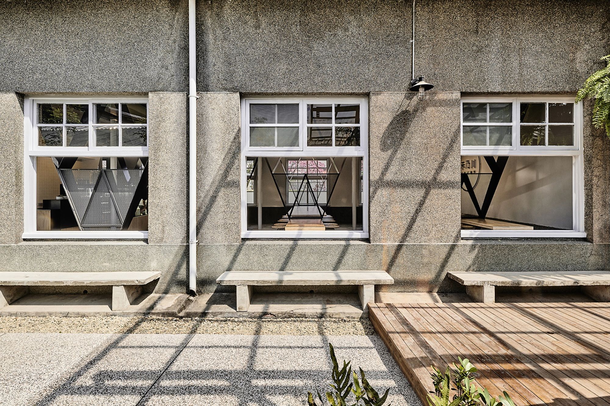
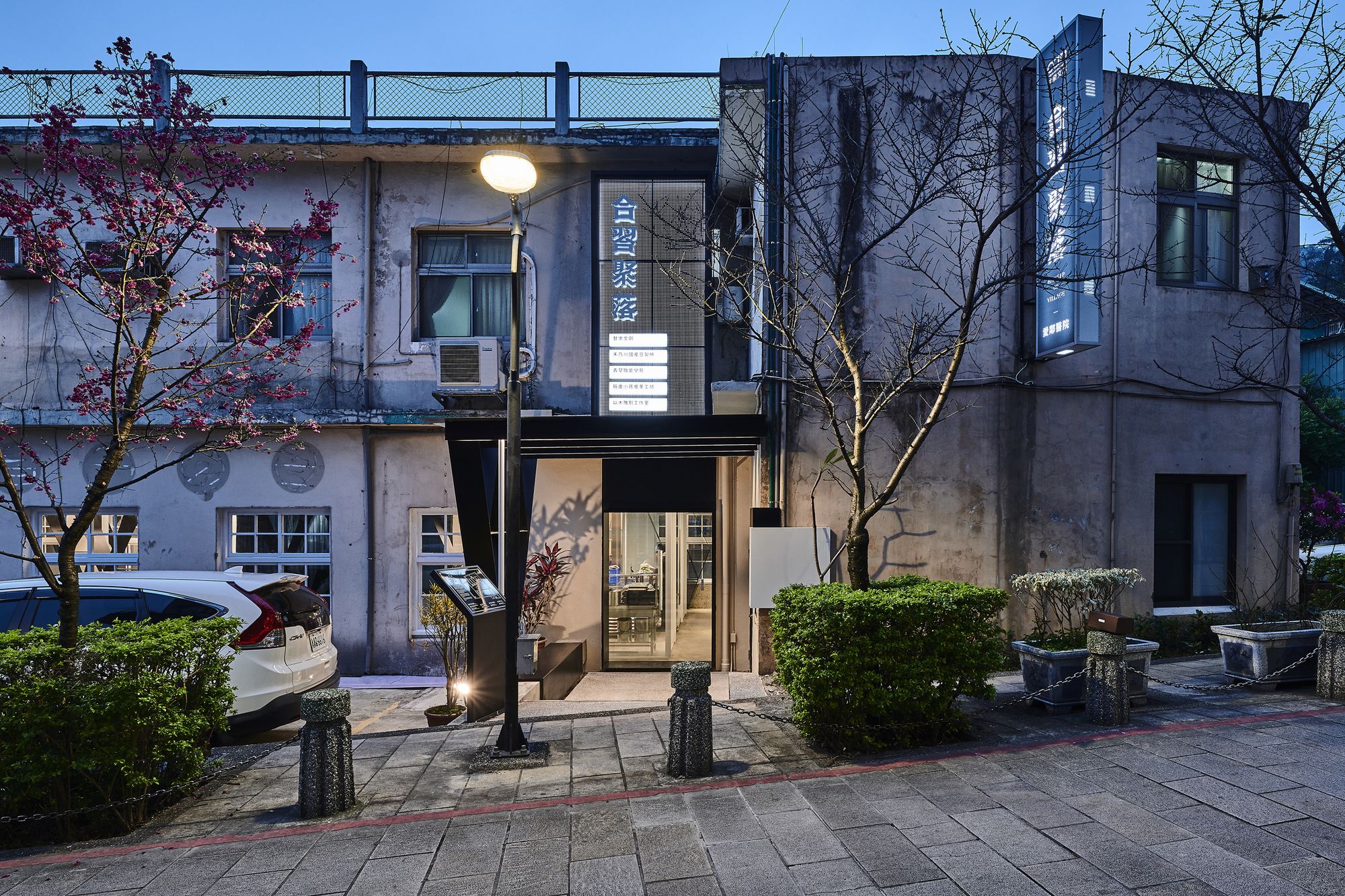
Windows and the entrance are also the other key elements of the design. The original windows and columns line out the beds which represent the layers of space to connect the courtyard with the walkway of the hospital. When the windows are opened, a new entrance of the village is formed to welcome the people on the street. While the original windows proportion and glasses grains remained, V becomes the first part of the inner window in the space. The proportions of the net framework are reflecting the windows frame so the old windows, walkway, blue dye curtains, and white box form many layers of the space between the activities inside and the window views outside.
Project Info:
Architects: B+P Architects
Location: Lane 13, Zhongshan Road, Sanxia District, New Taipei City, Taiwan
Lead Architects: Chia-Hao Tsai
Design Team: Chi Chung, Yung-En Lin
Client: Taiwan Corp. Sustainable Urban and Rural Care Association / oan Creative
Area: 151.3 m2
Project Year: 2018
Photographs: Studio Millspace
Project Name: Ward with V dots
