WE3 at Water’s Edge
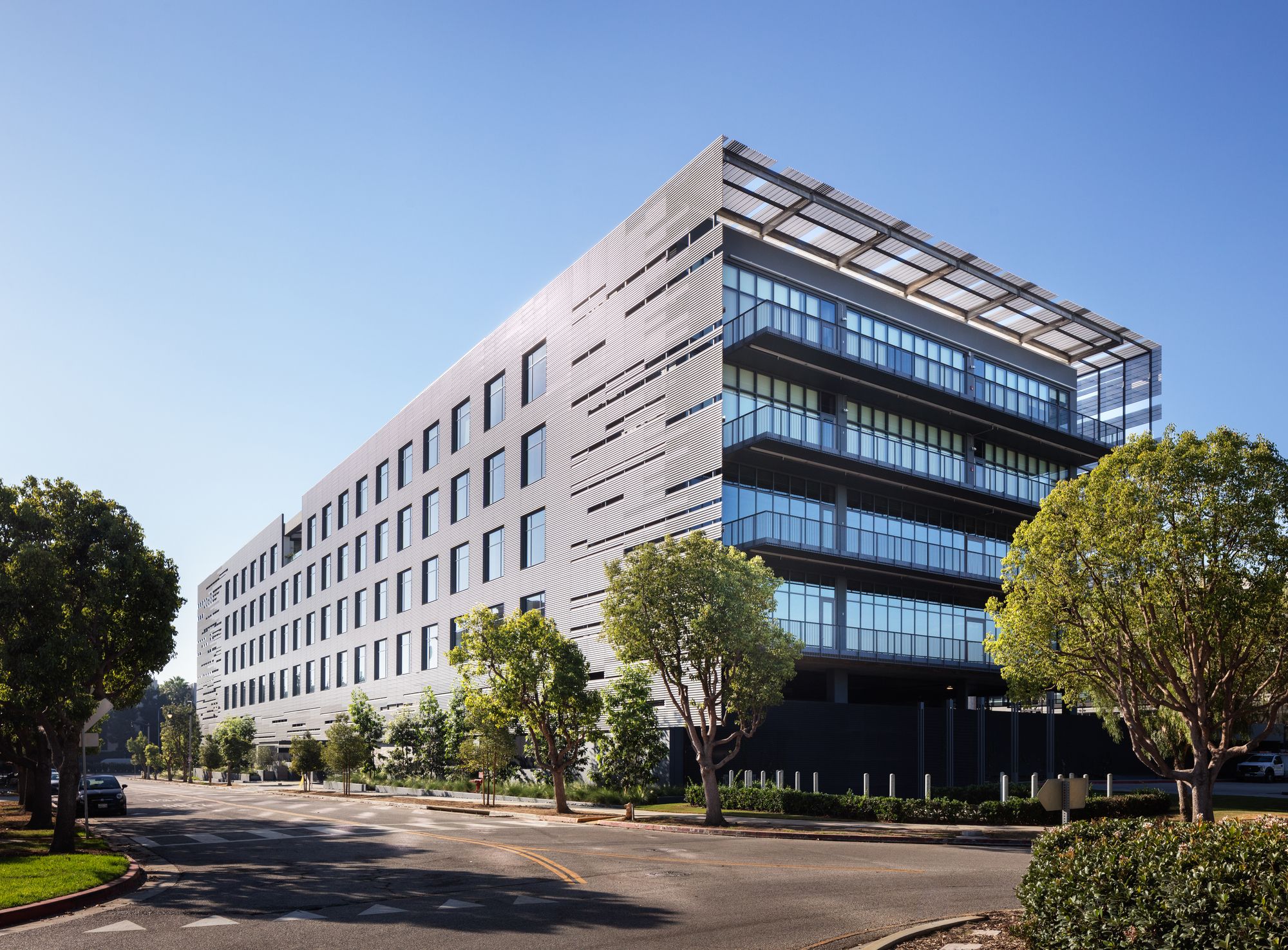
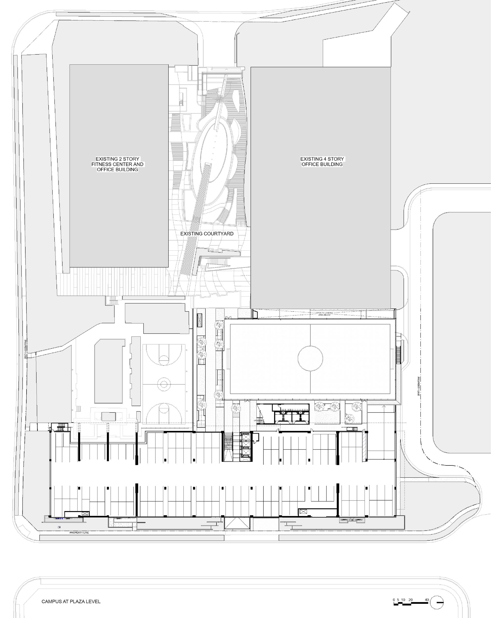
Designed by Zoltan E. Pali, FAIA and his firm SPF:a, WE3 is a six-story creative workspace in the commercially robust area of Playa Vista colloquially referred to as “Silicon Beach” and is the third and final building in a pre-existing commercial campus.
Photography by © Mike Kelley
Given the physical scope of the project and the aesthetic requirements needed to attract the top-level tech and creative talent the area is known for (including Google, Yahoo, YouTube, and USC’s Institute of Creative Technologies), SPF:a’s main challenge was to create a plan fully integrated with existing conditions that both maximized the lot’s buildable area and maintained a compelling architectural standard.
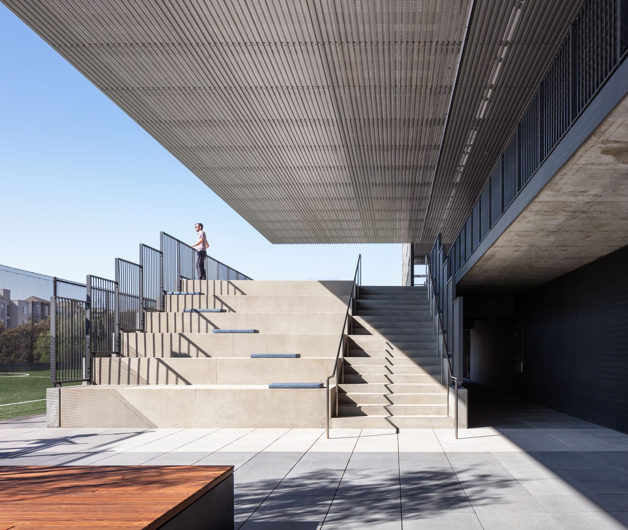
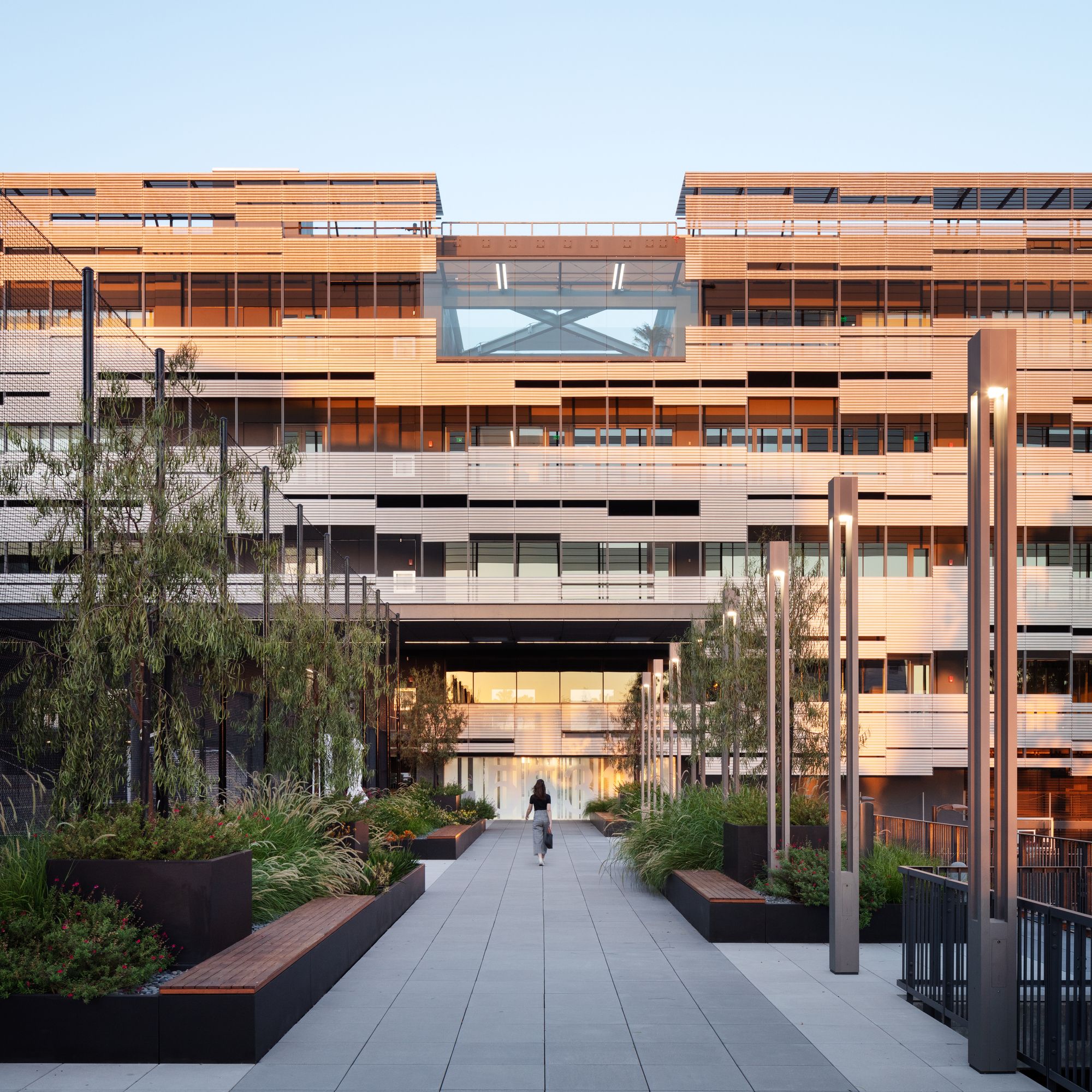
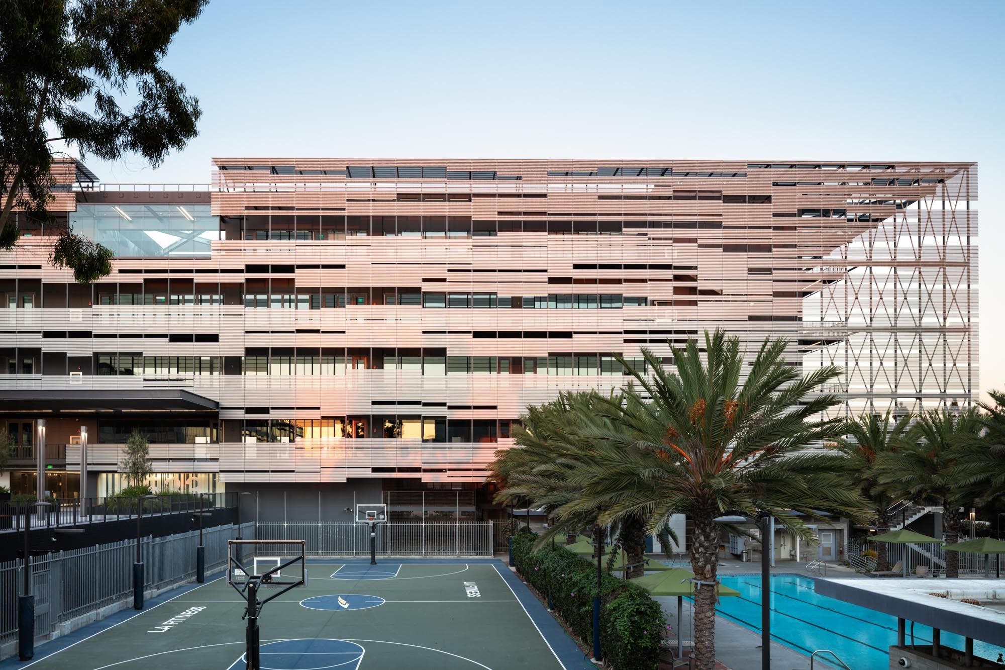
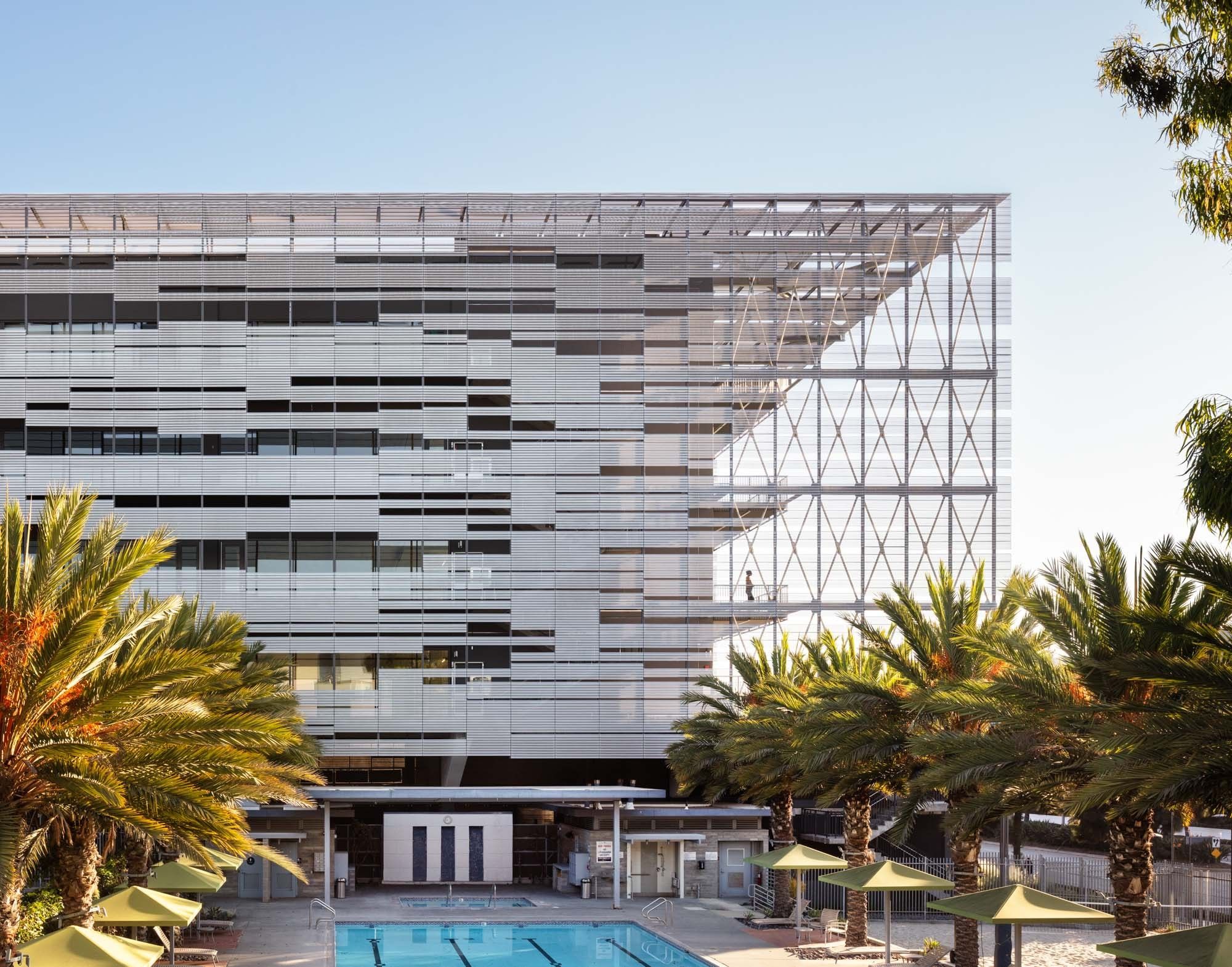
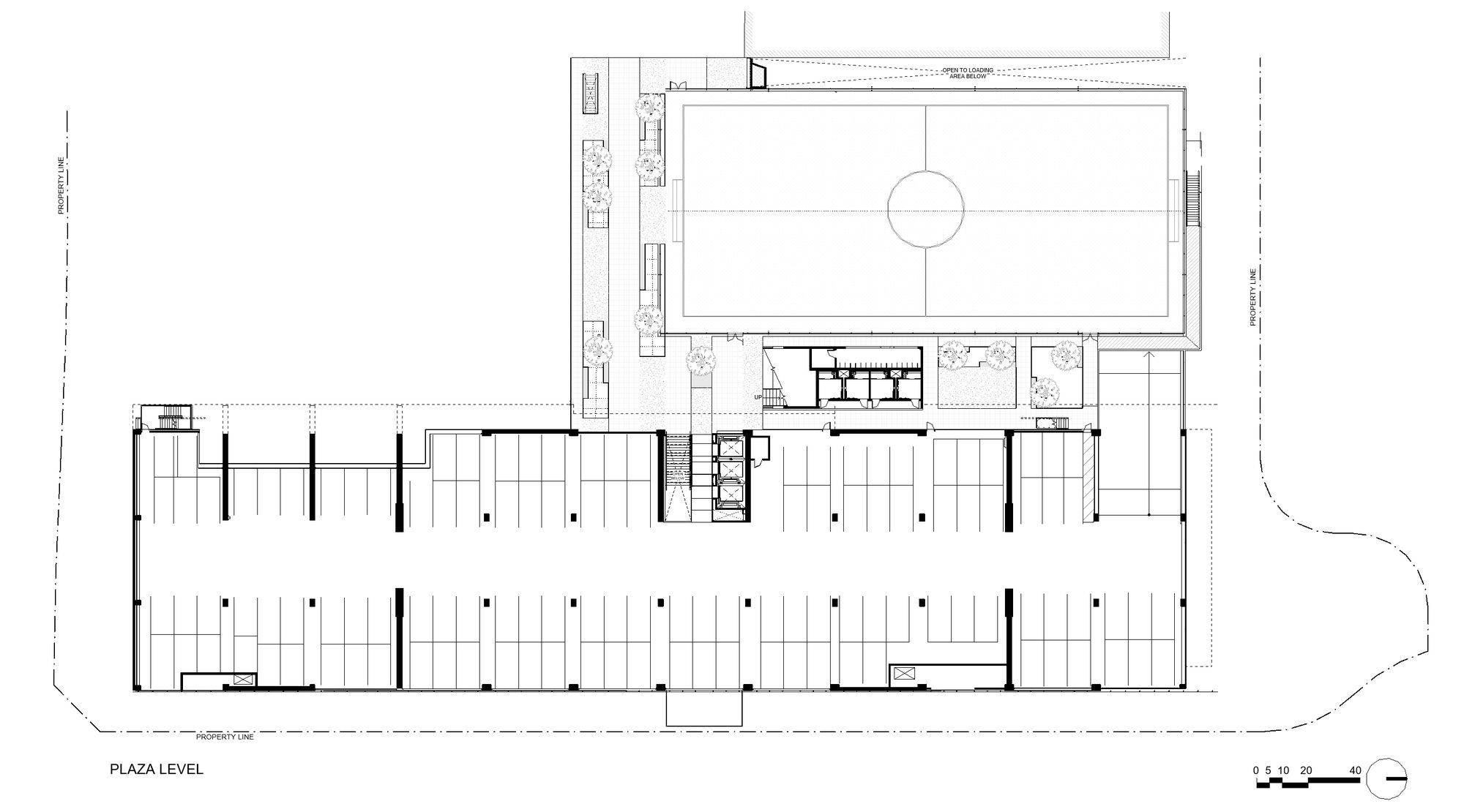
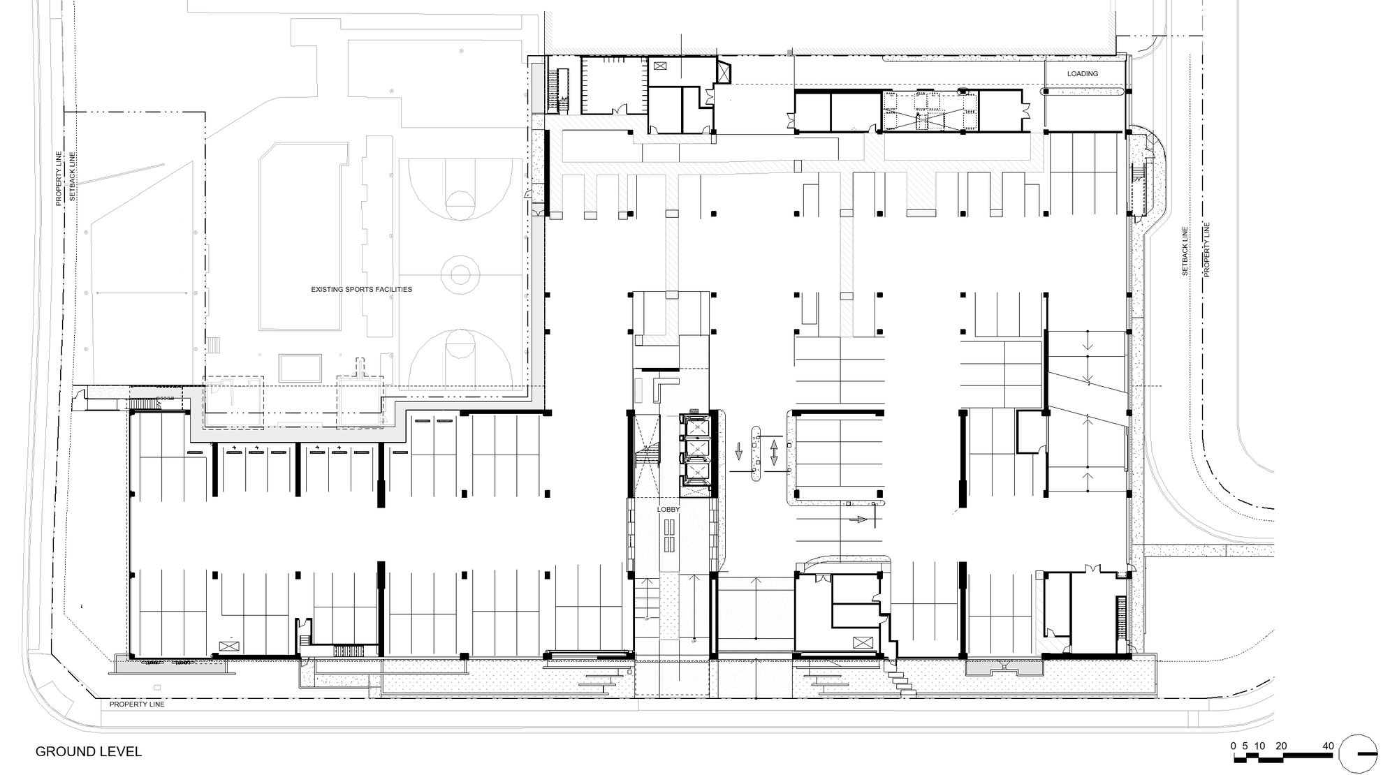
Initially asked by the client to locate the building at the northern end of the site to avoid the existing structures, the project evolved to create a longer, more flexible office floor plate oriented in the north-south direction, allowing more light and views on each elevation and creating a new public courtyard. An existing on the grade sports field was relocated over the parking substructure to allow for the site strategy to be realized.

Photography by © Mike Kelley
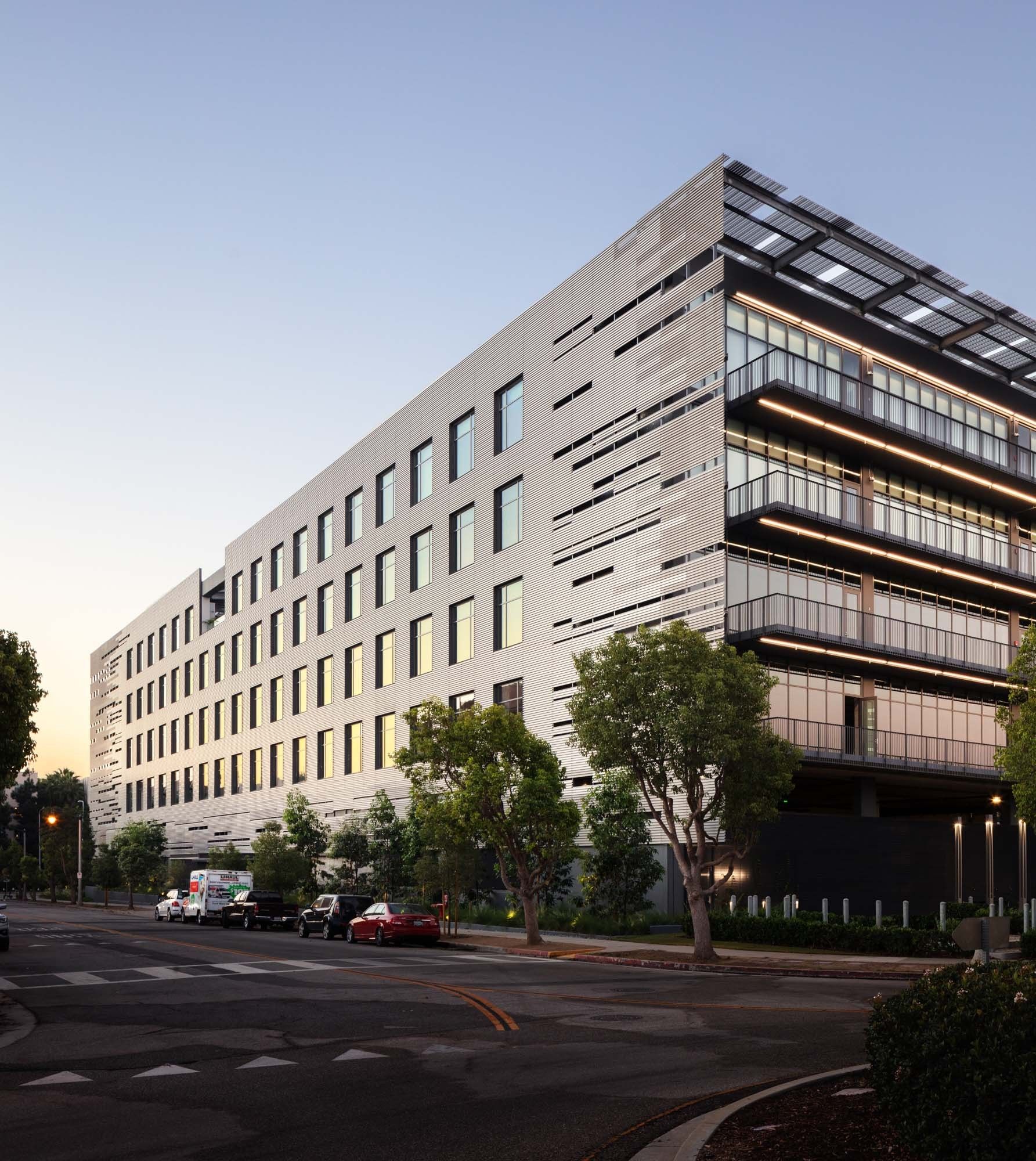
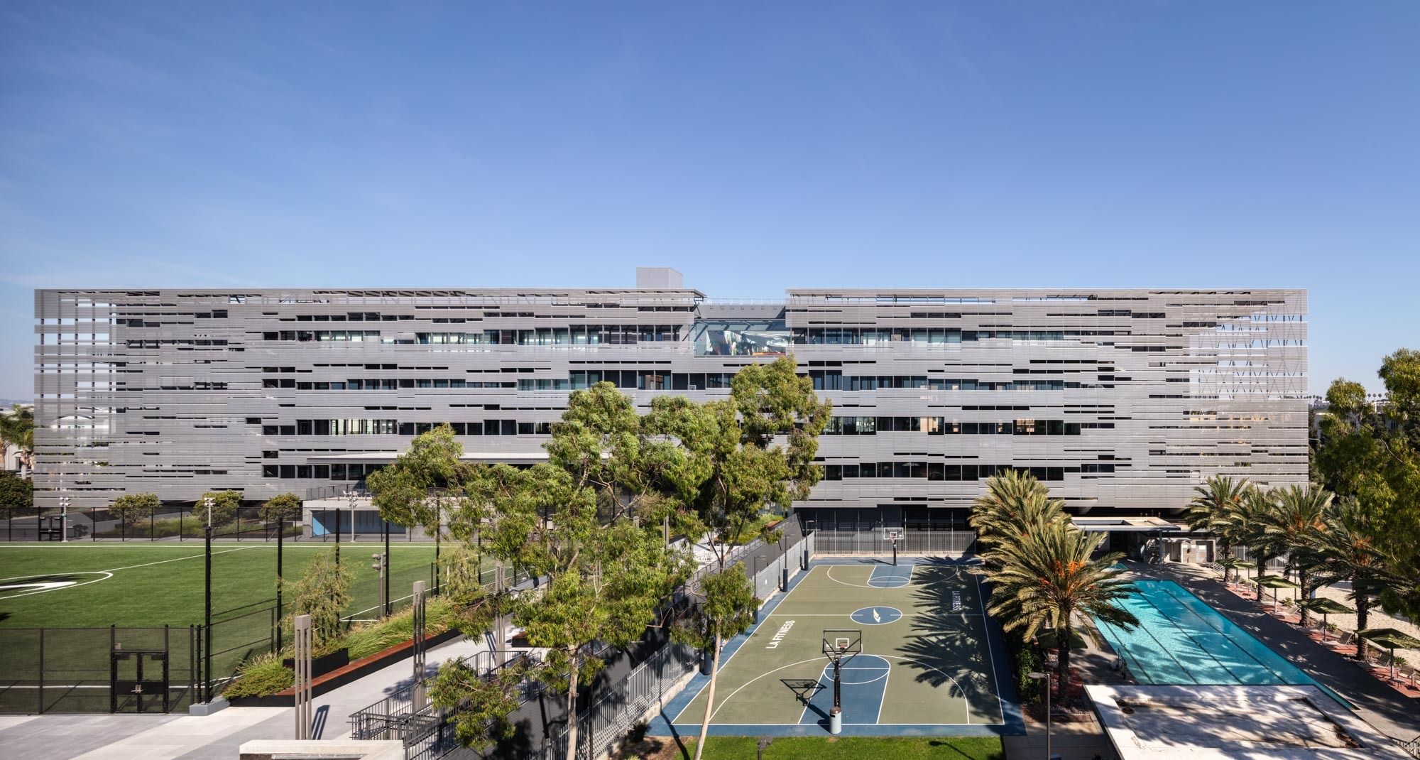
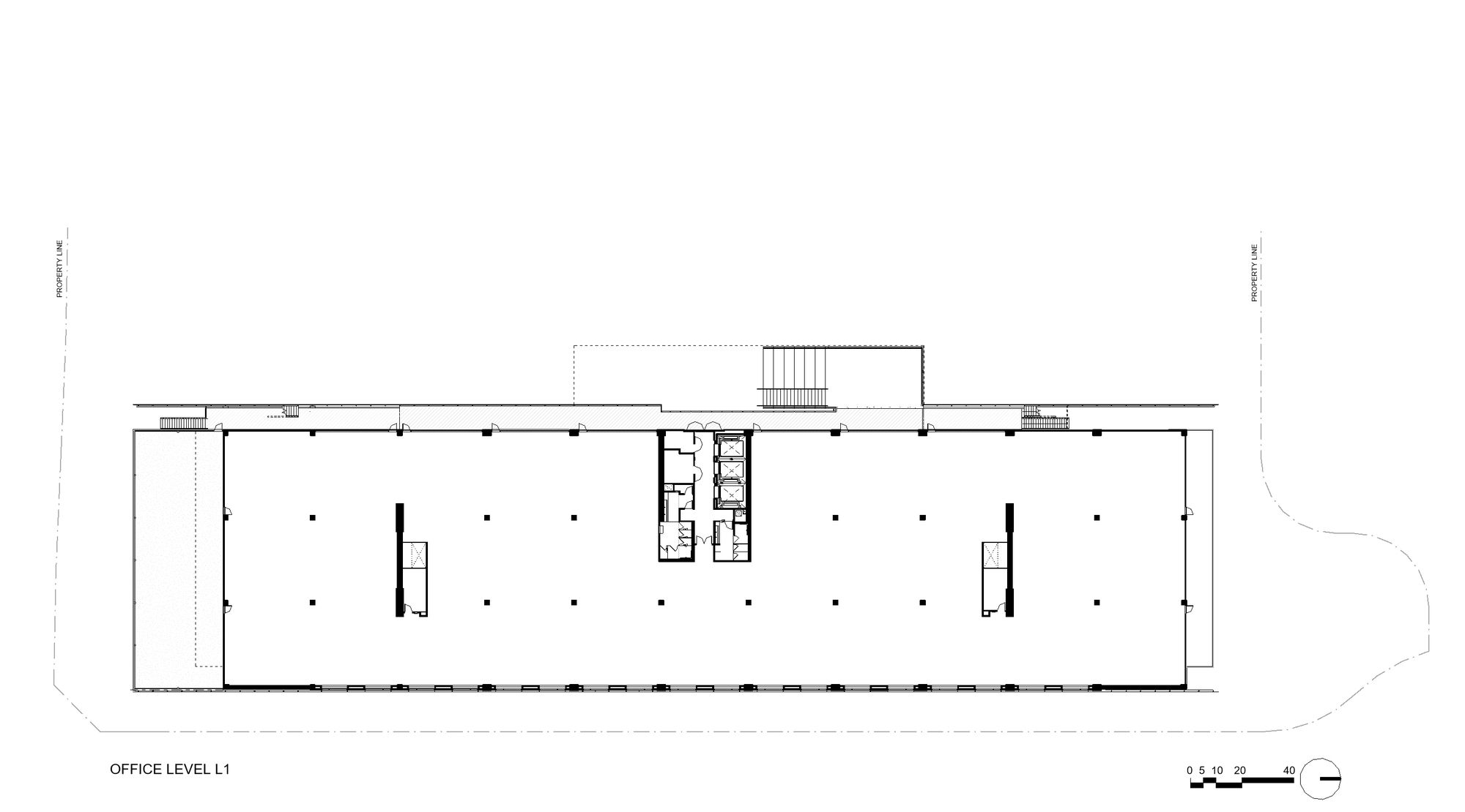
The resulting construction is 400-feet in length with a total usable area of 160,000 square feet. Horizontally expressed along the entirety of the campus’ eastern edge, when coupled with the two standing structures a classical collegiate effect is created with the three buildings bracketing an open quadrangle.
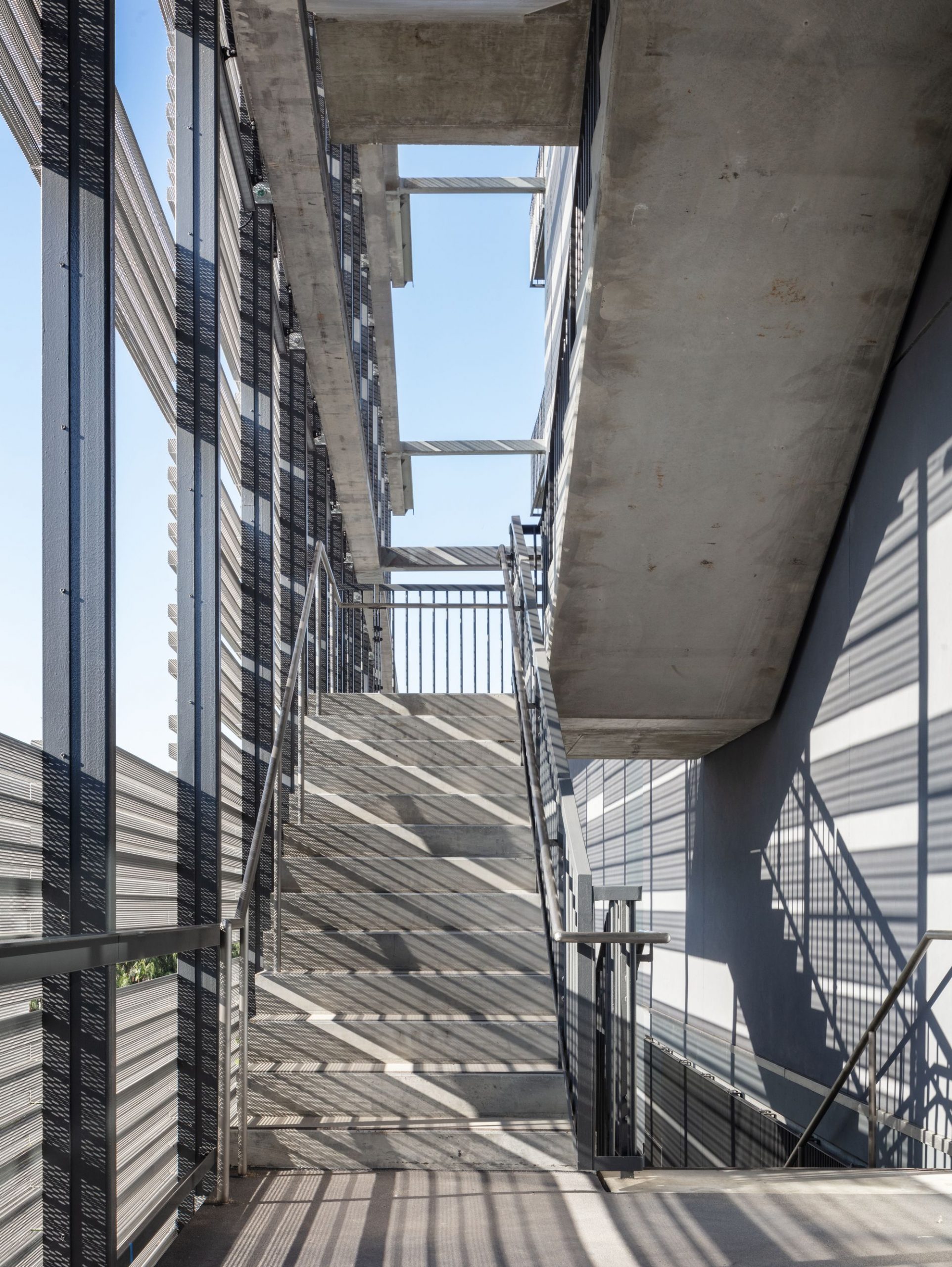
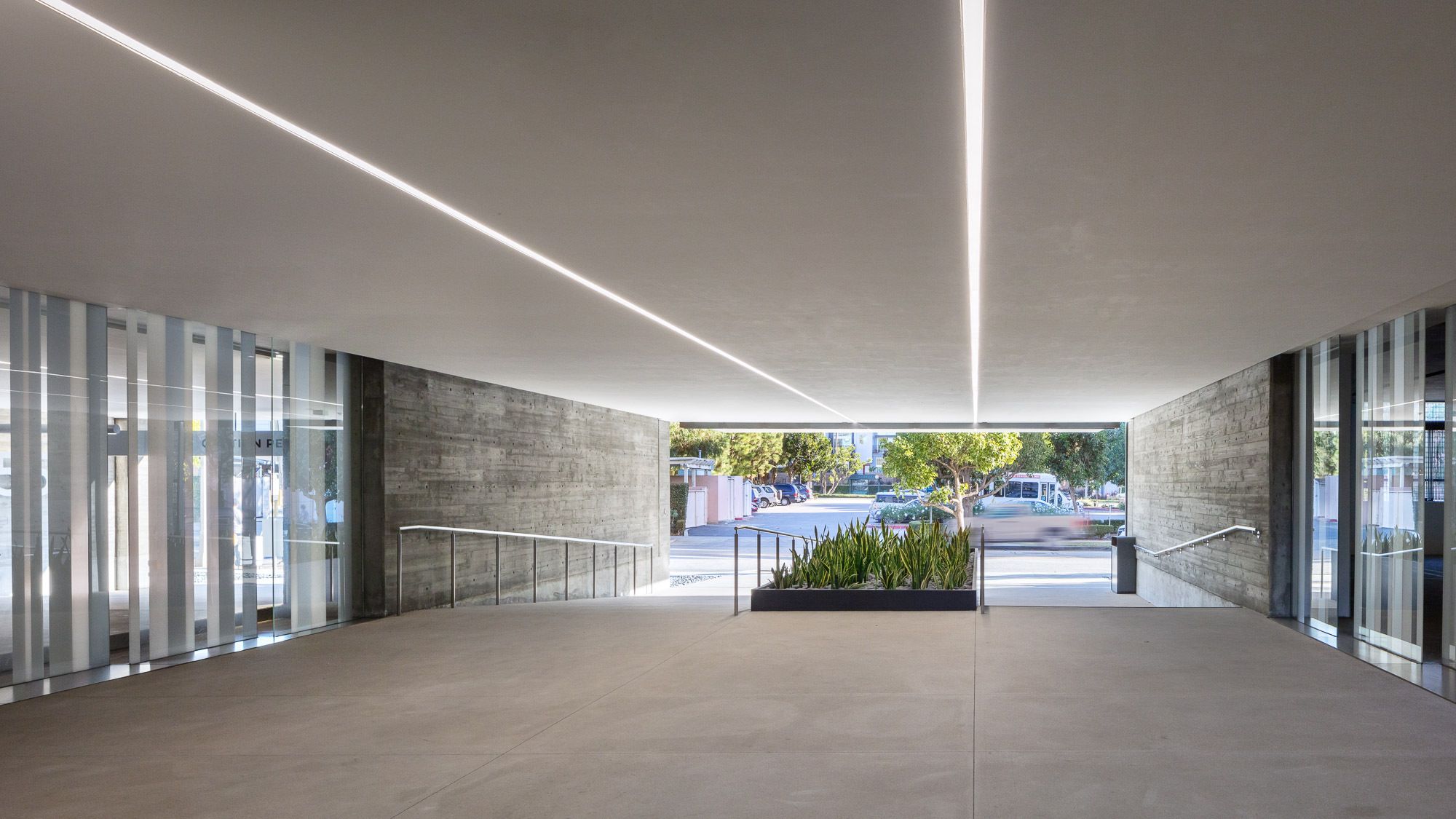
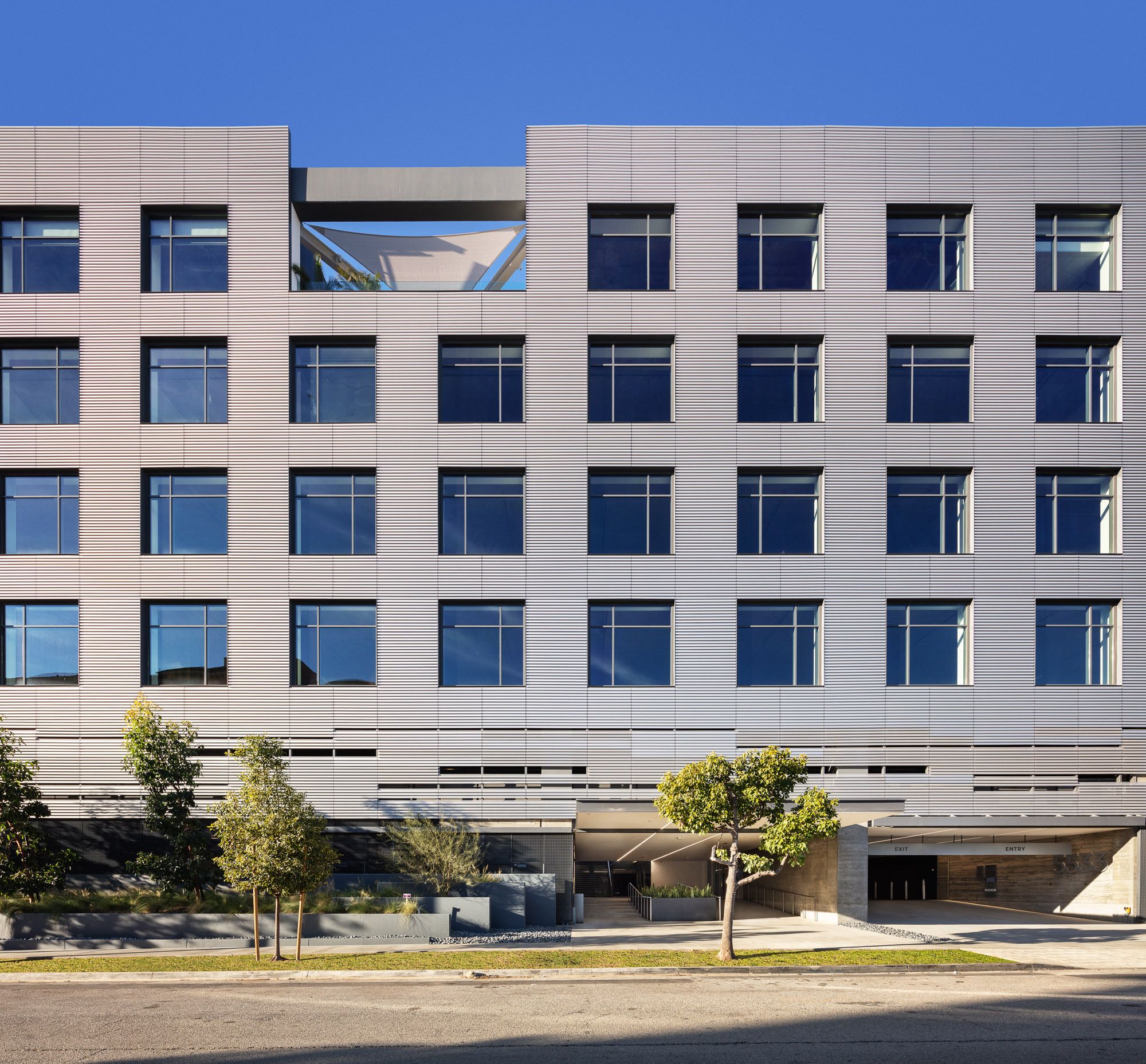
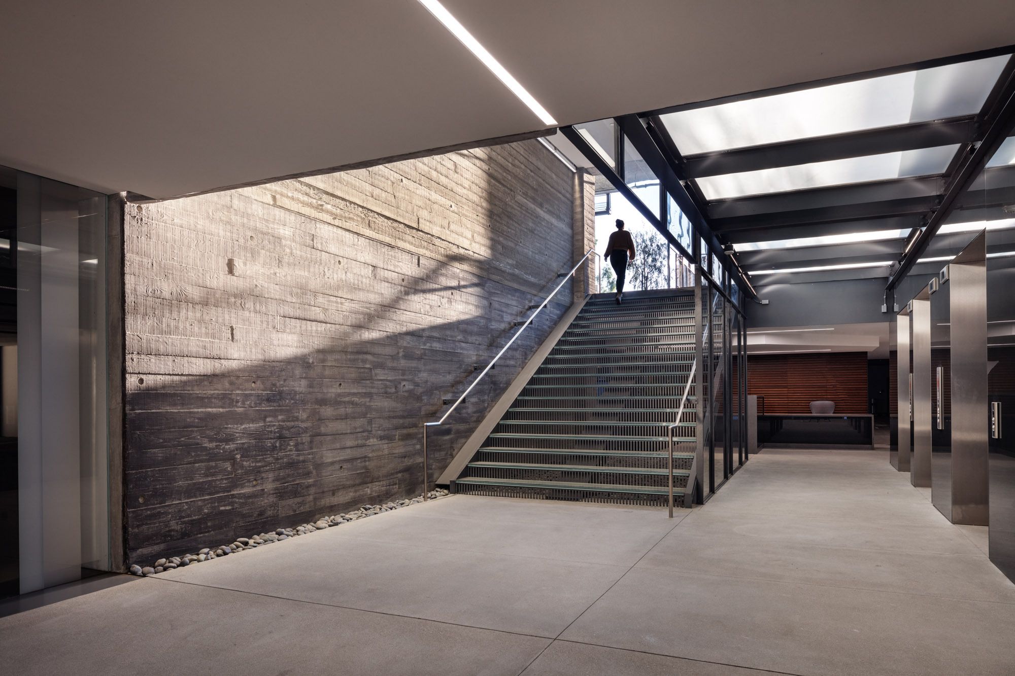
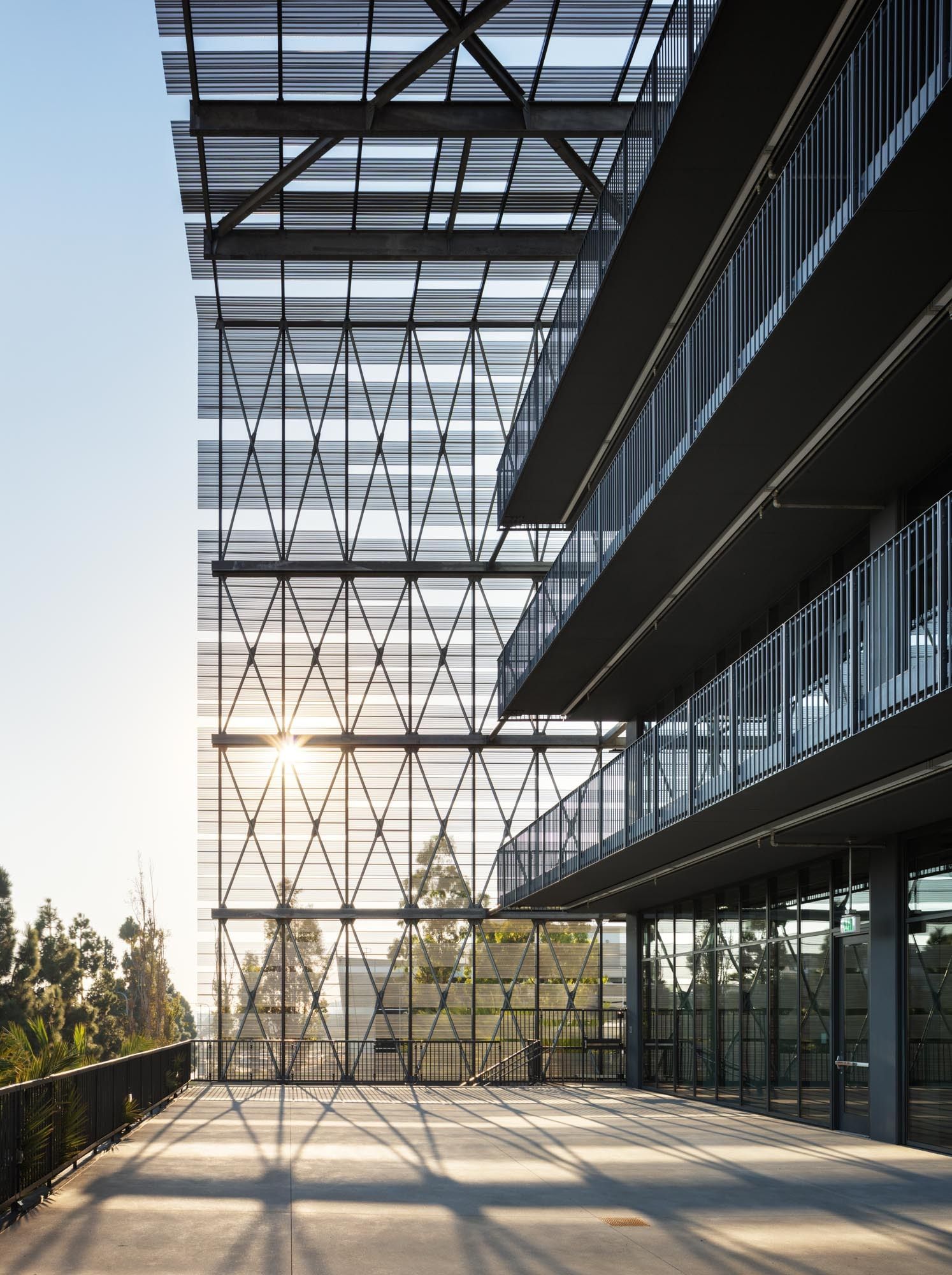
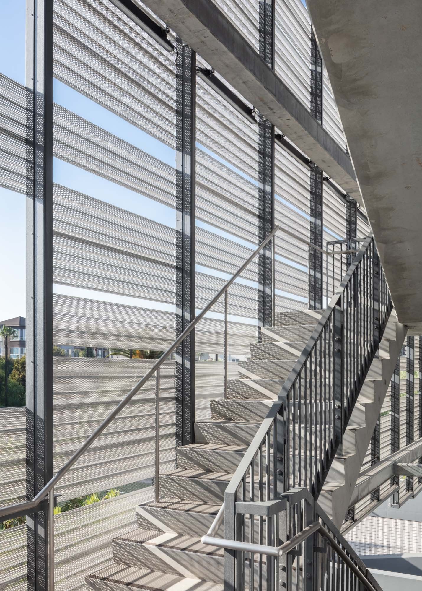
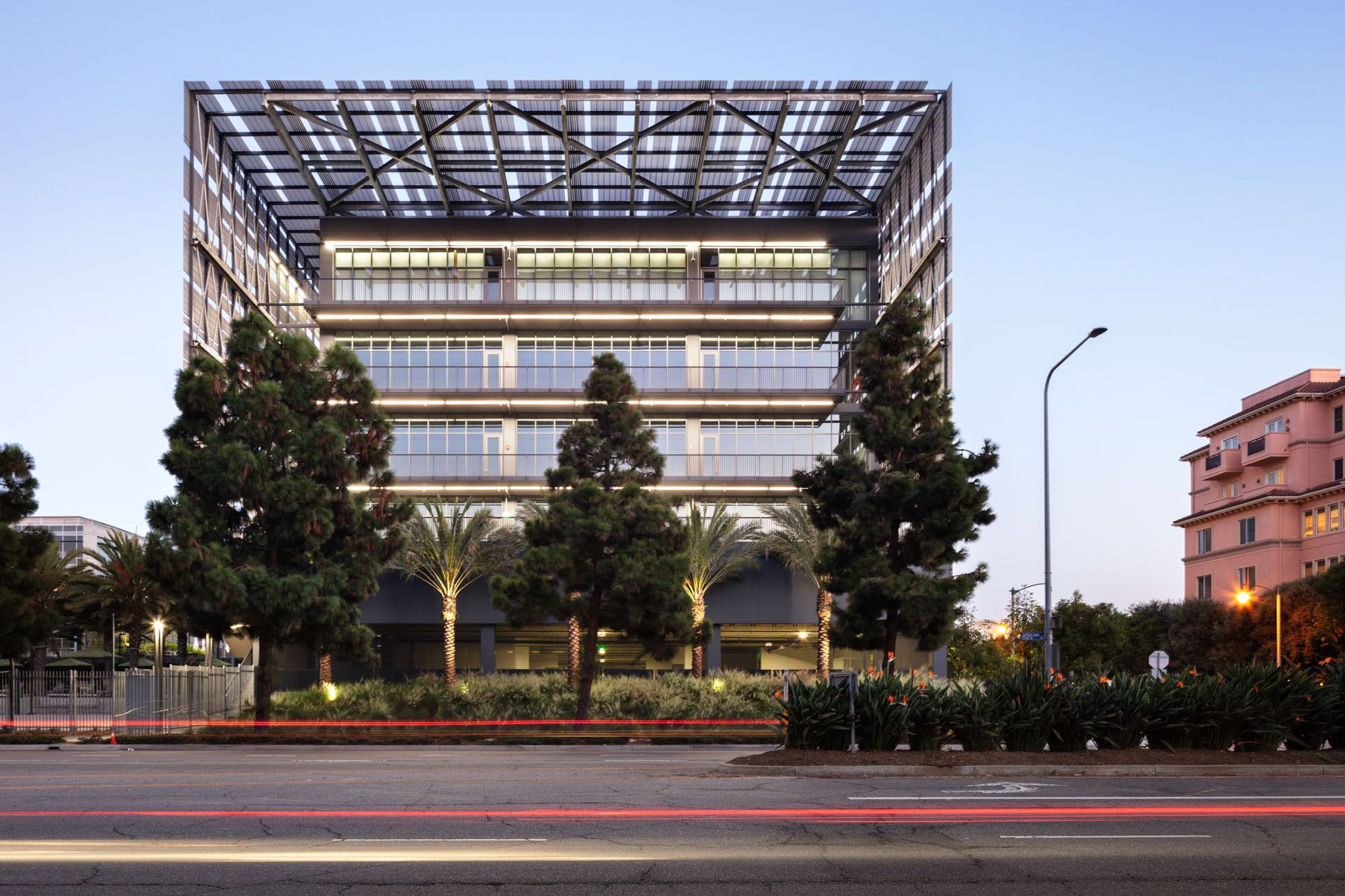
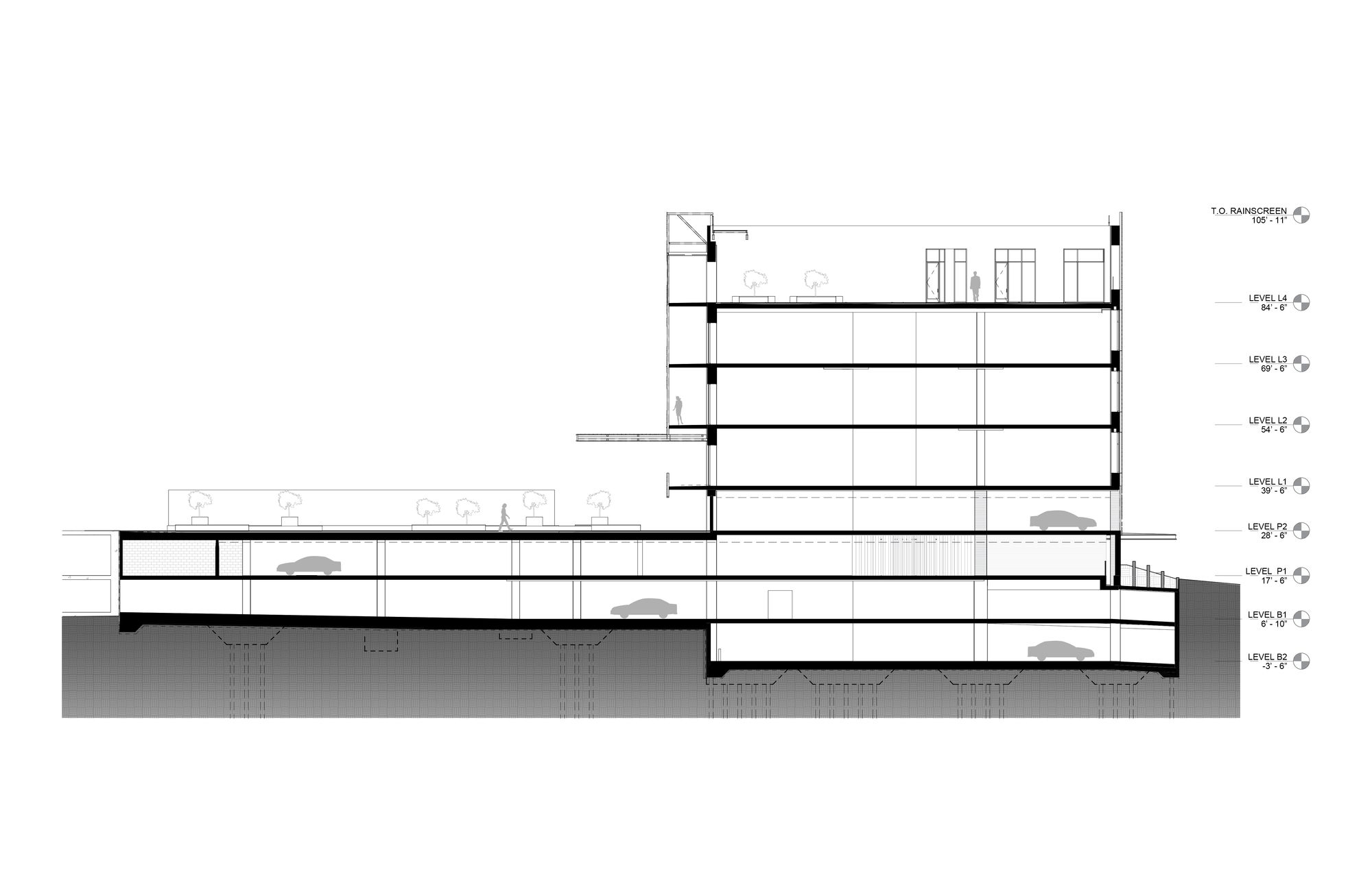
The structure encompasses four levels of parking—-600 cars in total- two subterranean, one at grade and one above grade— and four floors of open workspace, reflecting the trend in office planning and culture. All circulation and exiting are designed to be exterior that has now become serendipitously a benefit to working in a pandemic. Each of the four levels is approximately 40,000 square feet and fifteen feet floor to floor, with the entirety of the concrete superstructure, left exposed.

Photography by © Mike Kelley
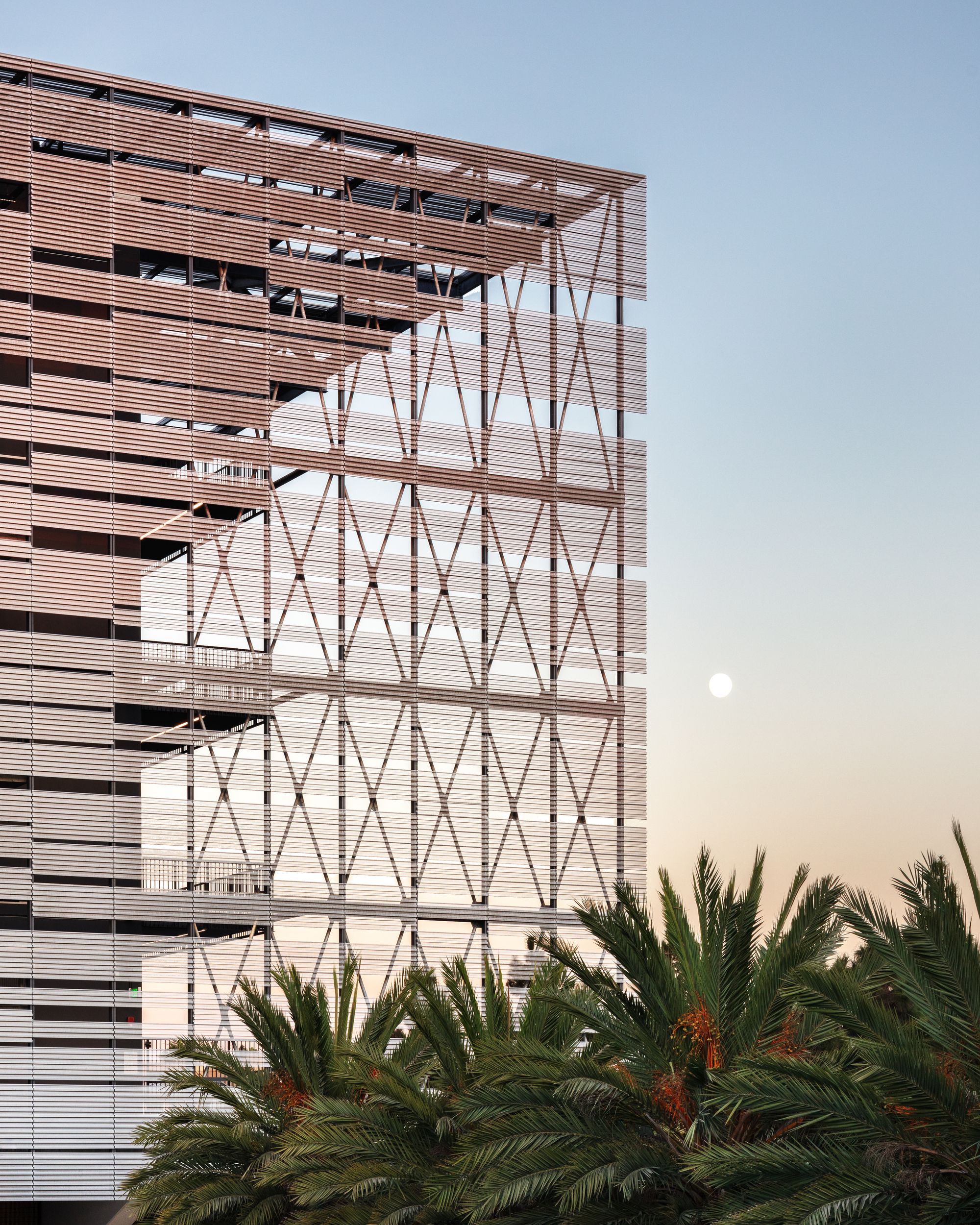
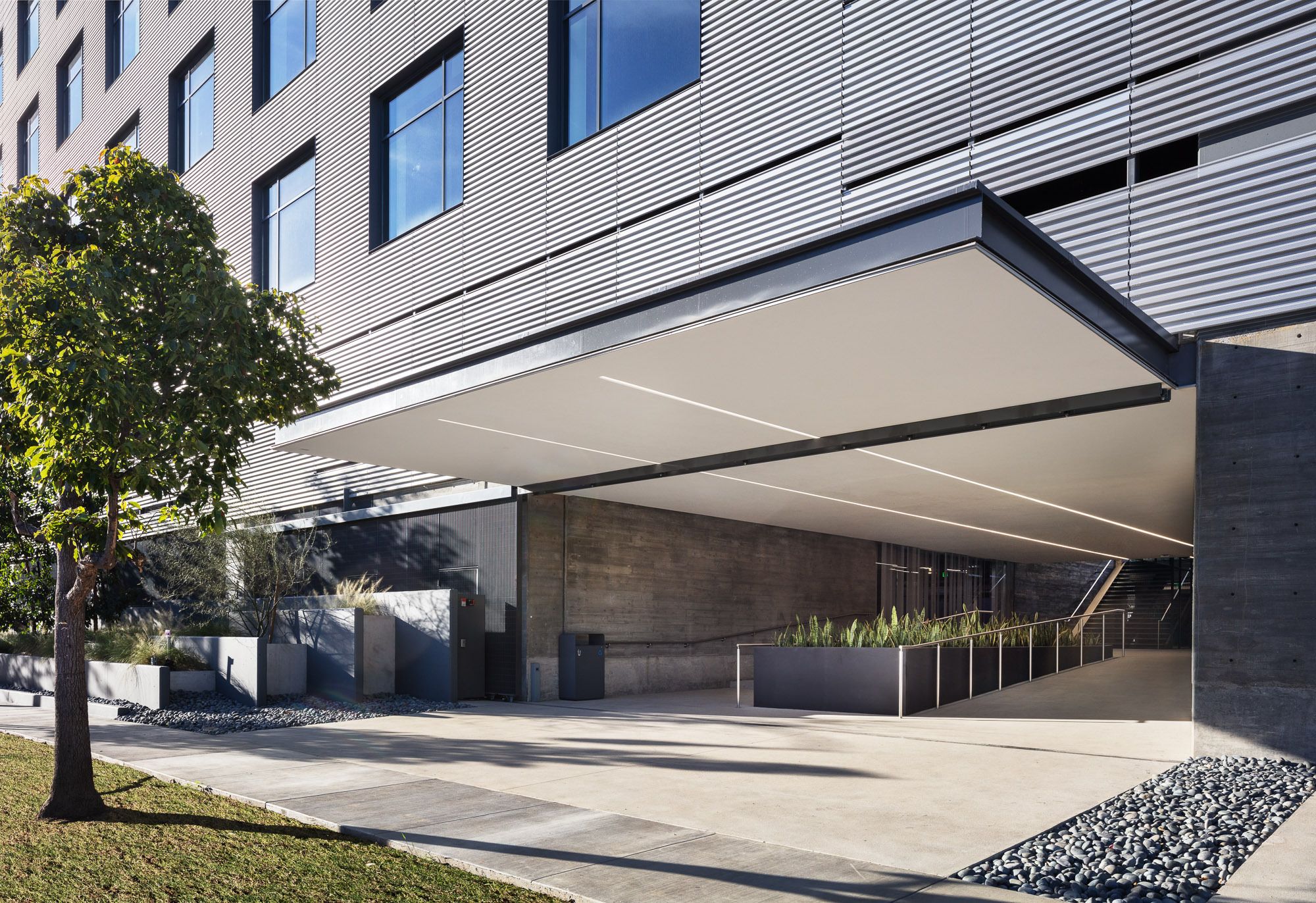
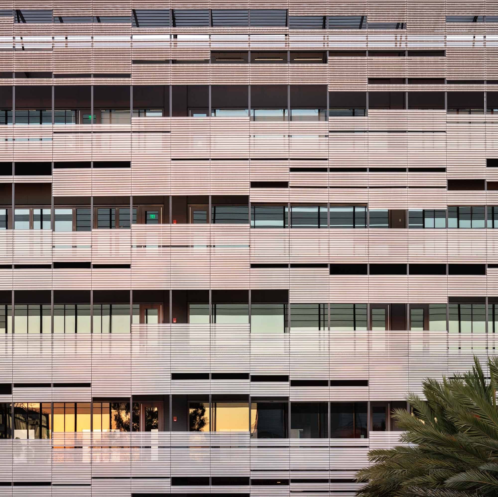
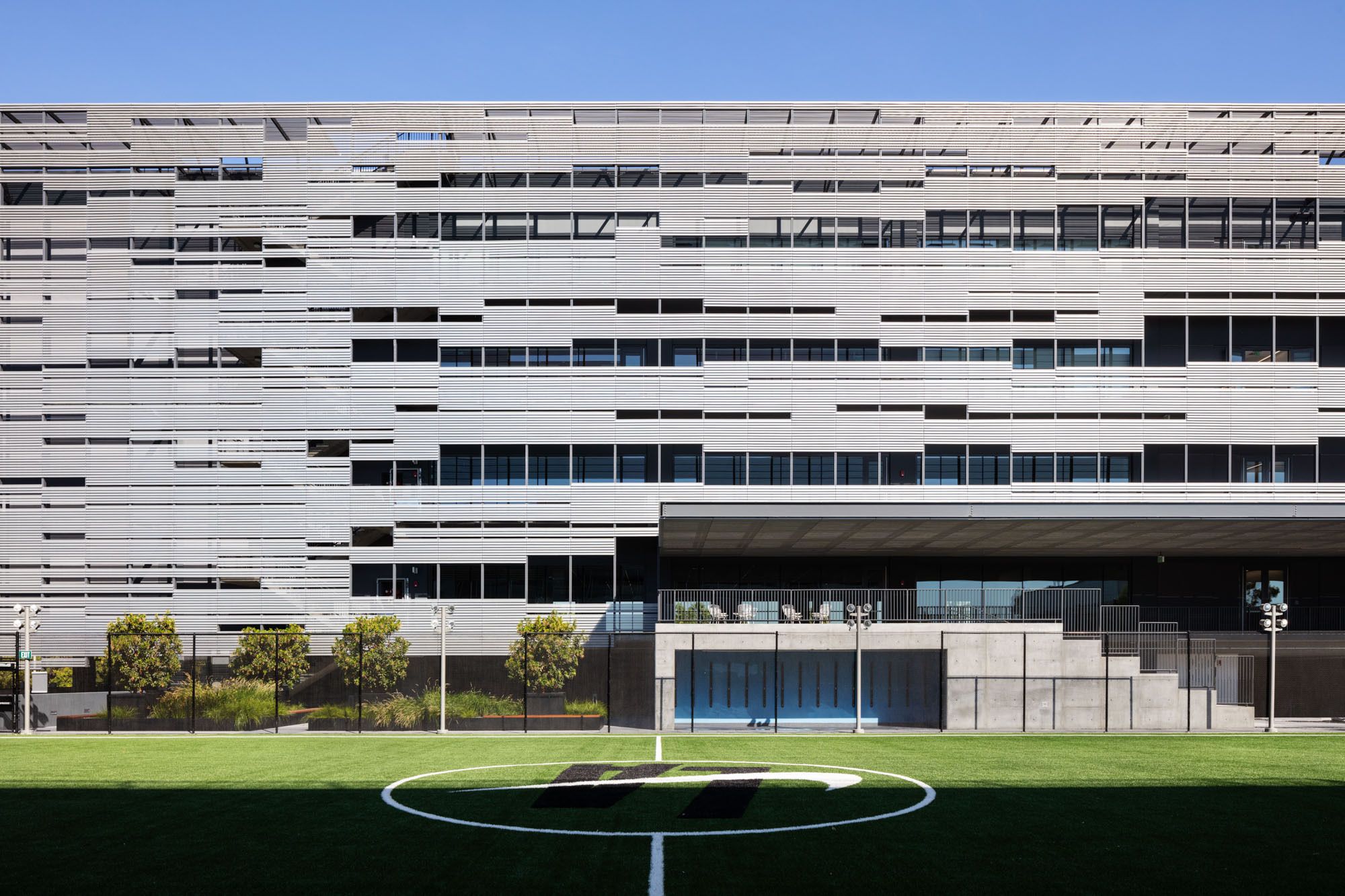
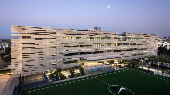
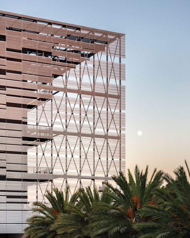
One of the project’s most distinctive feature: a “floating”, perforated skin that shrouds the building’s exterior. Inspired by the play of light on water and influenced by the uneven natural geometry of Ellsworth Kelly and Agnes Martin, the skin is designed to dematerialize, visually lightening the structure’s significant mass while functionally providing the glass façade cover from the full brunt of the sun. Natural light is gently filtered in from all directions and proportionally spread across the entirety of the interior surface area.
Photography by © Mike Kelley
Project Info:
Architects: Studio Pali Fekete architects
Location: Los Angeles, United States
Area: 407000 ft²
Project Year: 2020
Photographs: Mike Kelley
Manufactures: Arcadia Custom, Morin | Kingspan
