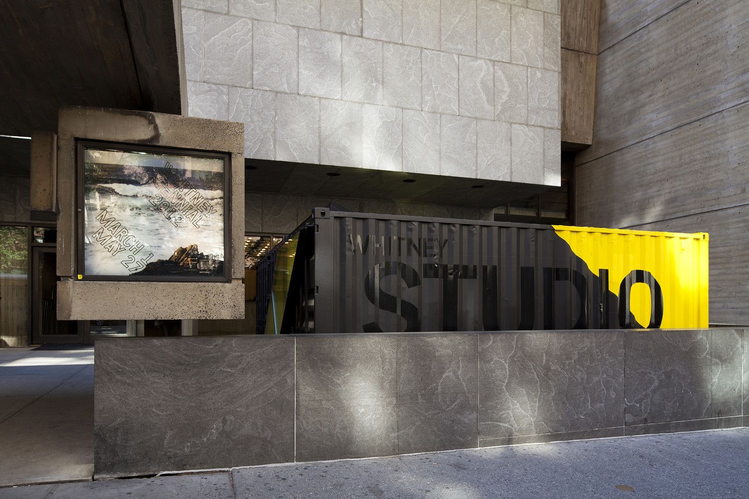
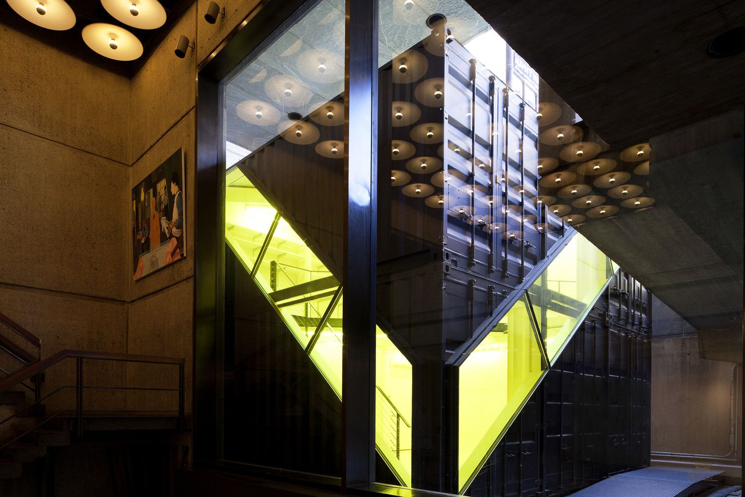
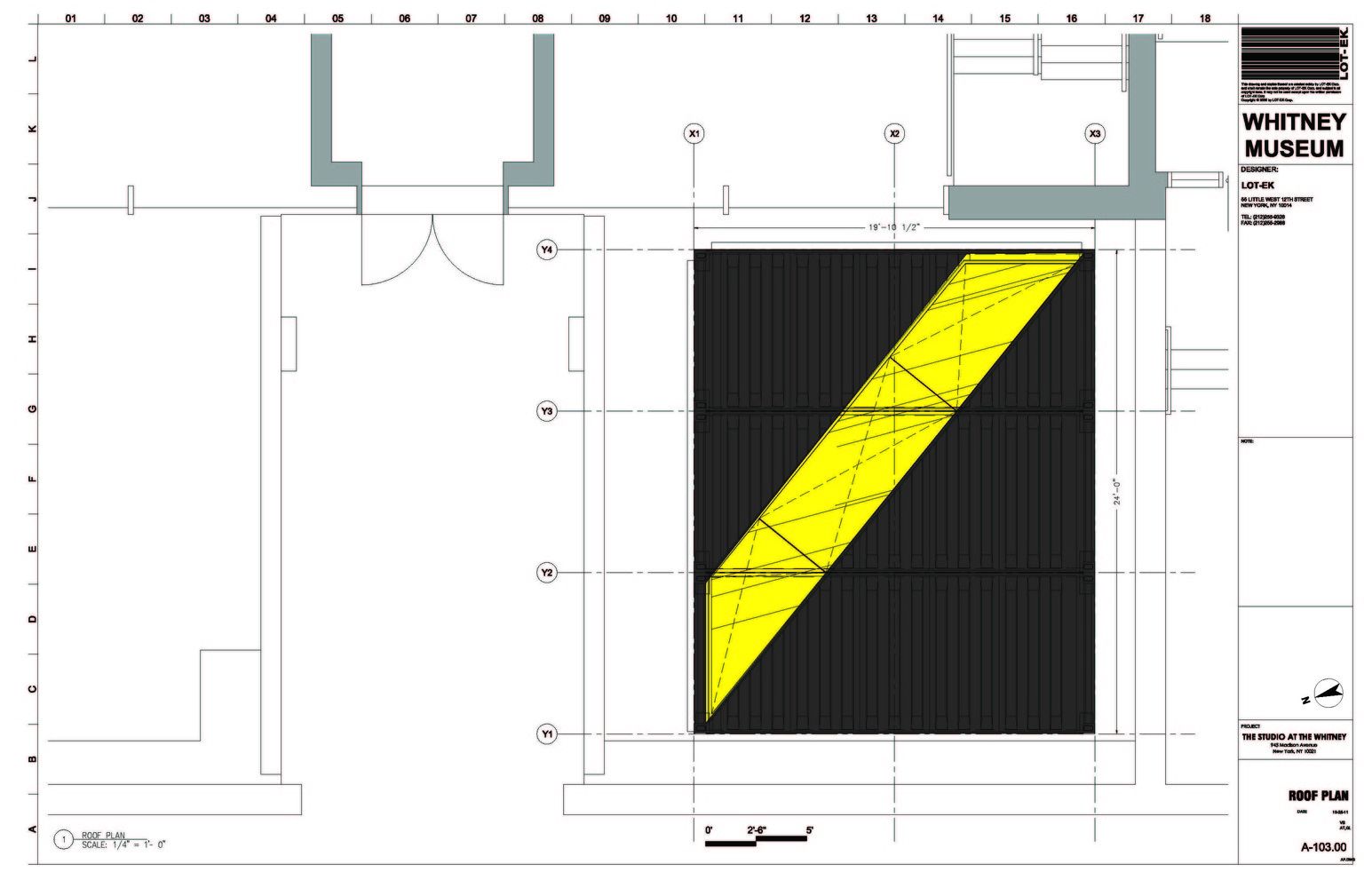
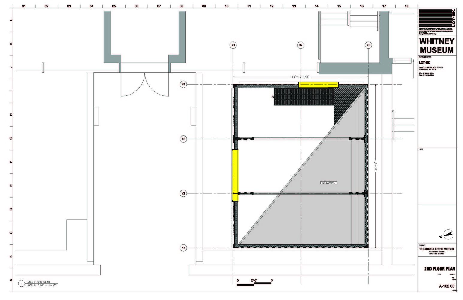
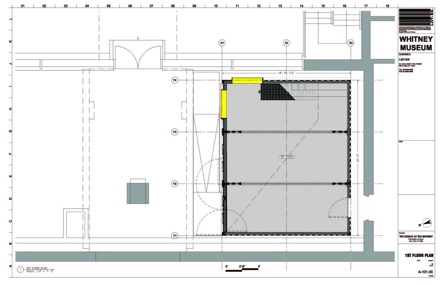
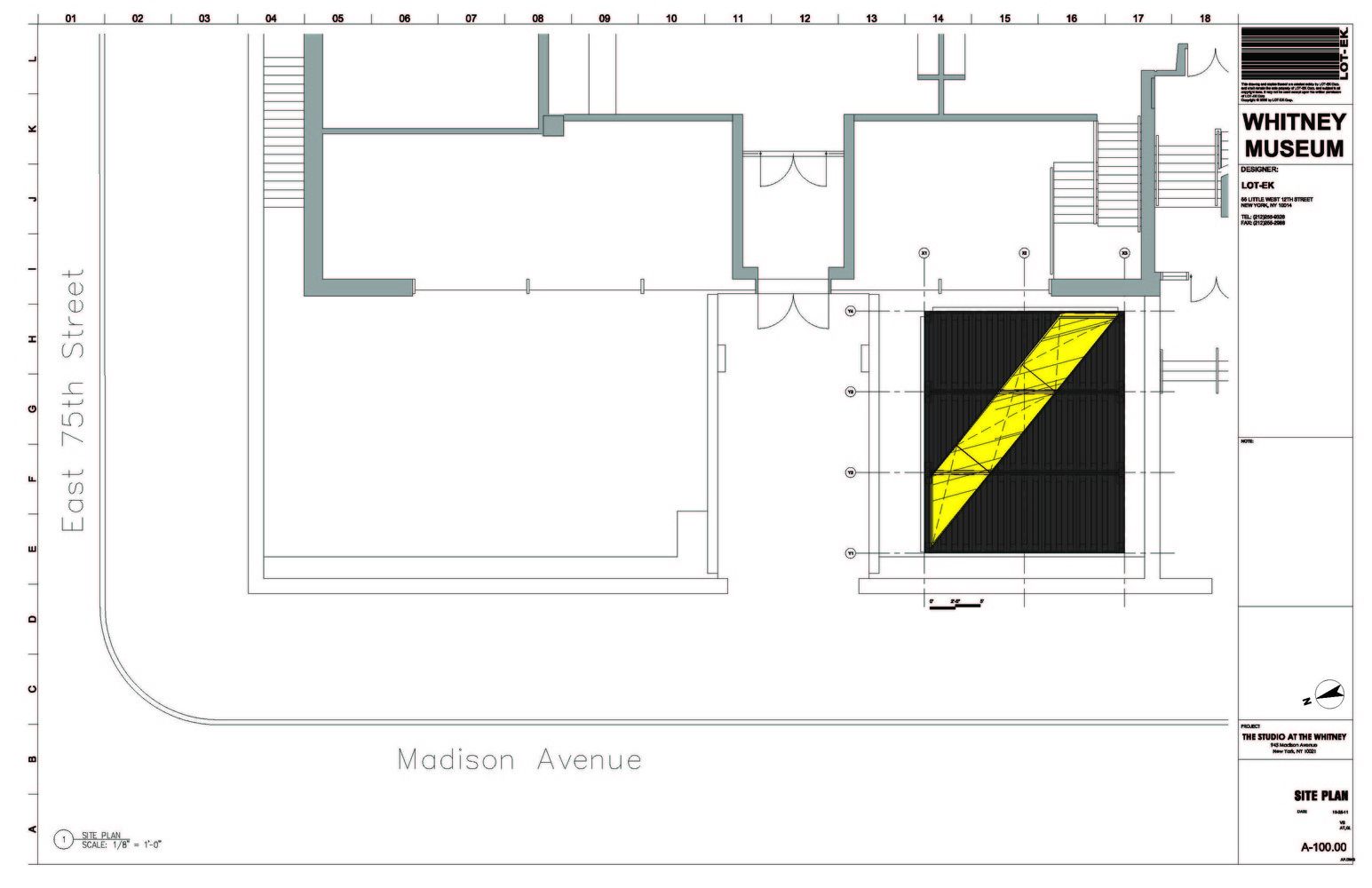
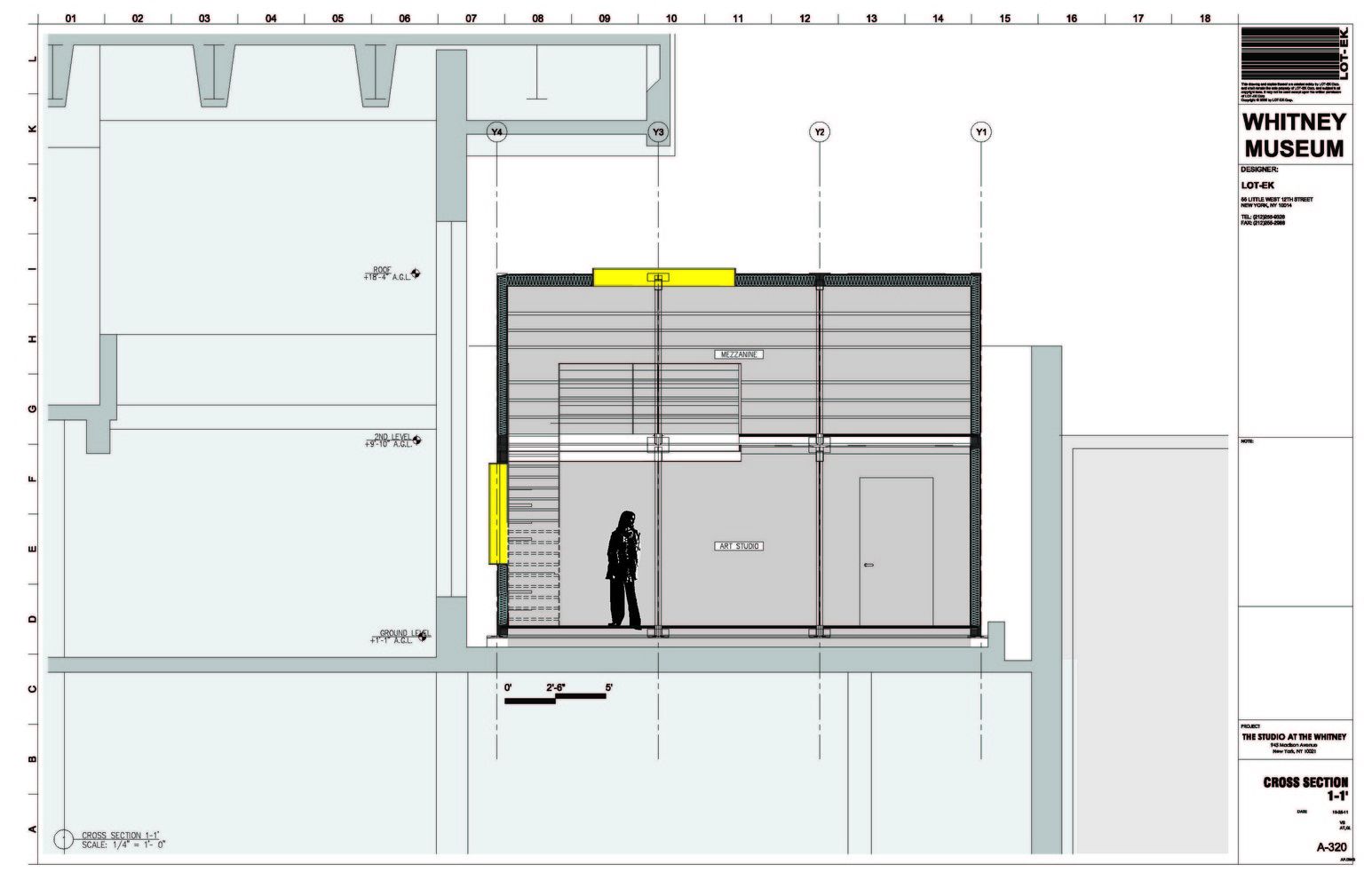
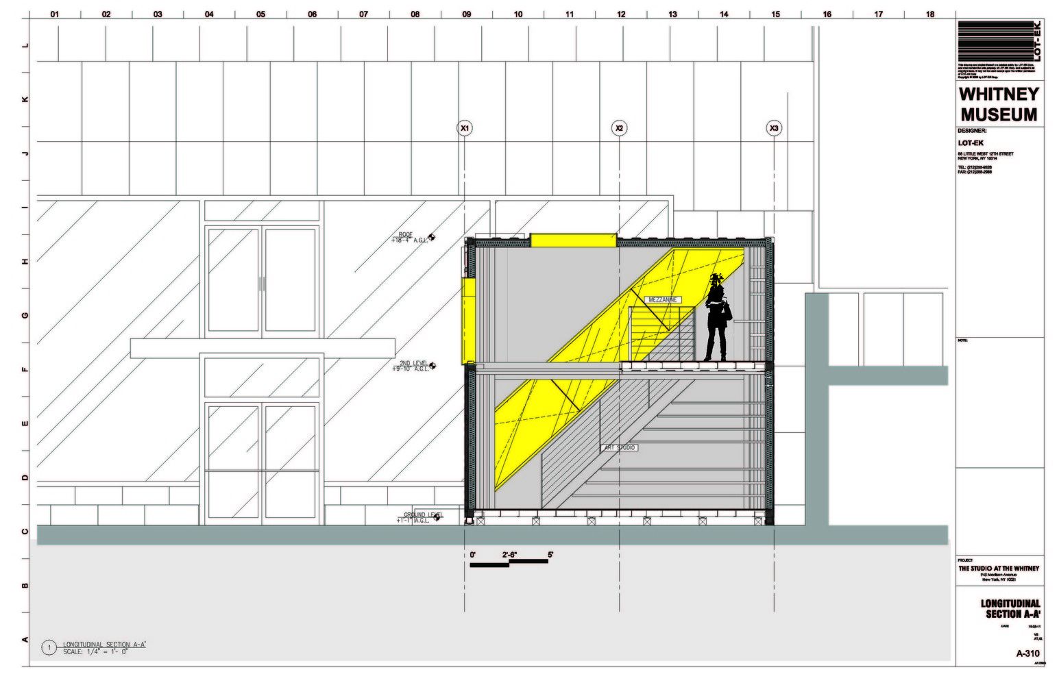
In stark contrast to the Whitney Museum of American Art stands a new educational space designed by LOT-EK. The structure is compromised of 6 steel shipping containers stacked on two levels and painted in a dark black.
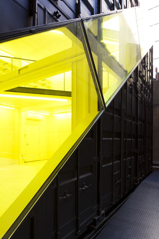
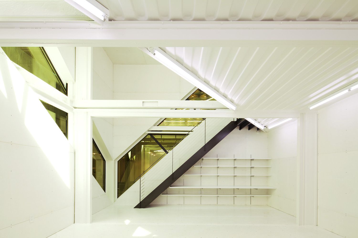
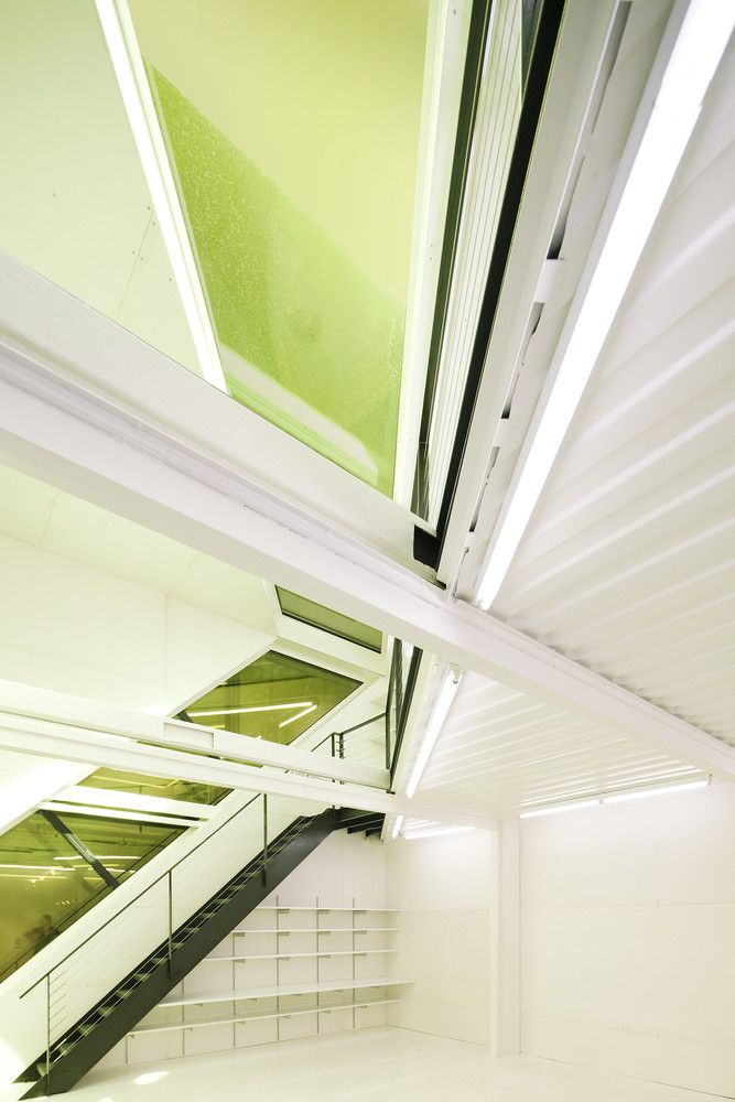
The design is very minimalistic but in no way an understatement. The rigid black structure is contrasted with soft yellow diagonal planes that create a continuous cut and a visual break. The windows allow for visual connection with the museum’s entrance bridge, lobby and restaurant. On the inside the gallery is all white double height space with a triangular mezzanine.
DH

Courtesy of LOT-EK Architecture & Design


