Ya Space!
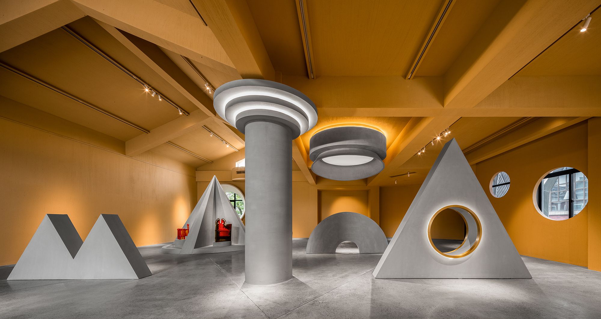
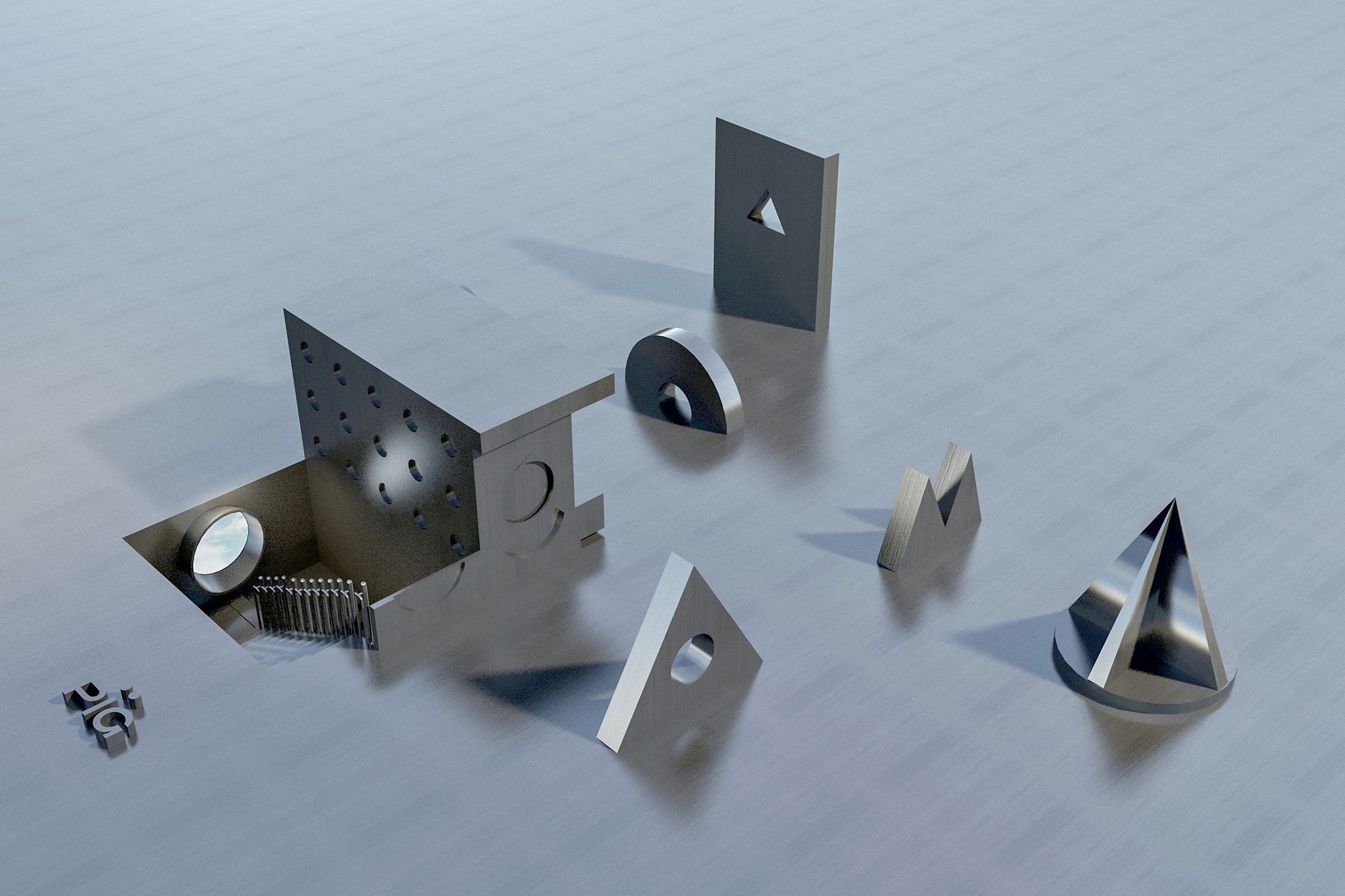
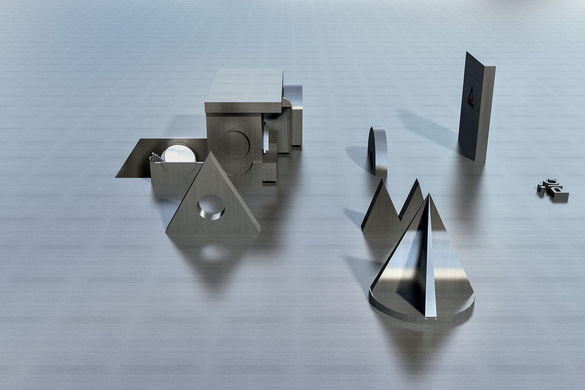
This project is a furniture exhibition space, with Memphis furniture as main exhibits. The designer titled it “Ya Space!”, which not only echoes the nickname of Memphis City in China — “Cliff City” (“Cliff” is pronounced as “Ya” in Chinese language), but also conveys a surprising feeling that indicate the unexpected sensory experiences Memphis furniture brings to people. Representative elements of Memphis style, including geometric shapes and free composition, were frequently applied to the project.

Photography by © Feng Shao
The designers identified priorities for the selection of spatial materials and hues, hoping to go beyond Memphis’ extreme emphasis on visual effects with enhanced textures and more sustainable concepts.
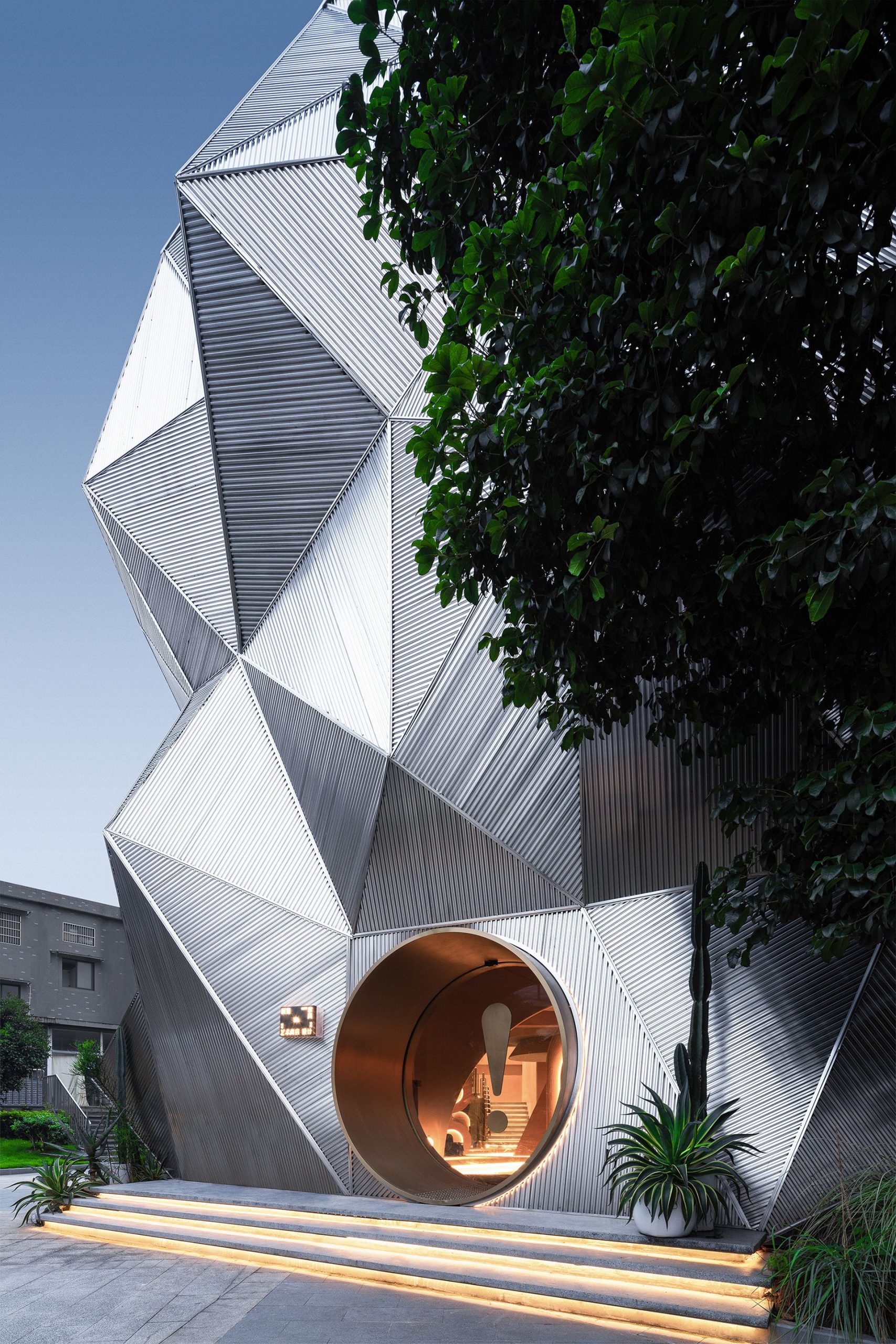
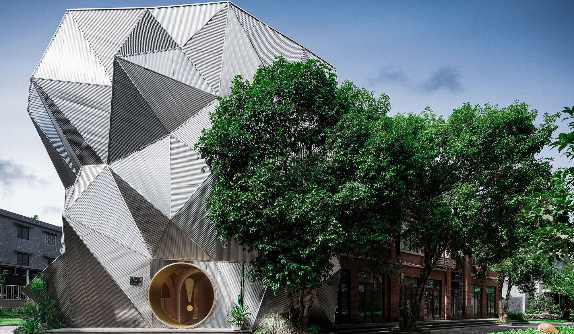
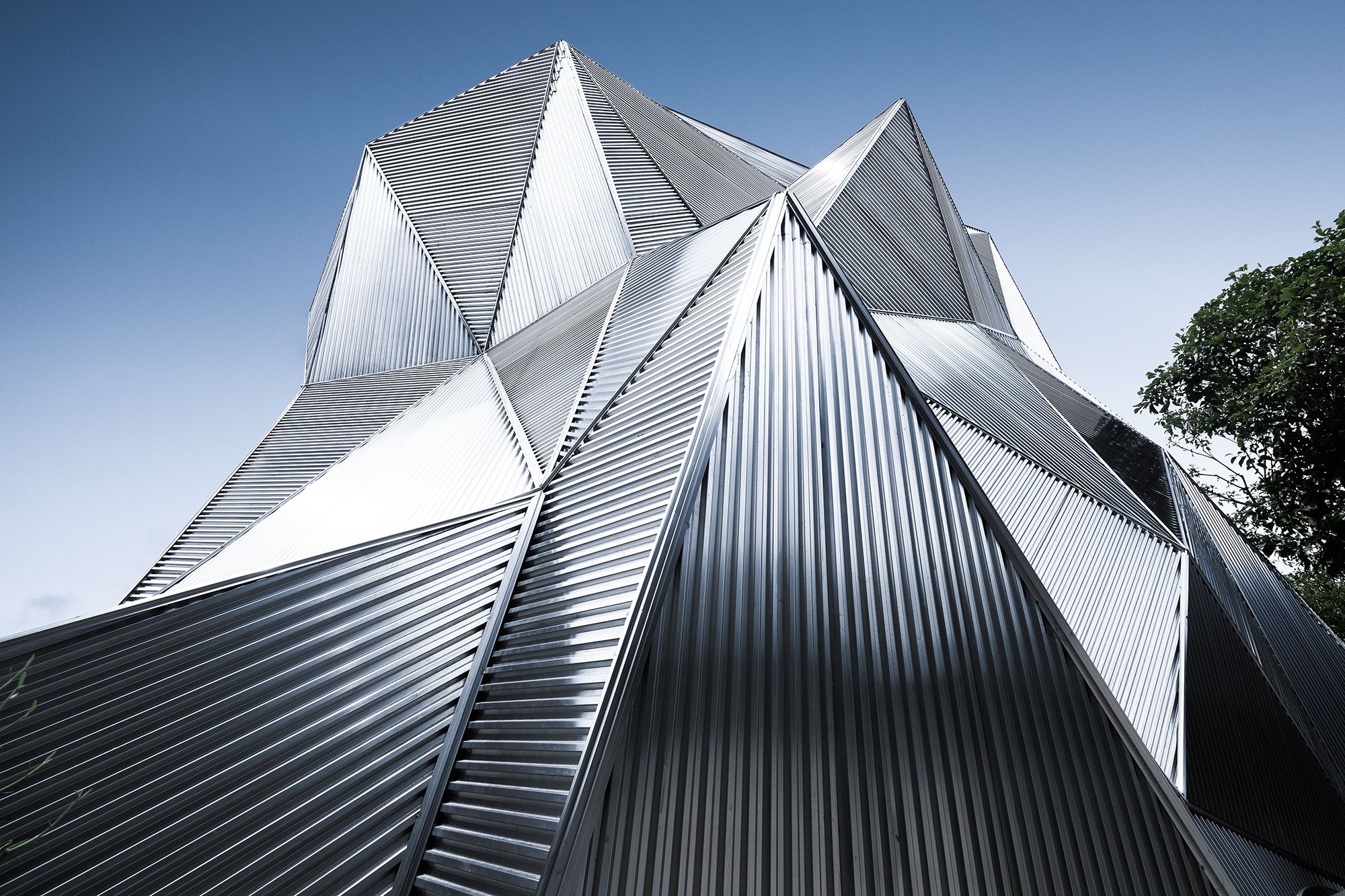
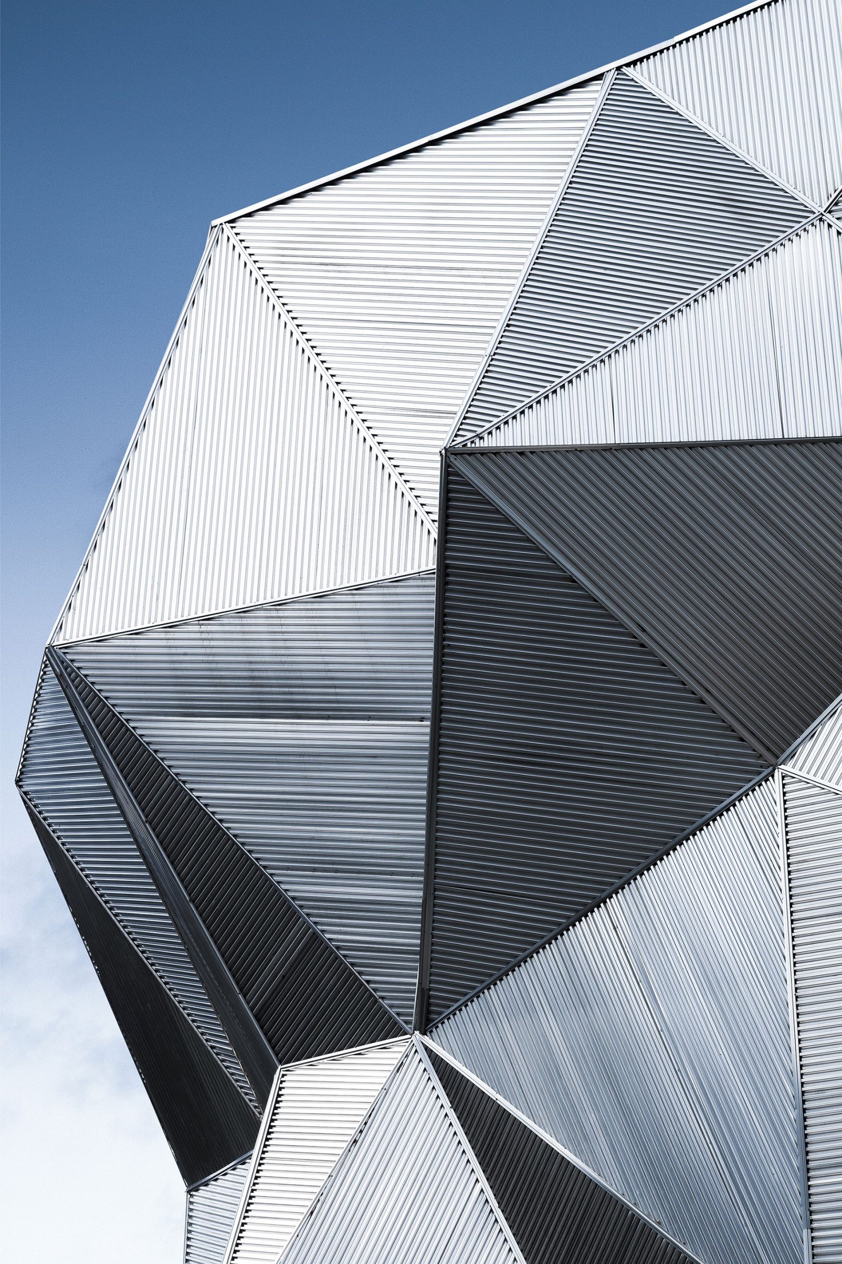
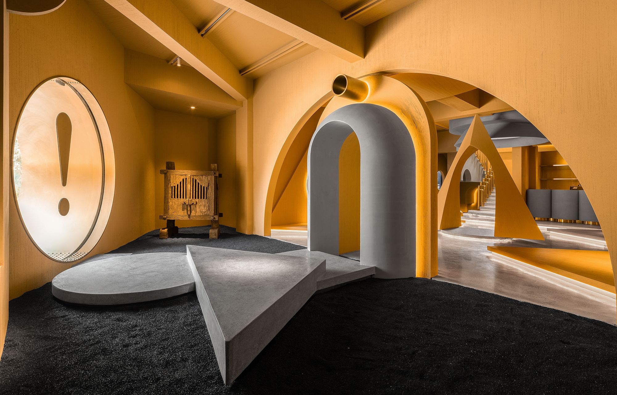
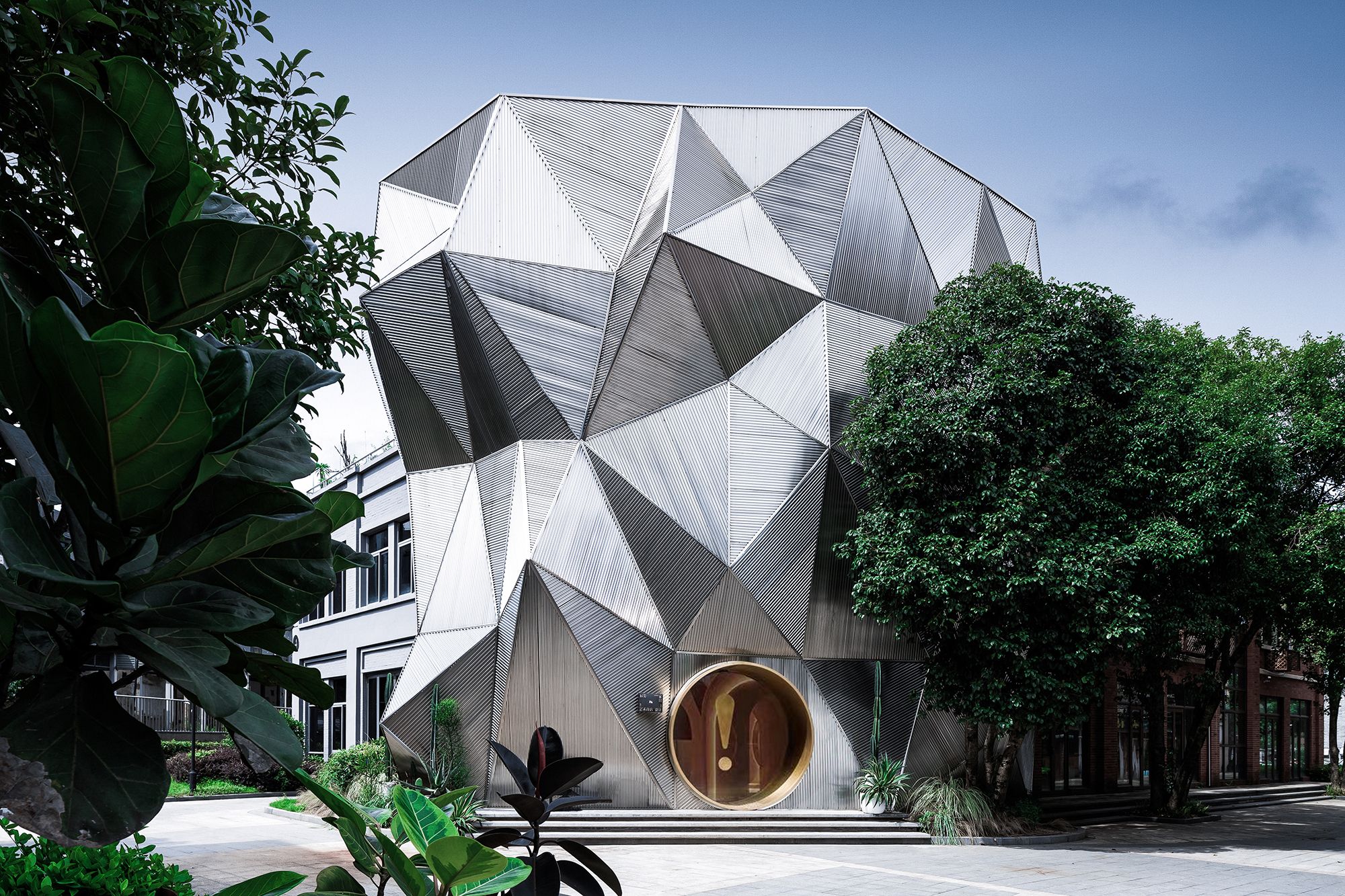
Constructed by corrugated stainless steel sheets based on the design concept of “cliff”, the façade is characterized by bizarre visual effects and complex structures and techniques. During construction, the design team constantly improved the edging and connection of corrugated sheets, as well as the treatment of nodes and materials, to ensure a holistic image. The entrance is highlighted by a large exclamation point, guiding visitors to explore the unknown interior world. All the visual elements perceived beforehand constitute an “index” of the peculiar and irregular space.

Photography by © Feng Shao
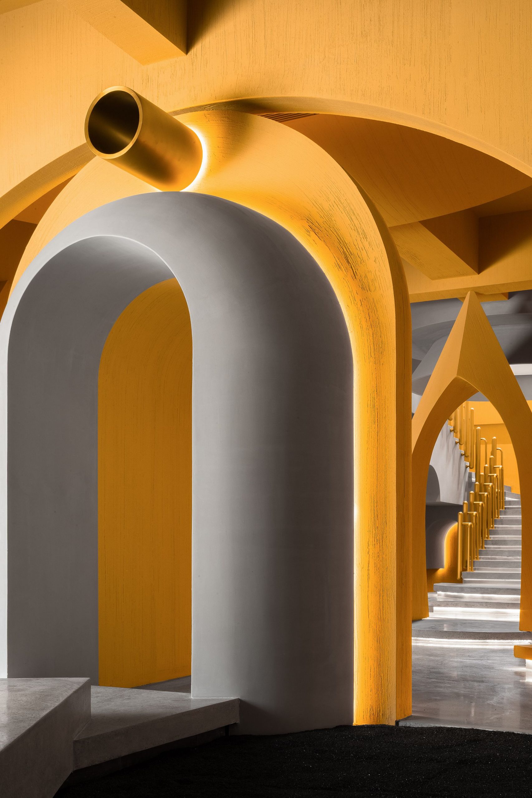
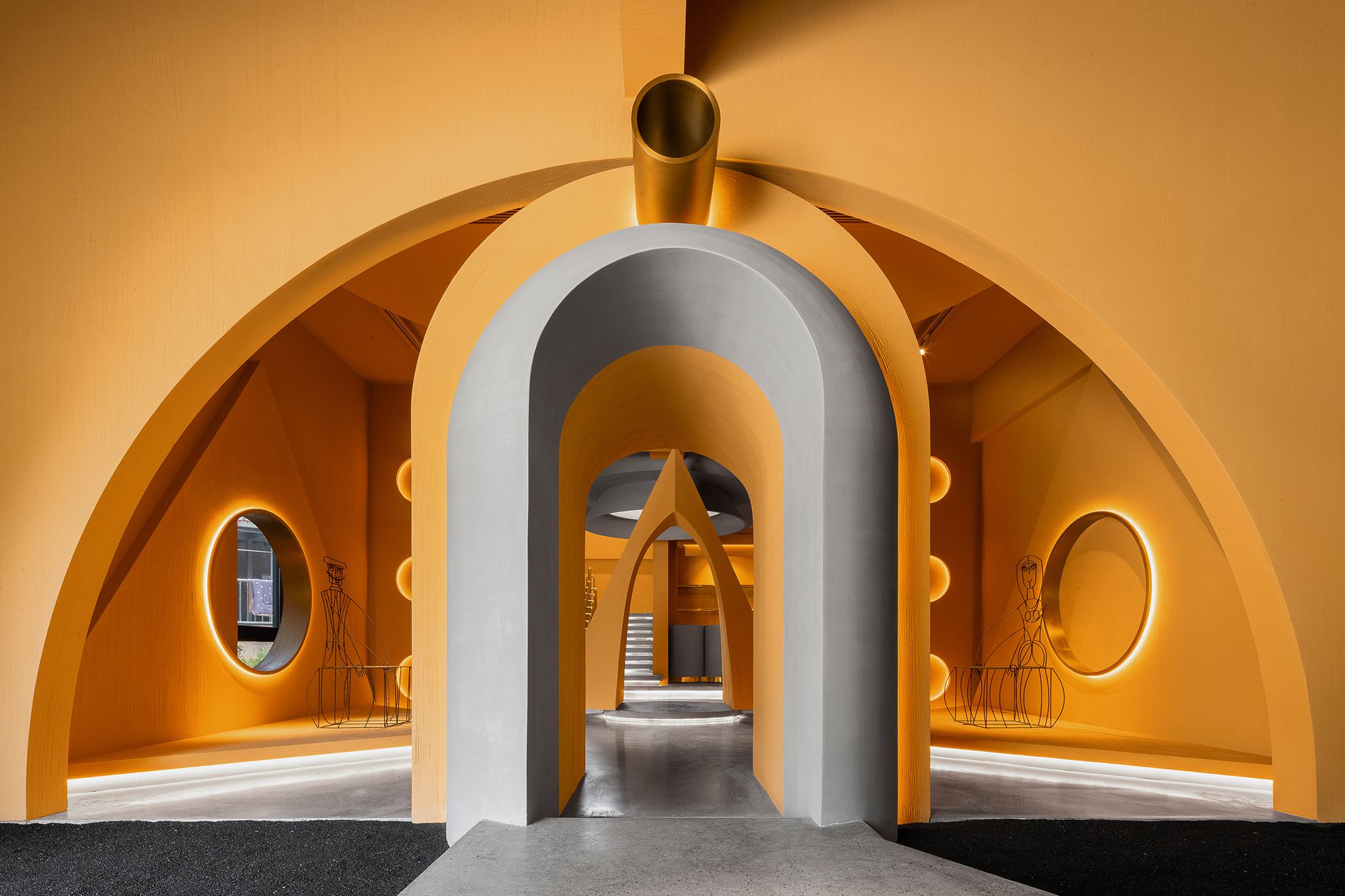
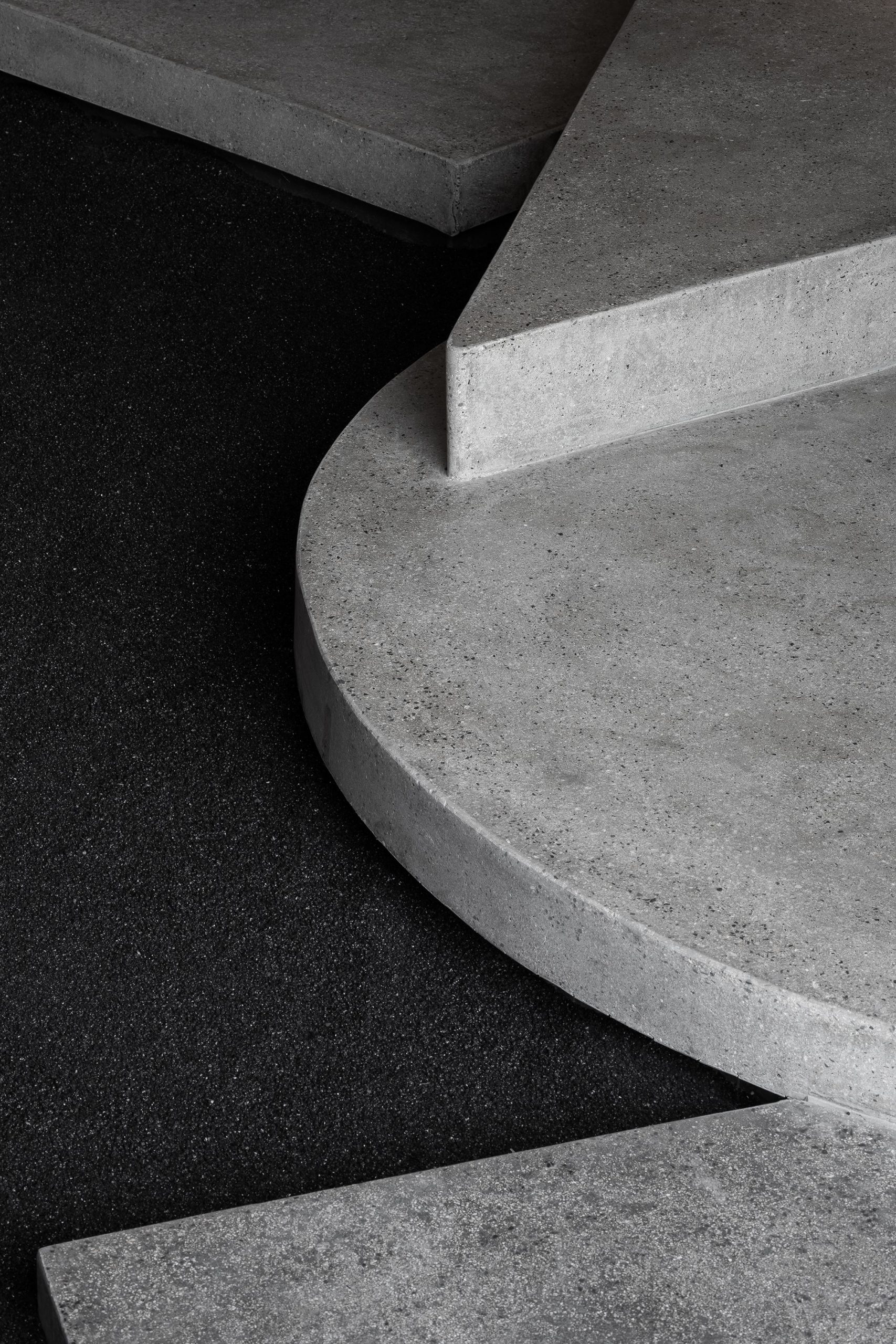
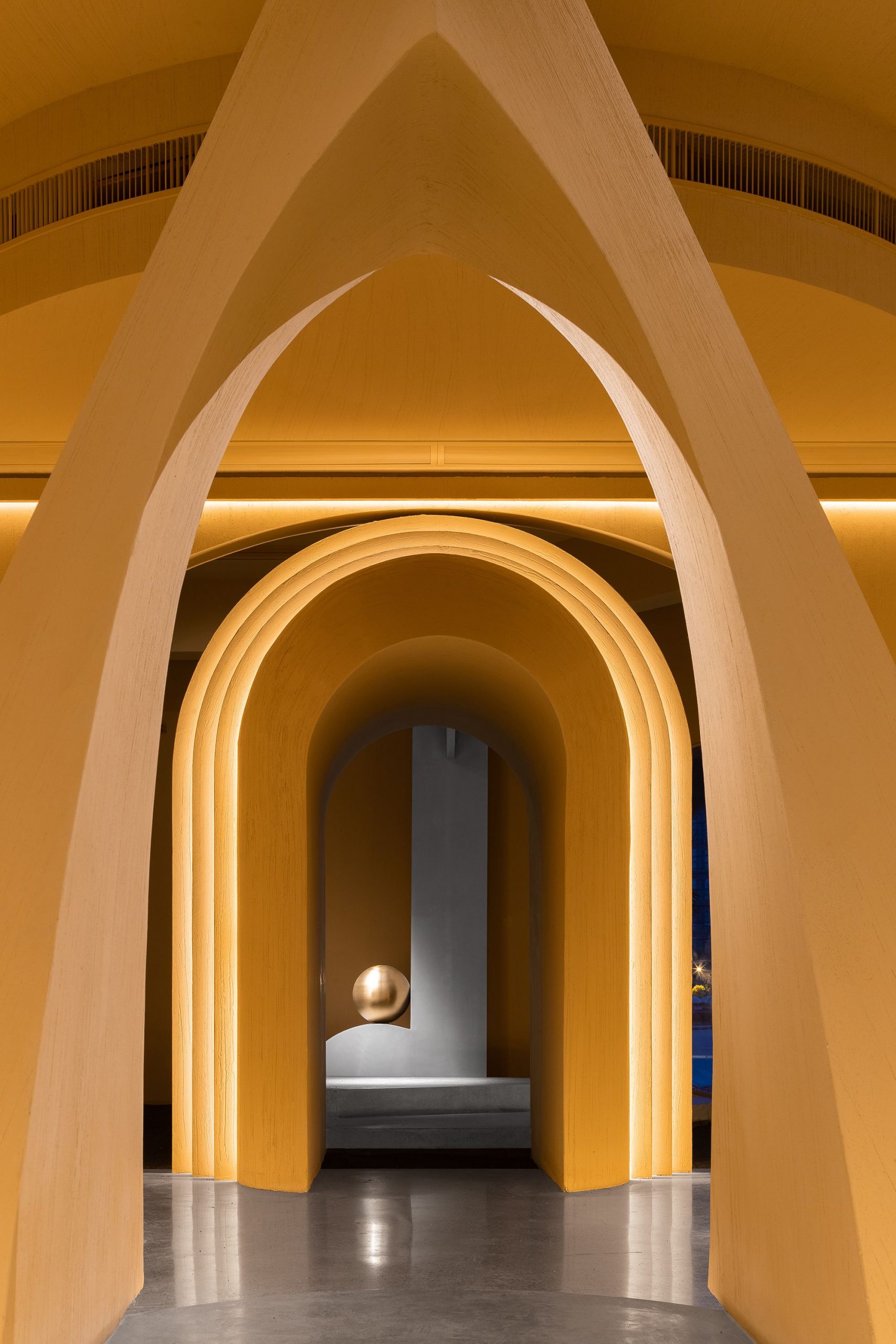
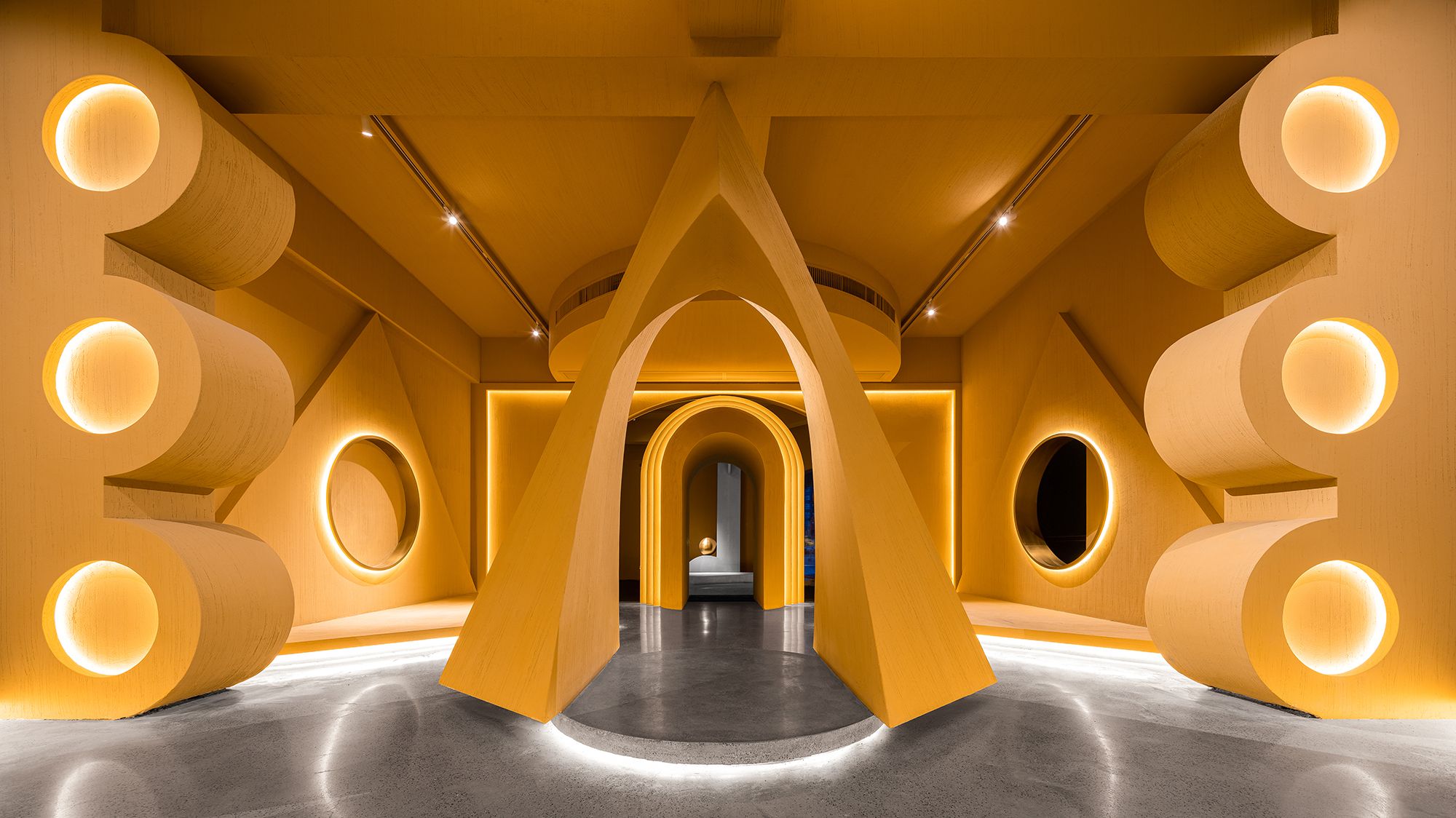
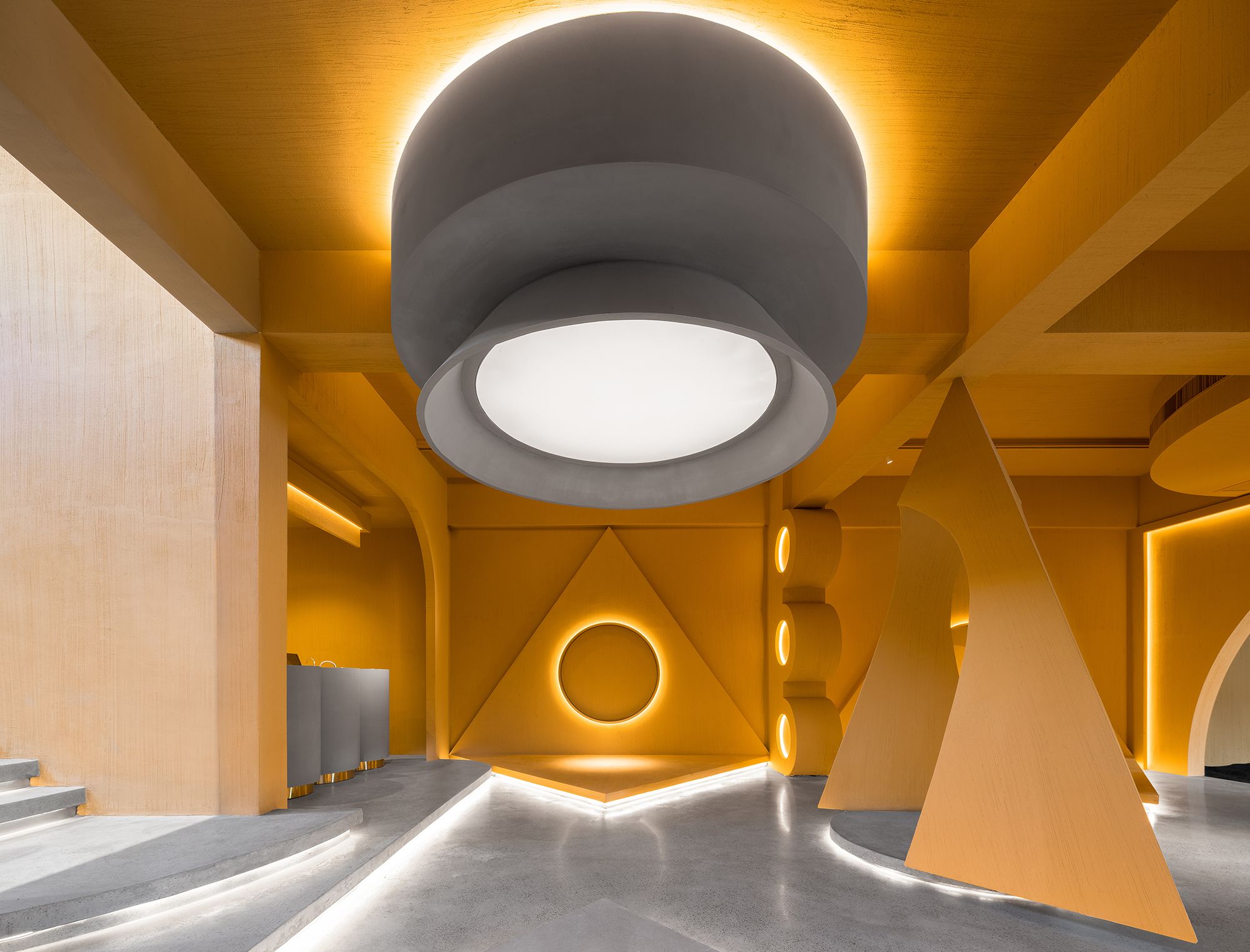
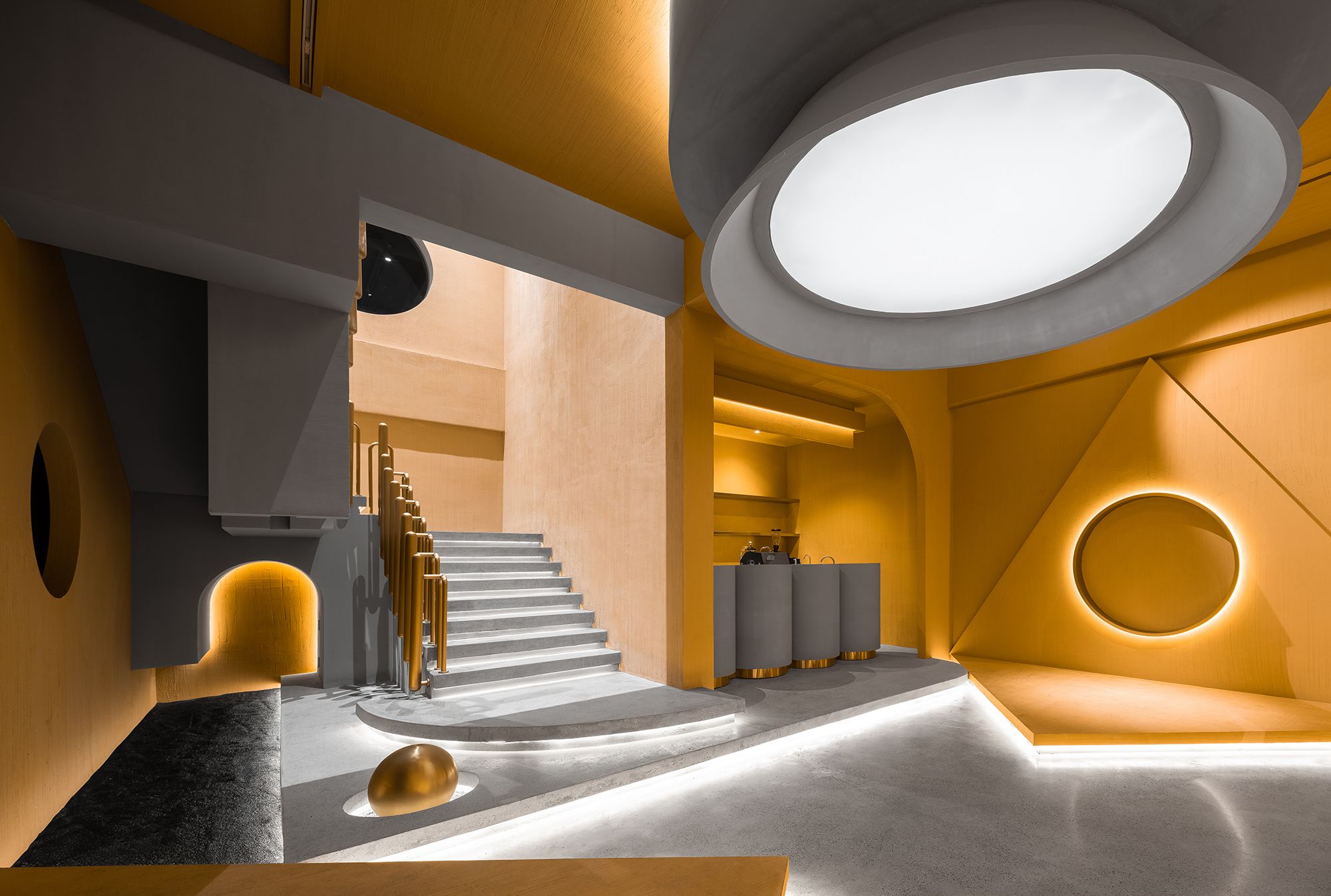
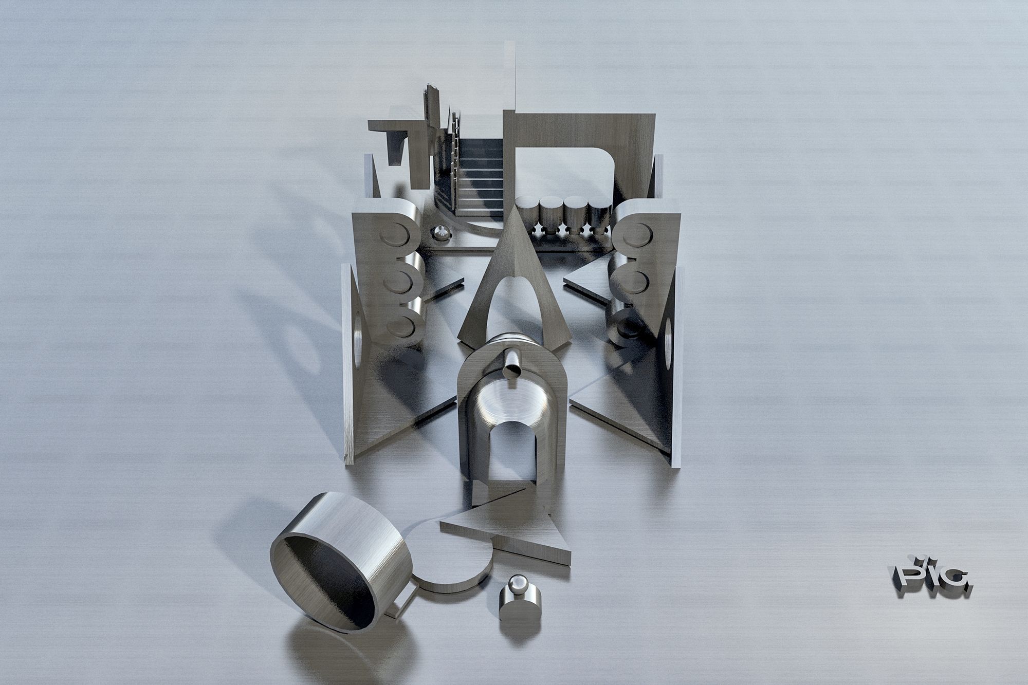
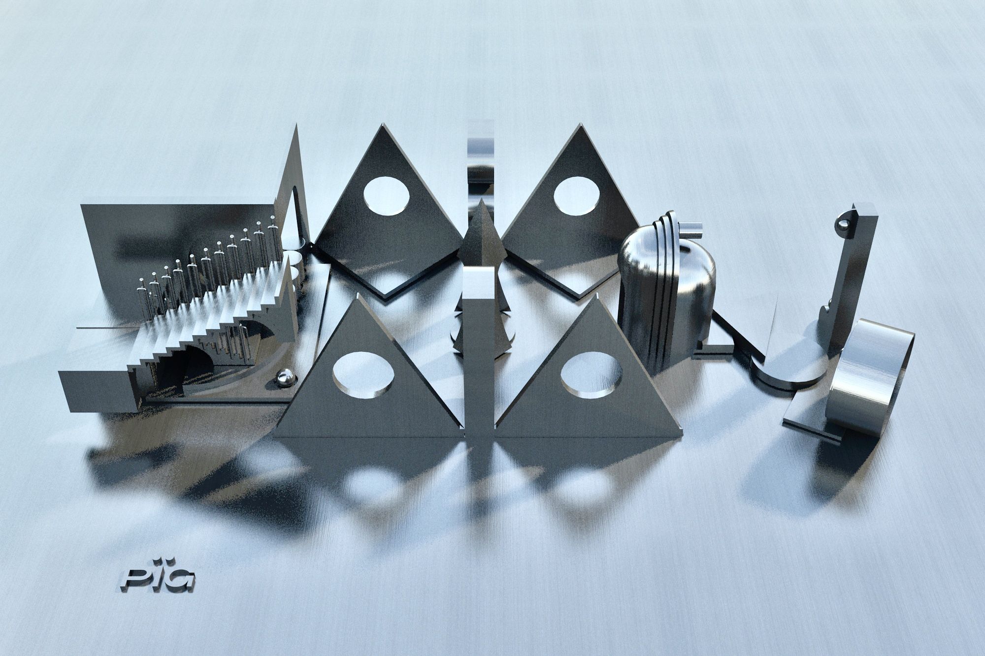
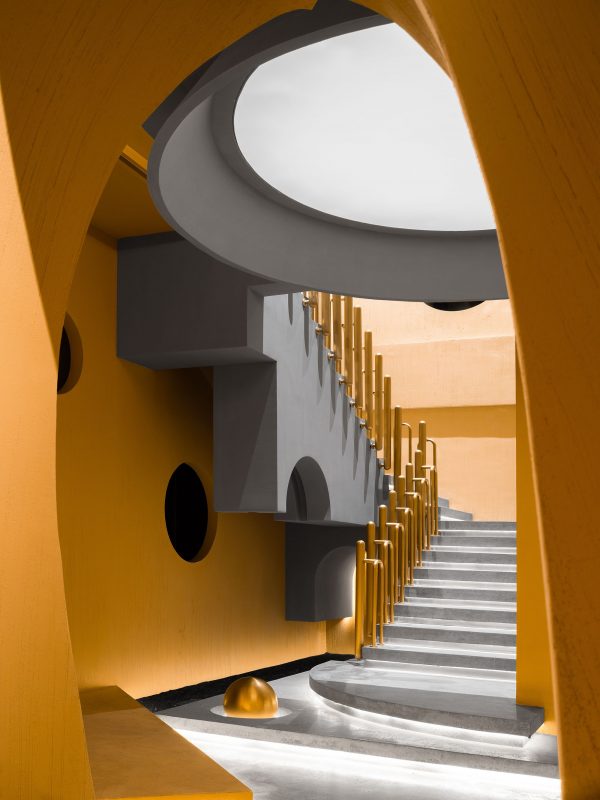
The interior space is composed of two floors. 1F centers on providing unconventional experiences, and produces spatial rhythm by unique combinations of geometric shapes. The foyer features irregular stairs paved with black stone pieces, a door opening that brings a sense of order and enriches visual experiences, and a building block game-like scene which tries to break the barrier of class.
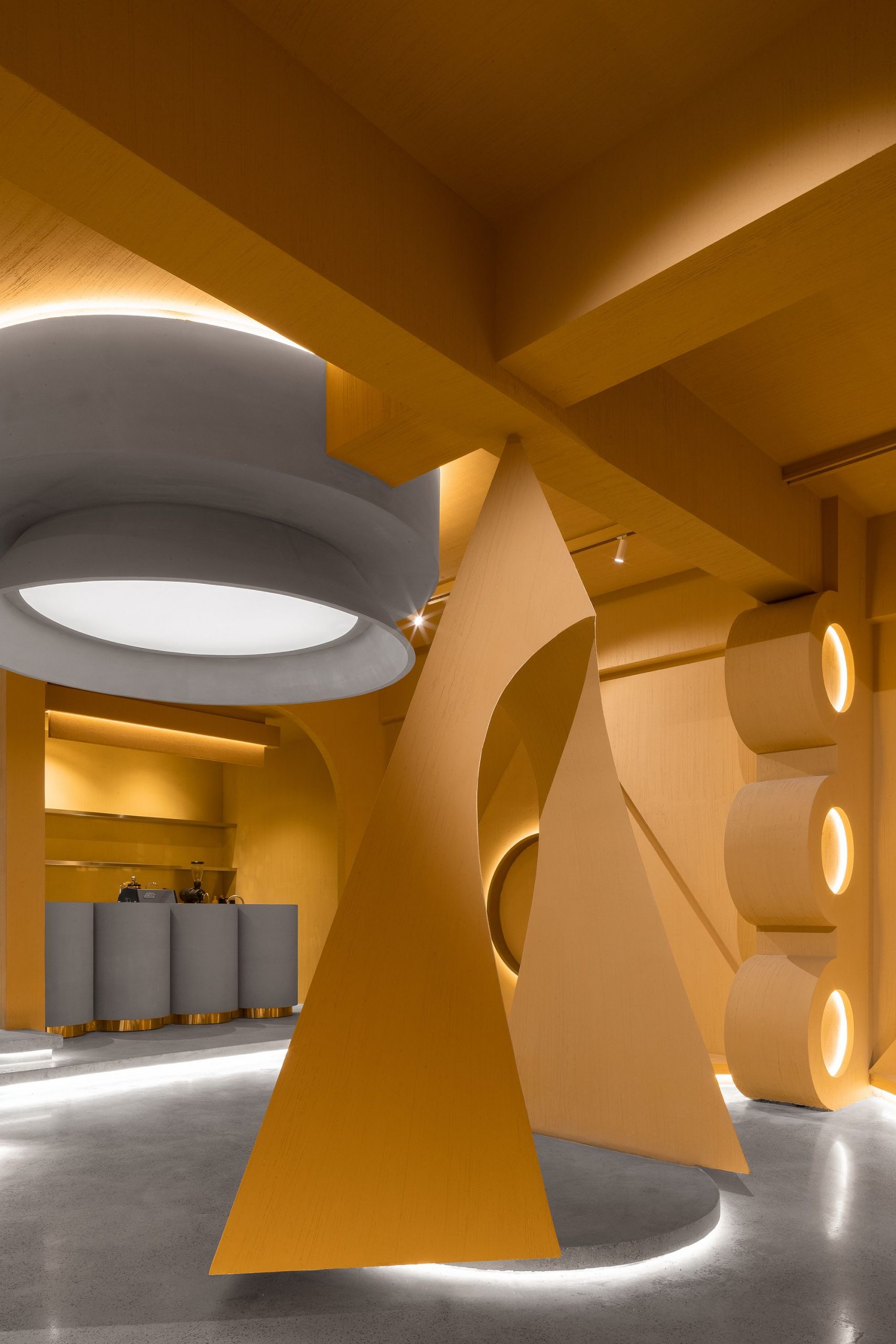
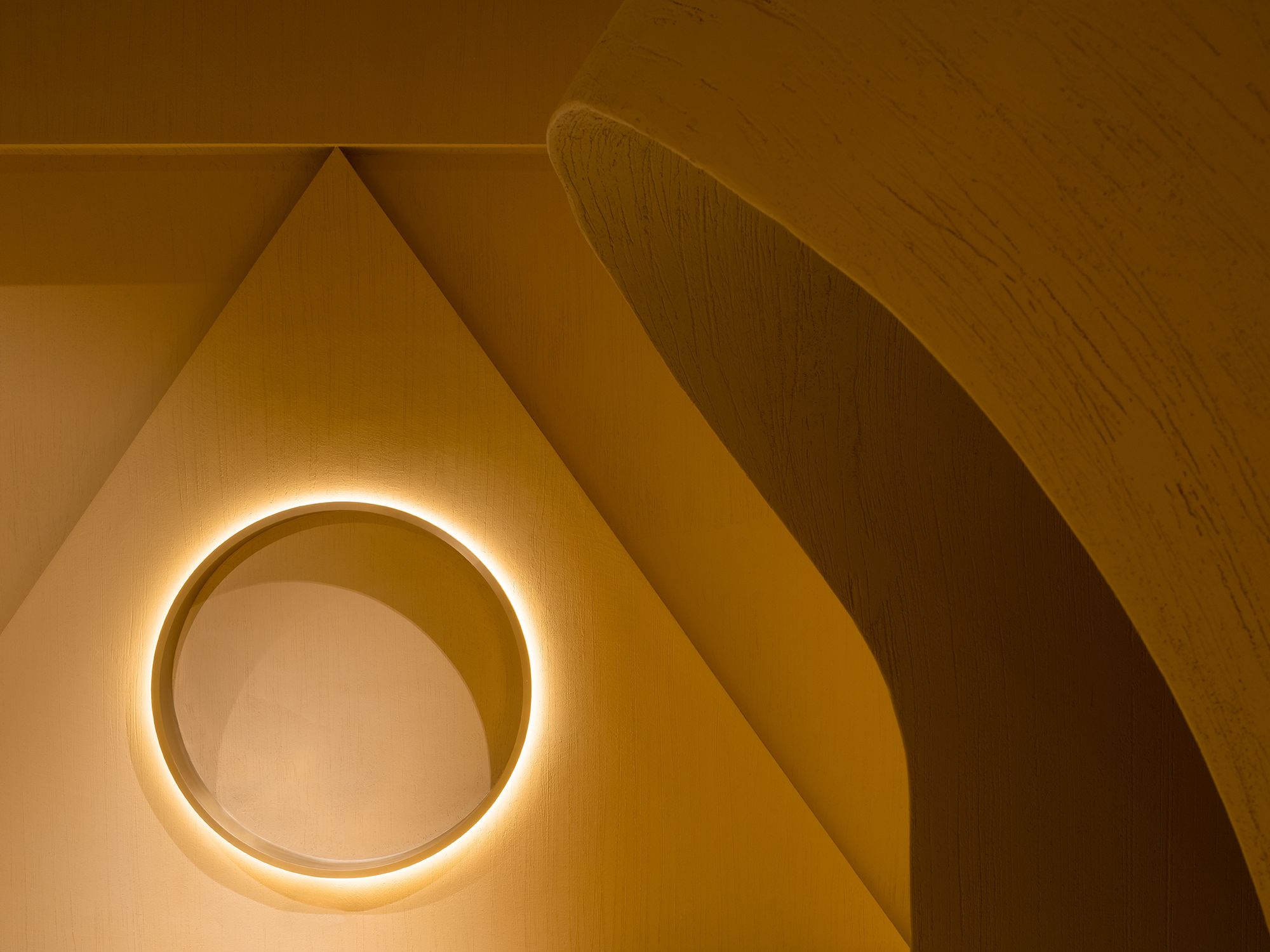
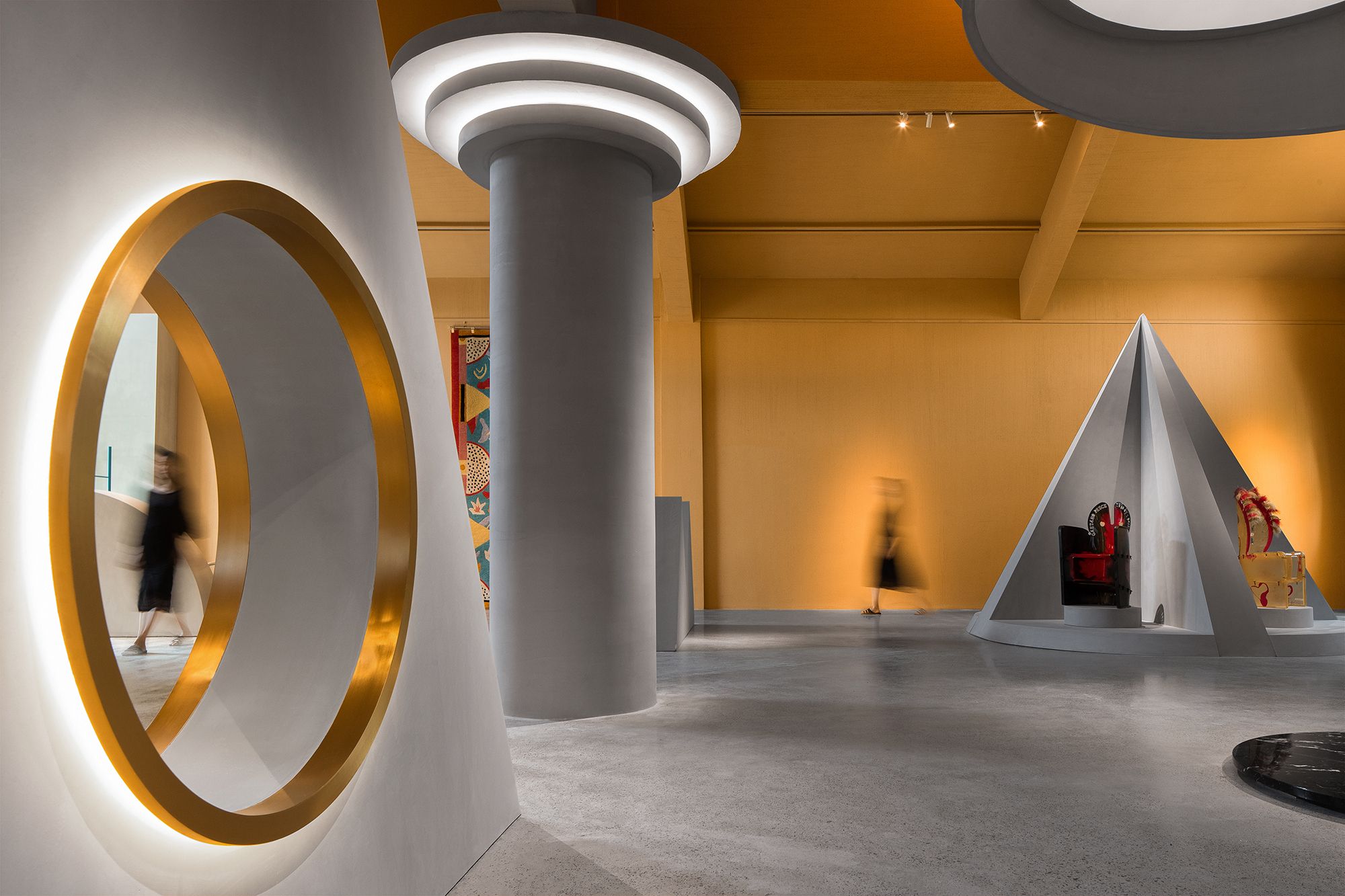
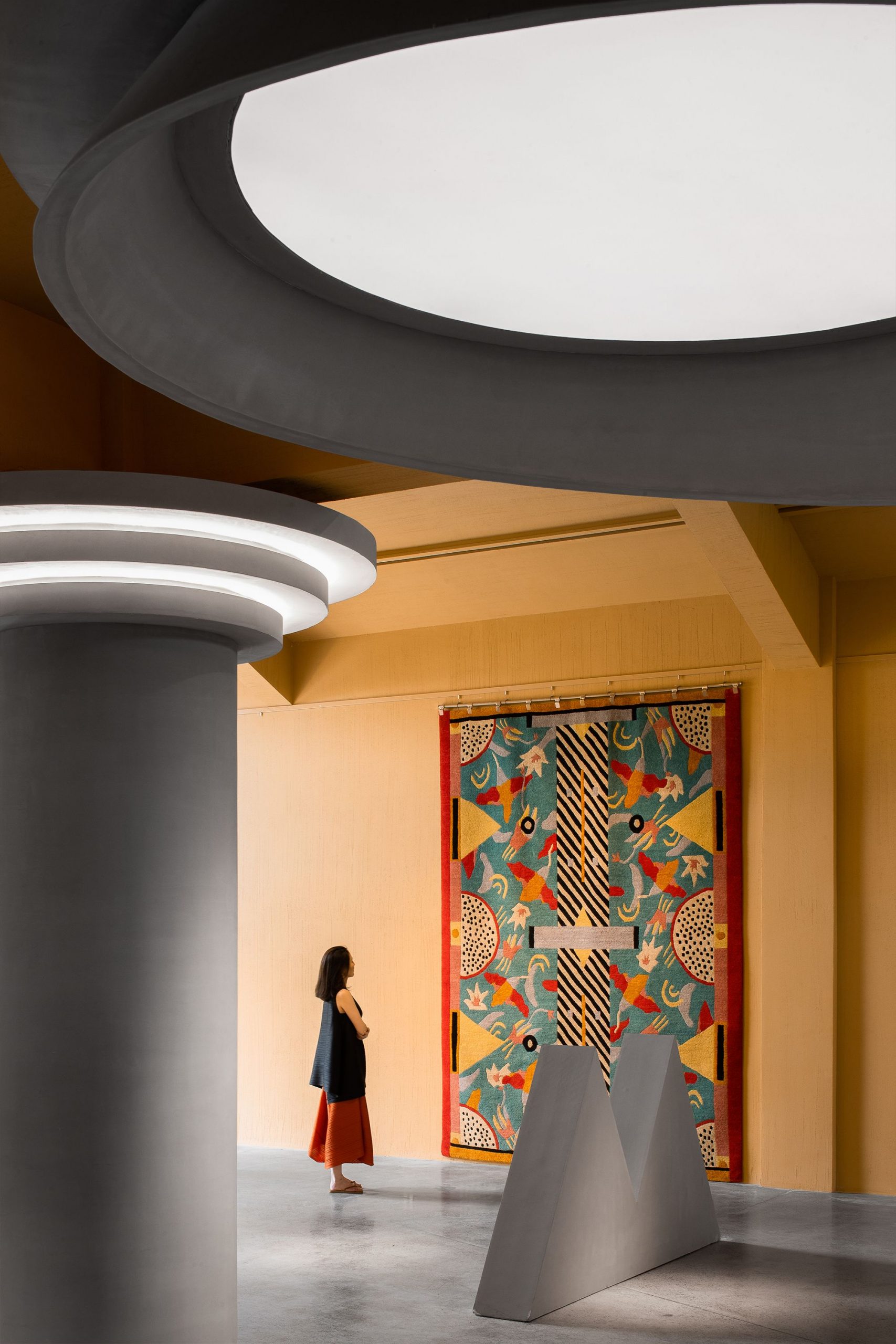
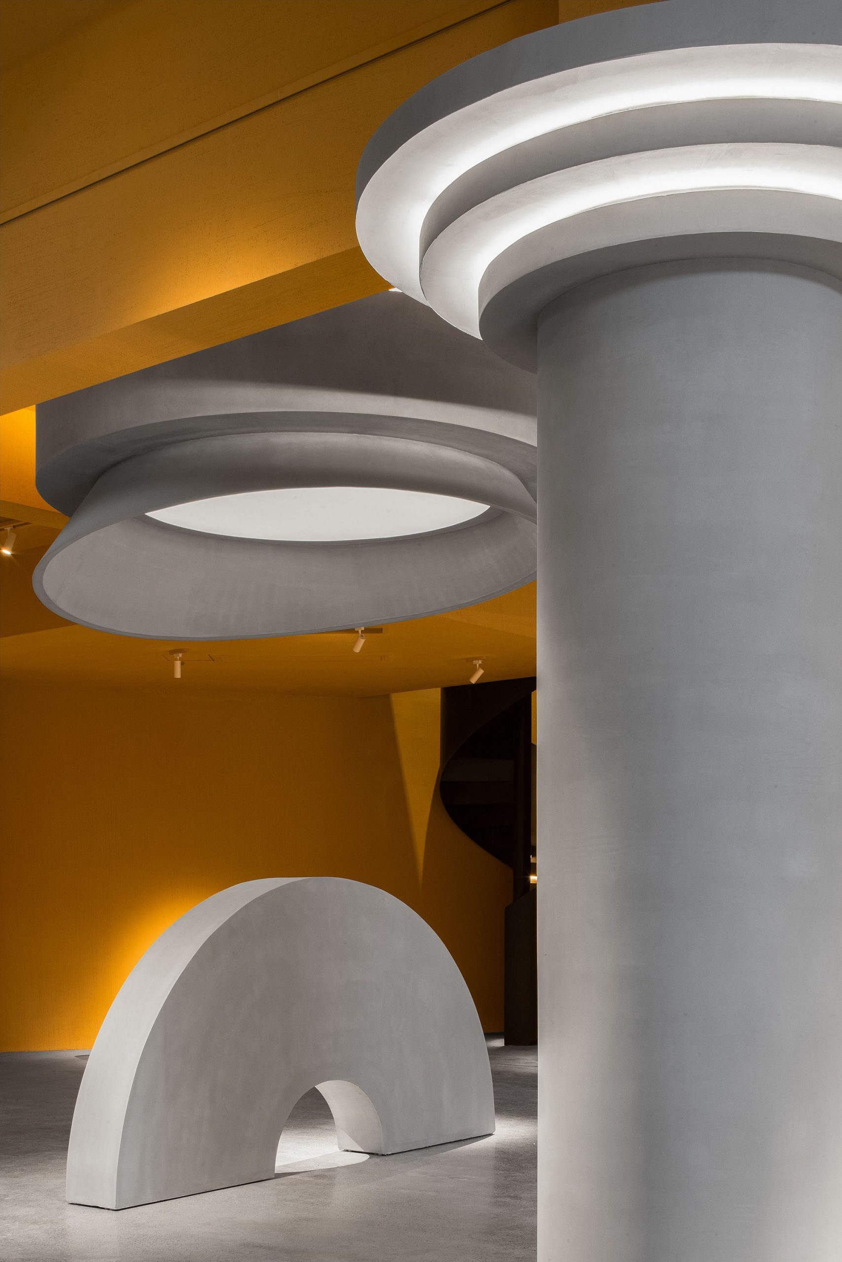
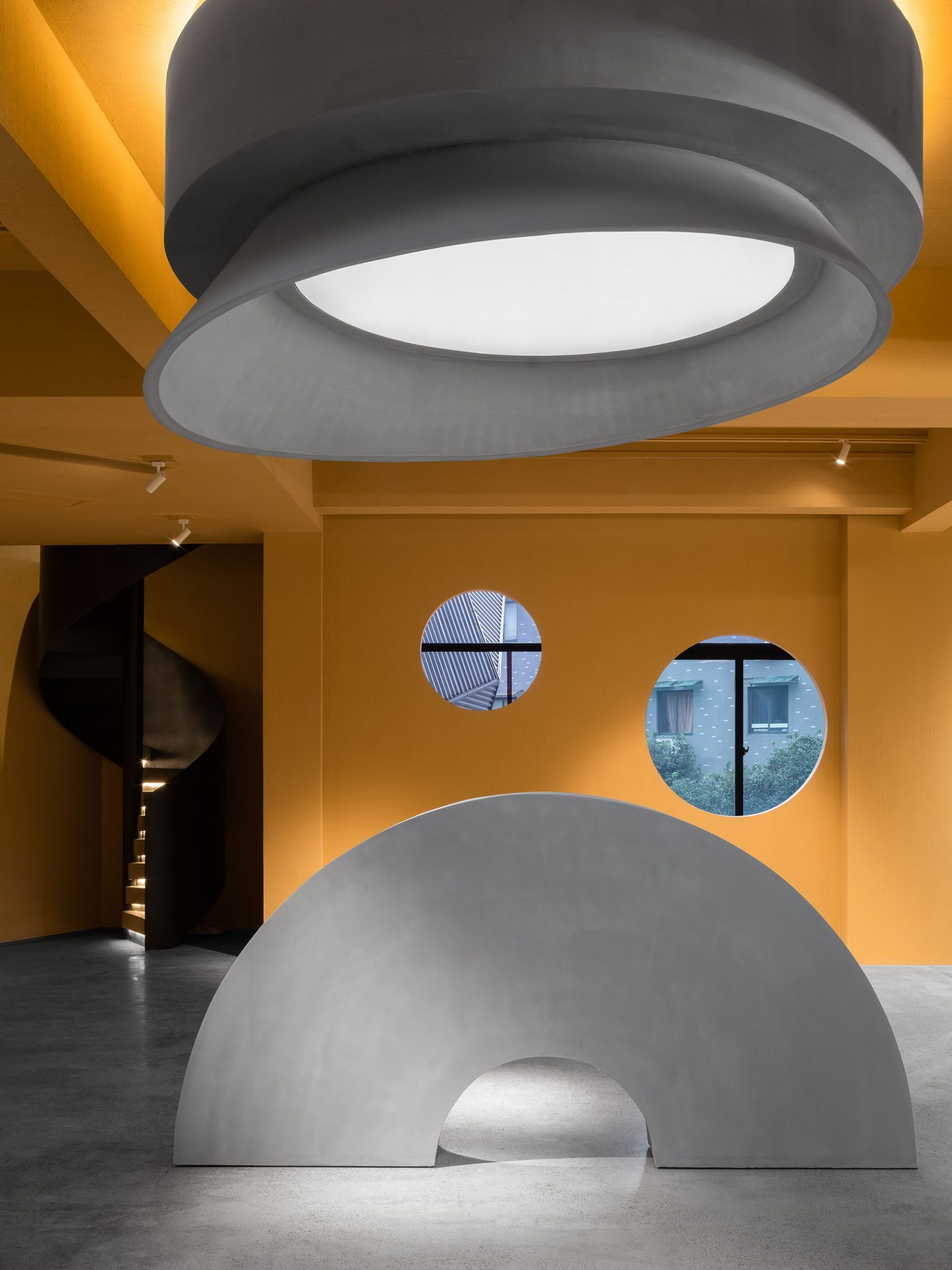
Countless visual points are formed by the combination of structures of different shapes. Every structure is a visual point, and a geometrically-cut view frame. Suspended from the ceiling, circular light boxes cast and diffuse lights, creating a surreal atmosphere of floating.
Photography by © Feng Shao
An array of cylinders form the bar counter, and several independent metal installations compose handrails of the staircase. In this space, ordinary items constitute a stage for display and experience. Lots of interior structures utilize the same materials as the walls, making them seem like objects that naturally “grow” from the space.

Photography by © Feng Shao
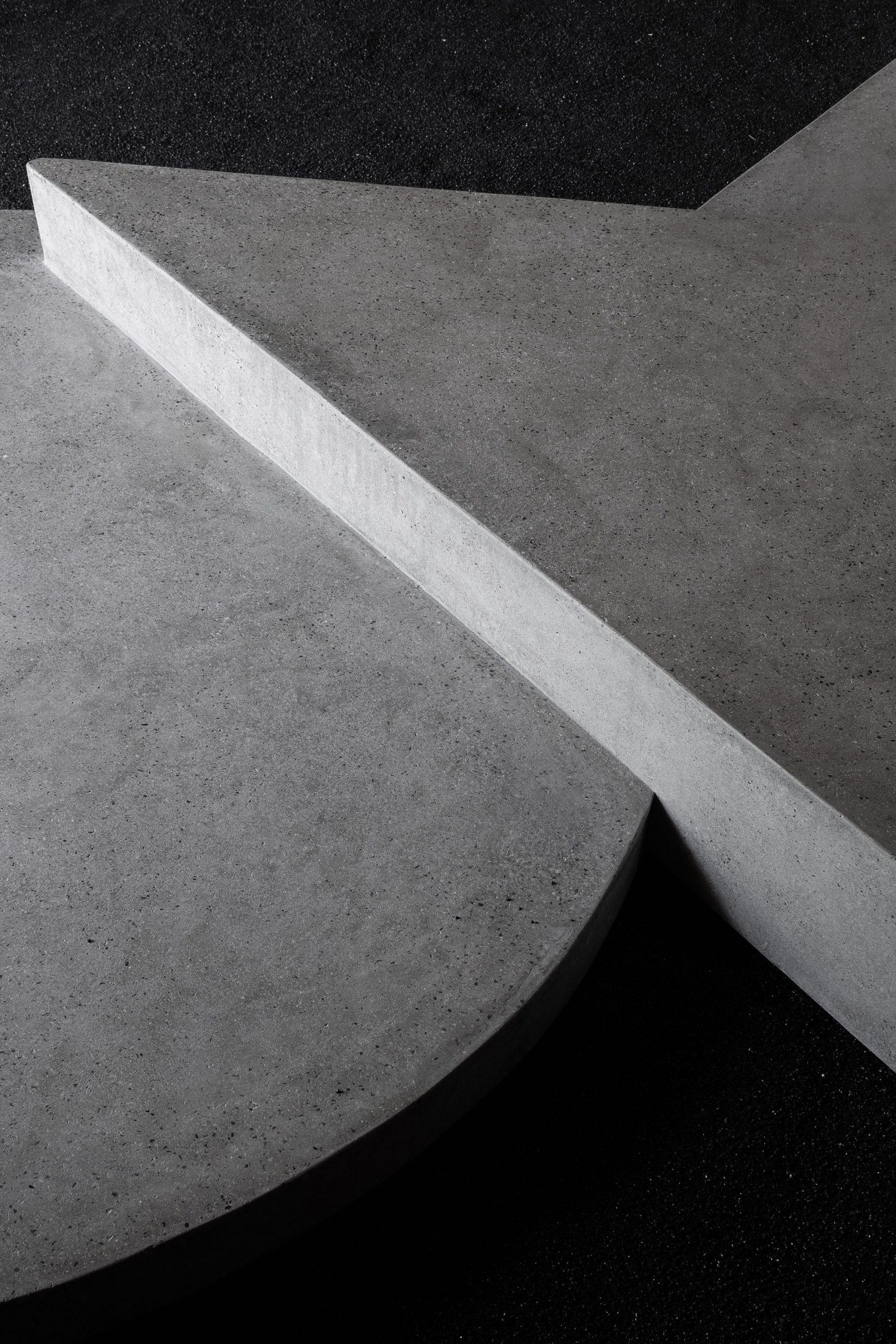
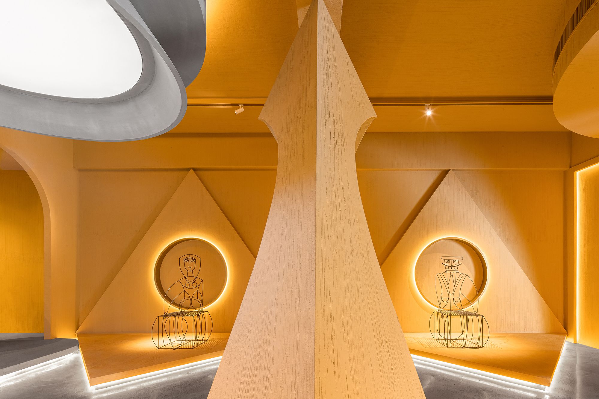
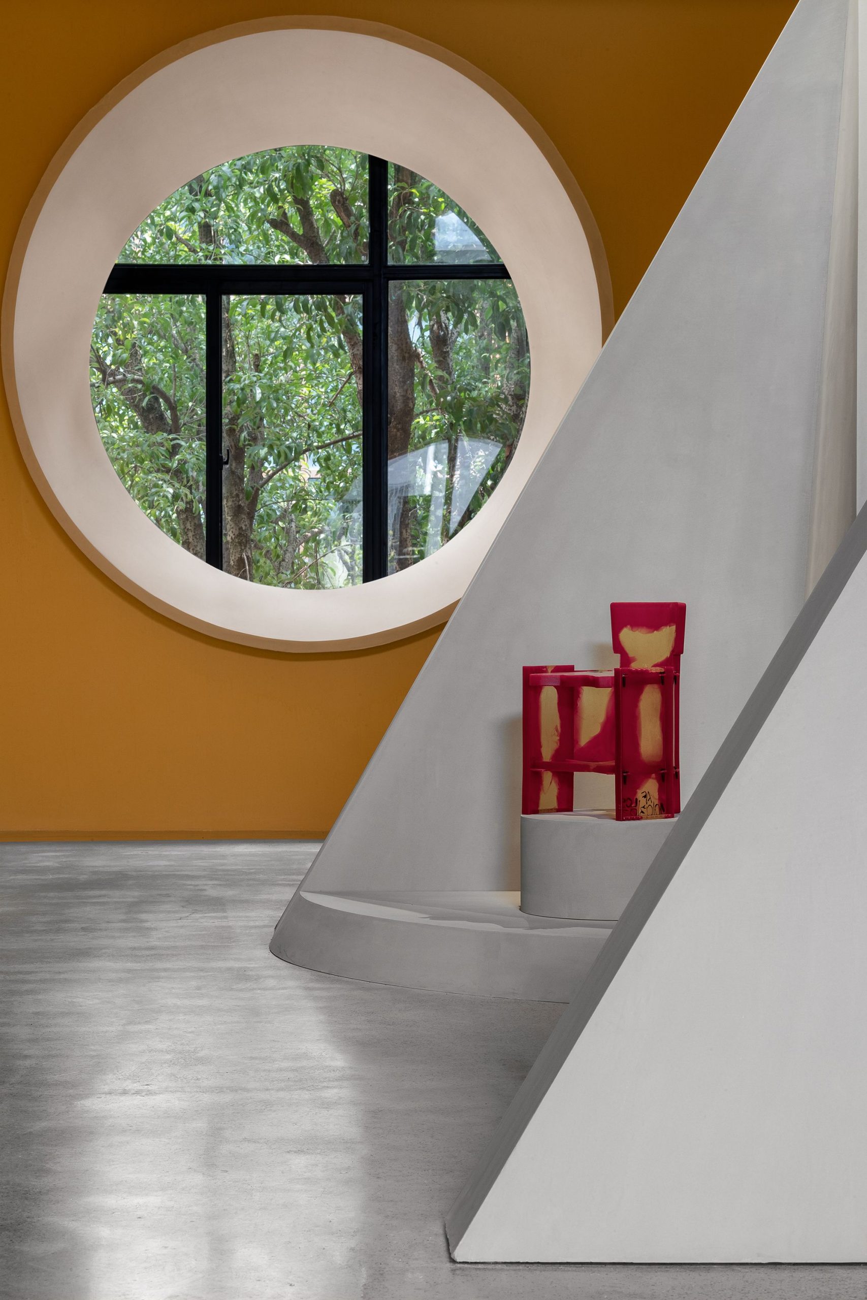
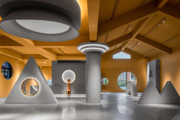
The entire space on 2F is used for exhibition. The interior surfaces are movable geometric screens. The design continues the concept of “view frame”, with a view to bringing changes to the angles of observation. In this space, visitors can have a whole view or partial view of scenes, and can stand on tiptoe or bend down. Simple yet subtle arrangement of spatial structures produces playfulness within the space. Those structures adopt same finishes as the floor, as if they’re growing from the floor.
The design of the display area is based on the concept of framed views. Through cutting and recombining the views, it brings infinite possibilities to visual experiences within the field of view and makes observation more interesting.
Photography by © Feng Shao
Project Info:
Architects: PIG DESIGN
Location: Hangzhou, Zhejiang, China
Project Year: 2020
Photographs: Feng Shao
Manufactures: Memphis
