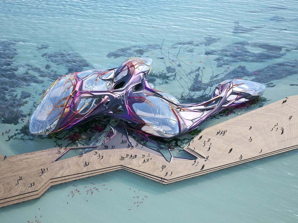
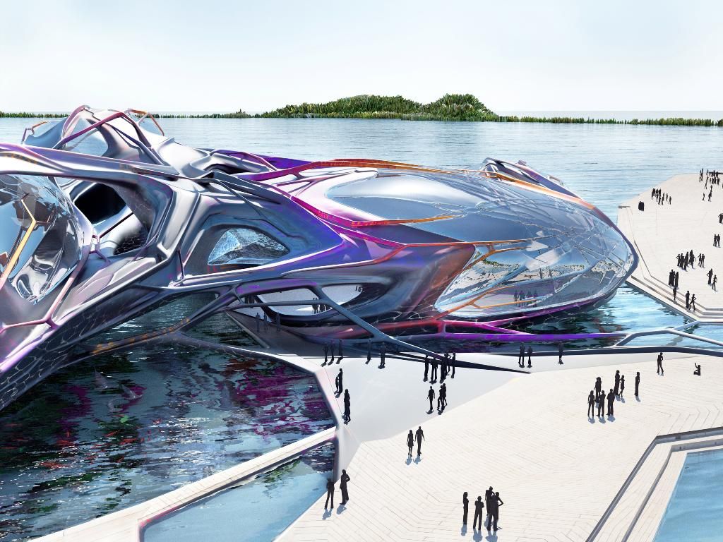
The Yeosu Oceanic Pavilion was intended to be the centerpiece for the Yeosu 2010 Expo, an unusual floating marine pavilion designed by Emergent Architecture in collaboration with KOKKUGIA. In accordance to the expo, the design celebrates the ocean as a living organism and honors the relationship between human culture and ocean ecosystems. The role of the architect for this design was expanded to include the active re-organization of matters and energies around and underneath the building, making the building object and its territory enter into a feedback loop.
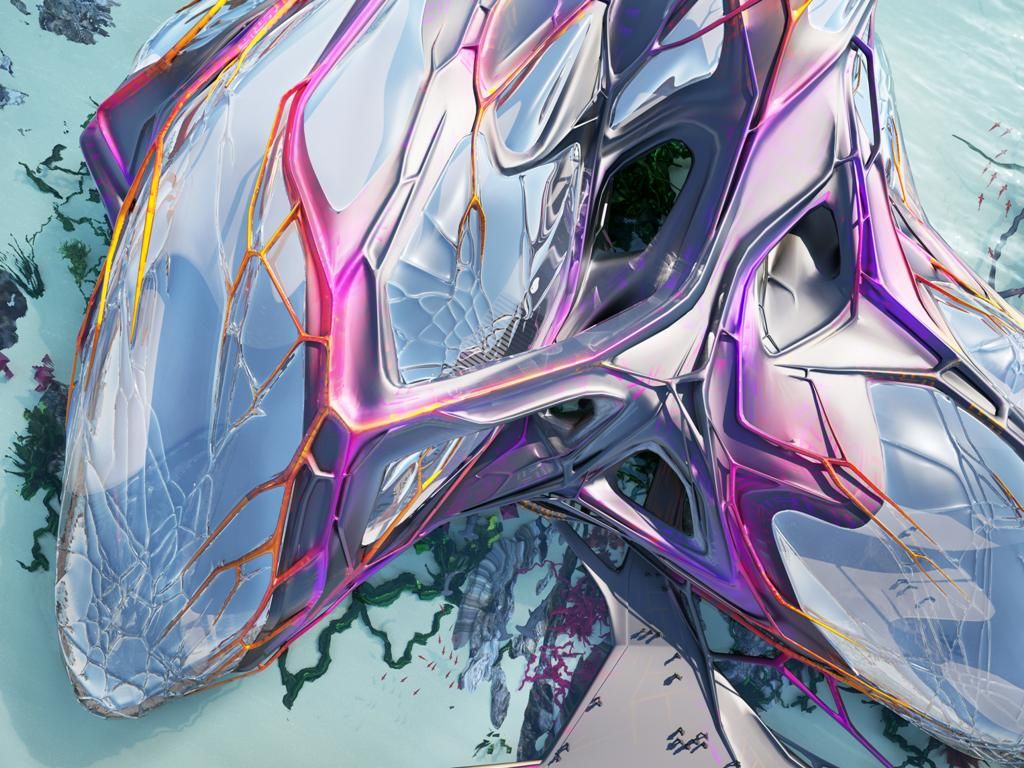
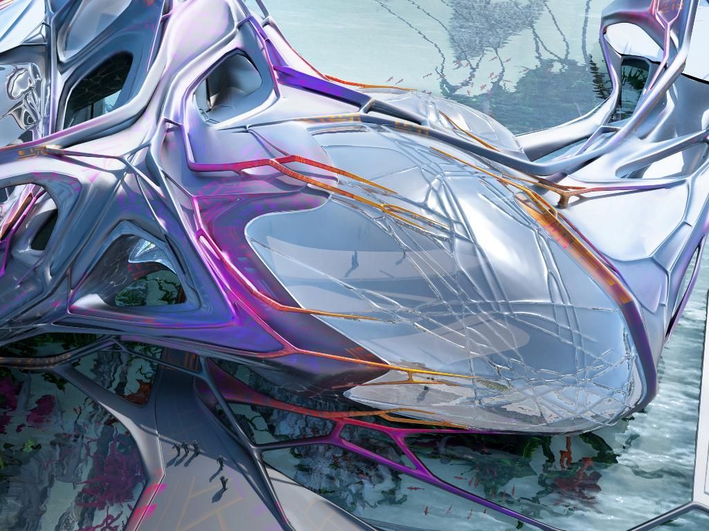
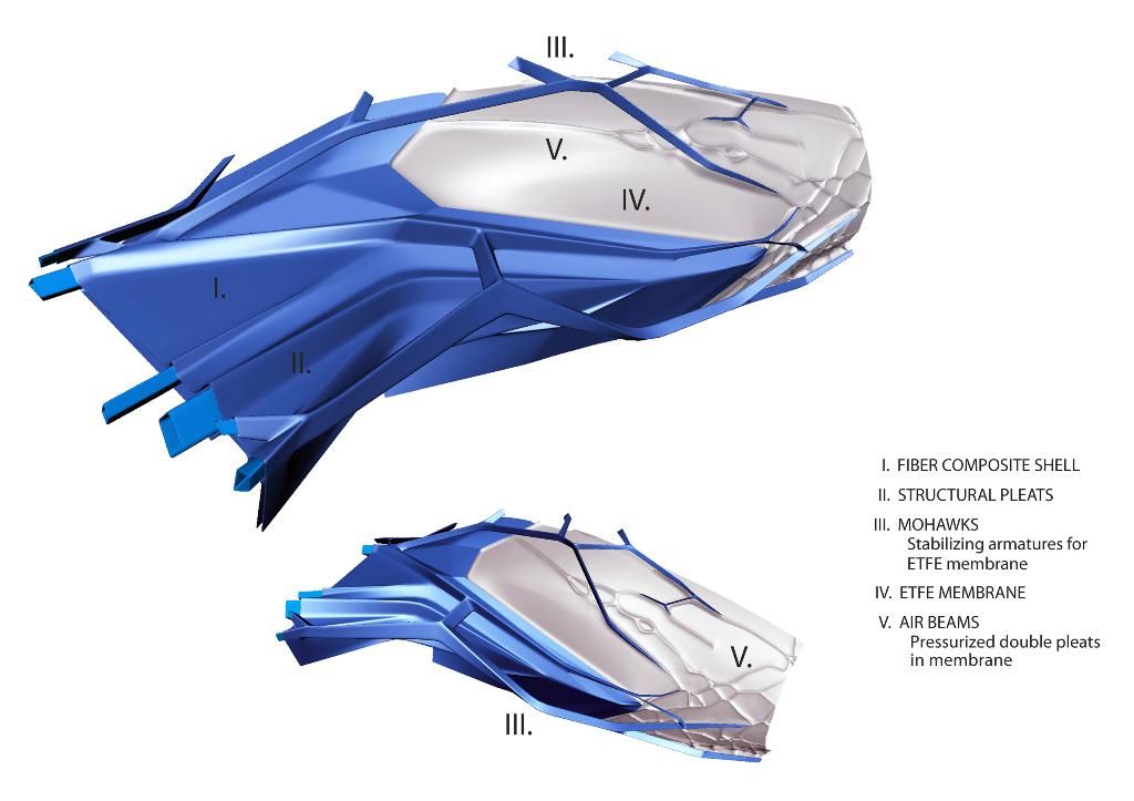
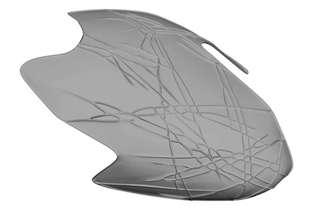
The building is based on an aggregation of soft membrane bubbles merged together with a hard monocoque shell, both being characterized by patterns of surface articulation. Deep pleats and mega-armatures that create structural stiffness are generally associated with the fiber-composite shell, while fine, double-pleated air-beams spread over and stabilize the vaulted ETFE membranes. Structural and ornamental continuity is created through the use of pull-off armatures referred to as Mohawks that transgress the thresholds between shell and membrane.
The design was developed though the exploration of messy computation in the sense that the project is the result of moving in and out of the realms of designing and scripting. The end result represents a loose, open-ended way of working that biases effects over self-justifying process. As much as the project is driven by mathematical hierarchies, material logics, and ornamental sensibilities, it is also driven by color features that help to visually intensify the transformations in structural behavior. The mega-armatures resemble a purple/pink color while the Mohawks tend towards orange/yellow, though the color gradients themselves are glitchy, being neither 100% indexical nor completely smooth.
I find that I have a difficult time connecting the pavilion with its intended purpose of drawing inspiration and focus to the ocean. In my opinion the design comes across a bit alien in nature although that may just be from how it is represented in the renderings. The use of color adds a nice layer to the project that shows how it can be creatively used as an active, substantial source of architecture without becoming a gimmick. It is not clear as to whether this design was actually produced or not, but I would be curious as to how this computer based design would be constructed to allow for it to keep its fluid dynamic nature and bizarre form.
