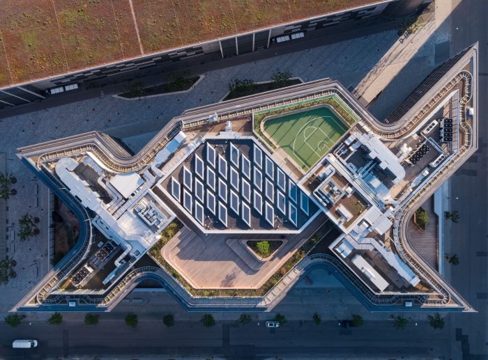
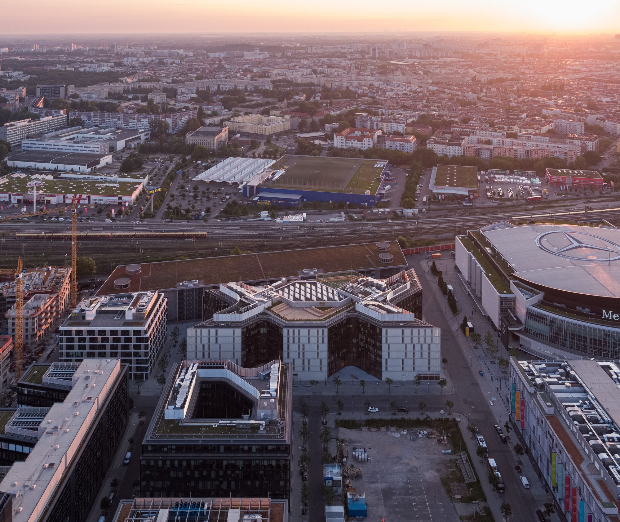
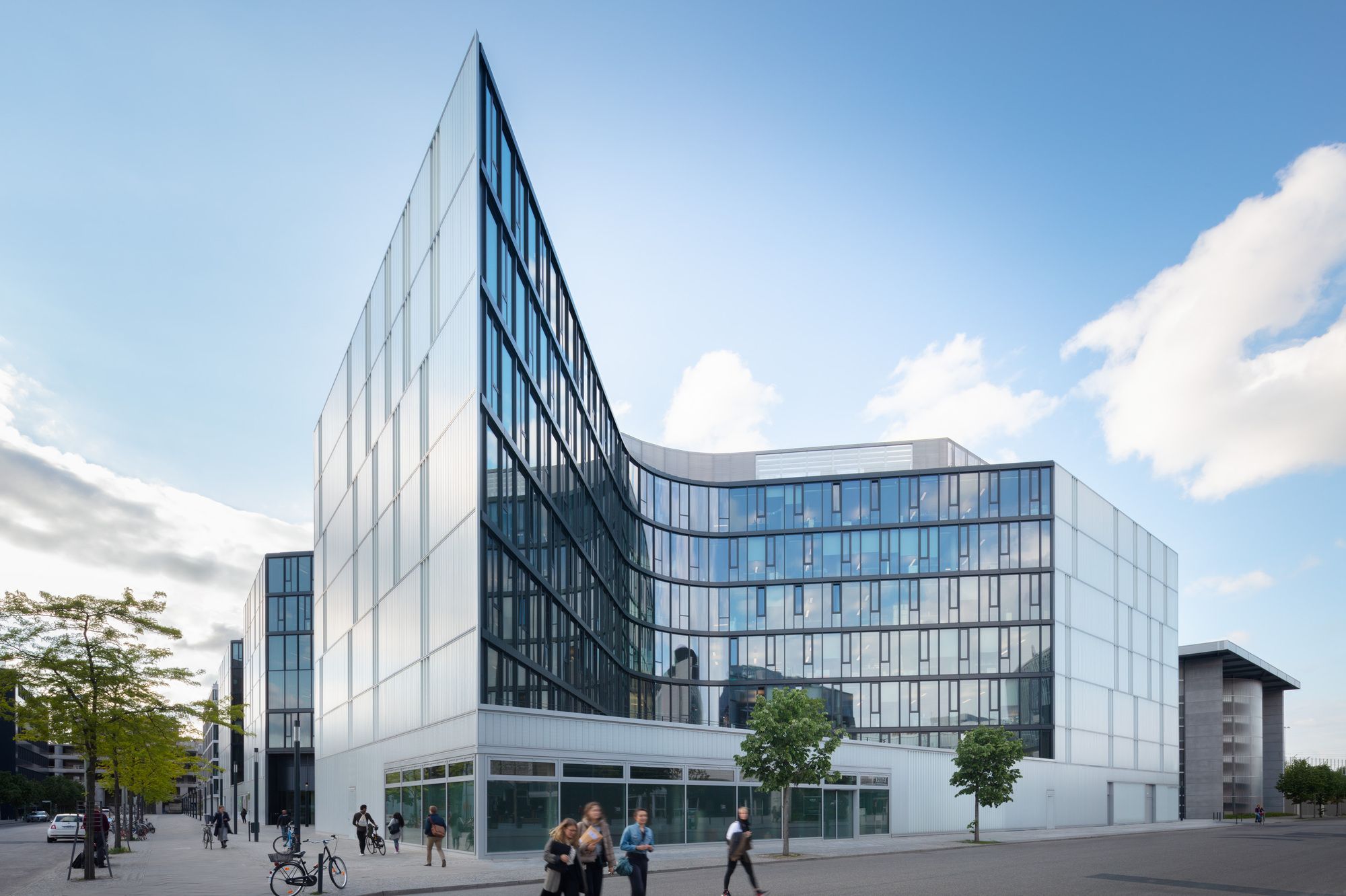
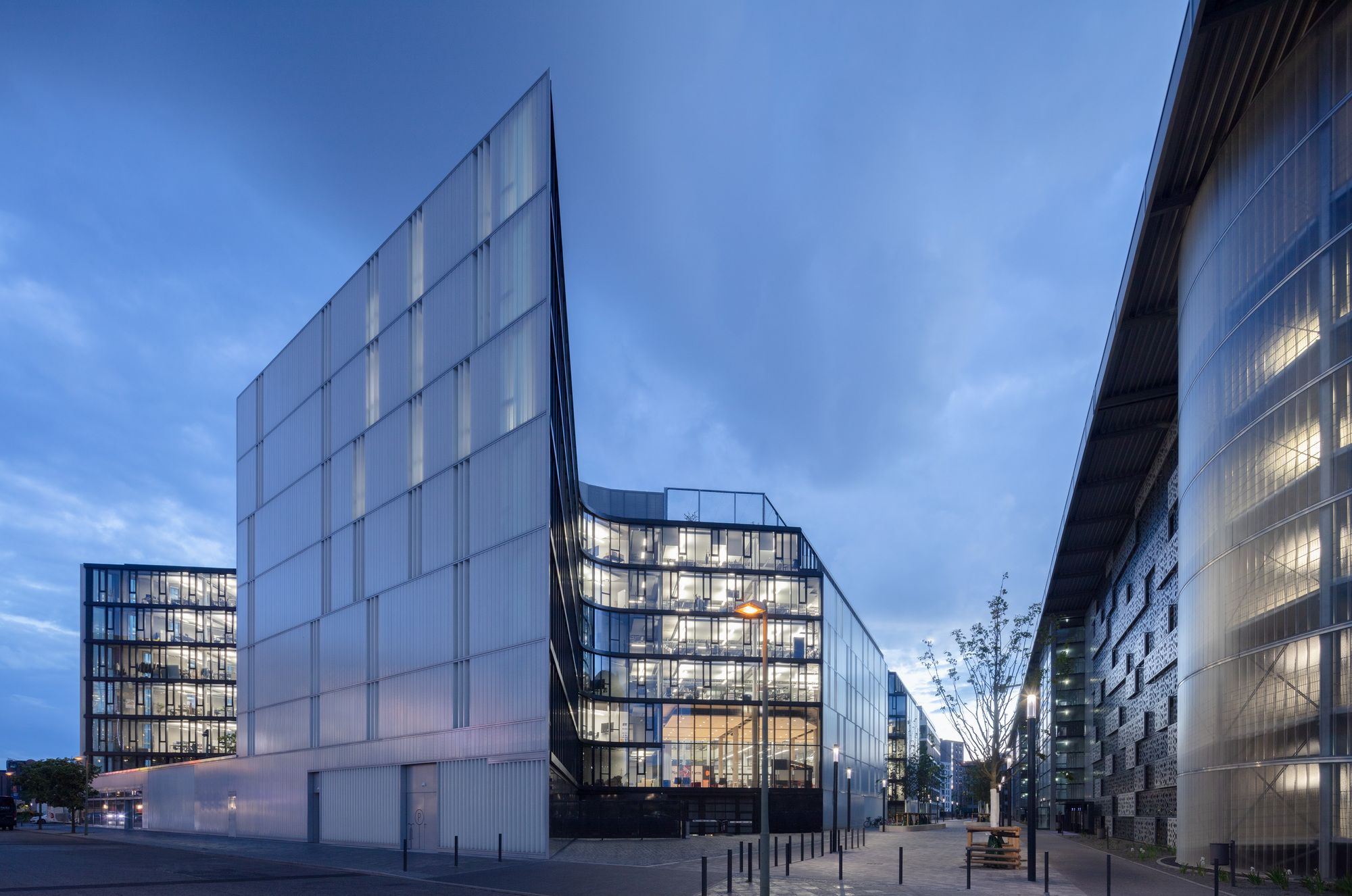
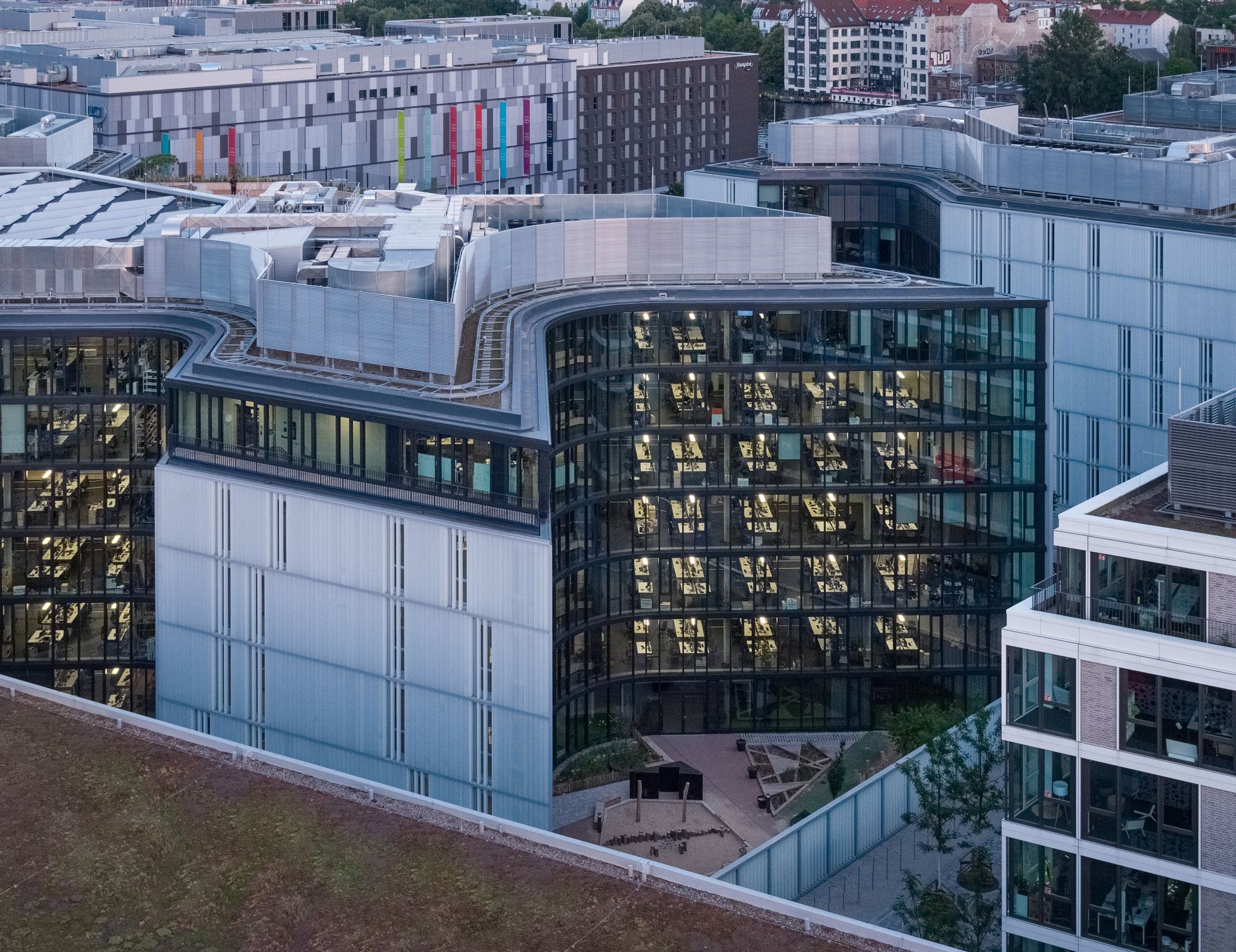
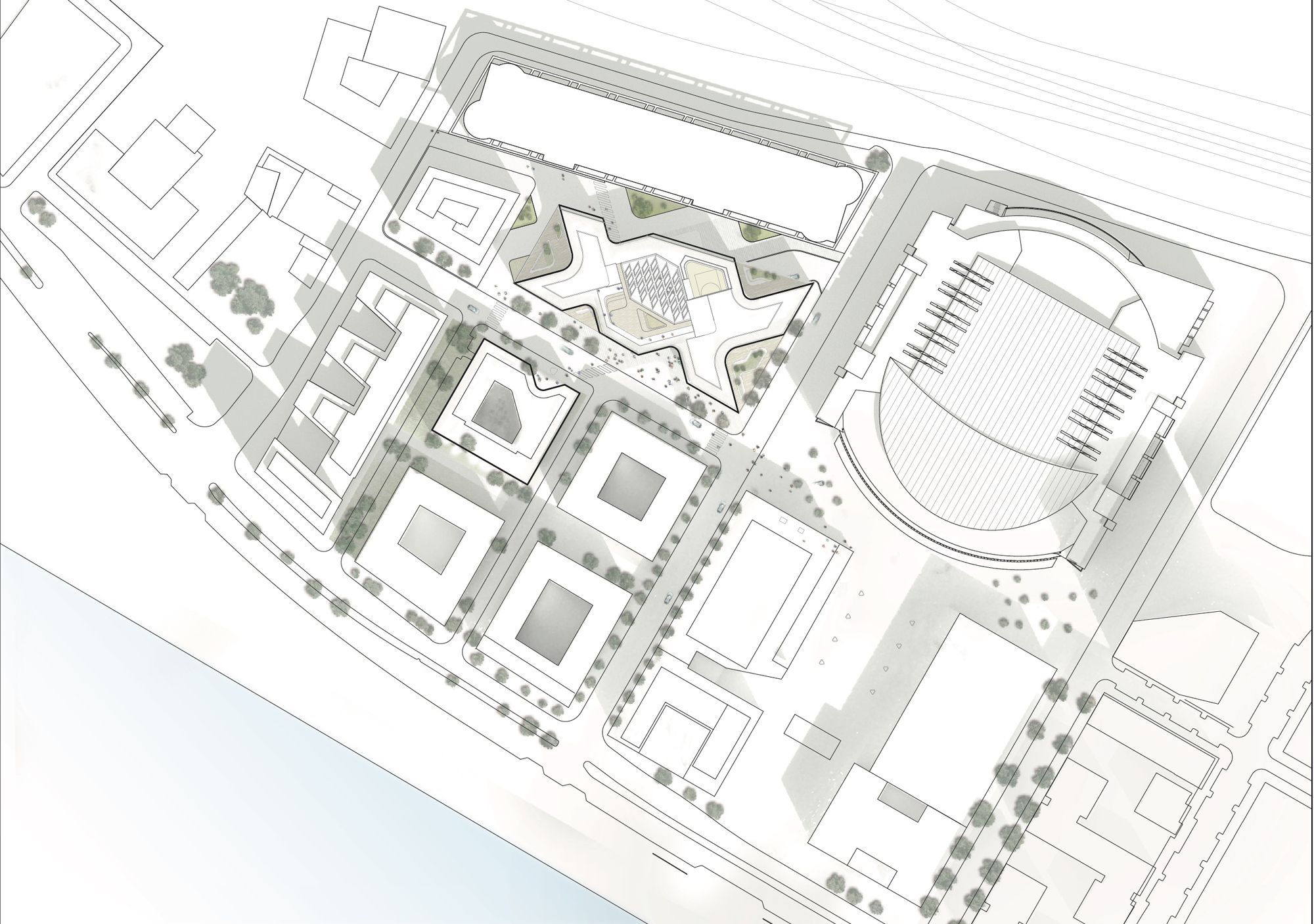
The new Zalando Headquarters consists of an ensemble of two buildings that form the heart of the company’s new campus in Berlin- Friedrichshain, neighboring the “Mercedes-Benz-Arena” and the East Side Gallery. The design of the seven-story building, accommodating a total of 43,000 m² of office space. Rather than forming a closed block, it assumes an open and transparent presence in the city, creating a striking expression and matching the company’s identity. The wrap-around glass façade which embraces the carved architectural volume like brackets is a fundamental part of the design. It is this reinterpretation of the traditional Berlin block, created by rotating the building layout diagonally to the urban-development plan, that enabled a design solution to be found with which the building unfolds towards the city.
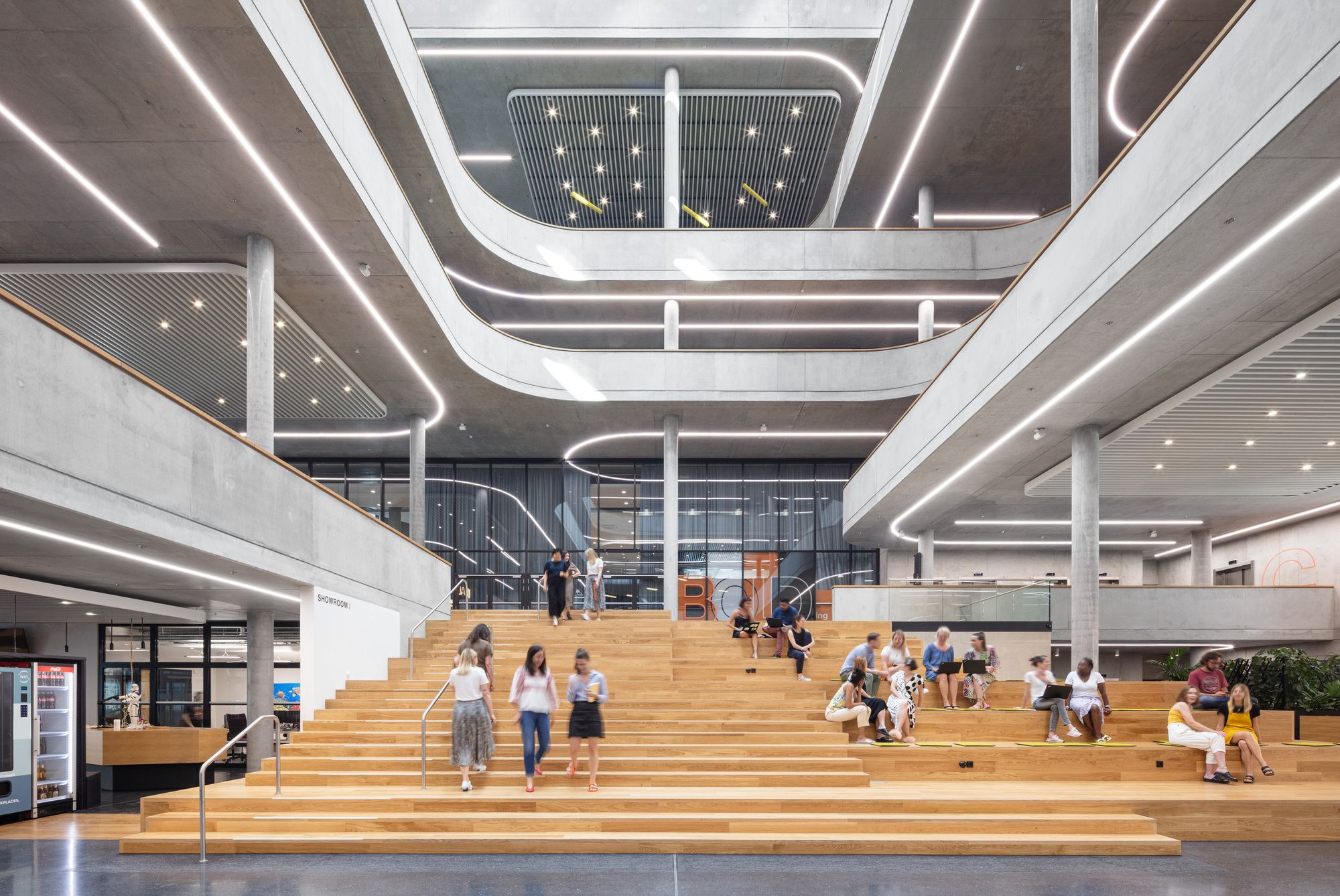
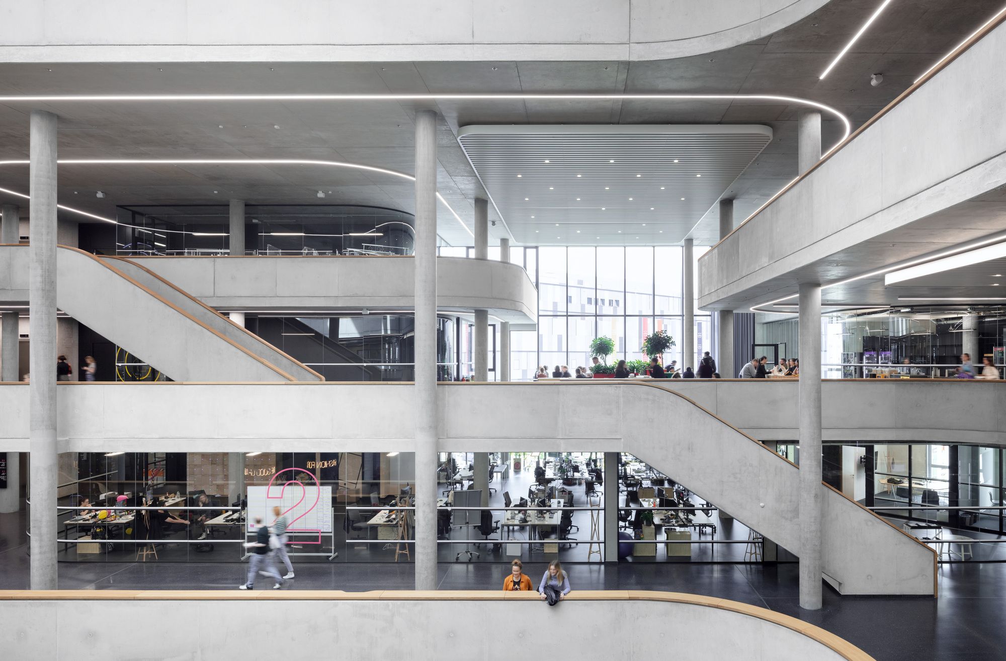
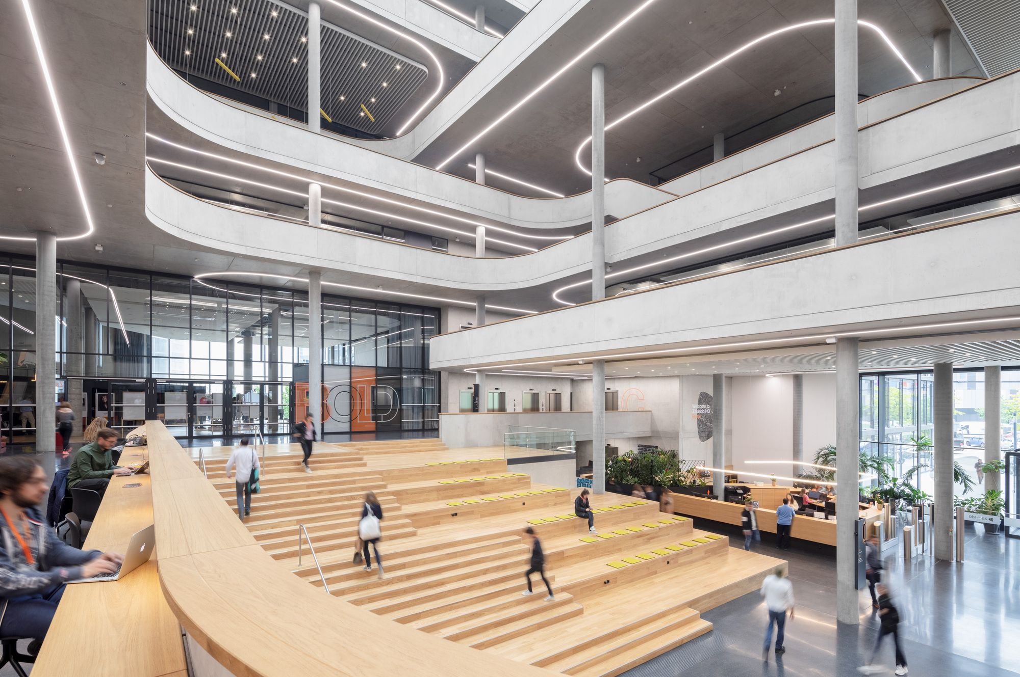
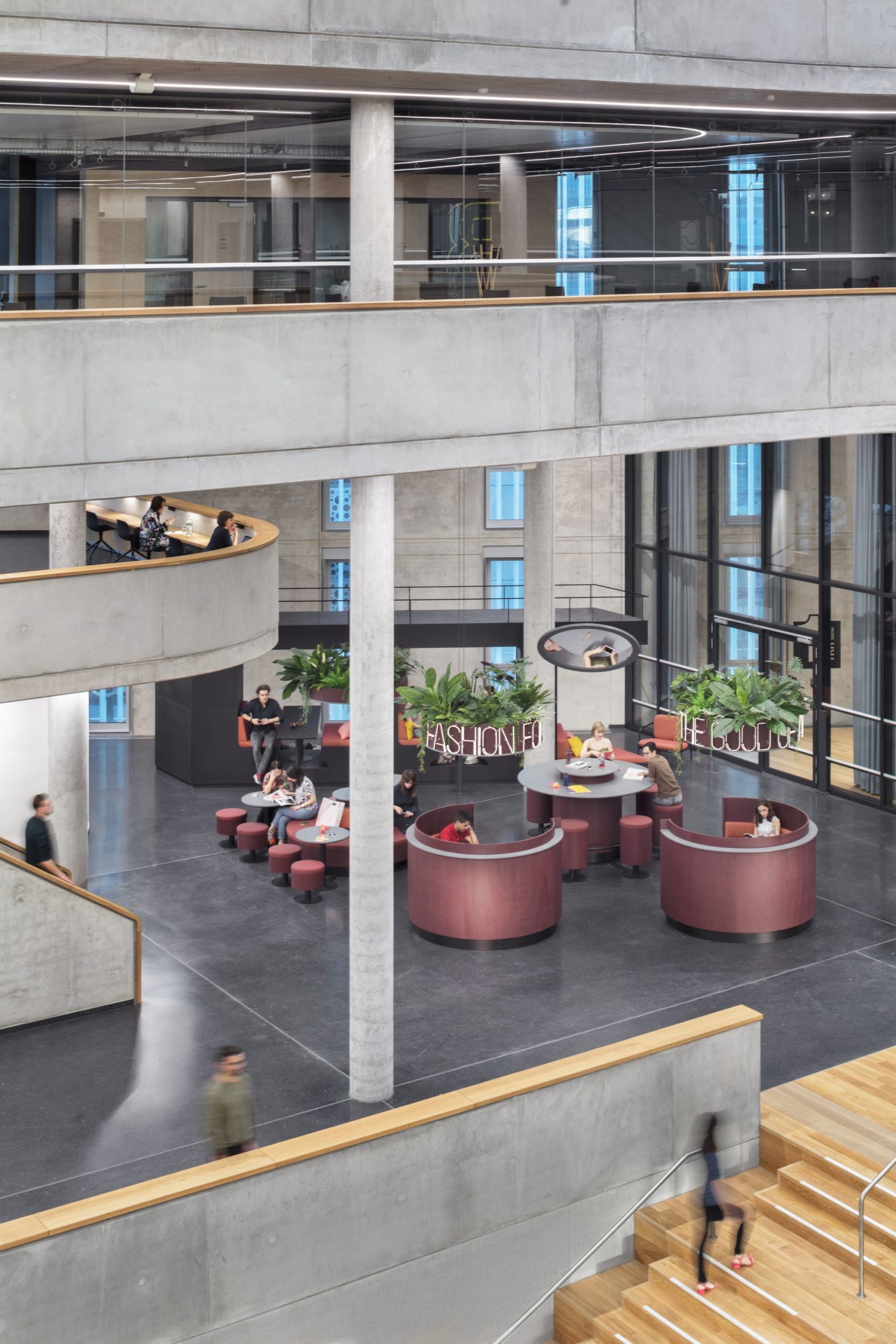
In this way, the interior courtyards shift to the perimeter of the site, enabling a fluid transition between the offices and the public spaces, in turn affording larger views both into and out of the building by virtue of the transparent and translucent facades. The core of the main building is the central atrium, which shifts its openings along its vertical ascension, thus drawing daylight to the public areas below. The central lobby is flanked by a grand staircase with integrated seating and lounge areas which can also be used for events. The atrium in combination with the adjacent auditorium, create a spatial continuum that extends over numerous floors, thus enhancing the users’ flexibility. Conference and training zones, next to a café and the staff restaurant, additionally dock onto the overall complex.
The choice of the analogy between the digital network society and a bustling market place is no coincidence. From kitchens and sports areas to childcare facilities, the building’s occupants can find everything that makes living and working both easy and pleasant. The atrium functions as a hub, with its branches winding through all seven floors like a spiral creating a variety of visual relationships around the clearly defined center. The Catwalk beginning in the lobby connects the stacked living rooms through all floors illustrating the core idea of the interior design: The interior design not only promotes horizontal exchange but also relies on vital interaction through vertical connections supporting the team spirit.
The unique spatial configurations of the interior, achieved by the interlocking double high spaces around the atrium establish an unexpected dynamic atmosphere. Irregularly dispersed, this generates either multi-story open spaces or more intimate zones for seclusion that meet the set criteria, namely the intermixing of the work zones so as to amplify an agile, communicative atmosphere. Sustainable office worlds provide flexible communication areas that promote creativity and interchange. The spatial organization of the offices on the upper floors is deliberately organized with both concentration and interaction zones in order to accommodate the shifting needs of the staff and to meet the differentiated uses.
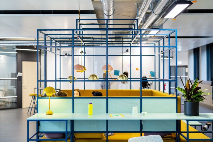
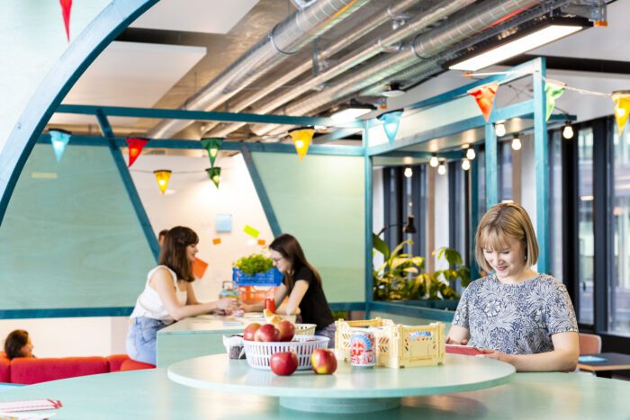
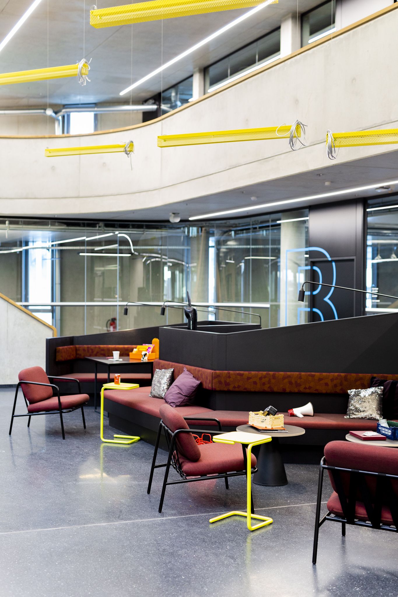
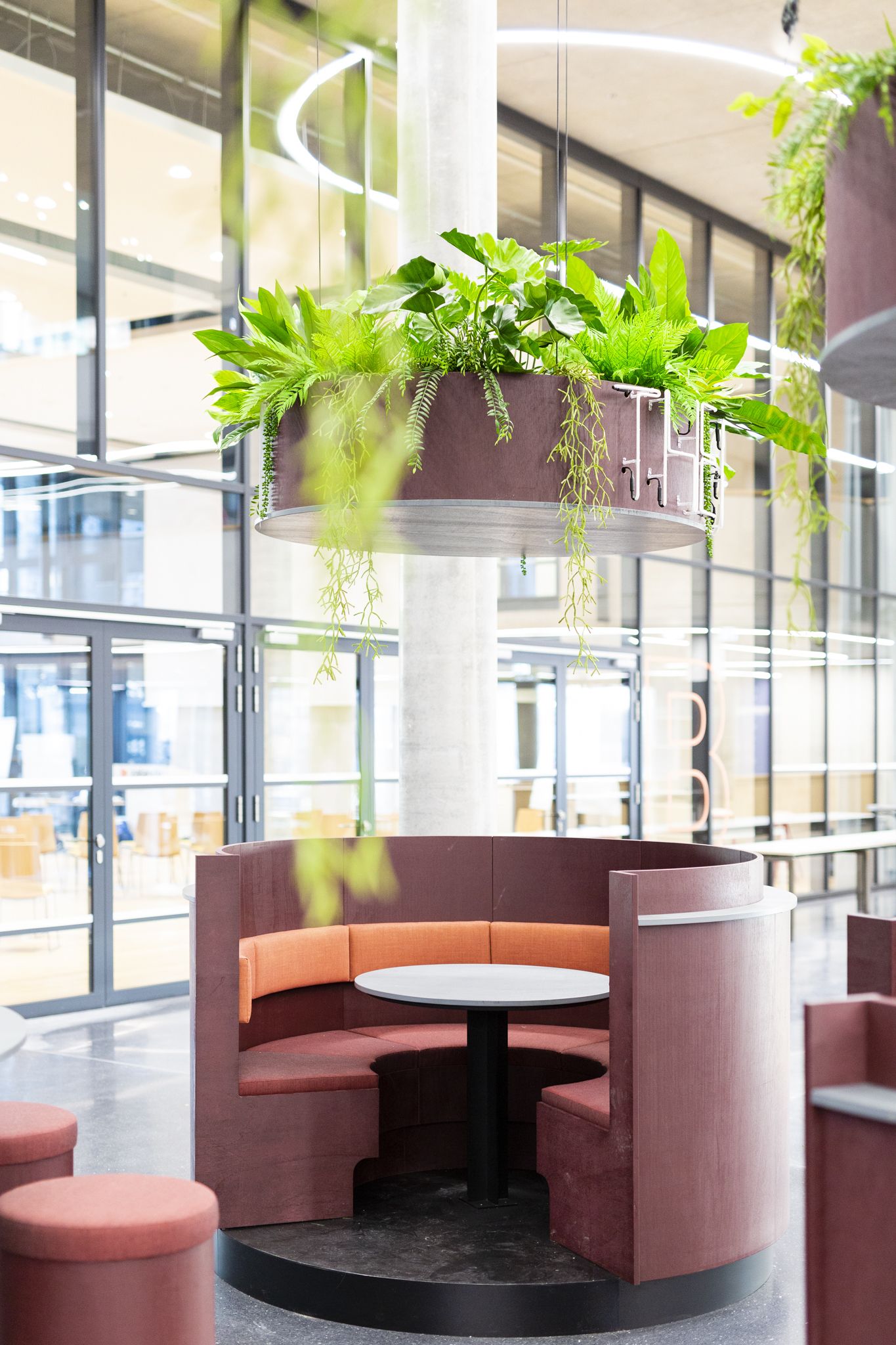
The considerable depth of the building is broken up through the skillful layering of the program, whereby the various functions – from the lobby to the roof terrace – group themselves around the atrium in the form of a double-helix. In the so-called “living rooms”, social interaction is encouraged through varying spaces for exchange such as co-working seating landscapes, kitchenettes with wooden tables and bar stools, a balustrade with space for laptops and a view out over the whole campus. This exchange and the connectivity between these communal areas on the individual floors is additionally magnified through the open stairway. Kinzo’s future-oriented design focuses on the people – after all, the most innovative ideas come from within the community.
The communal areas are centralized in order to encourage chance encounters among employees and interactions between different departments. Communication is actively lived. In addition, boulevard-like traffic areas inviting to mingle were created. The urban catwalks are regularly flanked by retreats and meeting points. There are also meeting room boxes on each floor for spontaneous encounters as well as planned collaborations. The motifs are reminiscent of the Berlin subway connecting all of its districts, and the boxes are both anchors and linking elements of the Zalando neighborhood landscape. The routing, as well as the acoustic and lighting design, create an atmosphere that is intuitively accessible, from loud to quiet, from public to private.
Project Info:
Architects: HENN , Kinzo
Location: Berlin , Germany
Area: 59000.0 m2
Project Year: 2019
Project Name: Zalando Headquarters
Photography: HGEsch Photography, Werner Huthmacher, Sebastian Dörken
photography by © HGEsch Photography
photography by © HGEsch Photography
photography by © HGEsch Photography
photography by © HGEsch Photography
photography by © HGEsch Photography
photography by © Sebastian Dörken
photography by © HGEsch Photography
photography by © Sebastian Dörken
photography by © HGEsch Photography
photography by © Sebastian Dörken
photography by © HGEsch Photography
photography by © Sebastian Dörken
photography by © HGEsch Photography
photography by © Werner Huthmacher
Site Plan


