Zhejiang Printing Group Headquarters
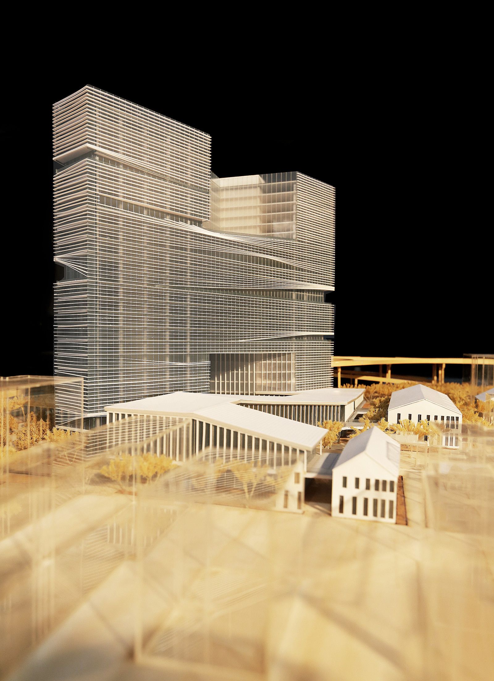
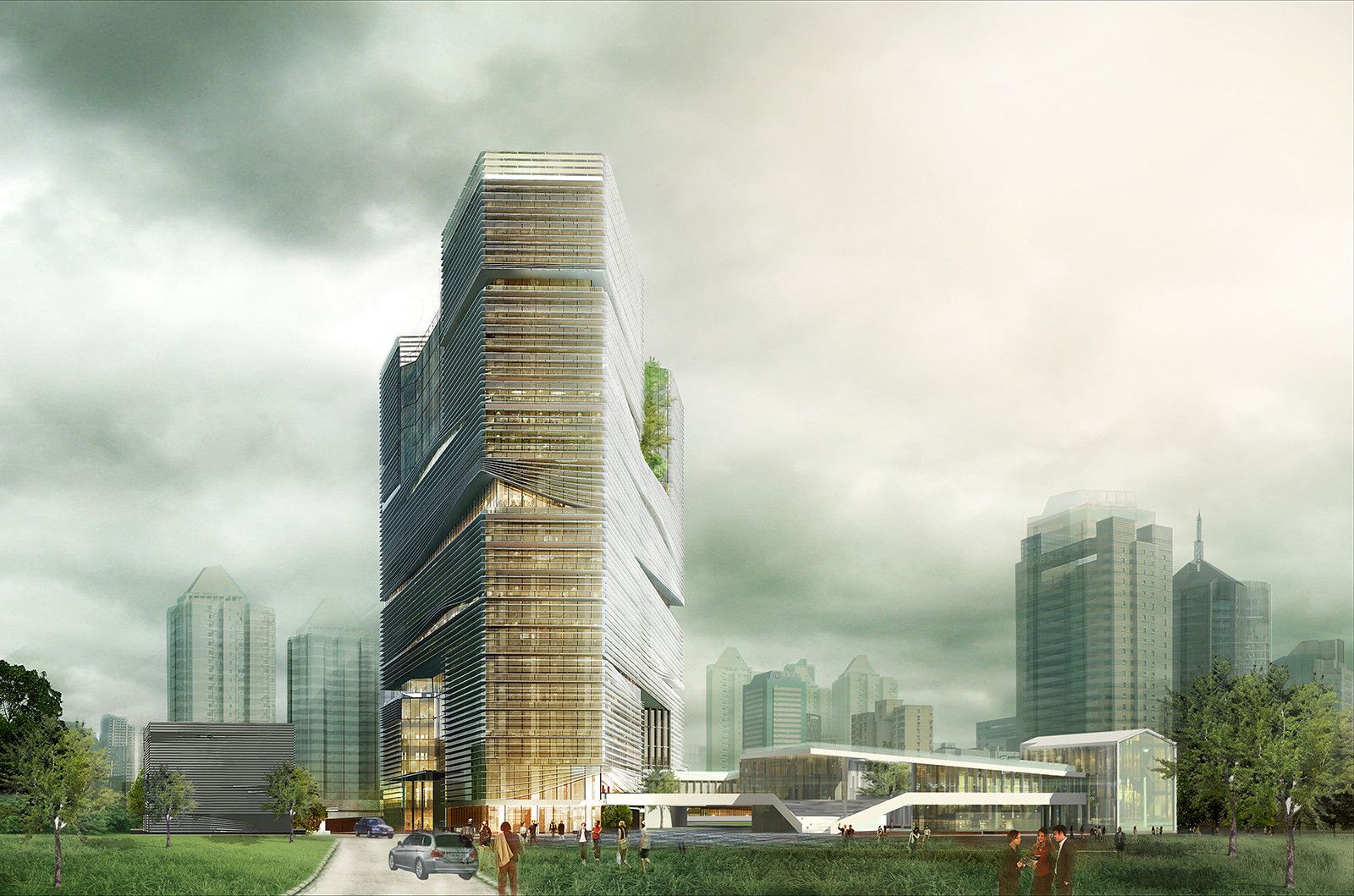
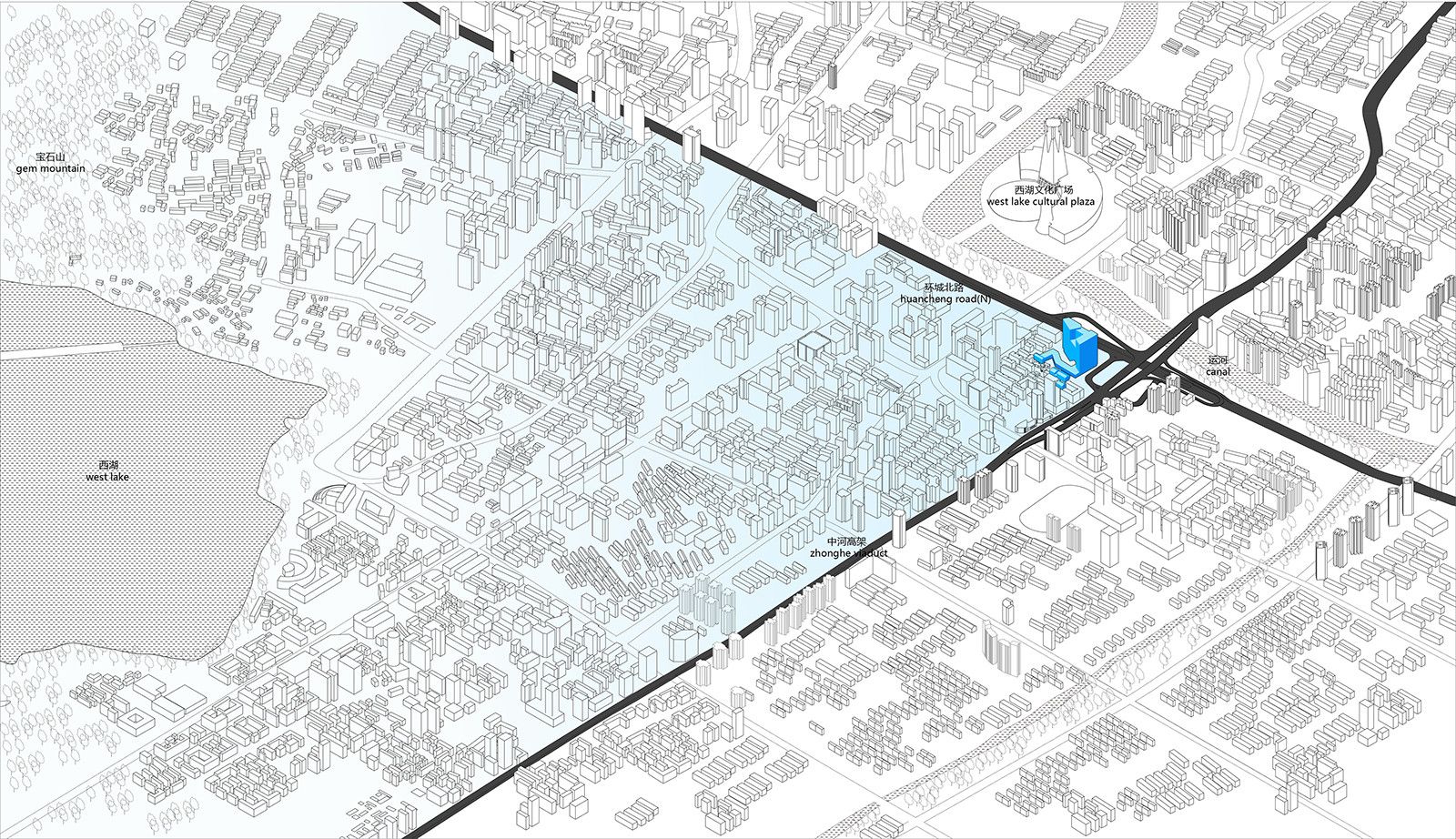
The Hangzhou-based LYCS Architecture office has designed the Headquarters for the Zhejiang Printing Group in the Chinese city of Hangzhou, after winning a competition. A proposal heavily influenced and shaped around the surrounding context and landscape of the area. It is also unofficially called “The Corner Hangzhou” due to it being enclosed by urban intersections and other physical and natural elements. The building is also placed in the northeast corner of the city centre keeping in existence a diagonal axis through its site.
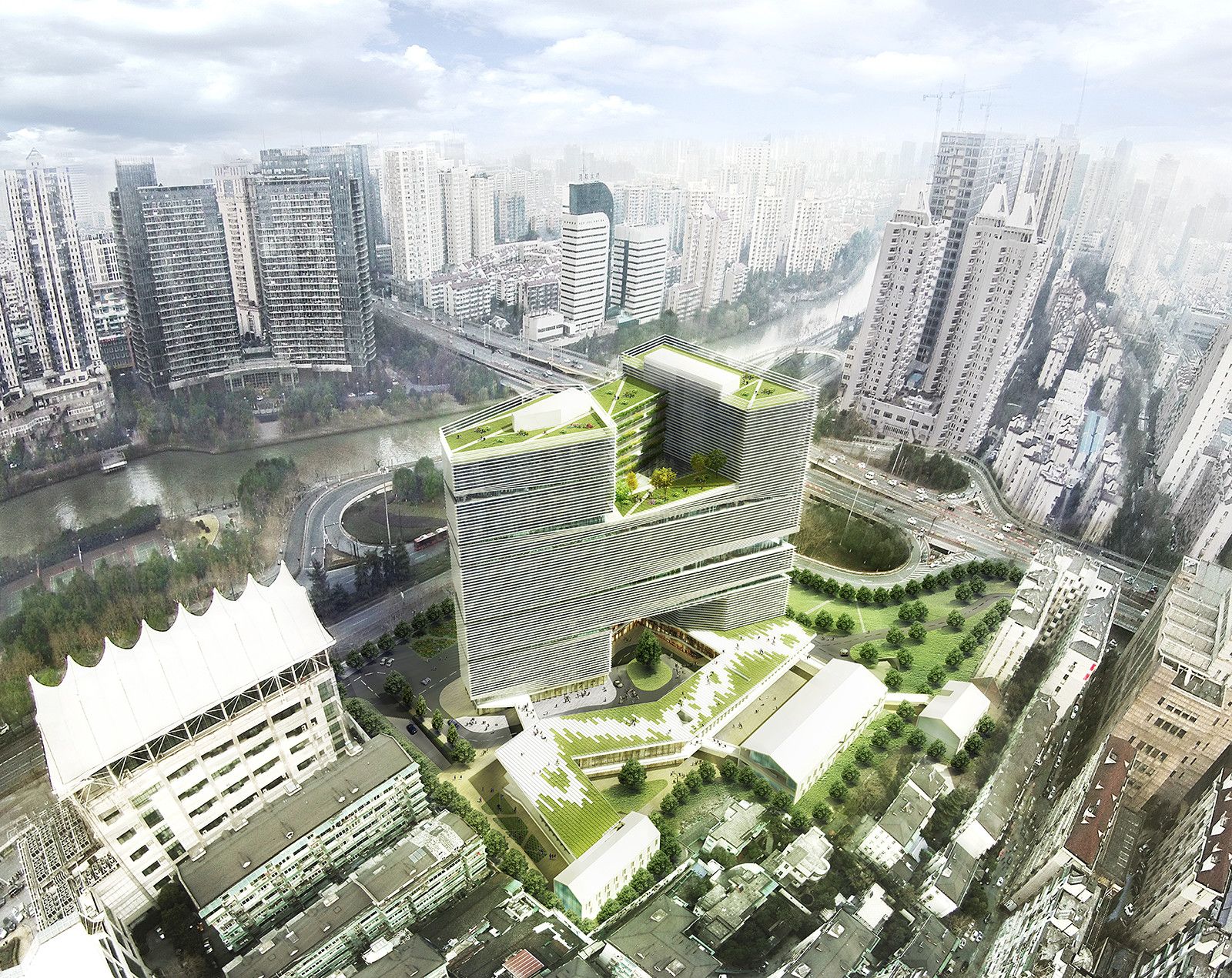
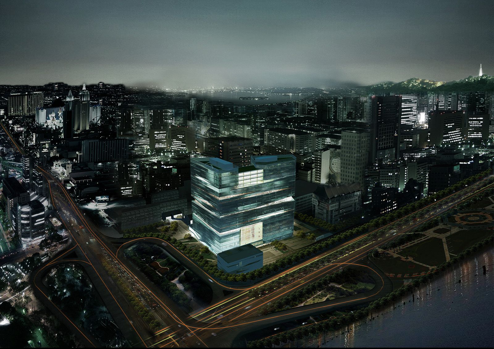
The client, Zhejiang Printing Group, required a large space for their headquarters, something which when combined with the limited space offered by the site, proves to be a physical challenge. An elevated highway, a cultural centre, a residential area and a canal, act as further complications for the design of the project. On the other hand, they are seen as opportunities to turn the site into a primary access point for the city of Hangzhou, while connecting people to the natural environment physically and visually. The 120,711 squared-meters development is expected to begin construction in late 2015.
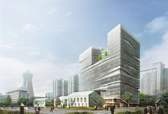
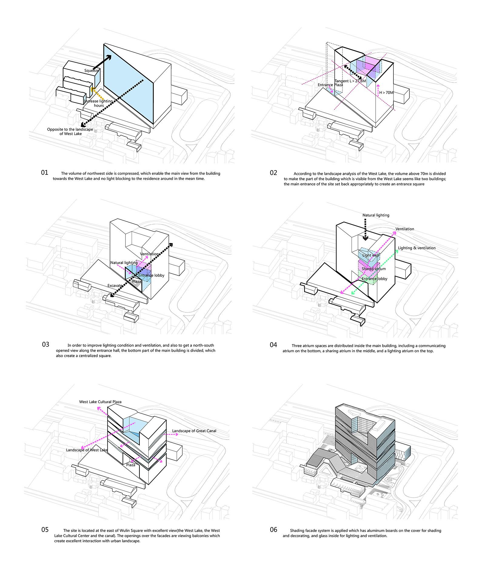
The surroundings are shaping the buildings, and this can be seen by the fact that each one of its edges is formed in response to their environment. The south side of it is designed to open up and embrace the nearby lake, cultural centre and canal by providing people with stunning views through a series of balconies and terraces.
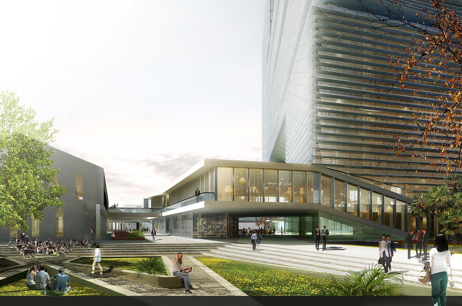
To the north and east sides, two high blocks are facing the elevated highway where heavy traffic exists on a daily basis. The building is then compressed at the point where it meets the adjacent residential area. The circulation around the building is also arranged diagonally while seamless accessibility is achieved between the headquarter’s cultural, production and landscape squares through the subtraction of a large volume at the lower part of it. This strategy allows also for better lighting conditions and ventilation and creates a square with ample shadows.
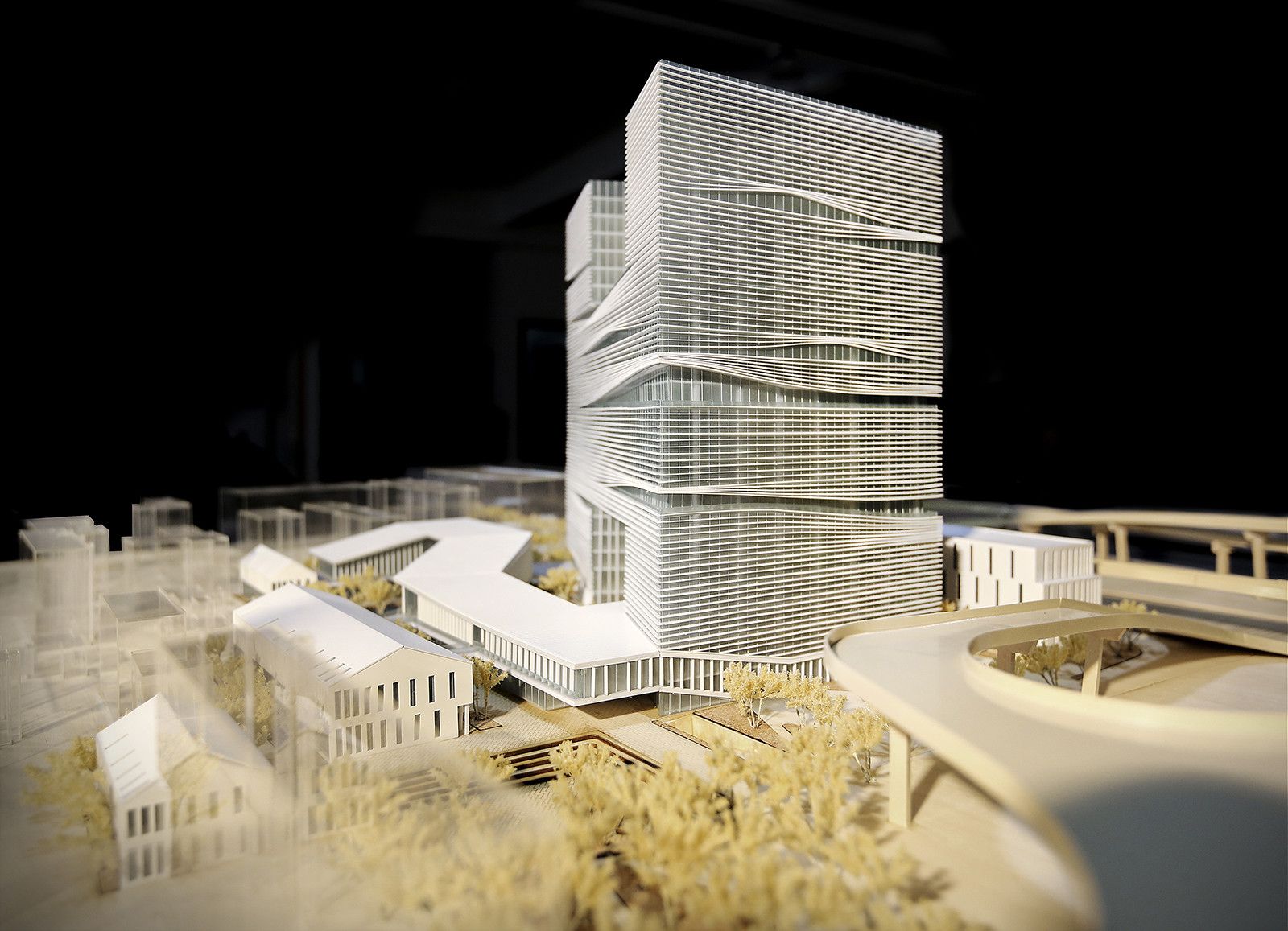
Furthermore, the volume above 70m is divided to generate a play of views, whereas the building is seen from the West Lake, it appears to be two different building. The main entrance part of the building is also set back to give way for a welcoming entrance square.
Openings exist on the facades, which are taking the shape of viewing balconies creating a sort of a poetic interaction between indoors and outdoors. These facades are dressed with an aluminium skin, which acts both as a decorative element and a shading and ventilation system.
The architects have done a great job designing this building. They didn’t take the easy way with designing just another office block, but they studied the surrounding context extensively, and they shaped the building around that. It is all about the context for this building, and the architects remind us that there is more to design than just glamorous facades. They respected the people that are already living thereby minimising the shadow casting as much as possible, but at the same time they included them in the development by providing mixed-use ground floor and open public squares. It is a healthy relationship between taking and giving to the urban and natural environment that I believe will be sustained for many years to come.
- Architects: LYCS Architecture
- Location: Hangzhou, Zhejiang, China
- Project Team: Ruan Hao, Zhan Yuan, Wenbin Chen, Jingrui Lin, Shiyang Wu, Shangliang Jin, Zhenyu Lai, Lina Chen
- Architect Of Record: Zhejiang Province Institute of Architecture Design and Research
- Area: 120711.0 sqm
- Project Year: 2015
- Photographs: Courtesy of LYCS Architecture
Aerial view. Image Courtesy of LYCS Architecture
Southeast view. Image Courtesy of LYCS Architecture
Night view. Image Courtesy of LYCS Architecture
Southwest view. Image Courtesy of LYCS Architecture
Southeast view. Image Courtesy of LYCS Architecture
Northwest view. Image Courtesy of LYCS Architecture
Landscape plaza view. Image Courtesy of LYCS Architecture
Site plan
Concept diagrams
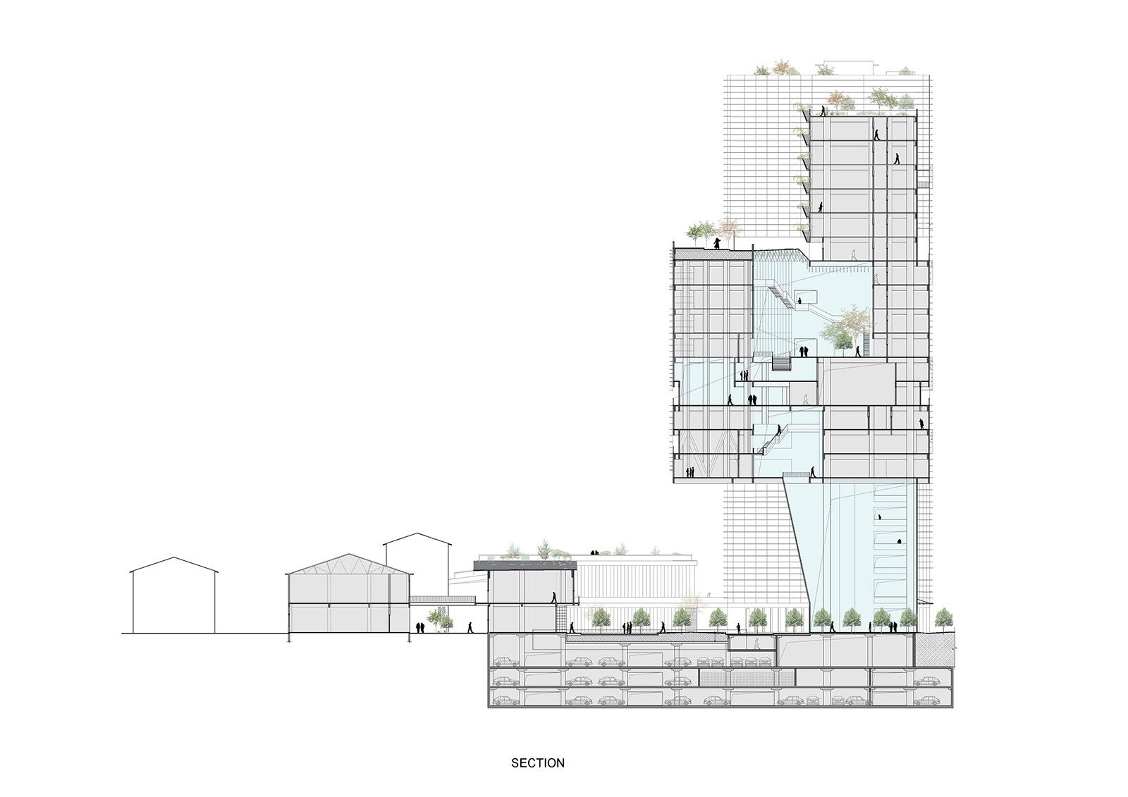
Section


